- Views 10,883
- Downloads 593
- Fans 2
- Comments 24
-
 85.50%(required: 70%)
 Gold
Gold

Camcorder22 90% no In:Cities 90% no RWE 90% no saxman1089 90% no chorkiel 85% no CoasterCreator9 85% no G Force 85% no posix 85% no Xtreme97 85% no bigshootergill 80% no Louis! 80% no Scoop 80% no 85.50% 0.00% -
 Description
What is now the Indian state of Rajasthan, was once part of the vast Mughal Empire. Amidst political, military and religious clashes, class struggles defined the daily life.
-
2 fans
 Fans of this park
-
 Full-Size Map
-
 Download Park
593
-
 Objects
492
-
 Tags
Tags
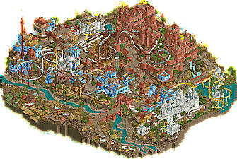
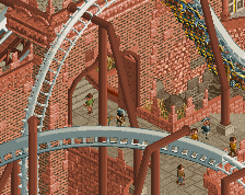
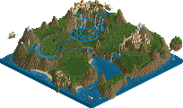
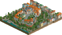
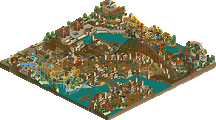
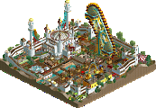
![park_4102 [H2H8 R3] Castles-n-Coasters](https://www.nedesigns.com/uploads/parks/4102/aerialt3848.png)
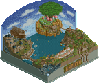
Here's my video review of both of these parks. Some great stuff on both.
https://youtu.be/Z3va7FxBMBg
This write-up was always supposed to happen, but we’re all familiar with H2H burnouts. Between finishing this, immediately moving on to Happy Valley, running the contest and having a life, this thing got postponed, postponed and postponed until it was only a vague idea in the back of my head. Time to wrap this up properly.
The original concept was something very different, combining several ideas from several team members, which I will not spoil in case some of it may be used in the future. There were some cool ideas, but conceptually it was related to hinduism, while the style we were inspired by was Islamic. Decided to not do all the conceptual stuff, and just make a cool location-based park. In this case, Islamic India. The state of Rajasthan was chosen, mostly because of its capital Jodhpur was home to the Mehrangarh Fort, a location that that had been on my radar for a few years. I think it was this picture that I had as my computer wallpaper for a while.
This was the main view I wanted to represent, with the main ingredients being: the fortress, the mausoleum in the foreground, an arid landscape, and a generally warm and dusty atmosphere. It was also important to me to portray a specific location/region, and not just do ‘India’ and reduce an incredibly diverse country into a caricature with no actual resemblance to the real world. In this case, the Mughal Empire. Some sketches were made - on paper, and in game. Though I like the monumental style of the fortress and the mausoleum, of which the Taj Mahal is another example, I thought it needed a more mundane looking town surrounding it for contrast. A labyrinthine town of flat roofed buildings can be similarly beautiful anyway. The park's construction was a battle between two styles: the 'mundane' and the 'monumental'.
The sketch helped me to visualise the map in more detail.
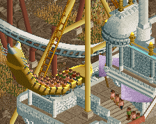
But the map layout really depended on the major ride... I was pretty sure I wanted a unique B&M flyer surrounding the fortress. IonZer0 was still a potential builder at the time, so he played with layouts a lot which did help me to come up with Zamindar eventually:
An attempt of mine:
Starting to resemble Zamindar:
GOT IT! This is the breakthrough moment of the planning stage.
Andrew's first tests:
Andrew soon found his groove, already surpassing the team's expectations for what quality he could contribute.
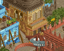
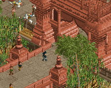
The gatehouse saw several versions. Andrew's style became increasingly 'monumental', which was somewhat of a problem in my eyes, muddying the vision of a few highly decorated monuments emerging from a dusty town.
We balanced it nicely in the end, but some of the more spectacular stuff was cut - just not because it wasn't good enough.
My own first tests were also of the monumental sort - the 'mundane' stuff I wasn't worried about (though it proved to be tricky later). The top screen is probably the first stuff built for this park, before it was Rajasthan even.
The fortress came naturally to me, it was pretty stream of consciousness, though I would chip away at it slowly over two months.
Testing and scenery manager fun:
Another of Andrew's gates, with me working on a cluster of buildings in the background.
My first mausoleum attempt wasn't terrible (though not good enough), but I was still measuring it against the first attempts at the church tower in La Tomatina which was absolutely rock bottom terrible. Andrew started redoing the building from right to left, and it definitely made my attempt look terrible.
Playing with Sanskrit and Arabic script. Not sure whether any of this made it in.
Meanwhile, ultro had availability issues, and with limited time and few moments for RCT it was harder for him to connect with the park. He mostly built some tests outside the map, and a few things on the map that clashed a bit with what Andrew and I were doing, sometimes just because of unfortuante positioning. Fortunately ultro managed to get some great work in at the end, and some of the elements from his earlier tests and contributions were repurposed into the fortress by me.
This building had some good ideas, but it went down all the way to the bottom wheres the fortress needed to be perched on top of a tall rock.
Back to the work in the town. I squeezed some good stuff out, but for every good building there were five abysmal ones. I was struggling. Balancing the colours was also tricky.
The mosque was one of the trickiest buildings on the map, though not in the way that I was struggling - it just took a lot of tweaking. The main idea the building was built around is actually the crescent on top of the dome. How to make a small crescent, sitting on the corner of a tile? This one was too big for sure.
Tolsimir's 3D signs came in handy. I did the crescent in ASCII-style on a 3D sign! Not sure anyone noticed this; was quite happy with it myself. There was another problem though: I wanted four minarets, but putting those at the corners would block the view on the crescent... I off-set the minarets by one quarter tile to make it look like the building was rotated a bit. Not quite half diagonal, just a little. That caused more problems for the shape below. How to make the minaret placement not awkward? In the end solved it with a single a half diagonal wall. The screen below is not the final state of the mosque, I played with the colours a lot and the decorative layer under the dome was replaced with a star shape, for example.
Progress on the park was very slow but steady over about two months. We were just chipping away at it, and suddenly we had a nearly complete park. This was the park with a week to go:
Before I conclude this post, I'd like to talk about the park's conceptual layer, or rather the lack thereof, in a way. The whole islamic India thing, and the Mehrangarh fortress, that's just the superifical layer of a park. I think any great park needs several layers. A narrative, or an abstract concept, just something beyond the objects placed on the map looking pretty. Rajasthan is conceptually a lot thinner than what I'd like, I/we just couldn't think of anything suitable. We just built, and I was hoping the narrative would reveal itself to me eventually (as it usually does). The narrative that presented itself somewhat, the one that I endorsed, was the concept of inequality. I tried to infuse the map with this idea wherever I could, but in the end its presence is flimsy because it is so tacked on, and I don't think anyone picked up on it, understandably. The concept should guide what is being built on the map, not the other way around.
I don't remembed the specifics, my knowledge from the research has faded a bit, but I remember about the feudal class system in the Mughal Empire that there's the poor majority, and the rich minority, the latter being mostly landowners - or Zamindar. This is represented on the map with the coaster, Zamindar, ascending from the town and its poor people into the citadel, elevated among the majority of the population. It's symbolic of how one might ascend to the upper class - by owning land. The most prominent buildings on the map, the ones where the monumental style is most apparent all belong to political, military or religious rulers. The second large ride other than Zamindar is The Tale of Dulla Bhatti - a piece of folklore of a poor man standing up against the Mughal power, stealing from them and giving it to the people - very similar to Robin Hood! The dark ride represents Dulla Bhatti infiltrating the fortress - the realm of the Zamindar - escaping, and going back to its hiding place. This is not the actual story of Dulla Bhatti, just the way we represented the Robin Hood angle. The elevator in the back of the map, by the way, shows gold (taxes) being hoisted up to the fortress.
There's also symbolism in other ways. When you look at the water and the foliage, the town is mostly devoid of lush green foliage. Quite a contrast to the nicely tended gardens and greenery inside the fortress and around the mausoleum. The riverbed, the town's lifeline, is mostly dry. Meanwhile, the Mausoleum has its own pond with no purpose other than being decorational, and from the fortress appears a waterfall, almost like an insult to the people, showing off the affluence of the Zamindar up in the citadel. Lastly, something that I added/changed on the final day in the final hours, is the farm. The farm is divided into two, with each half having a minigolf ride themed to a harvest season - Kharif and Rabi as these are called. The harvest seasons depend on the monsoon. There's a wet season and a dry season, each with its own crops. I thought this duality was a nice addition to the inequality theme. To emphasize the wet/dry dichotomy I also added some evaporating water (smoke objects) in a few places - there's a lot of evaporating water behind the fortress.
In short, we have the following conceptual contrasts:
1. Rich and poor (monumental and mundane architecture)
2. Up and down (elevation)
3. Lush/tended and bare/wild (foliage/landscaping)
4. Wet and dry (foliage/water)
That's it. Maybe Andrew and ultro have different things to say from their perspective, but this was mine.
Lastly, some pictures of buildings that can be found on the map, or that were inspiring.
Been waiting for this writeup for a long time. All three of you are fantastic builders; your architecture speaks for itself, Andrew is an utter freak and Ultro's stuff looked fantastic. I really wish we got to see more Ultro in H2H9. Didn't really grasp much of the poor town vs. big pompous fortress people narrative but I love how you subtly worked it in. I still look at this park for reference and get really really angry because how the hell is anyone supposed to make something like this? I remember I wasn't huge on this one at first but it's grown into one of my favorite H2H9 parks. Just insane all around.
Demo Offline
Interesting reading !
The size of the crescent is not something that caught my attention, but the minaret offset and little diagonal wall is such a cool thing to learn about, that seem to me so natural when looking at it that it doesn't seem like a trickery is required to make it work. ( and that may explain why when i try it doesn't look satisfying ).
).
Also the real life pictures really highlight the realism for me who thought it was the Red Fort in Delhi because that's the only one i knew. Thanks for sharing those insights and nice photos !
Really love when someone recaps a building process like this, even more so when it's someone like Liam who's end product is just so ridiculously good. It really humanizes the process for everyone - even the great builders go through some stuff that isn't that great. In fact, the really great builders maybe don't settle for things that don't cut it, and instead aren't afraid to put the work in twice, three times, to get closer to the vision in their head.
This park was a major achievement, that I felt didn't get the credit it deserved in the midst of an incredible run of H2H parks. I'm glad we can go back and revisit it now through the eyes of the builders.