Park / The Land of Nehekara
-
 20-August 21
- Views 2,213
- Downloads 346
- Fans 0
- Comments 6
-
 61.50%(required: 60%)
 Silver

bigshootergill 65% CedarPoint6 65% Jappy 65% saxman1089 65% Scoop 65% Xtreme97 65% CoasterCreator9 60% Louis! 60% ottersalad 60% RWE 60% posix 50% Terry Inferno 50% 61.50% -
 Description
Deep within the great sands of the Sakahara deserts lies a land shrouded in mystery and fantasy tales.
within these sands, the Land of Nehekara has thrived for century's.
Founded by the great tomb king Nehekara himself, the people here have always stayed true to their faithful war lord and tomb king.
When Nehekara died of old age the people of this land decided to build an enormous pyramid which would be worthy of the great deeds of Nehekara.
They also made a giant head statue of the king in skull form to remind every intruder or anyone that wants to harm the great city, that they are not welcome and that Nehekara is always watching them.
Come and visit our great city but beware Nehekara knows your every move and if he is not pleased with you his wrath will punish you, even in death...
Hey people! enjoy this heavy fantasy style take on Egypt!
Mulpje -
 No fans of this park
-
 Full-Size Map
-
 Download Park
346
-
 Objects
189
-
 Tags
Tags
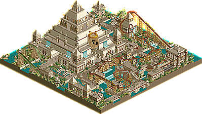
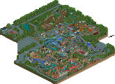
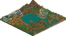
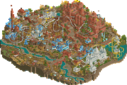
This is super cool. The pyramid feels suitably imposing and the mummy head is fantastic, especially the way you got the eyes! Great use of an obscure expansion piece there combined with the blacktile palette. The pyramid itself could perhaps have used a bit more detail and life, as it stands it feels quite static and doesn't really interact with the map very much. Even just a few guards or planters would have livened it up I think. The coaster has a pretty cool layout, great first half. The use of water throughout is another nice decision that pairs well with the heavy use of beige in the architecture.
Yeah dude, I absolutely love this. Sad it's not getting more attention. Always happy to see work from you
This deserves more attention! Time to give it a nice review.
This map is pretty cool! I love the massive pyramid and to echo Xtreme, that mummy face is ace. Those eyes man...
Coaster layout is nice, coulor usage is great as well. The palette helps bring out the dusty sun-bleached desert atmosphere. The water on the other hand adds a nice feature and adds some cool moments.
My main issue is also the coolest thing on the map: the pyramid. It just sits there, you could've added another ride (indoor perhaps?) or some interaction with a ride...
Still was fun fun to see though. Big fan of the current NCSO movement developing and moving away from the trackitecture for everything and instead using it the way it was meant: going further when objects fall short.
the Pyramid is indeed lacking a lot of interaction and I was super bumped out that I did not have any time left to give it some more interaction or maybe a cool ride inside of it.
Still i love every single comment i get on my work from you guys so thanks for taking the time and reviewing my park!
When night is high, Sah light the sky...
The Tomb of Nehekara is definitely the high point of the map, and most of this is due to creative track placement and support use. The spinning wheel under the hill would be the most obvious example, but even subtle touches like the mini "splashes" lining the cutbacks elevate this coaster to a higher level.
The map does fall victim to some of the classic RCT Egypt pitfalls, such as everything--the path, the walls, the rooftops--being overwhelmingly beige. Outside of the pyramid itself, the buildings largely blend in with the paths and lose much of their identity in the process. The supporting colors could have sung a bit louder to cement the shapes more clearly. The edifice surrounded by the "rose bowl" element is rightfully imposing from some angles and largely invisible from others!
One such consequence of a largely monochromatic approach to Egypt (or any theme) is that it can lead to textural overcompensation, which on this map means that every wall texture on the map seems to be used on every building. The "ruins" effect on the aforementioned "rose bowl" tower uses the various textures successfully, but some of the other structures seem as though they're alternating wall textures at various heights for the sake of alternating wall textures at various heights. The gold trims look great, and I think you could have gone even further with them.
Trackitecture, though used sparingly, works very well here. Nehekara himself is a handsome fellow, but even simple tricks like the station pillars and heartline supports add considerably to the theme. More of this Mulpje-brand innovation and less of the old "safe" Egyptian construction would have elevated this map to a higher level. Had you had more time to add details, I think colorful banners and bold canvas roofs would have brightened up the sea of beige.
I've seen your more recent work, and it's clear you've grown considerably as a builder since this was released; your eye for shape and color shines more in your most recent map than it did here, so I know your next releases are going to blow us all away!
Great little Egyptian park here. I agree with prior comments that theres a bit of beige monotony to it all that sorta blurs it all together. I think using the base blocks as path textures was a bit bland.
The coaster was pretty neat.. solid support work and elements flowed decently well. There's some neat trackitecture around the queue with the tomb and the train over the sign. Also, why do so many DKMP parks have trains out front? Seems very redundant.
Water elements and features really helped break everything up and made viewing a lot more enjoyable. I agree with others in that the pyramid was sort of a wasted focal point.. seemed like it could've been used more to house a ride or more stuff. For taking up such a large part of the map, it wasn't utilized enough.
Anywho, as usual your work is quite impressive in terms of scale and object usage and you have a lot of great tools to keep growing as a builder. I look forward to seeing more from you.