Park / NE Workbench 2021
-
 25-July 21
- Views 11,139
- Downloads 581
- Fans 2
- Comments 32
-
-
 68.50%(required: 60%)
 Silver

CoasterCreator9 75% In:Cities 75% posix 75% RWE 75% WhosLeon 70% Xtreme97 70% geewhzz 65% inthemanual 65% saxman1089 65% Scoop 65% Cocoa 60% G Force 60% 68.50% -
2 fans
 Fans of this park
-
 Full-Size Map
-
 Download Park
581
-
 Objects
421
-
 Tags
Tags
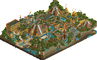
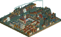
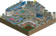
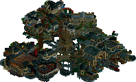
Took me a long time to decide what to vote for, but I just barely gave it to the Tile Inspectors. I was thoroughly charmed by the NE Workbench and all the little references, but X-Games is one of the most unique and lively parks so far. The concept is an unlikely combination but it just works so well. The attention to detail is also second to none.
Match Conclusion
The poll is now closed.
The Tile Inspectors have won this match with a score of 42–14.
Creators
Tile Inspectors"X Games Alcatraz"
55%Sulakke
30%bigshootergill
15%wheres_walto
Adventurers Club"NE Workbench 2021"
50%Louis!
30%otsdarva
12%Hex
8%SensualEthiopianPoliceBrigade (F)
x-games: this is a really fun park, wonderful idea and executed quite well. very lively and vibrant, but not sacrificing details or archy. I immediately thought of the old ww/tt alcatrarz scenario, which is a nice bit of rct nostalgia. this is well timed with the olympics too, because i've been watching skateboarding for the first time in years, so it seems quite topical. good shit
workbench: i definitely laughed at the name when i saw it. we've seen this kind of trope a bit, but its always enjoyable to poke fun at the h2h meta and put in lots of silly stickers and references. its not bad for sure, perhaps a bit random, but I understand how time constraints work! my fave detail was probably all the crossed out things on the back of the spare parts drawers. very impressive though for a last minute safety build!
Workbench
I've come to notice that I've really liked the more playful, simple and uncluttered concepts this H2H, as opposed to something that takes itself a little more seriously. Examples are TGD, Lost World, Circuit, Yerka, and Riverview. They all have that playful factor to me, and this park certainly does too. I ended up spended quite some time looking around. Smart to make this park reference other parks, as people's egos will make them search for references to their work, certainly drove me to do it haha. On that note, I'm a little disappointed not to see more CK in there an CCC in particular was missing
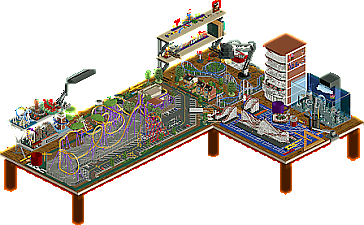
Big fan of the various details throughout, all the clutter on the desk, the various references to other H2H9 parks, etc. Especially a fan of the lamp, the aquarium, and the magnifying glass - that is just such a neat detail.
However, fun as the concept is, it feels a little rushed. Certain things could have used a little more refining, sculpting and/or breaking up of the textures, such as the back of the aquarium, the drawer, and the shelves. Maybe just some crunch objects to indicate patches that are dusty, or some untreated coffee stains, stuff like that. The entire desk could also maybe have been fleshed out a bit more. Perhaps there could have been a hint of the room around it somehow, a floor below with some stuff that's fallen down, things like that.
I am also a little surprised such a large area of the desk is dedicated to a parking lot. That seems a little strange to me - it feels like realistically speaking, people are not that into parking lots that they want to recreate them on large scales, and even if they were, it would maybe have been a good application of "artistic freedom" to limit the extent of it in favor of more interesting content.
All in all, a fun submission with some really great moments. It IS close to being a little too whimsical, but steers clear of being purely a silly gimmick IMO, and I'd much rather promote ideas like this than discourage them.
Alcatraz X-Games
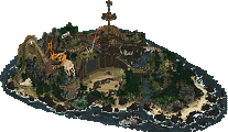
Definitely also in the category of "fun" parks. Despite being set on the island where the most infamous ex-prison in history is located, it is bright and brimming with activity. A lot of the various extreme sports are really well executed - that climbing wall is an amazing example, great creativity there. Also love those soapbox racers.
As for the aesthetics, I'm a little torn. Most of it looks good, and there are no clear parts I can point to that I don't like. That said, there is something about the textures, the color combinations, perhaps even the palette which I feel like it somehow falls a bit short. There is a lot of crunch, fitting for a place like this, but it somehow feels a bit cosmetic, plastered on, instead of evenly and nicely integrated. Might sound weird, but that is my impression of it. Some of the archy felt a little underdeveloped too, though I actually think that long, square half-diagonal building looks great, one of the better implementations of this angle I've seen. Works perfectly there. The central buildings also deserve some cred for clearly being well executed recreations - But there is still something about them that is missing for me. Landscaping is on the whole good - I think I like the implementation of Tolsimir's mini-rocks better here than in any other park they've been used in.
___________________________________________________________________________________
In the end my vote went to TI. I loved the playfulness that was present in AC's submission, but it was also there to some extent in TI's park, and that combined with a slightly more ambitious and feature-filled map tilted it in their favor. Well done both teams!
why do we keep doing this
good match tile guys. Well deserved
Super proud of my team for pulling this map together so quickly. Ots, Hex, Sens - absolute lifesavers. And Lew - i'm just glad I got you off your butt and made you work
Otsdarva Offline
Congratulations to Sulakke, BSG, and wheres_walto on the win! I like how you guys were able to build an event in a real life location and add all the necessary realistic logistics. The map is brimming with activity in every corner and even in indoor areas like the escape room and laser tag. I like the the arcade especially the screens playing Tony Hawk Pro Skater - definitely a fine detail. Then there are fun things like the advertisements and the booths that really bring the map to life. I laughed at the National Guard recruiter station - they definitely would be there. The skateboarders ctrs are well done with different animations when in the air. My only criticism is the body slide ride. The person should decelerate immediately upon hitting the water but now it seems as though he's sliding across butter.
Thanks to everyone who voted and commented. Big congrats to Sulakke and bigshootergill for the win, you guys were awesome, even if I certainly annoyed you at times
Quick review of NE Workbench
+ I like the idea a lot, at the start of the season I pitched a model train set as a park to the team, this is a much more exciting implementation of that. This reminded me of Diegetic Underground as a reimagining of rct in more "real-life" settings: what if our hobby was physical instead of digital?
+ mini Millennium Force is so good, someone commented that all it took to look great in rct was to make it miniature and they're so right
+ the small shelf of prior parks this season is really cute and creative, instantly recognizable and fun
+ the shelve ornaments are really cool, fun little features, all well done
+ toolbox drawers, you aren't the only ones who have imagined rct objects in such a way
+ fun park overall with a lot of awesome creative features. My first impression was that it strayed too close to meme territory but on deeper looks I found it more insightful than designed for cheap laughs
- I don't know how you guys cram so much content in so little time. I think this time it worked against you as the idea felt a little undercooked. I got the impression that it started as a recreation that stalled and quickly needed something around it. I thought Medusa, while being high quality work, stood out as very strange against the backdrop of a workbench, particularly the parking lot and theme park elements
Man, you know what guys? It's not often that this callous and irritable heart of mine is touched by this game but I gotta hand it to Tile Inspectors; this one hit home. I remember sitting at home after school as a kid, sometimes by myself or with a good friend and playing Tony Hawk's Pro Skater for hours. Since we'd sometimes try and skateboard ourselves without much success, we'd find solace in our PlayStation ripping cans of soda and munching snacks while seeing us as Rodney Mullen trying to see who could do the longest manual. Seeing things like the S K A T E letters and familiar faces signing autographs in a level from the game itself felt truly special. I can't remember having this feeling with RCT before, at least not in recent memory. Also, I'm glad I played the custom music; it added to that sense of nostalgia even more. On top of all that, the park is just straight up fucking skilled and executed well. I quite literally have no complaints other than I wish I built it. Thank you, Inspectors, for this. But also fuck you for getting a sincere comment out of me.
Now I gotta slip back into my persona.
Ugh, god, that hurt. What happened? I think I just blacked out. Oh, I gotta talk about Josh's team now? Again? How many parks are they making? Gross. Anyway. Yeah, this thing was fun, I will admit. That's about it though. I guess the Medusa recreation and the station for it were nice. Why didn't you guys just make a realism park with Louis? Seems like you guys struggled so I won't hold it against anyone other than Josh because he is clearly a shitty captain. Who allowed this? Liam? Figures. I trust that guy with about as much hair he's got on his head. Alas, the park is still fun. The mini-Millennium Force is great and I did enjoy the H2H9 figures (hey, Lemuria!). Overall a great outing despite my crude remarks and my crippling fear of having to say something nice so Scoop won't yell at me.
NE Workbench:
I enjoyed this a lot, it's a very distinctive idea and the park is oozing with charm and creativity that sells it in a unique way. Love the idea for Medusa being a scale model with the partially finished painting on the floor, with excellent layout and coaster design on top of that. The scale model vignettes for the H2H parks were also really neat call-backs. I like the little "real life" touches like the lamps and the stationary which were well made, and the toy story-esque peeps escaping and being let loose ties into the theme well. I think overall the park does feel a bit more bare-bones, with its details being more up front than Alcatraz, but I like the concept and risk with the idea more.
X-Games Alcatraz:
Really stellar park here guys, you did a brilliant job of bringing the map to life. Initially it didn't even register that the park didn't have a coaster, so it's clear that the variety of rides/events throughout made up for that and had stuff to keep my interest in every corner of the map. What strikes me the most is how, underneath the X-Games layer, this is a pretty much perfect recreation of Alcatraz judging from pictures. The decision to intertwine the event theme is superb then because it allows that extra layer of depth to shine through. Loved all the "rides" and being able to watch them for a bit and flit between is exciting, and the signage was a standout as well. Top piece for me was the laser-tag, amazing how much detail you fit into such a small space there! In fact it took my second or third look to find all of the interiors too which were excellent, even the storage room. I'm sure there's going to be more to find as I keep coming back, congrats on the win.
mrs_walto Offline
We're back! Long time no see Mr. Walto with the dictation and Mrs. Walto with the libations LOL.
X-Games Alcatraz
- I forgot that I hadn't reviewed this park formally, cause it took over your life for a while
- it feels like Tony Hawk Pro Skater, I wanna play it now, do you wanna play it later?
- I like the signs (wink wink)
- I like the jump custom ride, the x-games themselves are really well done: the stands, the crowds, ESPN logos, it really feels like exactly what it is
- I like the wait to get into the building itself and the jail cells
- I really like these custom roof objects on this white building, huh so that's how they made that? The eyedropper tool is frankly 10 out of 10
- How do they get birds to sit on the perches? Y'all think you're fancy using bird custom objects for realism?
- The party boat with the naked peeps, I feel like I would be there
- This park is fun. You know me, I want my parks to be fun, places I'd like to be visiting, and this park is
- I like the rock climbing wall, how'd you make that?
- **I would like to acknowledge that I'm super biased in favor of mr. walto
NE Workbench 2021
- *sees vote score* is this park gonna be shit?
- what am I walking into?
- oh....
- uhhh.. what umm.. oh so it's a literal workbench (haha)
- okay, at first I thought this was gonna be shit, but actually it's creative
- A little coffee mug
- I like the little protractor, pencil cup, that's really cute
- okay that's cute
- it makes sense, I see what they were going for. The desk lamp is actually really well made, you have a lamp like that
- who is in this photo??
- The little chotchkies are cute
- It's definitely creative and out of the box, it might be too out of the box
- there's a lot of cute little easter eggs for sure
- Oh hey, there's a flash flood warning (big thunderstorms coming tonight)
- Overall, this park is really unique but not one of my favorites
An interesting match up this one, where the best park won in my opinion.
NE Workbench was a good idea. I feel like we've seen "room" parks before, which is kinda what this is, and it's always really tough to get the scale right, and sculpt everything so it looks realistic. There's usually some kind of coaster shoe-horned in there as this is RCT, after all. The great thing about this idea is that it allows you to actually build a coaster and not have it feel forced or out of place. This kinda felt like the end of the Lego Movie where you see it's all a model - similar vibe.
The downsides of this park i've kinda already touched upon - some of the sculptures weren't super on point, not sure if it's even possible to achieve that. Everything was good enough that I knew what was going on though, and I enjoyed looking for little easter eggs. Also seeing that screen above of where this was at a week before finish, incredible work getting something finished and cohesive submitted.
I really enjoyed Alcatraz. It really reminded me of Tony Hawks - i've never been to a live X-Games or anything like that but I can definitely imagine it being just like this. I appreciate the melding of two concepts (Alcatraz for the setting, extreme sports as the theme) and you managed it pretty much seamlessly. Every few tiles there is something super interesting to look at, another great idea and everything moving and bustling really gives it a sense of life. I really liked that the water wasn't just used to frame the island, but was alive with a ton of different elements - so much to explore. Shout out to the landscaping and foliage - really subtly done, but added so much to the sense of believability.
Some of my favorite bits -
- The little beach area at the back near the jetskis
- Chad Muska signing autographs
- Harley Davidson sign
- The surf pool
- Collect SKATE
- Soapbox Derby was awesome
Really great park overall, thanks guys.
Really loved the creativity of both of these. These are the sort of matches I find a lot of fun.
Here's my video review of the parks.
https://youtu.be/19OAXNYClQU