Park / NE Workbench 2021
-
 25-July 21
- Views 11,139
- Downloads 581
- Fans 2
- Comments 32
-
-
 68.50%(required: 60%)
 Silver

CoasterCreator9 75% In:Cities 75% posix 75% RWE 75% WhosLeon 70% Xtreme97 70% geewhzz 65% inthemanual 65% saxman1089 65% Scoop 65% Cocoa 60% G Force 60% 68.50% -
2 fans
 Fans of this park
-
 Full-Size Map
-
 Download Park
581
-
 Objects
421
-
 Tags
Tags

Round Robin
VS
has Scoop voted yet
yeah, he was first to vote. gotta be consistent
Quick announcement: the Tile Inspectors download was missing one file, which has now been added to the zip. Please re-download!
admins fault I would hope
Yes, otherwise we wouldn't update the file.
Also, you ruined my beautiful html by quoting it
fixed
X Games
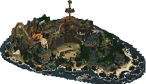
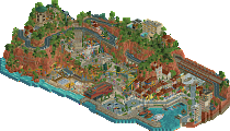
First things first; what an incredible recreation of Alcatraz. Really impressive. Second, as a longtime fan of extreme sports, I can say that you definitely hit the X Games atmosphere very well. There's a great festival atmosphere and so much cool stuff going on. I'm very glad that you didn't force in a coaster, because you really didn't need it at all. It was fun to explore the buildings, nice work on the interiors. There's new stuff to discover across the board, and I'm having a great time checking it all out. A few places felt like excessive movement just to have movement, but thankfully those were few and far between.
Huge fan of these coastal walkways; super atmospheric.
I like this little beach area a lot; the jet ski dock could have maybe used a bit of love - maybe some underwater details or something.
Excellent Coast Guard boat, very recognizable.
Workbench
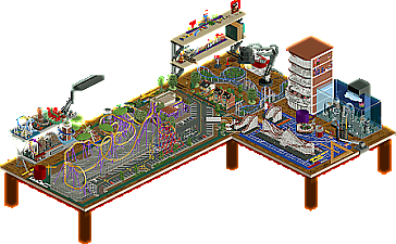
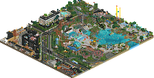
This is a fun submission. The referential ideas are executed quite well. They're fun features to find and suit the theme of an "NE Workbench" nicely. The nanocoaster is really cool, and I like the little models of things placed around. I kind of wish that the Micro Madness shelf was actually Micro Madness. Medusa's layout is well done, and I like the idea that it's another scale model. I did find that the front half of the park was a bit dead compared to the back - the only action being the coaster itself and a k'nex model that didn't really fit well in my eyes. I understand how a k'nex model fits with the overall theme, but I thought the placement wasn't quite right. There is a lot of fun factor here, with a few minor missteps in composition or execution.
Definitely one of my favorite parts with the nanocoaster model and the scale models of the RCT buildings.
The attention to detail and homage to other parks in H2H is quite nice; they do feel like models of the works in the parks.
To me, this last screenshot illustrates a few things. Excellent attention to detail with the desk and parking lot textures, as well as a wonderful layout. It also displays the part of the park that felt a bit more sterile; less guests wandering about, less activity overall.
Another great match. I'm going to view the parks again tomorrow before voting; I'm leaning one way, but great job to both teams for putting out two wonderful parks.
Congrats to both teams for putting out some nice parks. I really liked the concept of the AC park, and how it was filled with little pieces of RCT everywhere, breaking the "fourth wall" a bit, so to speak. It's definitely the "fun" park of this round. Favorite part was the nanocoaster model, funny that someone finally found that the solution to "making Millennium Force actually look good in RCT" was making it really fucking small. The big problem with the AC park in my eyes was that it didn't keep me interested for very long. I felt like I had seen everything the map had to offer in a relatively short amount of time. It also feels a bit rushed to me, which is maybe understandable given that the readme says it was built in two weeks (not sure if that's just a joke or not).
The TI park was pretty awesome. I'm not a huge fan of the X Games, but I know enough to know that you nailed the feel. The advertisements everywhere, the different events with different setups, etc, all feel really well done and make it feel like the real thing. The idea to set it on Alcatraz was a really cool idea, and you really did the island justice. The shape and buildings are instantly recognizable. There are a bunch of cool little things too, I think my favorite was the soap box derby racers. One thing on the map I wasn't feeling very much was the half diagonal building. I understand why you did it, and that it matches the actual island's arrangement, but the interior visible through the windows kind of makes it look like a half-diagonal building with an on-grid interior.
In the end, voted for the TI park.
Shen Kitchen Offline
These were incredible entries! X games really fused two ideas and gave it life, amazing. Workbench was well designed too. I really loved how the miniature park was executed, It was so cute!, I decided it would be the one I'd vote for!
NE Workbench:
Very creative idea and I'm a fan of the execution. You set out to build an idea and achieved it, I admire that.
Alcatraz X games:
So many neat little things here and its just honestly a joy to look at. Nice job on the landscaping without using the grand canyon objects. Sometimes it felt a bit too small scale.
Sad to see it faced another park that is up my alley. I loved the lamp, the drawing table, the matches and the micro madness shelves. Some things felt a little out of proportion. Even though I found the schiff wild mouse reference by now, I have to give this one to the X games park.
Alcatraz:
This is a great idea for a H2H and of course the execution was fantastic. I really enjoyed the signs in the park - both the effort put in for the custom scenery but also for the ones sculpted out of objects (red bull/san francisco). The park certainly had a strong and established atmosphere. The X-Games is not something I know a ton about, so I'm sure some references were lost on me, but I loved just how much was happening. I thought perhaps the inside of the main building could have used a little more work, but then I'm gung-ho with using cut-away view after missing so many details on a couple of earlier parks! So at least I caught the indoor skull skate park above the shop. The shop itself was neatly done too for the amount of people who'd dig that low with cutaway.
I'm not sure what's going on in that pink area inside the off-diagonal building. I'm not sure I want to know. But looks like those peeps are having fun!
I think my favorite part of the park though was the soap box derby. All the different vehicles flying down the streets there was very cool.
Despite the challenges of the type of rides you guys were building here, one thing I really liked was how neat the execution was. All the hacks were pulled off very well.
Workbench:
I see the discord controversy over my first thought on this park (which other people had said!) , which was, "this is not my cup of tea". I had a think about what how to phrase it differently.
I'm a big James Bond fan. Spectre is not a movie I like because it consists of nothing much but references to previous movies. It doesn't really establish an identity of its own.
This park feels much the same - it does try to develop its own character, and the micro coasters are fun to look at. I think the biggest thing this entry needed was some kind of backdrop around the desk. It just feels like this fairly blunt bit of furniture floating in space. Those types of things are very difficult to make look good in RCT, I know. The zoom I view RCT at (which I guess is similar to most) means I always have chunks of black around the edges when viewing this park. Generally this kind of park is always going to look too sharp around the sides of thngs like the desk/storage tower because of the scale of the desk and the real-life objects versus the shape and size of the RCT objects.
Ultimately there's lots of nice little details to look at (the default RCT houses I liked, the fish tank was fun, I'm not sure what the references of the whole-park cross sections next to the vehicles are, but they're v neat) but I think the idea just wasn't that great. My guess is you guys loved making this, which is generally a great thing when you're RCT'ing, but when it comes to winning H2H votes, I have to take mine to the park which I enjoyed looking at the most, which is Alcatraz.
I loved the Adventurers Club park and feel bad voting against it but X Games Alcatraz is so fucking good. Great concept, great execution. "Crunch" is the NE word-of-the-year and you nailed it. I love the fun details everywhere and things like the tacky ads just bring it all to life.
PS: The inflatable dolphin is amazing. It's so stupid but also so great.
Dang. Loved all the references in NE Workbench. Very cute park with some great ideas. The nanocoaster of MF was great. I was just at Cedar Point last week and it immediately made me wanna go back to CP. Also, I feel honored you guys had a Grumblegroin easter egg. Wow thank you. I think the ideas are all there, and its well executed. But I think I agree with Saxman in that there wasn't much to see beyond first glance. I think with H2H I've come to expect nitty gritty details... and when up against another TI park that includes a ton of interiors and layers of textures, it's a tough matchup imo.
On to the X Games park. Damn, right in the nostalgia as a THPS fan. The S-K-A-T-E ride put it over the top for me. Seeing rides like that, the soapbox derby run, the big air comp, and floating halfpipe all at once was so cool. But then you guys seemlessly tied it all together into a coherent and lively map. So much detail and fun stuff to explore. I enjoyed following the various rides around the island.. from the wakeboarding to the bmx'ers, there was so much movement and creativity here. Great work guys.
AC impressed me more at first glance, I had a super fun time with my initial viewing. I'm a sucker for quirky rct, sculptures, and trickery, so it was right up my alley. The magnifying effect was my favorite singular bit, MF nanocoaster a close second.
Taking a day to mull it over and look deeper and TI has to take my vote. It wasn't as charming out of the gate, but it's really holding up to repeat viewings. At the macro level it's great overall use of the island and layering the X-games theme over the prison, at the micro level so many little vignettes and clever object choices.
such wonderful work from both teams
X Games Alcatraz:
Just an amazing amount of stuff going on here, I love how all of the side events/ attraction are animated and functional as well the the main stuff. And it does a great job with the atmosphere of a big event. Architecture is solid as well. Overall everything comes together to make this very fun to explore and just watch running. Also though it was a bold choice to have no coaster, I think it worked out quite well.
NE Workbench 2021:
I love the concept of this park, and how it's done. The variety of different scales and types of models, the references to other parks and the small in-jokes place around. Also all the way all of the tools and and giant objects are done.
To be honest, I really struggled with this vote, maybe most of any match. The AC park had a ton of incredible ideas and was just plain fun. My first look thru both, I was leaning toward AC. But, the more time I spent with it, the less cohesive it felt. While the concept was really clever, it felt more like the park dictated the concept and not the concept dictating the park. By comparison, TI felt like a very specific and clear vision. Tons of content and great ideas, some new and refreshing, some feeling a bit repetitive in places. The TI park felt very true to it's concept, but I felt it was missing a focal point or huge wow moment. Alcatraz is so iconic, but a lot of that is more specific to the location and use then the actual look of the island and structures, which are a bit boring. Ultimately, I felt like TI was a more collective and carefully executed package, but the creativity in AC's park almost swayed me. The magnified model track should be nominated and probably win the award for best idea. I'd also say, I think the AC park may have benefited from being in R7 where it could act more as a bookend to round robin, here it feels a bit odd.
Congrats to both teams on two very fun and interesting parks!