Park / Extraction

Select your favourite park:

  1. Villerouge sur Mer by Tile Inspectors 42 votes [82.35%]
    • Scoop
    • MorganFan
    • Iretont
    • ottersalad
    • Camcorder22
    • Gustav Goblin
    • Mr.Brightside711
    • Hex
    • Lowenaldo
    • geewhzz
    • Six Frags
    • Dr_Dude
    • chorkiel
    • Steve
    • Jene
    • Magnus
    • Zarathustra
    • In:Cities
    • Turtle
    • deanosrs
    • PizzaWurscht
    • frigginbrownie
    • Psi
    • Lurker
    • hydroportal
    • RaunchyRussell
    • SupraSix
    • MCI
    • CoasterCreator9
    • Astroturd
    • Recurious
    • Pacificoaster
    • dr dirt
    • BelgianGuy
    • Otsdarva
    • tabard424
    • Faas
    • Xtreme97
    • Louis!
    • hoobaroo
    • trav
    • Jappy
    Percentage of vote: 82.35%
  2. Extraction by the Cereal Killers 9 votes [17.65%]
    • 6crazy6king6
    • olddtfan51
    • Milo
    • CHE
    • Lilith
    • Ge-Ride
    • KaiBueno
    • SensualEthiopianPolice
    • Thethrillman
    Percentage of vote: 17.65%

25 Comments

This park shares comments with 1 other park(View Park)
  • Kumba%s's Photo
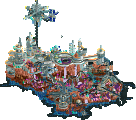
    Extraction 
     
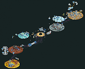
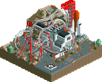
    This was awesome. It's funny, the second this match-up was released, my sister called for a daily family facetime chat and it was her birthday too. So yeah, had to run out just as I clicked on the file and it started to load, lol. I came back to an awesome space park. This thing gave me flashbacks to Asteroid Fields... I think it was definity near that level. Everything was done with detail and quality. My favorite thing was the spread out map layout, been waiting to see that in H2H! 
     
    Highlights for me:
    + Black whole with a hidden 3 part frozen staff reference that was awesome! Big fan of that song, lol. 
    + The Excavator was very cool, great idea
    + Loved all the frozen staff and of course the astronaut CRTs
    + Helium planet was great
     
    I don't really have any negatives from the park. It was all very enjoyable. I do think the planets to the left of the black hole were a little weaker, but still outstanding work overall. 
     
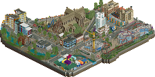
    Villerouge 
     
    I got to say, working with Fisch was an experience. I don't think I have ever seen any H2H park stay on course like this one did. From his first post to now, it's shocking how the layout didn't change, just a couple of supporting ride choices. I was a late swap onto the map after it was about half done and looking a little iffy for the deadline. Rob was on it the whole time to work with Fisch as an apprentice and learn from him. 
     
    Before picture from April compared to the finished overview:
     
    Attached Image: vrbefore.JPG
     
    Attached Image: vrafter.JPG
     
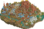
    The first thing I did was rockwork on the highway and near the church. I used the SM to copy some of the rockwork from the big cliff and move it over. Fisch would never notice and I would save time, right? Nope, he noticed right away and shut that shit down, lol. Yeah, the landscaping is ALL original. I didn't use the SM again and Fisch was pretty happy with my landscaping work (vertical only, I didn't do the edge work). I did a pretty good amount of it, mainly where the cluster the coaster track weaves in and out of, the back area where the path tapers off and around the highway bridge section between the two tunnels. 
     
    We did clash a few times. I was not happy with the placement of the museum on the beach and was vocal about it, even saying that I thought it might ruin the park. It seemed I was mostly alone on that stance, so it stayed and for a while I built with an occasional cold glance at it. I also was not wild about the choice of the highly detailed land edges. I think they look outstanding, I was just concerned about the time it would take. We were tight on the deadline and the extension looked like a possibility. We ended up using the extension on the morning of the deadline. 
     
    Honestly, both me and Rob got frustrated throughout the build. Fisch would often change or remove what we did. He was very nice about it though and always willing to have a chat about it. We had voice chats often, they always helped us get on the same page. Fisch is really one of the nicest and most patient people I have ever worked with and wanted to keep the park true to his vision. If I re-colored a pole, he'd have probably had the same reaction as if I added a UFO dumping toxic waste into the park. It would have been something like, "Oh yeah, I see what you did there, but it should really be like..." I mean, the guy is a legendary parkmaker, architect/city planner and the lead builder. I didn't win any disagreements, even over small things, lol.
     
    Around the last week on the park, I seemed to really get the hang of it. I added details to the buildings on the diagonal street and got some very kind reaction emojis from Fisch and the team. I think that gave me a confidence boost and from then on, my detail work was solid and rarely changed. Funny thing is, I warmed up to the museum after Fisch detailed it and finished the structure. After saying I thought it might ruin the park, I found myself doing the whole interior and most of the roof/fashion show (Fisch's idea). We really worked down to the last minute to try and get the park 100%. I took evening naps, so I could stay up until 2-3 AM to build before passing the park to Fisch. Was just like the old days. On the final day before our extended deadline, I was covering the mass of track needed to create the amazing traffic and for the first time in my RCT career, saw the ZZZZzzzz that meant the object limit was hit. The last day of building was pretty crazy and Fisch was covering off-map hack track for the traffic down to the final 10 minutes.
     
    Also huge thanks to SpaceK for all his contributions to the map including the custom tables which I requested with just a few days left. If I thought of it sooner, they could have been everywhere rather than just in a few spots. A big thank you also needs to go to Tolsimir for his help on the traffic hacking. Rob also with outstanding work in the hacking department. BSG as always with the amazing work on the evidence board and really the whole team with great support all the way.
     
     
    On a personal note, this H2H victory marks a milestone for me, a record tying 10th H2H win (Liam also has 10). I want to take a moment to reflect back on those 10 parks...
     
    Parkmakerz with Six Frags - My first H2H park happened to get a win. I had the idea to spoof/mock the NE community with the park (myself included). Some guy named Six Frags jumped in the help finish it and we picked up a W.
     
    Aviara Cove with Corkscrewed - This park actually started as an idea on the first H2H3 team I drafted. When we re-drafted, I got Cork again, so we got to keep it going. It was awesome working with Cork, who at the time was considered arguably the best RCT2 player in the world. 
     
    The Great Carolina Quarry with ekimmel - This was a lot of fun, had wanted to do a quarry theme for a while. ekimmel was a solid builder, but had a different style, so he basically did the surface and I did the quarry. This is one of only a handful of H2H parks that have won by DQ, which sucked, because I really think it was some of my best work.
     
    Anheuser Busch Park and Zoo with J K - This park was rushed and definity not our best work, but it did win game one of the best of 3 finals in H2H4, which we won.
     
    World Showcase with Robbie and Gwazi - H2H5 has by far my best season and it started with this EPCOT inspired idea. It was fun adding and subtracting countries on the World Showcase layout and Gawzi and that promising Robbie guy did outstanding work.
     
    Roman Vice with disneylhand and nin - An idea that was rolling around in my head for a while. This was a rare time where I feel my partners didn't get the theme too well, so I kinda took over on this and we landed a playoff win. 
     
    Terra Progressia with J K and Comet - My lone win in H2H6, were my first park (Zombieland with Josh and Goliath) lost in week 1 and then my playoff park (Rowling vs. Tolkien with Six Frags) lost to some waterfront park... I only did about 1/3 of this park and mostly solo, but I really loved how it turned out. One of the more enjoyable areas I have made in H2H.
     
    Lotte World with Pacificoaster and Arjan - My first time as a support builder in H2H, I did a lot of helpful things around the park and got to do the India area. 
     
    Star Wars with Shotguns and Xcoaster - Maybe the first H2H park theme to ever change to suit a replacement player (Xcoaster), but that's how Star Wars started. With the help of Shotguns, one of the fastest parkmakers ever, we got this done in 3 weeks flat and scored a playoff clinching win.
     
    Villerouge sur Mer with Fisch, RobDedede and Bio - Win number 10 as I jumped in late to help Fisch and Rob finish this and land a big win for the Tile Inspectors. I had a lot of fun working with Fisch and Rob. Thanks for 10!


  • FK+Coastermind%s's Photo

    Congrats on the win TI. The park was really beautiful, I particularly loved the landscaping and rockwork, and the atmosphere was next level in capturing a specific place. As someone who really fell in love with that approach during GT, I loved the sense of place and culture embedded within this. I also think you showed that there are ways to think outside the box and innovate even if your park isn't in another galaxy or dimension.


    Unfortunately, I wasn't able to give Mama and RWE the amount of support for this park that I'd have liked, but I really enjoyed the exercise in testing and crafting otherwordly landscapes that step outside what we typically see in rct. Big props to Mama and RWE (and Bill as always) for crafting a really unique take on the space park, particularly in this stardust heavy H2H. Always would wish for a closer outcome, but I won't lose sleep over the outcome, plus I'm pretty seasoned at losing H2H matches by now, heh. 

  • Cocoa%s's Photo

    extraction: sort of a difficult one to rate. I think for me it comes down to the contrast between the macro and micro. for the macro, I don't really get why the planets are in these like flat circular dioramas in a big line. the composure on the whole just really brings it down IMO. but the micro is pretty great. perhaps a tad undercooked compared to other scifi work, but theres a lot of great little scenes and details and bits of atmosphere. some cool ships too. I would have liked to see this concept but really reeled in a bit with maybe one main diorama as the focus.


    villerouge: firstly, love the music choice... more bioshock? lol. and maybe some ghibli in there too? lovely park, very quaint and relaxing with fantastic atmosphere. I can't wait to never build with those rocks. the archy is lovely and in particular the artworks and graffiti add a lot of life. it reminds me favorably of park guell. i think the train is my favorite bit, with the underground station and bridge. i can just imagine how that would extend out into the world and really sells the whole piece of land to me. lots of lovely extremely detailed bits all over, i'm sure i haven't seen them all yet. good stuff.

  • AJ-%s's Photo
    ~Villerouge sur Mer~
    I think this park is so cute, I love the opening village scene and the diagonal village across the water. The little kick ball scene were the ball falls into the water is very cute. The crazy glass train station is my favorite building in the park. 
     
    The theme park section is done really well, I love the coaster station. It’s a good coaster layout too. All the flat rides are done well. I really like the diagonal drop ride, that’s a cool hack. The chairlift is also done well too. The beach scene is also done super well. I like the hidden beach further down with the cliff divers. The overall landscaping is some of my fav the whole contest. The orange rocks are done so well. The thick foliage is also done really well. Also best map edge.
     
    All in all is a really great park! I like the macro in the park a lot, as well as the change in elevation and density around the whole park. 
     
     
    ~Extraction~
    Woah, the black whole is super cool. This park has some really cool parts! The sulphur planet is super cool, that coater was built so well! I think this section is my fav on the map. The spaceship next to it with the steamline monorail and multidim spinning parts is super cool too. The background made up of the galaxy lookin stuff on the black tile is also super cute. 
     
    I don’t think the methane coater is as good but the detailing around that planet is still nice. The rest of the planets are all good but none of them stand out like the sulphur one to me. I like all the little spaceships shooting around too.
     
    All in all the macro on this one is what held it back for me. I think the way this was done was good, but I think if there was more a gradient of density of content and intensity around the black whole the opened up the farther away you got - i would’ve enjoyed it more. Still a great park nonetheless!! 
     
  • mrs_walto%s's Photo

    Better late than never eh? walto let me know that I'm quite behind so we're going back to the old format <3 


    Extraction

    - extraction? extraction from what?

    - what the hell is that thing? oh it's a black hole hehe

    - I like that they used the custom ferris wheel to make the spinny rotatey space station thing, that's pretty cool

    - huh.. so it's like 4 or 5 little discs all interconnected

    - umm I like the coaster on the yellow disc, I like the gears, that was really smart

    - overall it feels like a bunch of little pieces that are related but not interconnected, I'm not sure I like that

    - this park feels kinda dark and cold... like space (giggles to self)

    - I like the use of the short.. what's that ride called? the thingy where they drop really fast? Oh they used them as digging towers

    - I like the ice skating custom ride, that's cute

    - a little empty and spaced out, I like the concept, it just needed more


    Villerouge sur Mer


    - I try to make parks like this and they end up looking shitty so props to them

    - nice church. The use of the diagonals is really cool

    - it looks like a functional little city, time for cutaway view, mostly cause I want to see how they did this

    - the boats are really cool, I like the use of track for the boat railing

    - how did you make this? interesting, so how did you make... oh okay (talking to self)


    *I would like to note that I used the eyedropper tool multiple times LOL*


    - very inventive

    - parks like this make me appreciate how much further I have to come, I'm over here clicking around trying to figure out how they made stuff

    - I was skeptical of this building with the fashion show but it came out really good

    - the cliffside is really nice, I like how varied it is

    - it's kinda funny the cars drive off a cliff when they leave the park

    - there's a guy painting, that's cute

    - people tell me I need to work on my composition, I think this is what they're talking about


  • CedarPoint6%s's Photo

    These were fun parks.  Villerouge spoke to me especially, since I had just visited the area in real life.  Seemed to capture the feel pretty well.  


    Here's a video review of both parks:

    https://youtu.be/1NEmhE0SdL4