Park / Riverview Exposition
-
 13-July 21
- Views 12,196
- Downloads 721
- Fans 8
- Comments 35
-

-
 87.00%(required: 70%)
 Gold
Gold

chorkiel 90% no G Force 90% no robbie92 90% no saxman1089 90% no WhosLeon 90% no bigshootergill 85% no CoasterCreator9 85% no Cocoa 85% no geewhzz 85% no RWE 85% no Xtreme97 85% no posix 80% no 87.00% 0.00% -
8 fans
 Fans of this park
-
 Full-Size Map
-
 Download Park
721
-
 Objects
524
-
 Tags
Tags
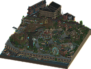
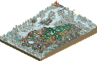
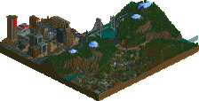
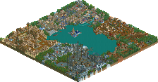
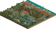
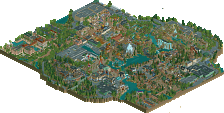
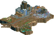
Tough vote. By now I've come to appreciate the old-school type h2h parks like cosmic infection a lot. That it was pit against Riverview made it very difficult. Updating Renaview Bay Park has been talked about a lot, but I think you did a good take on the concept. Simply building an abandoned park would have been beneath you and the ghosts were a nice touch, although I also would have liked to see a version without them so I could take in all the details more. While I appreciate the groundbreaking palette tycoon parks, cosmic infection resonated with me more. It reminded me of h2h6 parks, which made it feel a bit nostalgic. Thank you both for the parks!
Cosmic Infection:
Neat park. There is alot of cool little sculptures around the map, like all the ships. They are all super cool. The sci-fi buildings all look good but none of them felt similar aside from color, though the colors are great. The park def has like an Apex Legends/ Titanfall feel to it... of course mixed with maybe The Thing or Stranger Things. It's weird how some parts are sooo clean and some parts are sooo messy. Neither are my favorite areas... It's where the park is clean and messy together where it looks SO good! Gotta say not a huge fan of the coaster and the map does feel pretty small and maybe a bit light on content but there is alot of great movement throughout. I think its a very solid park and unfortunately matched.
Riverview:
This park is like... way too fucking good. It's my favorite of the season. The concept, the execution, the vibes... man it just all came together perfectly. There is so much detail and things that just break the meta of how this game is played. This park is revolutionary. Major props to you guys for this one. Not much else to say. I hope we get more parks at this level.
I'm going to skip the pleasantries and weird meta commentary on myself and the community and making fun of certain people that have wronged me in incredibly particular ways and say "what in the living fuck, Adventurers Club."
Have you no morals? No integrity? How dare you? How dare you throw down this fucking masterpiece before our feet in Round 5 of this contest? I have no words. Well, some words, clearly. Mostly: I hate you. Where is the grid? WHERE. God. You know, well done, I do not hate the half diagonals on this map. I still hate them in general but this is the first time where they WORK. I think the key to them is to lean into them to the point where you can't really tell which way is left, right, up or down and that's what you did and fuck, I applaud it. I really have nothing to fault. On top of this just being a skilled display of RCT the idea on top of it is pretty great, regardless of whatever holes you want to poke in it like Rusty is doing, or whatever. I only skimmed his post but it sounds like he's jealous. And, hilariously, what if this was the Scoop solo Josh was always joking about? I'm not speculating by saying it is, but can you imagine? Wild. If you thought 2020 was bad then 2021 would've just got a lot worse. Maybe. Don't be mad at me Scoop, I said plenty of nice things in the beginning to be allowed to make fun of you now.
In summary: If this doesn't get Spotlight this entire class is going to feel. my. wrath.
As for the Manual Laborers, well, it's a neat little map but also, uh...sorry.
Match Conclusion
The poll is now closed.
The Adventurer's Club have won this match with a score of 61–6 .
Creators
Adventurer's Club"Riverview Exposition"
80%Hydroportal
18%Scoop
1%RaunchyRussel
1%SensualEthiopianPolice (F)
Manual Laborers"Cosmic Infection"
90%Jaguar
5%Lotte
5%inthemanual
Congrats on the well-deserved victory, hydroportal, scoop, RR, and Sens.
The ghost cars and peeps look awesome, and the diagonal layout of the park is very impressive; looks so much better than the traditional in-game diagonal angles. Not to mention: the crunch. I'm a sucker for abandoned stuff, and this is truly a brilliant park.
Jag, so cool to see another park from you. Was truly not expecting to see 90%! Looking forward to spending some more time in your park and providing an adequate review. Lots to be proud of in your team's release!
Review is on my to do list. For now... A graph of the match chronology!
Cosmic Infection - An enjoyable park that is generally well built. The coaster is the highlight for me; very cool, very badass, and one of my favorites of the contest thus far. I really wanted to love this park, as it felt so close to awesomeness, but I get the feeling that the design of the park layout hindered it significantly.
The big idea, the portal with a parasite emerging, was tucked into the corner of the map. There's a lot of setup for a central focal point here: a launched coaster with the launch right in the center, a clearing around that, and the layout wasn't awkwardly balanced around its launch. Also all the infestation is over there. Why not have the coaster launch out of the portal where the parasite is emerging? It'd give a perfect centerpiece and the infection is spreading out from there. As it stood, the main parts were situated in a big "L" along the edges. All the elements of this were cool and stuff, but it wasn't framed for us to garner interest in it.
I liked some of the stylistic choices on the sides of the structures, but the lack of roofs hurt the overall ease of viewing. There's a lot on the map that is trying to grab your attention, some dark roofs would give some breathing room. I did like the way you've approached the parasite/infection through the landscape; there's some great designs and methods of building that in there. I think 'spread' wasn't quite conveyed as there's not a clear source or thinning out of it, however. This would've started to guide some of the macro direction of the park in a direction that would bolster what is already there.
Impressive to do a 90% share, that's a tremendous effort there; unfortunately, it came up against a phenomenal park.
Riverview Exposition - Possibly the best park of we've seen. There's parks that feel like an extension of H2H8 progression, and then there's the "H2H9" park. This is the first that is definitively the latter. The highlight is the use of 1/2 diagonals to skew all the grid so that things that are sitting on the normal grid appear to be built off-grid. I found myself unable to orient myself to the grid, which is impressive. Such a simple method to do this and it retains the detail we can add to building along gridlines.
The concept is great, so simple to just recolor peeps with a palette and have rides run on ghost trains. It's like Renaview meets the bizarre which is both dead and alive. Great idea. There's nothing built I thought wasn't executed phenomenally. The buildings at the end felt natural, the ride details, and applying some levels with the waterfront. Only complaint really is that the cars sort of just turn about on the road, which I guess is unavoidable given the direction the road is running.
Everything to love about this park. Skull Island was great, but I think you've realized your potential on this one, hydro. This has propelled you to the top and justifies the R1 pick, easily. Scoop additionally appears to be coming into his own. This is a park to revisit, for sure.
@dirt, glad you liked the coaster... while the original idea was to have the coaster travel through the portals, given the size of the park and the distances between the buildings, it would've screwed up the ratings as the mini-golf elements count as inversions. Pac definitely gave a lot of good feedback for the layout though and I appreciate it.
If anyone's wondering about the stylistic choices of this are, I sorta attempted to do a modernist/retrofuturistic look, something like Chris Foss meets the Crimson from Terraria.
Also, regarding the lack of 'spread,' well, sadly given the time constraints, we didn't utilize it to its full potential. However, mk98 made a cool landblock object for the park. I would really recommend fast-fowarding while viewing the parts covered in bare dirt.
Popping back in to say that the soundtrack on Riverview, which I couldn't listen to on my vacation, is a fucking masterpiece. It's so creepy in the best possible way.
mrs_walto Offline
Riverview
The river is alive with the sound of blue peeps! This spooky town filled with ghosts has everything. Upon first inspection, this park is just really a fantastic display of how FUN parks in RCT can be. Everything, from the music, to the park design is a joy to explore. I first want to commend whoever made the music for this park because it is spooky, it's fun and it really transports you into a ghost River Town which I really appreciate. The skill that it takes to have a multi-pronged idea like this is huge. You have to 1) Build a realistic riverwalk town, 2) Make it abandoned and overgrown 3) Make the ghosts! Overall the use of the peeps was just so impressive to me as an element of the park because we often think of peeps as brainless and stupid which they are, but using them in that way was just so creative and fun!
The detail that it would take to do a broken roller coaster with ghost writing on the track with the original pieces still there it was really mind-blowing and I love how you can see the original town, games and rides along with the overgrowth...itt makes it feel alive! I really like the use of track pieces to make a custom carousel, I wish I was that creative with my own parks! Like I always say I love parks that feel fun (and that I would want to visit myself) and with Riverview, it just has me wanting to come back and keep looking for the little details. Overall it's a fantastic park.
Cosmic Infection
I don't even really know what I'm thinking what I see this park because it feels like a lot and it feels very chaotic
Where_walto suggested that I do bullet points instead of trying to do academic writing on RollerCoaster Tycoon which I think is really funny so the community will have to let me know which were about they prefer lol
So I kind of like these of the roller coaster there's a lot of projects interaction which I appreciate
I like the custom Ferris Wheel rides to stimulate energy and lightning? So it's a portal
I think of the grass elements like to give it that artificial-like... company feel that feels funny to me
Like a little lightning thing up at the top. I wonder how they did that?
Upon further inspection it looks like some sort of generator type thing with a lot of custom objects which is really neat I wish I could build things like that. Oh, it’s a reactor core
I also like how they use the curved paths that seems like it would be hard to do and using the tracks to outline it is very creative so kudos to you for that!
One great park here and one good one, and the scoreline reflects as much.
Cosmic Infection felt like a ton of almost generic space-y ideas shoe-horned into a kinda generic setting. There were some cool ideas and parts, but overall it felt a little messy and disjointed to me.
The color scheme didn't really work for me with orange and red on that really dull brown... maybe if you'd leaned into it fully, but there were also random still green parts and trees that felt fairly normal. Couple that with the black coaster that just kinda blends in too, and everything was pretty hard to read.
Some cool ideas though - the portal was great, definitely the highlight. I also liked the cutaway building at the back of the map.
Riverview was a park that I really didn't think was going to do anything for me from the screenshot. It looked dark and dreary, which i've always found a really hard theme to make look good. But pretty soon after opening this I realized I was looking at one of the best parks this season. What a great idea, really cleverly done, and executed as well as it could have been. You could have left 3 or 4 layers off of this theme and it still would have been a great overgrown ghost park. But then you added ghostly peeps, ghostly trains, make those trains run on a broken coaster and run over the broken trains, and made everything on a really complex diagonal and rounded layout. I really appreciated you guys leaning so hard into the old feeling by having older rides, and making everything overgrown without feeling too messy.
Just a great park, deserved win.
An overdo review, keeping it short and sweet.
Congrats to everyone involved, and to AC on the win. Riverview really blew my mind, and I've spent a decent amount of time yelling at Hydro about it. The execution is great, but the vision is really what astounds me on this. It kinda ticks every single H2H box: a theme park but with a unique and non-realistic twist, rundown and crumbling but filled with energy from the unique twist, and tons of really fresh content. A powerhouse for H2H. I don't this Cosmic Infection is bad by any means, but it came up against a park most this season would struggle to contend with. I loved all the ideas and really unique architecture in cosmic infection, and I felt like there were a lot of references to games I've played that made it really fun. My main criticism would be that it felt busy and full without feeling very cohesive. It kinda needed space for some of that content to breathe. In addition, for a park with such a unique theme, it felt very flat. Pushing it into a more dynamic map shape I think might have helped. All that said, I will reiterate that I don't think this is a bad park, just at the wrong end of a classic H2H matchup. Again, congrats to all involved, finishing parks to this quality should not go overlooked.
Yeah, I had to log in and give some praise here...
Riverside is easily one of the best parks I've ever seen. It is spot on on about everything on all scale levels. That is soo rare. From each angle I constantly find new things to like. Not only that, but the theme and execution of it is stellar.
What surprises me the most atm with a lot of parks lately is that they have either new fresh thematics or that they have themes that are executed in such a matured fashion. Although a lot of this is made possible by the awesome developers of OpenRCT2 it is the creators that keep surprising me (and believe me; I'm not exactly easily impressed). Only downside to this it demotivates myself to play again as it would be so hard too catch up to the current level of display xD. Ah well
Seeing how I'm waaay behind with reviews, I'm just gonna post my quick thoughts. Welcome to Jappy's Short Thoughts:
Riverview Exposition: we've seen abandoned parks before but the ghostyl addition is absolutely fantastic and a nice twist to add movement and stroy. Feels like something out of Ghostbusters, who seem to be present! The semi dagonals also work perfect here, one of the few times I actually think they do.
Cosmic Infection: the theme is pretty clear and it's something I really like. Love the different vehicles and the creativity in some of the labs. Sadly it's a bit messy and hard to read imo.
Lots of cool stuff in these parks. Here's a video review of both parks:
https://youtu.be/LM92ZNhymZo