Park / Riverview Exposition
-
 13-July 21
- Views 12,196
- Downloads 726
- Fans 8
- Comments 35
-
-
 87.00%(required: 70%)
 Gold
Gold

chorkiel 90% no G Force 90% no robbie92 90% no saxman1089 90% no WhosLeon 90% no bigshootergill 85% no CoasterCreator9 85% no Cocoa 85% no geewhzz 85% no RWE 85% no Xtreme97 85% no posix 80% no 87.00% 0.00% -
8 fans
 Fans of this park
-
 Full-Size Map
-
 Download Park
726
-
 Objects
524
-
 Tags
Tags
Round Robin
VS
I've had a bit of time with these parks already, and being so busy I'd like to post a bit of an early review with my thoughts.
Cosmic Infection
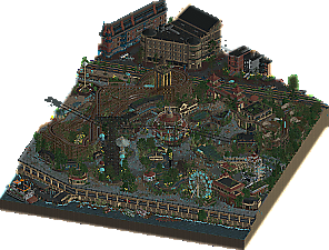
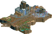
I enjoy this sort of theme in a park. The spacecraft and the coaster layout are particular highlights for me; both are quite well done. The overall architecture has a convincing semi-futuristic style to it, and I appreciate that it's a unique but consistent aesthetic. I also really loved the areas where it seemed like this infection is gradually overtaking the buildings and landscape the most. I would have loved to have seen this particular aspect pushed further - I couldn't really tell at points if this was an alien planet with human built labs or a human planet being overtaken at times. I think it was the latter, but I'm still not sure. Unfortunately, as a result, I did find the presentation of the overall theme to have rather mixed results - this infection seems to be coming from the portal to another world (the thumbnail shot, for example)...that doesn't seem reflected (to me) in the way the theme is spread over the map. It's almost like the portal is one of the least affected parts of the map with respect to the infection. As such, I believe that the narrative had some coherency issues which predispose the park to seeming a little bit all over the place in spots. I don't know if the buildings lacking crucial structural features like rooves helped that much, either.
One of my favorite parts of the map other than the thumbnail shot; great form to the ship and excellent use as a station feature.
Another cool ship; I found the hangar structure itself a bit oddly placed, but I do love these spacecraft. If I didn't know better, I would've thought Splitvision had a hand in this park. It seems like it could be right out of the Eos universe.
Big fan of this in particular; I believe that these features were extremely effective. I would have personally loved for this kind of subtle, creeping overtaking of the environment to play a larger role.
Riverview Exposition
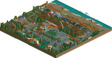
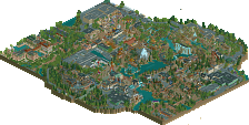
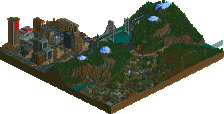
Another theme I like - for some reason, the whole abandoned spooky park aesthetic gets me. I kinda liked the bold use of half diagonals - it seems the more there is the better it works overall, which makes sense. Really enjoyed the ghostly operations of the park mixed in with the remnants of the physical rides; broken down trains, stuck chairlift cars, jammed up boats on the log ride. The amount of detail is pretty wild, too. The buildings all have a lot of texture to them and are quite interesting visually. Obviously it's another dark palette park with blue people from the Adventurer's Club, but I think it worked to your advantage this time. It's a lot less overbearing than Lost World's attempt, and I personally think it makes the atmosphere click a lot better than it would otherwise. It's 100% necessary for the ghosts, but I also think the dreary tones worked well in this case without being too much. Ride design is great, and I love these 1920's-1930's era ride types and park styles, so that's fun to see - especially in a less than pristine manner. My main critique would be that I perfectly understand the abandoned theme park and the ghosts just having a good time; but the additional abandoned buildings around it with all sorts of crashed and abandoned cars is oddly sinister in comparison. I'm not sure if I was missing something here, but I'd have almost liked to see a little contrast or something between the park and the city.
Classic wooden coasters are fun, and this also shows off the subtle but effective use of the physical trains in combination with the ghostly ones.
I thought this layering was super neat, and the amount of texture used is quite impressive. It does feel a bit much in some places - this is no exception - but I found it worked more to the advantage of the park as an abandoned place than it felt overbearing.
I actually loved this little log ride, and think the jam of cars is actually surprisingly effective. I had this neat moment of realization upon my first viewing where I didn't notice the physical vehicles still present on the tracks until midway through, and once I noticed them the whole presentation clicked even more.
Please enjoy this soundtrack ambiance alongside viewing our park:
I deleted the attachment. The custom music was not submitted in time, not even close, which is why it's not part of the package. It's unfortunate for you of course, but it would not be fair if we allowed you to update your submission like this.
Cosmic Infection - cool little park. Haven't seen the warp thing before. That's pretty cool and a nice effect on the warp gates. Nicely done! The coaster was a little... bleh. I was never a fan of that coaster track, and I think it could have used just a little more speed when it does make it through the pretzel (or whatever the technical name for that inversion is!)
after seeing that, I searched the map for some more "main events" to look at and didn't really see any. There were some cool details, but it just felt like it missed a main knockout punch.
it's a great fun park and I really enjoyed checking it out.
I am so torn on riverview exposition. I really don't know what to make of the half diagonals. On the one hand, when I see them I'm like, WTF! But then sometimes it makes it so much harder for the eye to see what's going on. Like I was looking at the road at the south side of the park for a good couple minutes before I realised it was actually below the boardwalk of the park. And only when I scrolled to the side where the half diagonal wasn't. Part of me feels like I don't want the community at large to feel like this has to be done for a good park. It's damn difficult enough as it is to put together a full map. It's amazing; I wonder if I'll be amazed less the more of it I see. It's a breath of fresh air, I like it.
Loved the ghostbusters reference and the general theme was super cool. Really nicely pulled off. I often find these palette changes to be token gesture but the whole park wouldn't work without this one. Great use of that.
The use of cutaway was fairly inconsistent in the park, but maybe that's deliberate?
I spent a good 10 minutes just staring at awe at the plaza in front of the entrance to tornado, and the coaster's station. That's the neatest, finished little area of RCT I've ever seen and it blew me away. Great stuff there. But kinda funny that maybe an area that was just straight up classic RCT just pulled off perfectly is what impressed me the most. But it's H2H, we're here for the bells and whistles too!
Easy win to riverview exposition to me, but I enjoyed both parks a ton. The quality is just, through the roof.
It's not super often that I come to a conclusion this quickly, but AC's entry is phenomenal. The moment I saw the actual ride vehicles sitting still while the ghost vehicles clipped through them, I knew what was up. The new custom vehicles and scenery are top notch too. A little bummed that the shoot-the-chute doesn't have water effects nor does it seem to behave like a log flume boat, but that's a tiny issue.
holy crap AC, this is maybe the best park of h2h so far, and one of my favorite of all the time. the music is the crispy cherry on time, damn. will leave a full review after voting finishes...
Why would a ghost make a splash?
Glad you guys enjoy the music! Very proud of my team for this park. Love my boys
Holy god AC, I maintain that you people do not fucking sleep, ever. Love the park, I got the narrative from the few screens I saw alone, and was floored when I opened the park in-game. Unbelievable the stuff you guys have been putting out. Love the all-in use of half-diagonals here, makes everything feel off-grid.
Cosmic Infection was pretty good, but also felt a bit rushed, almost like you needed another few days to wrap up some things and polish it up. I like the idea and narrative, but the execution wasn't up to the same level as Riverview.
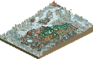
Cosmic Infection
+ creatures on display in tanks
+ dragon/dino remains, love that the coaster runs along the spine
+ pretty cool atmosphere, reminds me a lot of Half Life as an alien takeover of a research lab
+ vehicle sculptures around the park are well done
+/- the parkmaking style feels more old school in a lot of ways, there's things throughout the park that aren't as en vogue as they once were: base game launched freefall towers, monorail path borders, Junya Boy concrete footpaths, toon deco blocks. The style reminds me a ton of early 2010s In:Cities and of my own style as a younger player
- the reliance on toon blocks creates a lot of very smooth textures, and I think some of the forms are lacking definition as a result
- it feels very messy overall, the landscaping, the building design, path borders, pool of red liquid all feel unrefined
Not a bad park by any stretch, but it does feel dated because of object use and design choices, I could see this being released in any of the past 3 H2H seasons.
Riverview
+ wow, I love this park. I voted very quickly and saved this park to revisit again. Amazing job
+ outstanding music choice, I played without sound when I first opened the park, the second time through I played the custom track and the theme clicked for me. The far off sirens, crows, and ambient noise do so much to create the feeling of a ghost town
+ you continue to surprise me and break the game in new ways. I love your team's use of color and emphasis on new aesthetics, this is probably the strongest result yet
+ half diagonal map.. I love it! This is easily the best execution of half diagonals on a large scale that we've seen so far. It throws my entire sense of perception off, I honestly have a hard time deciphering which buildings are built on the grid and which aren't. Thank you for doing this
+ the coaster flying around the original layout while the "real" track has fallen and original trains are stalled is a great detail
+ if not Le Coeur, then when? If not Stardust, then when? You can't tell me this isn't more impressive and groundbreaking than your run of the mill large scale spotlight. The level of creativity and detail is astounding
ManLabs, you came up against an absolute buzzsaw this round, Riverview is in immediate contention for best park of the season
Oh you sly devil. 11/10 best park
I made the mistake of opening Cosmic Infection second. Which caused my initial reaction to be a little underwhelmed. I don’t think that’s fair though, because it’s not because of the quality of this park, but of it’s competitor. After this first reaction, I got a more into this park and I think it’s a really great piece of RCT. I really like all the spacecraft verhicles and the archy style. I really liked the rocketbike ride and the use of the trilobite ride. The idea of Cuthulu/infection is nice, but I agree with what CC9 wrote; the placing of the infection is kind of illogical placed story-wise. The park also feels a little small compared to other H2H parks.
I think what it’s competitor in succeeds most (next to great archy, coasters and crunch) is that it’s so brilliant in it’s story-telling. After five seconds in viewing the park, the concept is crystal clear. The 1920’s vibe, the ghosts riding these old rides, I love it. The music adds a ton to the atmosphere. Is that custom made by one of you guys? When I first saw the overview in the LR Discord, seeing all the half-diagonals, I thought it would be too much, but seeing it in-game, I love how it all breaks the grid lines. Definetely one of the highlights this H2H.
As a whole, I think the complete concept of both parks is a little lost on me.
With ML, I guess the title describes most of it, but the park doesn't really seem to portray much here. What's here is solid, but it left me expecting more from a storytelling perspective, and perhaps a more cohesive style RCT wise. While it's a solid park, it just doesn't really seem to hit me and leave much of a lasting impression, perhaps it was a bit rushed? Maybe a couple more weeks would have helped, the bits around the coaster are definitely my favorite and makes me wish there was more of the weirdness and less of the sci-fi buildings. Other than that, I kinda feel bad for it, ultimately its going to be forever overshadowed and marginalized by the park its matched up with... as many H2H parks have been. Unfortunate part of the contest format I guess.
Now onto Riverview... okay, obviously this is one of the best H2H parks of the season, and honestly might be up there with some of the best ever. Incredible use of diagonals, fresh feeling aesthetic, absolutely love the classic park elements and makes a coaster & history nerd like me swoon. Initial impressions aside however, the park does feel a bit sloppy, both from an RCT perspective and from a conceptual one. RCT wise, you've got all these diagonals and such, which work really well, big kudos to those who made the objects, for the most part they work really well, and even bigger kudos on actually using them to the extent we see here. The amount of clutter for a park like this is great, the maximalist feel is truly impressive visually and is insanely iconic already. However it does make me dread what the future of RCT here will bring, not sure I'll have the patients to keep up haha, but this is good! and bad I guess, oh well. Maybe I'll do a further review in the future where I talk about the park elements in more detail, but overall, lovely stuff.
Here's where I'm a little lost, and this is really a great thing to be at this spot with this park because its so great and so well done that I can actually question these sort of concepts because the vision is so clearly captured in rct. But the vision, the concept... outside of just a ghost inhabited abandoned park (which at a surface level is probably one of the great H2H ideas in ages, love is so much) why is the whole map abandoned? It almost seems like this is some dystopian world, or perhaps the whole area is abandoned? But it seems like the city and at least part of the docks are in-use?
I guess this all just confuses me a bit. Because since everything is abandoned and run-down... it sort of just confuses me on what the plot is here. Hopefully that makes sense! I do absolutely love how my mind wants to try and explain the story myself, can get really creative here. Like is this just a totally abandoned world? Is it just sorta a Halloween/scary/horror type concept that doesn't really have a reasoning behind it? I do love horror concepts and themes and wish we saw more in RCT, so this sort a triggers that a bit! Anyways, this is a mark of a great park, when you can let your mind run and think about things like this.
Anyways, regardless of what the concept/plot truly is, I still adore this park and am very jealous of who built it, but glad we got to see it. Truly struck a deep cord with me, and I hope ya'll continue to produce stuff like this because its truly fantastic.
Just wanted to chime in and say I wholeheartedly agree with this and this sums up what I had been trying to say earlier much better.
~River View~
Wowie this park is super cool! I think its super successful in its construction and theme. Both as a ghost park and a vintage park- I think its homerun and a half! I say this literally all the time but I think this may be my favorite park rn. Theres just so many good things. All these little music notes are so gorge. I love all the rides in this park, literally all of them. Wow! I love this archy a ton too. Great job!
~Cosmic~
I think parts of this park are super cool! The huge portal things are great, all the tech stuff is super cool. I like the exposed buildings like the monorail stations. I think the coaster is nice, i like seeing non-conventional coasters like the steeplechase. The layout for the launch is good too. There's just a few things here and there that you probably already know about. All in all a fairly solid park though.
Cosmic Infection:
I like how the sci-fi/horror theme was done here, and the transition between the infected and uninfected areas. The spaceships were another nice feature, especially the coaster station/ship. A solid coaster with some nice elements throughout as well.
Riverview Exposition
I was blown immediately when I saw the ghost trains and guests, just a fantastic "haunted park", a concept I already love. The recreations of the classic rides are amazing, and the fact the custom flat having static structures works great with the ghost vehicle concept. And of course the custom music was used to great effect.
I genuinely think we can see the first h2h spotlight this time around.
Man lab you guys delivered a stellar park, great execution of the theme and splendid idea, great use of gradients and CTR to sell it and have great motion in the park, I honestly cannot fault your park in what it wanted to achieve cuz it did so with flying colours. I'd have given this an 85%. amazing amazing work, I just gotta say you guys went up against a submission that just took rct to whole different playing field again but that doesn't mean this park isn't anything short of amazing.
and then there's Adventurer's club...
This park so wel designed in a macro sense while still having the micro that matches or even surpasses it, the use of the palette to turn everyone into ghosts and take that haunted theme to the next level was brilliant and the run down feel while still being so alive and kicking in atmosphere just goes above and beyond. I also love how the use of half diagonal took this entire map in a viewpoint where even straight boxes felt flowing in the macro of the map and it's a power move on it's own, i loved all the small height changes and little staircases to give the park a truly memorable feel. stellar stellar performance. If I where on the panel at this given time i would honestly give this a 95% yes vote, no doubt in my mind ranks this as a spotlight park.
Cosmic Infection
Solid park. I like the theme and i think the spacecrafts as well as the coaster has been quite enjoyable. Although weve seen something like that before the portal ring was quite cool too. I think this park shows a great sense of little details and giving the viewer stuff to explore.
Sadly i think the composition and overall presentation of this park is a bit more debatable. It was a bit overloaded with stuff, felt like a h2h park from past seasons and the rockwork just hasnt looked great for me. I also definitely had problems figuring out the story of this. I think experiment in the reactor core got wrong and then the infection came to earth? I dont think it came through the portal, cause that area of the park feels more human to me? I don't know. Why are there two tables with umbrellas next to the lab sign btw? That little moment had me giggle up haha.
All in all a nice park with some solid moments.
Riverview Exposition
Nice to see this. It's definitely one of the better parks we've seen this season. This showcases a lot of amazing abilities of the builders: Amazing architecture, good ride design, nice usage of curves and some solid foliage skills. I think parts are a bit glitchy, but ghosts are glitchy beings (or non-beings?) i guess...
There is not much on the negative side for me on this. I agree with russ. I also had problems figuring out the whole plot of this. I also am not a fan of the half diagonals. I don't think they add anything to this, feels a bit like they are just there to be gimmicky.
To conclude amazing park that won that matchup for me. My vote goes to Riverview Exposition.
AC, hats off. With every round you top your performance even more. When I made that half diagonal path piece one year ago it was just for fitting to a strange angle in a street layout in Valencia. I would have never imagined that it would have such an impact on how you can built parks that break the grid and look just beyond anything else we have seen in the game yet (of course not only because of them but also other off grid and curvy developments). I'm utterly impressed by how the builders have mastered this skill. Imo best park of the season (until now, since there will be more AC parks coming lol) and best park of all H2Hs (maybe up with Le Reve for me). Have you had built the actual park it would be up there already, but with the whole ghost layer/story it gets elevated even further. Concept executed to perfection.
Supercool parks, but the execution of the haunted theme by AC just wins the match. Shame though as for me the portal park also had some supercool elements, but nothing beats the half-diagonal destructed park that is Riverview. Great submissions by both though if you ask me.