Park / Sea Surfer
-
 26-June 21
- Views 1,664
- Downloads 360
- Fans 2
- Comments 7
-
-
 52.50%(required: 65%)
 Design Submission

In:Cities 70% bigshootergill 55% G Force 55% RWE 55% Scoop 55% Xtreme97 55% chorkiel 50% CoasterCreator9 50% Louis! 50% posix 50% saxman1089 50% Cocoa 45% 52.50% -
 Description
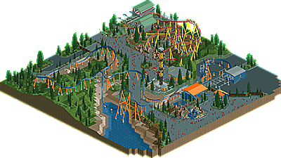
A Premier Rides Multi-Launch Coaster inspired by Ice Breaker.
This is my Entry for the Premier Rides Multi-Launch Coaster Contest Hosted on RCTClub. -
2 fans
 Fans of this park
-
 Download Park
360
-
 Objects
218
-
 Tags
Tags
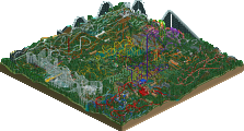
![park_3130 [MM2014 R1] The Janitor's Jinx](https://www.nedesigns.com/uploads/parks/3130/aerialt2776.png)
ELONNN
This is pretty good stuffffffff. Already shared my thoughts but glad to see this shared to a bigger audience!
i'm sure cp6 is proud to see his design out and about in RCT!
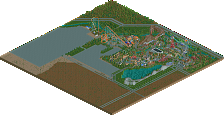
for both the layouts, I think they have like two good angles and two clunky angles. Maybe good to keep in mind how rct elements look from all four angles as you build. the paths and landscaping is a bit bare but the little bits of archy there were quite nice and realistic. Just needs a bit more content and oomph next time
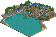
This is really nice! Very cool to see an IceBreaker rendition. Layout looks solid - if not a bit awkward in spots. I do like how it swoops over the path, and interacts with the water a bit for that first drop. Although I wish there was a bit more water simply to make sense with the coaster name! I also think that you could have toned down the amount of backstage / pavement. I do appreciate a bit of the backstage areas in parks, but unfortunately theres a little too much here with not too much going on. Your paths could have also used a bit more in regards to seating sections, planters, flowerpots, awnings, food stalls - etc. The overall flow and layout of the park is done so well though. I particularly love the sculpture and signage for the coaster entrance. And the orange-roof station and photo stall is spot on.
The red coaster is cool - great interaction with the queue line here. Station is done very nicely. The mint green colored grass is unfortunate. I think you could definitely work on your foliage more in the future - You need more natural clumps of trees. Couldn't hurt to incorporate more rocks and less of the grass object.
Overall a very strong showing - You should be proud of this map! Looking forward to more from you!
Really happy to see a release from you, elon. You already know my thoughts from the RCTClub reviews but I'm happy for you. This release is really solid!
I think outside of the coaster this was a little dull and lackluster but does show potential. I think more experience and experimentation with objects and new ideas will go a long way. Finding your style more and figuring out the game really.
Not quite a design but definitely keep building!
Agree with G, a little dull and stale to look at.. namely the foliage. Was pretty patchy. I think more captivating architecture and backstage stuff would elevate this. The layouts were cool, enjoyed the spinner more.
My review is probably going to echo In:Cities a lot, so I'm going to focus on something I always used to struggle with. The foliage is a surprisingly prominent feature on this park, and I think it's the one thing that requires the most work. You've sort of spread it around to fill out the spaces of land where there isn't much else. One thing to consider is how patches of trees and tall grass tend to clump naturally, often going from taller trees to shorter trees to tall grass to short grass. Experimenting with that concept can really up your foliage game, and by consequence your overall game, by a surprising amount.
The coaster layouts are sort of just okay, and the architecture is a bit simplistic - but you've got a good foundation to build on.