Park / Stardust Jubilee
-
 10-June 21
- Views 15,903
- Downloads 691
- Fans 9
- Comments 51
-
-
 88.00%(required: 70%)
 Gold
Gold

Cocoa 95% no geewhzz 95% yes Scoop 95% yes chorkiel 90% no G Force 90% no In:Cities 90% yes WhosLeon 90% no inthemanual 85% no saxman1089 85% no Xtreme97 85% no CoasterCreator9 75% no RWE 75% no 88.00% 25.00% -
9 fans
 Fans of this park
-
 Full-Size Map
-
 Download Park
691
-
 Objects
560
-
 Tags
Tags
Round Robin
VS
Please view Stardust Jubilee (Tile Inspectors) on Develop. There is an issue with the amount of elements that is fixed on Open RCT2's Develop build but hasn't made it into Release yet.
Therefore do not try to look at it on Release, just go for Develop right away.
Our park has to be viewed in develop version of Open RCT, cause there were some fixes done for this park that aren't currently implemented in the release version. Also, if you encounter low frame rates we recommend sizing your screen down a bit.
Be sure to view the Tile Inspectors park in the develop version of OpenRCT. Do not open the park on the release version, or Fisch and Tolsimir will hunt you down. And you know they can because their team logo has a detective looking guy with a magnifying glass.
edit: Gustav combo breaker
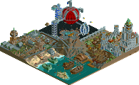
Imagine being the Scream Queens, erecting a park as wonderfully quirky and soulful as Yerka Daylight, breathing a sigh of relief after getting it done before the deadline, and getting utterly demolished by the Tile Inspector's thumbnail. Stardust Jubilee is legitimately one of the most impressive feats I have ever seen in RCT2 and one of the highlights of H2H9 for sure.
Stop ittttt..... voted Stardust Jubilee.
Really appreciate the simplicity of Yerka here, and the fact that once again you guys are doing your own thing and not trying to play to the growing meta of the season. Kind of nice to just open a park that feels like this, without a million new objects, rides and flashiness that's trying to impress.
That being said, Stardust Casino might be one of the best h2h parks of all time... the interiors, the animations, the SIGNS! All of this is pretty incredible, just seems so well thought out and executed. Such a fresh vibe and atmosphere you've created too, a bit perhaps too many flashing lights haha. Really goes to show what's possible with the tools we have now in this game. Custom track is an absolute banger too and really adds to the chaotic space casino atmosphere you've created.
Congrats on submitting finished parks lol
I can't even begin to fathom what that Tile Inspectors will look like in game from that screen. Holy shit.
Tough decision. I don't know if I'll be able to decide by the deadline. I'm blown away by Stardust Jubilee but Yerka Daylight Time has such a nice atmosphere and I really like the individuality shown in the ride design. If there's one bad thing I can say about SJ it's that it's basically broken the game with all the customization like the wide variety of space cruisers and the planet illustration that you can only see from one angle. It makes me ask why this was done for RCT instead of some sort of digital art museum.
Yerka: This park was really charming. Enjoyed it very much. Furthermore I'll echo what G Force said that I appreciate what your team is doing this season. Some personal favorites of mine from this map were the swan labyrinth, the entrance building, and basically the whole area around the piano and the origin of water.
Stardust Jubilee: It's like a whole different game. This may be one of the most impressive (h2h) parks on the site. Personally the esthetic didn't click with me much. Perhaps it was just a bit too much for me, making it a bit too dense or just not as legible as I'd have preferred.
The poll asks for my favorite. Which is a bit difficult because I'm more impressed by Jubilee, but because I liked Yerka more they get my vote.
I am absolutely blown away impressed by Stardust Jubillee. No idea how most of that was done. Just ridiculous.
That said, and this is a weird distinction, I didn't enjoy it that much. It's hard to view, because the frame rate is slower than ideal, I can't rotate the screen without losing my place, I just can't parse it in my mind. I like to follow guests around and enjoy the park with them.
So my stardust experience is first WTF you guys are ridiculous. How on earth?! What is that? How?!! Then I'm like, ok, cool, you're ridiculously good at RCT. Then I try to watch the park and take it all in. And that's really difficult and not so enjoyable.
Yerka is the exact opposite. There's some really nicely well designed pieces to this. There's nothing in particular that stands out and blows you away or makes you really have to stop and wonder how it was built. But, it's a park. I can enjoy it with the guests, follow them around, there isn't so much going on that I'm not just totally overwhelmed... because less stuff is moving around, my eyes are going where the parkmakers wanted them to go, not just flying around the screen having no idea what to focus on!
Both parks are really good, in different ways. Stardust is the most impressive RCT I've ever seen. Like 15/10 impressive. But I found Yerka more enjoyable. I'd much rather open that save up again and view it some more. So that's where my vote went.
Generally, massive congrats all round to everyone who's building in this H2H. Last I remember, H2H was always hampered by part-completed parks and rushed parks. This year, and I don't know why or how, it's just insane. Every release I'm blown away and think surely we've reached peak RCT. And then the next one comes along...
Honestly, after looking these over for a while, it was still really tough to choose. I love both maps for completely opposite reasons, which makes sense because they're basically polar opposites. One map that's an all out assault on the senses, and another with a much calmer and easy to digest atmosphere.
In the end, I went with Stardust because the sheer technical skill it must've taken to build this thing won me over. I can't imagine ever being able to build something this insane, let alone in a few months.
Great job to both the teams!
Yerka:
Quite a pleasant park you guys made, and everything about it read well and was easy to digest. The rapids were fun to watch.. the island had a great map edge as everyone has pointed out. The piano coaster that was directly inspired by the artwork was extremely well done. Just loved exploring this park. It was very simple at times, but such a clean look. The swan boat maze was super nice and atmospheric. The heart motif was cute, and it was really cool to see the 1k fog objects in a heart shape as well.. neat little detail. The coaster there was pretty unique I think as well. The backside of the park with the go karts and the log flume was very bold. The terraced tracks were quite awesome to look at and were really well done. I think I agree with AJ in that the flume was a bit odd at times, mostly for me when it's diagonals were coaster track.. just not a fan of that look for a flume. I also wish I knew more about the astronaut entertainers.. what portal they are alluding to specifically. I feel like I'm missing an important detail?
Stardust 2.0
To quote myself in our team's discord: "holy fuck stardust 2 is hurting my brain. Makes me want to retire lol" Kudos guys, you broke the game! But obviously in a good way. Just insane how much is here considering how short of time until this round. What was it, two months? Incredible. Overall, the zoomed out view was awesome, and from there exploring every nook and cranny of the casino was so much fun. The main casino floor with all the tables and red chandeliers(?) caused me to sit and stare at my screen for a few minutes. Such unique objects you guys have added to the game. Loved the casino floors/rooms with the tolsimir object that looked like hanging glass/beads.. I forget the exact object name. The introduction of more CTR's though gave me pause. As someone who really enjoys NCSO and being able to creatively use assets original to the game, the influx of so many CTR's in this park, and others this contest annoys me a bit. But, that doesn't take away from how I rate the park, just more of a side note than anything. The coasters and the zipper here were great as well. Rides like those added even more dynamism that really made this park come to life. Stellar work guys. Should be really proud of what you made.. easily one the best H2H parks we've ever seen.
What a ridiculous park, and man is it ballsy. I love the coasters and the concept of having “better luck next time” roll back. All of the other casino features were great too.
I feel like a lot of people are going to haaaaate that planet background but whatever you “game aesthetic” purists, your tears are delicious. I love it and thanks for having the balls to do it.
Yerka Daylight Time Is a very nice park. The piano was great, I loved the flume and the swan ride. I probably enjoyed it more in a way since it could actually load, and it’s refreshing in H2H where the meta is... well... exactly the type of park that you were up against but I’m sorry, you guys just had horrible luck and ran into a killer park.
yerka- wow, I actually LOVE this park. not joking, it may actually be my favorite park of this season so far. it feels like artistic mastery- a theme park with absolutely zero 'kitsch'- just genuine art. the forms are astounding, especially over by the mountain, but I adore the cliffsides with integrated clocks everywhere. the entrance is stunning in particular and so atmospheric. the piano is a perfect centerpiece to the park, and the coaster inside feels like its out of my best kind of dreams. this park feels like it is everything it is 'meant' to be- surreal, subtle, beautiful, thoughtful. I suspect you knew it doesn't have the h2h bombastic vibe to win a tough matchup but I also love that I don't think you care. I'm so impressed by the restraint and the love put into this. my favorite little spot i hadn't seen mentioned yet is probably the intertwined spiral path and flume lift. (reminds me of a little detail I did in MM!). anyway- really really loved this. great work. i have no clue what the score is atm, but I can imagine its hard for you guys-- don't get bummed out too much if you can help it.
stardust- of course, I hadn't yet viewed this... thing. this is fucked. just, wtf. you deserve a lot more words than I am able to give, because I'm overwhelmed. its the most fucked thing i've ever seen in rct. the signs, the FULL interiors, the beautiful swooping single rail, the atmosphere, the music, the rocket gas station, the ring highway system, the beautiful up-down symmetry of the hotel (really sells the floating composure), the absolute nuttiness of the planning and execution that had to have gone into this. And on top of that, its finished as fuck. its actually not that similar to stardust 1- the scifi style here is quite a different direction. just, holy fuck. one request- can you guys finally shut up about your whole 'oh boohoo everyone tries hard against us' shtick? yes we know you're good, obviously, enjoy the win.
sorry screamers- I've got to go with the most fucked piece of rct i've (ever?) seen. it doesn't change in any way my feelings about your park. but this is transcendental.
Shen Kitchen Offline
I really like the take on a surreal theme from J Yerka, the palette was probably a bit too saturated for what I see in most of the paintings. Wish there was more change in elevation to play with ideas more. It is nice and atmospheric but nothing eye catching.
For Stardust, there is lots of movement, and very dense places of architecture. While the outside is very impressive, I found the attention to detailing interiors won me over. The big planet has a nice effect, thought it doesn't necessarily fit with the rct aesthetics.
Both parks deserve great appreciation!
Yerka Daylight Time:
This is such a solid park. Nice composition, great setpieces, great atmosphere and great readability. Using entertainers as guides the landmarks and areas was a great idea. I had to look up the artist this was based on, after doing so I was impressed with how well this translated the surrealist style into RCT.
Stardust Jubilee:
It's hard for me to even start on this one, the amount of detail here is just mind-blowing. It does a fantastic job with the whole casino feel, the traffic, the flashing signs, the bright colors. And I loved the intricate structure around the Neon Flash. And, of course, the interiors on every floor I saw, with some of the finest detailing I've ever seen, and very well optimized for cut-away view at that.
Also this is the first time I had to go to my more powerful computer to run an RCT2 park.
What a matchup. Great job done from both teams.
While Stardust is probably the perfect H2H park to receive massive votes, I honestly did not like it too much. The park shows impressive skills and it is beyond my mind how some of the park is pulled off, but all in all is too flashy and effect driven for my liking. The neon signs, the animated objects, it was simply too much for me.
Nevertheless I appreciate the great effort and skill.
Yerka has a really nice and unique atmosphere. It feels everything has a meaning and while the park is not created for flashy H2H matchups, it is great piece of unique RCT. Congrats on creating a really nice park.
Voting Yerka.
(I am pretty sure this will be my first vote this season for the losing team though.)