Park / Legend of Zelda: The Missing Link
-
 26-June 21
- Views 1,347
- Downloads 431
- Fans 0
- Comments 3
-
 Description
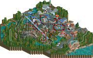
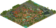
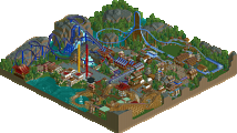
I recently completed Breath of the Wild 100% and got inspired by a sword Mamarillas made, so I thought it was a nice idea to pay tribute to the game with a Zelda theme in OpenRCT2. Made references to a few spots in the game, but most important are the giant silent princess flower made of only small quarter tile flowers, and the three symbols of the goddesses. Can you find the flowers around the statues of the goddesses and pay tribute to restore the swords true power to defeat evil?
-
 No fans of this park
-
 Download Park
431
-
 Objects
180
-
 Tags
Tags
I mean, I love zelda, so i'm always excited to see some more zelda content here.
on a compositional level, I'm sort of confused by this park. It has a big, realistic swooping b&m (cool supports too), and little pockets of zelda themeing, all chucked on a black background with swoopy abstract stuff. I'm not really sure what 'purpose' the blacktiling serves. Am I meant to read this as floating islands? or something more abstract? why are there little bits of recreation from zelda games thrown into swoopy patterns and giant sculptures from the games? its very hard to understand what this park 'is' and so my brain just tells me its whatever you felt like building then putting blacktiles underneath to make it seem finished. I do like the swirly trackitecture stuff though, and each element on its own is nice.
ps the triforce is a 60-60-60 triangle, not a 45-45-90. Maybe hard to make in ncso but worth the effort to make it seem not squashed?
I'm not familiar with Zelda, so all the references are lost of me. I can appreciate what I see though. The old man in bath robes is nicely done, I like the expressive vine-like floating pathways as well as the giant flower, and I think the coaster layout is good - although very cliche, and short too. I support getting creative with supports, pun not intended - it could've done without all the flat beams at the base, as it emphasises the flatness of the RCT map and your composition. Also, I like the map better without that giant spatula.
I basically entirely agree with cocoa. This sort of felt like vaguely Zelda-esque references with a decent B&M layout between them. Other than the Master Sword, the symbols, and the obvious quote - I'm not sure where the rest fits into "The Legend of Zelda". Not bad at all, but I definitely agree that it just sort of seems like a loose collection of ideas.