Park / Stardust Circuit
-
 27-May 21
- Views 14,704
- Downloads 639
- Fans 12
- Comments 55
-
-
 82.00%(required: 70%)
 Gold
Gold

Cocoa 90% no saxman1089 90% no chorkiel 85% no WhosLeon 85% no Xtreme97 85% no bigshootergill 80% no G Force 80% no inthemanual 80% no Liampie 80% no Scoop 80% no CoasterCreator9 75% no RWE 75% no 82.00% 0.00% -
12 fans
 Fans of this park
-
 Full-Size Map
-
 Download Park
639
-
 Objects
554
-
 Tags
Tags
Round Robin
VS
Forgot to mention in our team's readme (who reads it anyways), but we highly suggest that you add/enable the custom music file included with our park when viewing!
Best of luck boys!
christ
Here are my reviews for the parks. Nice job to both teams!!
Stardust Circuit:
Really cool park here, though I do actually think the palette is too dark. That's probably my only gripe though, the rest of it is really cool. All of the new objects that were created are amazing. The racetrack was super cool, and the use of expansion looking objects was funny and novel. The best part of the park for me has to be the lower city area. Reminds me of the lower levels of Coruscant from Star Wars. Also, who could forget the giant vertical fish tank! That’s so cool man! The race track video feed is bonkers, I can’t believe it! So much object creation in this one, it’s crazy! Insane park Adventurer’s Club, keep it up. It’s a shame that this went up against my favorite park of the season so far.
Frontier's Keep:
My favorite park of H2H9 so far. The gritty industrial theme is my total jam, and the sharp contrast between fire and ice is so cool to me. The RMC was really great and complimented the park excellently. The zero-g roll over the bridge was my favorite element and I also loved how it interacted with all of the industrial equipment everywhere. There were so many amazing details in this one. The floating rocks on the lava (which was really nicely done texture wise in my opinion), the funicular railway, the lava bucket cars, the wild mouse, the sled ride, the cranes, the extractor in the crystal mine, all super cool. The amount of new custom rides in this park is insane honestly, I love it! Even the small little mining town was integrated so well into the landscape, awesome work. All of the small details really made this park come to life and really sold the gritty industrial theme. Great work.
My vote for this round is going to the Scream Queens, but both teams should be proud.
be sure to use the soundtracks. They enhance the parks tremendously.
edit: shoot josh beat me to it. yikes.
If anyone needs me I'm just going to be here for a little while
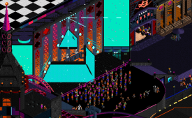
Stardust Circuit: had to open this first to see what all the fuss was about. I was immediately impressed by how you've created a whole new esthetic in this game that also works. The second thing I was impressed by is how much movement you were able to create in what are usually static elements like billboards and buildings. The b&w billboards stood out to me. Great job on those. One thing that bothered me - it's a small thing - was that this park was difficult to navigate. Every time I flipped the map I saw blacktiles or a whole different part of the city. It was easy to overcome because of how good this park was.
Frontier's Keep: this park was also really good. I really liked how you did the lava. The lava and ice combination created a nice look which was what mostly sold the park. The map was filled with details and rides which were enjoyable, although not much we haven't seen before. Overall a solid effort on your team's part.
I voted for Stardust Circuit, i enjoyed both parks but Stardust was just incredible. Great stuff.
Jesus Christ, I'm having a hard time wrapping my head around Stardust Circuit.. it's too damn good. The custom music track to go with it made for one of the best "opening a park" experience ever in RCT. Incredible, amazing work guys.
Stardust
Best implementation of a custom music track ever, by a mile. Opened the park atleast 3 times per viewing just to have it sync up with the music again. (i know you timed it properly but i was playing the track through vlc, sorry) Spectacular worldbuilding, and for some minor gripes i have with the park, there's just so much awesome stuff to make up for it.
Whoever made these reflections is on crack, honestly. Love it.
Frontier
The worldbuilding is all there, the village feels like it's held together with ductape and sheer willpower, which is what a frontier setting is all about. The boarded windows are a very nice touch. Most of the industrial details were great. The cranes in the harbour for example were very well made. The main thing that kept me from enjoying this park as much as i did Stardust Curcuit was the lack of a centrepiece or wow-factor.
My vote will be going to the Adventurer's club this round, as their park absolutely captivated me.
As a member of AC I'll save my review of Frontier for when the match is done, but I'm kinda disappointed with the lack of posts/reviews here. Come on people, there are obviously enough people who downloaded the parks if you see the vote count
scream queens- i actually ended up liking this a lot more than I expected to at first. there's a lot to see and a really fun and unique atmosphere. the archy ranges from ~passable to quite interesting, especially on that middle island which was probably the highlight. Boats are a little undercooked (lol) but overall the industrial scenery is interesting, like the swinging crane ride, the very good funicular trains, all the crates ctrs and shit. I really want to like the coaster, because its quite photogenic, altho i might not have gone with pink rails. but i actually struggled to follow the track, even with invisible scenery toggled. not a huge deal, but i was hoping i could follow the train around the map more easily. all up a solid performance, and some new juicy scenery and CTRS (yippee...?)
AC- well. maybe now would be a good time to announce my retirement? because this is fucked up. yeah, theres some rushed bits and some little mistakes around, but they take almost nothing away from my enjoyment of this... thing. (btw-- I have less and less idea what is going on in these adventure logs, but you have some serious artists on your team)
theres too much to see and too much to like. my favorite bit is probably that little alley with the reflections on the ground- absolutely ridiculous and so stunning. the different cars, the rotating cars under the stadium, the giant glowing pictures, moving music video screens, rich kid pools, lasers and screens at the daft punk show, the fade into the blacktiles below... so much. BTW, i put the custom music in but couldn't hear it. maybe i'm dumb. anyway, just a superb park. not particularly clean and certainly varying in composure and tidyness, but it doesn't matter, because its so absurd and so novel. I've had a little go at this sort of shit before and it is so much harder than it looks in RCT. damn!
Keeping my review a bit shorter this match. Another two great parks, but Stardust was just on a whole other level. One of the most jaw dropping H2H parks I can remember seeing.
Frontier's Keep: This was a nice park, and I thought the theme was quite cool with the lava and ice contrast. Enjoyed all the custom rides and mine equipment. My main gripe is with the coaster. I didn't find the the layout particularly strong as it was quite hard to follow and just seemed a bit random overall. Interesting ideas here overall and nicely done.
Stardust: The screen had me a little confused when downloading, but opening the park I was just immediately blown away. Really next level stuff here. Even though I'm not a huge fan of the floating around coaster, everything else is just insane. You made it feel completely different, yet still familiarly RCT at the same time.
Frontier's Keep:
This park manages to pull off having both ice and lava elements amazingly well, and I love how this park gets the rugged, dangerous frontier feel. The buildings (Especially the one on the center) have so many fun small details, like the burned sections and boarded windows. I liked the bridges as well.
The coaster has a great layout and I like how it's incorporated into the park, especially the inversion built into the bridge. I also like all of the action and motion around the park, like the rocks floating in the lava and especially the entire mine scene.
Stardust Circuit:
This park just stunned me as soon as I opened it, just amazing. It barely even looks like RCT at this point and really seems to push the game to its limits.
I love the whole "Select your racer" element how it shows off the park at the start. The grandstand area is such a great centerpiece, especially the side with the circuit map and animated screens. The rest of the buildings are a nice mix of colors and style that gave me a lot to explore from top to bottom.
So congratulations to both teams for making amazing parks, but I think it’s quite clear who’s going to win this round.
Scream Queens – Frontiers Keep
This park looks lovely with the white-blue vs. black-red colours. The lava looks great and those moving rocks really help to sell it. There’s a whole lot of content and it took me quite a while to see most of this park. I love how there is so much movement going around everywhere. I think you guys really sell the story/theme well, only thing that didn’t match it where the lava ski’s imo. Other minor thing was that I think the funicular/surrounding glitched to much. But damn this is an impressive park.
Adventurers Club – Stardust Circuit
F*cking hell this doesn’t even look like RCT anymore. Let’s be clear; this park is gorgeous and you know it. And I know it. And everyone knows it. So instead of writing a 20 page essay about all the things that I love in this park, I’m just going to spend my time looking at it while listening to some Daft Punk.
mambo Fan Offline
I love the racetrack and love all of the movement inside and around the park; i think my jaw hit my desk a half dozen times looking at this.
i'm a sucker for daft punk too so thank u lots for putting this out there
When first opening both parks I thought they were lacking in content.
I could not have been more wrong on the first impression. What a matchup, great work from both teams.
I guess this will be pretty much a lopsided matchup, as Stardust is simply amazing and taking the game to a new level. Amazing details and great animations. The parks feels very much alive and I still cannot believe how much the game has evolved since the first floating park with GCC.
It almost feels unfair for Frontier's Keep to be in this type of a competition. It is a very solid park and while some areas were lacking in detail it created a very unique atmosphere. While the coaster is guiding us through the map, I feel a more compact layout would have helped here and would have allowed to incorporate more unique content. Still a good park that would have probably stood a good chance of winning in a different matchup - and maybe also here as this is only my opinion.
Screw it, just going to leave my review early because someone has to.
Spent a good amount of time in the Queen's park, and man there really is a lot to love. The overall zoomed out macro is pretty spectacular - I really enjoy the contrast of the lava and ice colors, with the dark brown and black natural textures in between. Good first impressions upon viewing initially - particularly with the falling ice. Also really enjoyed the Blasting bit as well haha. The moving rocks are such a great touch, and add another layer of depth and ingenuity to the park as a whole. Lots of interactivity throughout. The architecture felt a tad dated in some spots - I think maybe using some more reference images as a base and then trying to push further by incorporating some diagonals would have helped a lot, because it seems a little similar in areas. A big suggestion would have been to greatly expand the town hall building. Make it more of a central focal point - open up a plaza around it, build it a little more imposing, etc. Minor complaint though - the overall map itself is awesome. Lots of rides packed in there as well. I particularly enjoyed the sled ride. The RMC is fantastic. Yes, we did one with a similar drop first, but aside from the steep hill and drop - both stand completely on their own. I'm positive that you guys built it before ours was even out, so any similarities are a stretch haha. I really love how it interacts with everything on the map. The truss bridges, the lava buckets, the curvy part into the station especially. I also really like the section with the cars awaiting loads next to the crates on the crane and funicular. Just so sprawling and all-encompassing in a good way! The lava skis are such a clever ride as well haha. I really hope people spend a ton of time exploring this map - there really is a TON of content.
Some things:
This bridge is so cool. The mving mine carts, the moving rocks in the lava, the peeps walking across. So many layers of thought put into it
Great scene. The cliff shapes are great, and it frames the ground level with the mine train so nicely. The green building is a perfect accent piece. Had to give dirt that smackdown though!
The little vibrating diggers and excavators are a nice touch.
I really like the little funicular. This whole section is a masterful use of elevation.
Really enjoyed this sled ride going down the hill! Lots of cool interactive and weaving moments.
You guys nailed the lava. The use of the road cracks for the lava on the edges is brilliant. Layering, colors - all so good.
Yet another bridge with a great interaction point. I really love the trusses and how the track element is incorporated into the overall structure.
Favorite part of the coaster. Very curvy with great interaction under the bridge and through the bottom level of the buildings.
I like the guy roasting a gigantic marshmallow haha
This section as well is so cool. The purple gems, the crane, the beams. All very convincing as a loading station.
All in all a very solid map - you guys should be mad proud of it.
We'll share more of our cocaine-fueled park after the match ends
Josh
I gotta say, even more than the quality of every map this H2H, the matchups have also been incredibly interesting to see what goes against what and how they fare as a result. Both parks have great concepts that provide some really interesting elements, but one is so bonkers and so original, it makes the other feel safe by comparison. Not to say that Frontier is by any means safe, but it feels that way because Stardust is just a different game entirely.
In terms of construction, macro, set elements, I think Frontier is a great park. It has amazing little details and vignettes, some really striking visuals with the lava and the ice. The coaster was fun, if a bit hard to follow in places and I thought maybe a different color would have helped it pop more? Really, this map has everything we'd look for in a great H2H park. Where I feel it's just missing is the final layer of polish. In a few places it seems rushed or like another level of detail and crunch (particularly with this theme) was needed to bring everything together. In some places, it also felt so cohesive as to be too much of the same, like some of the conveyers and support structures started to blend a bit. These are minor on their own, but in face of something wholely unique like Stardust, became a bigger factor in my vote.
Stardust is, by comparison, a technicolor dream. The theme, the palette, the construction is so entirely unique and outside what my expectations were for H2H, that I am shook and very excited to learn who birthed this beautiful creation. It made Frontier feel safe (when I don't think it is that safe) and made all the striking visuals in Frontier feel plain simply because of how bizarre and electrifying they were in Stardust. I do think a few parts of the map feel a little clunky or blocky, particularly for a theme that presents so smooth, but the smaller vignettes, the technicolor setting, and particularly the artistic choices and gradients along the map really took my breath away. I'm excited to explore it further and to get my hands on some of these objects. For something so unique and different, AC got my vote.
Congrats to everyone involved. Like I said, I think Frontier is a great H2H park, it just ran up against something that in places doesn't even feel like rct, and my personal preference has always been for parks that are pushing the boundaries a bit more.