Park / Stardust Circuit
-
 27-May 21
- Views 14,704
- Downloads 634
- Fans 12
- Comments 55
-
-
 82.00%(required: 70%)
 Gold
Gold

Cocoa 90% no saxman1089 90% no chorkiel 85% no WhosLeon 85% no Xtreme97 85% no bigshootergill 80% no G Force 80% no inthemanual 80% no Liampie 80% no Scoop 80% no CoasterCreator9 75% no RWE 75% no 82.00% 0.00% -
12 fans
 Fans of this park
-
 Full-Size Map
-
 Download Park
634
-
 Objects
554
-
 Tags
Tags
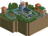
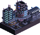
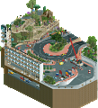
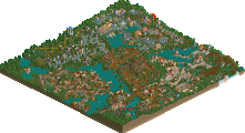
Alright y'all, time for another Mrs. Walto review:
Frontier's Keep
- oh wow it's like an ice and lava duality deal that's creative
- oh this is cute, shipments, a tonic bar, this is cute!
- I really like the lava, I think the rock elements are very uniform, very square
- Oh a little snow village, I've seen better architecture
- that's cool it notifies you the ice crashes, that's creative
- I see what they were trying to do with the crane machines but I think it falls flat
- the ice is very uniform, there's not much variation
Stardust
- oh motherfucker are you serious? You're joking
- omg those LED signs are so good
- *gasp* you're joking.. the astronaut in the sign? That's professional omg
- look at the raceway that's really cool
- we should steal their signs, they're really good
- I love this raceway track, oh there's an actual race! This is park is really fun
- It's very Tokyo pop
- They even have a little dance floor, that's fun. A daft punk concert, wow
- is that a naked lady sign? Who doesn't love a pair of boobies?
- omg the little car displays
Very interesting matchup. I voted Stardust, I think the parks were actually quite similar in terms of architectural and technical skill but the palette and aesthetic of Stardust takes it to another level. I admit I spent significantly more time looking around Stardust than FK, there's so many visual tricks that are just so cool. It's very cyberpunk, I've never seen anything quite like it in rct
I was going to wait until the match was over to post this but I think Frontier's keep needs some love being such a great park.
Frontier’s Keep:
First of all, This is a really cool concept that I appreciate. The contrast between fire and ice is awesome and makes viewing this park really interesting. I’ll start with the coaster. I really like the layout in the sense that it kind of guides you around the map and has great interaction. I like how it serves to connect the fire and ice in a way also, it kind of brings everything together for me.
This spot in particular has amazing interaction with both the landscape and the buildings.
The archy itself is pretty basic but it definitely feels right for the industrial theme. I enjoy the neat overhangs used to give the buildings more depth and the fact that there is actually a decent amount of color despite the industrial theme. I kind of wish there was a bigger center piece included archy wise, maybe a large central factory of something of that nature. All of the cranes and boats are very convincing and work positively for the map.
This is probably my favorite archy section right here. Everything is so busy and feels very true to life
As for the landscaping, it was great. I think going for just straight quarter tile land blocks was the right call. With that being said I am less of a fan of the over use of the ice texture for the cliffsides. I think the default texture in some places would have added a lot more depth and contrast to the landscaping making it seem more interesting to look at. I think the lack of foliage was a bold choice, and makes sense with the concept. I think I would have rather seen some snowy trees in the icy areas to add some more color to the map though. I like how you incorporated buildings and the sleigh ride to break up the landscaping a bit but I wish there was just that extra level of detail to make the mountain areas hold my attention for a bit longer.
In this scene for example, I think some sort of fencing around where the sleigh ride goes would have gone a long way with readability.
I think that review might have come off a bit harsh, which isn’t what I was trying to convey because I really love what you guys came up with here. I appreciate all of the cool little details in the park such as the ice slide and the little duel between josh and dirt. The moving rocks were absolutely great in the lava, and I love the craziness of the jetski ride in the fiery river haha. Overall, this was a pleasure to look and it was a park I really enjoyed.
As mentioned before it's really sad how this match has so few reviews. I mean... 62 votes and this low amount of posts? Come on people, this is ridiculous! Even if it's a few lines, just post your thoughts on the parks. Normally I wait until my team's match is over to post my review but since the lack of reviews I'll just post my review of FK a bit earlier.
Scream Queens - Frontiers Keep
The first thing that gets my attention is the contrast. There's fire, ice and land. There's also even a little waterfall so there's water too, you got all the elements! The contrast works really fine and it creates some nice colors. There are def some cool structures to find here and the way how it's all composed with the RMC all over it is so good.
The RMC is a nice coaster and I love the RMC track splitting off to a load section. There are many more cool details in the map like the barrel roller, the burnt RMC track in the lava, the conveyor belts,.. Also some cool ride ideas like the water tower swinger, the sled ride, lava jetskis
I think the port was def my favorite area of the map. Very clean and yet very atmospheric too. Great job!
Ofc I'm glad my team is winning but let's not forget to give SQ and their park also some love! Whoever built on it has put their heart and effort in and giving them an honest review will surely be appreciated. Because losing is one thing, just being forgotten hurts way more...
Stardust Circuit
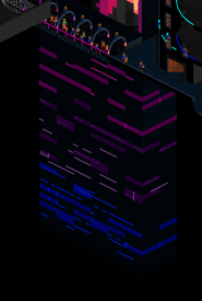
Firt of all, kudos for pulling off such a complicated theme and setting. It doesn't look like a real fantasy place, or a futuristic city - it feels like the GCI backdrop of a 1999 video clip. The colours are perfect, the race circuit is well done and varied, and I think you've done a good job with fading the city into the void below. There are some beautiful structures on the map, but also great smaller ideas like the roulette wheel, the race track mural, all the video screens, and the aquarium. Are these fish objects new? They're going to be very useful. That said, I don't love everything on the map. The biggest drawback is how it's impossible to rotate the view without moving all the way across the map. Certainly a flaw that you could've handled better. Secondly, there's the lag, further making it hard to enjoy the map at times. There's a coaster but it looks like an afterthought, and it requires a lot of view rotating to fully appreciate it - which I can't. All in all there are a few things to dislike, and a lot of things to love. Two of my favourite bits:
Frontier's Keep
I really appreciate seeing some 'normal' RCT, without a custom palette even. It's easier to digest, and the macro design instantly stands out in a good way. This map is composed, not a surprise, from dirt's theme. I'm sure there were some dirty sketches involved here. The concept is simple but offers enough to work with. Points for taking something obvious and giving it an original twist! I'm a bit confused about the setting/era though. Sometimes it looks like 19th century western stuff, and sometimes it's closer to 1940. I think you could've done better there. Regardless, lots of cool bits and ideas like the basalt ship, the lavafall, floating rocks, the cranes, and the buildings and bits of coaster claimed by the lava streams. I really liked the RMC. 'Krash'n Burne Rail Road Co' though? I wish you went with something less silly. I suppose this brings me to my other points of criticism. 1) It seems you couldn't choose between doing a community living at the edge of ice and fire under harsh conditions, and making the whole thing a whimiscal cartoonesque circus act. 2) The rockwork is undercooked (pun not intended), I'm not sure whether the choice to make it all default RCT rocks was a good one. 3) The icefall is a great idea, and I suppose it's one of the more important ideas here, as it announces itself with a notification as it happens. However, it's stowed away in a corner where no one is likely to actually see it happen. It's a cool effect but I had to reload the game and fast forward to see it again. I think you should've had a bunch more of them around the map, and drop them at intervals during the first 1-2 minutes, in more prominent places.
Overall I really like this map, mostly for being so accessible. There's plenty to see, and all the movement everywhere is great. The execution is at a level below most of the H2H parks we've seen so far, but the standards are ridiculous anyway. It's a lovely park.
Fun fact: I don't think there's a single plant on this map. Bold.
------------------------
In the end I can't deny the Adventurers Club my vote here. Frontier's Keep wins in the rides and fun department, and it's closer to my heart. The ideas and artistic vision behind Stardust Circuit pull it head of the competition, though. Both parks have their pros and cons, but it's gotta be Stardust Circuit. Great job both teams!
Last one for R3! Thoughts included below:
H2H9 Park Reviews
Frontier’s Keep
Very fun and creative theme! Reminds me of a sort of dystopian Mysterious Island/Frontierland
Loving the tons of inventive and dynamic components throughout!
Notable include all the vehicle and attractions hacks, with my favorite being the barrel roller
+10 for ice fall, that was such a cool moment capturing that effect!!
Really enjoying the effects of the environment as it helps bring the theme together
Small details include the firetruck, the water tower line cascading down to the lava flow below, the burnt RMC track, and of course Wendy’s Wooden Water Tower!
Was pleasantly surprised to see Shaft Accident operate, didn’t realize it was a ride at first until I saw the RV drop!!
Krash’n Burne had some great moments as well! Favorites being the roll element with the pedestrian bridge and the ‘trick tracks’ with empty mine cars stationed on them
+1 for the Funicular cars
Both the glacier faces and lava flows were relatively simple, but also effective!
The map edges and interiors were also very nicely done. Loved the Excavators too
Stardust Circuit
Immediately, the colors and animated object use is just out of this world…
Short Circuit is one of my favorite attractions on the map, such a fun idea!
The fading structure effects and reflections are incredibly well done!!
Adding the sculptures and all the ‘LED panels’ to that note as well
Going to add all the advertisements on the grandstands and dotted around the map to that list too…
The back-alley area is probably my favorite on the map, it’s just so good!
+10 for pretty much everything included with the race. I enjoy the scoring billboard, the interior show car displays (lol Cybertruck), and the podium encircled by celebratory fans!
Gave this one the +10 seeing all the incredible views around the track, and overall life breathed into this map by the attraction
+1 for the entire Daft Punk setup, kudos to somehow creating a near spitting image in RCT…
Also, shoutout to all the artist/song references. I had no idea anyone else heard of Frontier Psychiatrist is!!
Vote for R3M3 – Stardust Circuit
The decision was supported by the sheer technical prowess and overall execution that was abundantly present in Stardust Circuit. Not to take anything away from Frontier's Keep, but Stardust Circuit did feel more well rounded. This match proved quite challenging for me as the longer I explored Frontier's Keep, the more I was fascinated by it. Unfortunately, it just lacked some refinement which held it back in my eyes.
Awesome to see another matchup of such polarizing park concepts. Hoping that both teams are proud of their accomplishments this round as they have created fantastic work yet again! Continually impressed by the art contributed by everyone involved.
Here's to R4!
Scream Queens, this park is so enjoyable!
I love the RMC layout and the way it winds itself around every little hill and structure.
When I saw the screenshot I thought that it was water with rusty runoff turning it orange, but the lava route was such an interesting take; fire and ice, gotta love it!
I really enjoy the simplistic architecture, I think on this site we get so caught up in the super-detailed Disney-style architecture that we forget to go back to the basics, and this does it quite well!
I'm also a sucker for gantry cranes.
I really would have liked to have seen more custom supports on the RMC but that's probably my bias from working on Lost World talking - that bridge is ace and I wish the rest of the supports were as good as there.
The weather where I am currently is cold and wet, and that made my viewing pleasure more real. I felt cold throughout, but looking at the lava gave me a sense of inner warmth.
There are plenty of ideas here that bring this park to life, and moments that are truly inspiring to me in a theme I very much enjoy but have yet to attempt properly. When I do, I know I will definitely be opening this park for inspiration.
Well done.
Match Conclusion
The poll is now closed.
Adventurer's Club have won this match with a score of 57–9 .
Creators
Scream Queens"Frontier's Keep"
30%Jappy
25%CHE
25%Roomie
20%PhoenixWing101
Adventurer's Club"Stardust Circuit"
45%hoobaroo
30%Iretont
24%In:Cities
1%SensualEthiopianPolice (F)
Adventurer's Club have used their one-time deadline extension for this match.
Congratulations to the Adventurer's Club! Stunning match.
Stardust Circuit (grr) - Adventurer's Club
- I've always wanted to do a blade runner / cyberpunk style aesthetic, and you guys pulled this off impeccably! The overall impact of the neon palette and LED projections were jaw dropping, it takes some true artistic skill to make such impeccable images out of pixels.
- The music added so much to the atmosphere. To other teams, TAKE NOTE. Include custom music. It could be the nudge your park needs in a tight matchup when all else is equal.
- The race was so much fun to follow, the hacking that went into that must have been tedious and time consuming. Fantastic course, really well laid out and planned.
- Loving all the details throughout with the reflections in the alley being my favorite
- Architecturally I thought there were strong spots and weak spots. The aquarium tower is stunning, the grandstands were a big wow factor, the LED towers are all super creative as were all of the underbelly, cast in a gradient glow that faded away into the dark abyss below... my favorite parts for sure! However, the overall shapes of some of the buildings looked very blocky and could have used a lot more finesse; they read as chunky and clunky instead of slender and soaring.
- The Daft Punk rave is absolutely bonkers, I would totally find myself there. The way the neon pyramid and diagonal towers pop is so perfect, and it's even complete with lasers!
- The coaster itself was the weakest spot of the park for me; the layout was weird, megapark-esque and the pacing was really fast, and it was hard to follow in all views as it was quite hidden. The park could have done without this and have been better for it.
Overall this is definitely one of my top parks thusfar this season, and I'm so happy to see this cyberpunk neon style done so well. Congratulations!
Scream Queens - Frontier's Keep
- I really enjoyed this theme, the juxtaposition of the hot lava and icy landscape is really beautiful.
- Love the flowing lava paths, and the moving rocks! I think to make it pop even more, there could be more rough edges with black mixed in to really make the lava flow that much hotter
- the falling ice rocks! brilliant. Wish it would've happened a little sooner so I didn't miss it the first few times.
- the RMC had an unconventional layout, really like the underground pre-ride scenes. However, it felt a little meandering and lacked in overall composition. My favorite layout was the sleds in the corner! They were so adorable and really fun to watch
- some interesting rides, loving the commitment to the theme with all the flat rides.
- lovely funicular! and all the scenes with parked carts and crystals
- architecturally this felt very familiar, and saw Jappy's influence immediately. I think there could have been some development to round out some of the rough edges, and push the park compositionally. While I love the giant ice cliffs and the lava flows (really well designed and placed), the buildings themselves and the way the park was laid out could have use some more focused set pieces to give a more punchy impact
Overall a really fun park, and unfortunately had to go up against something groundbreaking. Great work to the parkmakers, hoping to see more fun ideas like this in future rounds!
Sucks I was too late to review and vote, I would've voted Stardust Circuit in a heartbeat. Best use of custom music I have heard so far, and the theming and execution was second to none. The rotating restaurant, the shady underside of the city, the buildings disappearing into the abyss below, the Daft Punk concert, just everything about this park is mind-blowing.
Finally getting around to reviewing this matchup.
Frontier's Keep
At first, I wasn't very convinced - the theme is mining, and there's an RMC? Hmm, that doesn't feel new. However, sitting with it for a bit longer, I started to appreciate more elements of it. First of all, the nuanced lava stream is beautiful and very convincing - this is how all lava should look from now. Comin up with the ideal aesthetic for something - big or small - always scores a lot of bonus points in my book, and the fantastic look of this lava definitely qualifies. Onto the coaster - dominating the map like this the layout has to be great, and it is! Sprawls and twists and turns and is very nicely integrated into surrounding landscapes and buildings. The falling ice is a really nifty idea, right up my alley - but, it should have been used to a much more dramatic effect! Maybe some ice falling right when the viewer opens the map, with smaller pieces falling for a few minutes thereafter, and then at a few minutes in a huge chunk of ice could have come crashing down. So props for thinking of the idea, but it is a bit underutilized. I also was not very convinced by the archy - it looks a little unpolished, and also the 2x2 shapes are repeating a bit much to the extent it stands out. I think it could have benefitted from one or two larger, more monolithic buildings. Even the station for the RMC is not that well defined. These critiques aside, lovely park from you guys! It's just a shame that you are up against...
Stardust Circuit
Ok, plenty of the previous parks this H2H have been objectively great. Le Coeur, Acqua Alta, Nippon come to mind. They had dense layers of detailing along with what most people agreed were captivating themes. But Stardust Circuit takes this to a whole new level. Easily the best park of the contest so far. What a shockingly impressive and cool park. It presents a whole new aesthetic - and it's fucking brilliant. High contrast, light, dark, all the colors, hypersmooth surfaces, crunchy slums, crazy details, movement everywhere. So. Much. Fun. So. Much. To. See. So many incredible ideas. Flashing billboards, floating restaurants, tube-shaped aquariums, and a DJ stage that just is indescribably cool, just to mention a few.
I've spent more time in this park than any other H2H park so far, and I'm sure I will come back to this one again and again. Probably my new go-to park to show people what I mean when I say "there are people who play RCT with real artistic ambition and dedication" - hypothetically, of course, since I almost never say this to anyone. I've already ranted about it to my wife though.
I'll echo Mrs. Walto's comment above - and she's obviously a very keen observer of RCT - "oh motherfucker are you serious? You're joking".
My vote this round went to Stardust Circuit. I would possibly agree to commit a few crimes if I was promised to see the park that would have beaten it - so no shame at all for SQ's efforts. Frontier's keep was a lovely and strong H2H entry, but Stardust Circuit is fucking stellar.
Frontiers - while this map was technically good, it didn’t do as much for me as the other map did, unfortunately. I didn’t really get the theme at first, and am still not entirely sure of it now. Is it just “mine in lava field surrounded by ice”? Even if I got it figured out, I guess it just left me wishing for more. That being said, I did enjoy the archy and some of the ideas. The ice fall was really cool, but I wish it was used consistently all over the map rather than the limited way it was used. I was on the opposite side of the map when the ice fell, and I had to reload the park and figure out where it came from to actually watch it happen. Maybe opening on it happening, and then having other ice falls later would have been a better execution.
Ultimately, went with Stardust because it amazed me in its aesthetic and ideas.
Man this park was a nightmare to build. Thought about putting this all in a PDF, but screw it - this thread needs some content lol.
Major shout out to the Dirt Queens - I thoroughly enjoyed your map and the ending vote tally does not accurately reflect the quality of your team's park. Keep your heads held up high!
I figure we might as well share some of the build process for this cocaine-fueled fever dream. I know hoobaroo and iretont may have some commentary as well.
This map was supposed to be our round 1. Hoobaroo was super keen on coming out with his dick-swinging hard against Tolsimir right off the bat. Initially it was him, Iretont, and Scoop. Scoop built some awesome test architecture, but after a couple weeks wasn't really feeling it. Hoob was also spending tons of time trying to figure out a track layout and wasn't building much in game at this stage, so progress felt basically non-existent. Scoop asked if he could move on to the R2 park - which at that stage was to be lead by Lew. We all figured it would be a good move, so that's where his attention shifted. Hydro did some test ideas for this map initially, but ultimately we determined that having him on Lost World would be the right choice. I didn't really consider building on this right away, because I knew that I would be very busy with work projects irl - as well as school and travel. Thus - the decision to have me build in R3 (Lost World). However, with all the shifts, I realized that it might be best for me to step in to help push this park along to completion so that the other guys could focus on their respective parks. We decided to move Lost World to R1, and delay this one further. Some of the guys had some personal things going on in real life at this time, so progress on this basically came to a halt. Hoob was still chipping away at layouts and blocking buildings in, and poor Iretont was trying to figure out what sorcery he'd have to conjure up to make 15 vehicles all race down a relatively narrow track. God forbid that stupid helix at the end as well lol.
Once Lost World was done and out of my hair, I shifted focus to this. Although I became very busy with work and other projects once again. We finally started to make good progress about 2 weeks before deadline, but I ended up taking a random spur-of-the-moment vacation to Chicago with the lady on the weekend of the deadline - so I couldn't build at all, let alone submit it. We decided pretty early on that we'd use the extension for this park. Not only for that reason, but because we all knew that we really needed the extra time to actually get content on the map.
When I got home on Sunday afternoon, it was basically a non-stop build fest between the 3 of us until the deadline on Wednesday lol. Unfortunately because we had to use a continually running MP server - Iretont's perfectly timed race ended up getting slightly disjointed. The final map isn't quite as reflective of how the race was supposed to be - as his version didn't have any of the cars "collide" at all, and each vehicle was perfectly timed to overtake other racers at key points, etc. In the end, it still worked out well, despite him having to hurriedly reset all the timers just before submission - causing me to rush and try to resync the custom audio haha. Which explains why its a tad off-sync. Oh well.
Hoobaroo built in turbo mode those last couple days - the entire lower level areas were built and colored, as well as much of the entire area around the final helix. We ran into a lot of build issues throughout - where he would accidentally work on an old save, or copy/paste parts of the invisible completed race tracks lol. I accidentally deleted things, or opened/closed rides as well. Basically a huge potential to screw everything up, since things were timed so delicately haha. Surprised Iretont didn't absolutely murder us during this whole process.
I had a few sketches of buildings that I drew early on that ended up being really helpful when it came to building them in game (planning is important). We had the video screen idea locked and loaded for a while, so when we saw it in Nippon we thought for sure people would think we were copying haha. I wanted to include those camera guys on dollies too, but we ran out of time. There was a lot that was cut actually. Mostly due to time restraints. Coaster supports, flying blimps with video screens, more animated murals, animated standing crowd objects, a Top Golf style skyscraper with peeps hitting golf balls into the void, etc. Hoob has a lot more to add to that list i'm sure.
Ultimately we were able to scrape things together and get it submitted. I built the majority of the facades along the inside of the track by the video screen (ramen shop, shogun thing, video screen, grandstands, treble clef building, etc) on the night before/morning of deadline haha. Iretont built the entire backside of the main stadium/garage/press box in like a days time. Basically everyone was a magician. But in the end, the true vision of the park came through and we were able to achieve our goal. It's not perfect. Its rough around the edges. I forgot to hide some supports. But hey, we turned it in haha.
Massive thanks to the team for their support on this park. There was a ton of doubt throughout the process, but I'm glad we were able to change their minds. Was definitely the most stressful but fun build process i've been a part of, and i'm thankful to the boys for pushing so hard on this. Memorable.
This map and concept was 100$% Hoobaroo's baby from the start. Although Iretont and I built a ton, and the rest of the team contributed a lot, he was the true visionary behind it. Sometimes frustrating, but I'm glad we trusted the process. Can't say enough how much I enjoyed working on this park with these guys. Very lucky for the team I've got!
Shout out to Sens for recording the audio for the Announcer voice!
RaunchyRussell for hacking the topple tower
Scoop for being sassy
Hydro, Barn, Fred, Lew, ][ntamin, Ots, & Hex for their encouragement and overall sex appeal
Some notes on the soundtrack:
- The race is perfectly timed so that the same racer wins each time. "Tusk" ends up pulling ahead at the last second. The song of the same name by Fleetwood Mac then starts playing at the moment she crosses the finish line.
- Face to Face by Daft Punk plays when the cars drive past the stage on the first lap
- Sens recorded audio, that I then threw some reverb/delay/filters on and mixed into the audio file along with sounds of a cheering crowd and engine sounds haha.
- Tracklist: Barry White - Never Never Gonna Give You Up > The Midnight - Crystalline > Daft Punk - Face to Face > David Bowie - Heroes > Fleetwood Mac - Tusk > Jai Wolf - Moon Rider > Kalax - The Ride > Daft Punk - One More Time > The Midnight - America Online (Instrumental)
Onto some pictures now.
Initial sketch by Hoob
Another layout sketch by Hoob
Some test building by Scoop
My first sketch for the map. Obviously not how it ended up haha
Awesome test build by scop
Sketch by Scoop
My sketch of the aquarium building I proposed. Would go on to be the first building made on the map
First draft by Scoop
Another proposed draft by Hydro
My first attempt at it. Ended up scrapping it and going back to my original sketch look
Sketch by ][ntamin
Another ][ntiMAN sketch
Very demotivating early stages of the map lol
My sketch of the diagonal "High Life" building. Was so surprised at how easy it was for me to build it in game.
My sketch of this corner of the map. Ended up swapping the ride, as we did a condor in Lost World instead
This cool little thing that hoob made that wasn't included lol
Macro sketch idea I drew to get things going
3 weeks before deadline
Absolute sorcery
Like I legit have no clue how this man did this
Hidden pyramid from El Dorado
This was the park at the time of the actual submission deadline.
Final builder shares!
Attached Thumbnails
that art is fucked and the unfinished state nearing the deadline is even more fucked. i would have given up three years ago
Most professional builder shares picture I've ever seen. Wowee. Really mind boggling how much was left to do at the normal deadline. You guys did more work in those couple of days than I did on all of Gauntlegrym! Insanity.
Stardust had such unique colors and scenes that it was hard to pick out spots that I enjoyed the most. I've already commented on how the soundtrack elevated the park viewing experience.. but the individual vehicles like Formula 1 cars and LMP prototypes make me so happy as a racing fan. The casino was so cool. Honestly the aquarium was a bit bare looking if I had to nitpick. I liked the other one better that you scrapped.. go figure. The grandeur and enormity of the race start/finish straight was so cool as well. Loved the track map and the live videos of each car. What a great detail. I could just go on and on about what I loved about this. Gonna be a park I return to again and again.
Frontier's Keep unfortunately had to come up against Stardust. I think I agree with other comments like Saxman in that this park didn't do much for me. I felt like this was a theme or park I've seen before, but copy pasted onto an icy map. I think exploring more architecture that sources materials from the landscape would've been more exciting and daring. The archy here begs the question, "where did all the wood come from?" But, upon viewing a few times, I do greatly appreciate some of the unique and new CTR's of mining equipment... lava buckets, lava carts.. the incline train. I enjoyed searching and looking for all the working parts to this mining facility and seeing what goes on here... the fire truck was one of those such details. The RMC was neat, but I had to pause and rotate the map a lot just to follow the coaster train.
Stardust was incredibly creative and a deserving winner of the round, though it's not without its faults. The massive helix felt misplaced both in-universe and aesthetically. I didn't even notice the coaster until my second viewing, so it was either too buried under the beautiful chaos, or it was an unnecessary appeal to RCT-ism in something that's otherwise so unique and incredible. There's so many incredible little scenes and such a unique aesthetic that really helps pull together what might otherwise (read, without the cyberpunk theme) be a massive dissociated mess into something phenomenally refreshing and fun to watch.
FK didn't quite reach either the highs or lows of stardust. It was calmly composed, a thoughtful theme and world, but it didn't quite reach for anything extraordinary. The RMC was decent and fun to watch, but felt a bit sprawling and interaction-forced in places. The worldbuilding also didn't entirely sell me. It felt like a dangerous mining town built on top of a unique environment of lava and ice, but nothing sold me on its purpose in the world. Overall this felt like a committed and well made park, but one that didn't take enough risks or go deep enough in its worldbuilding to stay competitive in this extremely difficult matchup.
That bit of the story behind building Stardust just solidifies it even more as an all-time great H2H park for me personally.
This competition is all about the clutch. Who can make the most insane park in only a couple weeks? Or a couple days....?!
H2H parks are unlike any others because of the extremely quick deadlines. Normal accolade submissions are often worked on for years, with multiple iterations and perfectionisms. Whereas the best H2H parks of all time are often rough around the edges because they get built so quickly. Yet they often have some of the most ambitious and impressive elements. And this park absolutely fits that bill.
Building what looks like more than 50% of this park in 4 days is madness, brilliant madness.
Hats off to Hoobaroo, Iretont, In:Cities, and Sens!
Absolute insanity seeing the unfinished overview screen vs the final product. Incredible work folks. The level this H2H is honestly unbelievable
Impressive speed around the finish line.
This reminds me of the good old days, when we built H2H parks in two weeks time. The only difference is the lack of content on the maps back in those days. In H2H3 iris basically made me complete a solo H2H park in one week, while moving out of my parents' house to start university. Fun days and nights.
I would totally appreciate a how-to-video of how it is possible to build a park with this level of detail is such a short amount of time. I think it could help a lot of people here. Fore sure the planning and concept work helps a lot, but pulling this speed off in-game is simply beyond my mind.
Wait! I'm here! Nobody leave without me! Man, I've slacked off so hard on this matchup. I'm sorry Journey Tribe, but there's only so many hours in a day and like I've said: I'm a busy man. Not as busy as Josh though, apparently. Has he built on every park this season? Feels like it. The man looks sleep in the eye and nose-laughs in the face of it. That was confusing, wasn't it? Oh well, not as confusing as wheres_walto thinking El Dorado is a Spotlight contender. But that's a conversation for another universe altogether.
Man, Starfruit Circus is just wild. WILD. How? When? HOW. The aesthetic of this is just so great. Something players have mingled with in some form in the past I reckon, but never like this and never so successfully. Some of the forms in the buildings are so-so, but the buildings that are great are fucking GREAT. Jesus. The billboards on the huge skyscraper and then just fading into the black abyss and the race going on and the music, UGH. THE MUSIC. I can't. Honestly, it's unfair and I hate myself for dignifying it with a review. This is all you get, assholes.
OK next up is Canary Mines But With Snow Overlay. You know, it's fine! It is! It's just incredibly unfortunate you had to go up against what you did. Quite the spell of bad luck for the Queens but that's how it goes I guess. There was some stuff to like here: I particularly liked the stuff by the coaster station the most, but overall the vibe for the whole map was quite nice and a good idea overall too. There's really not a lot to dislike but there's not really a lot I find myself swooning over either. The moving rock blocks are fun. I also echo what Liam said about the lack of foliage in this: fucking bold move. But then again the other park doesn't really have any foliage either. Bold moves all around, I guess. How many bold moves can we all take before they start getting boring? Probably not for long. Josh can only keep this up for so long. I hope.