Park / Lemuria
-
 23-May 21
- Views 15,907
- Downloads 617
- Fans 4
- Comments 49
-

-
 84.00%(required: 65%)
 Design

geewhzz 95% G Force 90% inthemanual 90% Liampie 90% Scoop 85% WhosLeon 85% CoasterCreator9 80% Cocoa 80% In:Cities 80% RWE 80% saxman1089 80% chorkiel 75% 84.00% -
4 fans
 Fans of this park
-
 Full-Size Map
-
 Download Park
617
-
 Objects
506
-
 Tags
Tags


I spent a part of my life in NZ. I was so happy to see Christchurch city centre recreated in RCT2. It was such a throwback, thank you so much for that!
Alright - finally getting to it.
Lemuria
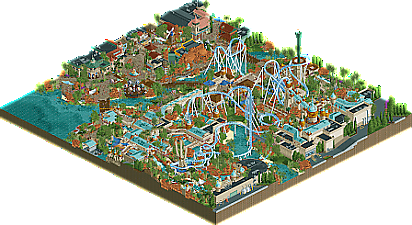
Ended up voting this one because I'm a sucker for Universal. I appreciate the new and daring approaches to the game, but this one was just lovely. Great color choices - although it does tend to blend together a bit in spots. Coaster layout was perfect, and had some fantastic interactions. Biggest gripe is some of the buildings are a bit similar. Lots of 2-wide structures. The details like the Trident, Mythos, rotating rapids, interiors, etc are what sold it to me as a successful Universal "land". I adored Christchurch, but this one resonated more. Nice work boys. Knew for sure that Steve was on this, but I should have guessed Xtreme as well. Looking forward to the next one!
Couple things I noticed / enjoyed:
Lovely use of open space leading up to the interlocking corks and Poseidon's trident. Really love that you guys included that set piece! Rockwork looks very nice too. Very Namibia-esque. Keep it up boys, you'll get there one day
I dig the Hulk-ish launch. I almost wish it were more prominently placed over a large entrance plaza or a lagoon though. Needed something contrasting in the background to make it pop more. Nonetheless really cool!
Love that you added a sculpture of my boy tolsimir
Interior is super cool. Great use of color, and I like the water tunnel. The parallels to IoA are what set this apart for me. Great idea
Poor sam always stuck with the grunt work.
Christchurch
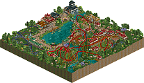
Jesus Christ this map was incredible. Upon viewing more, I feel like I should have voted this one. Don't tell Steve though. The sheer amount of detail is just mindblowing. The growing building / painting trick is so well executed. The cranes, the cement truck, the lifts, bucket trucks, food trucks - all of it. Fantastic. I was personally a fan of the coaster. Cool station, nice long profile, curvy path border, nice arches, rooftop terrace. Just very believable. FK once again establishing himself at the forefront of realism building. While still also being one of the greatest fantasy builders this site has seen. Legend.
The two gripes I have with this park come down to personal preference. I generally enjoy the half diagonal pieces - but primarily when used as accents or integrated into a structure. The long streets just look so awkward I think. Took a bit of the immersion away from me I think - but really not that big of a deal. Secondly - it just felt a tad sterile. The structures are so good, and the details are wonderful. But I think it could have used a bit more "life". Lots of empty benches, balconies and tables. Maybe some peeps on bikes, or more small scenes. Protests, demonstrations, music performance - something. Sounds very nitpicky, but I think that would have elevated it for me. Although I personally really do sympathize with time restrictions haha. You guys should be mad proud of this one.
Some things I noticed:
I should have voted for you simply because of these posters. Great taste.
Can't NOT mention this thing. God its such a great idea, and executed so well.
Very believable little rooftop terrace. Would have loved to see a bit of activity on it. Even an angry smoking peep
Another awesome bit of architecture. Again - the terrace would have benefitted greatly from a bit of action
This is just so cool haha. Took me a second to realize how you did the seismograph. Invisible scrolling sign? Brilliant.
Best piece of heavy machinery i've ever seen in game. Sorry BelgianMan
Nice and curvy, just the way I like em
I see you FK
The closed building is pretty great. Nice detail with the construction debris and signage on the fencing.
The quality of every park this H2H is so intimidating
A big one! The biggest so far, arguably. At least for me, and probably for Liam too since he let FK go absolutely off the rails and do another Grand Tour park! Just kidding, that was mean. But I also, it could be one! Did we go to New Zealand for the Grand Tour? We should've, I've always wanted to be in a Lord of the Rings film. I'd make a great dwarf. I might be too tall but I'm too funny not to be one. Elves have no personality so I would be the most annoying elf ever, probably. Who's the elf in that Rudolph cartoon? Hermy, right? He's more my speed. Merry Christ(ha!)mas I guess!
Anyway. The park! Or I guess it's not much of a park. The city! A city being built, even! Gotta say, an interesting concept and one more fit for H2H than other parks of this vein I think, so good call there. The tower being built is obviously a great feature. I sat there and watched it like a total idiot while open-mouth breathing and I'm not going to apologize for it. Eventually I had to move on, though. Seeing everyone talking about the Earthquake museum thing I had to check it out next. The little shaking tower thing is absolutely hilarious. In a cute way, though! You know, like me. I mean, what. A great little moment on the map, all the same.
As I took a gander around the map even further, I simply cannot hold back my hate on these diagonals. And they are in full force here. It's almost as if Liam had conjured up an elaborate scheme against me to use them simply to piss me off and boy howdy did that motherfucker succeed. I hate everything they stand for and sit for and drive to work in two hours worth of rush hour traffic for. The church, yeah, it's great! Obviously! The excavator and all the details around the church are more slick than dr dirt trying to talk shit about me while we almost beat two legendary parkmakers in Round 1. BUT THE ROADS. I can't look away. It's like a car crash. Will they ever grow on me? Will I forever be in utter disgust of these offset diagonals while the community soldiers on without me? Will I continue asking rhetorical questions in all of my reviews? The answers to all of these are an undeniable "yes" until my next review where hopefully the ones I ask there are a "no" and I can continue my pitiful existence in peace. Wow, that took a turn.
Really interesting matchup here, still not 100% sure how I feel about it. I voted for Christchurch, but I do think the better park won.
Christchurch - So, so clever. Really believable architecture and setting, tons of love and inspiration here in what could potentially be quite a "normal" setting. The ideas definitely set it apart, and are what swayed me to vote for it in the end. Mainly the under construction building, which was one of the cleverest ideas i've ever seen. Love how it's a new scenery idea that utilizes mechanics that exist in the game (watering gardens) to make it work.
Loved pretty much all of the buildings, and even the ones I didn't love in isolation worked really well in their setting, and had enough charm and believability that they didn't lower the overall impression.
Lemuria - A bold idea to rehash such an iconic classic, which i'll be honest I didn't love as a concept at first. Just felt like cheating, almost. But the more I looked the more I found, and it's pretty obviously an incredible improvement on the original. This may be my favorite ever "area", I can see this being in a park and absolutely fitting in. It made me imagine the rest of the park, and I wish this could one day become that. Hell, even a total reimagining of RoB would be amazing. The theming, the atmosphere, the colors, everything was totally on point, and i'm really jealous you got to make something so great. I feel like this was a worthy winner, even though I voted for Christchurch.
I appreciated the classicness of Lemuria. Something I wished for prior to this round, and I got it. Great layout and interaction. I don't like the red/brownish blob behing the cobra roll (classic cobra roll!) and I would have liked to see the normal palette.
I loved the geological referencing throughout Christchurch, and the modern architecture. I think the single rail coaster felt a bit out of place though, and the church didn't do it for me. I also felt this park was a lot smaller?
My review of the parks!
Thanks for the review Mav! Was a lot of fun watching, and the bit of time since this round actually made it feel like a fun trip down memory lane, heh.
Here's a review of both parks. Really loved Christchurch. Some excellent city building.
https://youtu.be/11yavKLeyds
Christchurch is still so good, anyone wanting to dive into non-theme park realism should start here