Park / A Day at the Races
-
 13-May 21
- Views 14,150
- Downloads 572
- Fans 0
- Comments 58
-
 67.50%(required: 60%)
 Silver

geewhzz 80% In:Cities 75% G Force 70% RWE 70% Scoop 70% Xtreme97 70% bigshootergill 65% Cocoa 65% inthemanual 65% WhosLeon 65% chorkiel 60% Louis! 60% 67.50% -
 No fans of this park
-
 Full-Size Map
-
 Download Park
572
-
 Objects
386
-
 Tags
Tags


![park_3324 [H2H7 R1] Circus Circus & Adventuredome Atlantic City](https://www.nedesigns.com/uploads/parks/3324/aerialt2970.png)


so whats the scoop
I'm really happy for my boy Geoff! Bold moves from SQ but it didn't pay off. Better next time.
Great matchup guys, I think the right team won, although as I said I was 100% sure I would vote on the other park before spending a bit more time in them.
Esoterra was really close to being an incredible park. I LOVE the idea behind it, I don't think i've ever seen a good tarot park and it's a great H2H concept. For me, there was just too much missing. Most of the tarot "scenes" you made didn't get the idea across well enough, and I wasn't sure what I was looking at half the time. The card graphics that accompanied the park were a nice tough, but as someone else mentioned they were so pixelated that I had the same issue - not sure what i'm looking at. I think it would have been better to have actual tarot cards, and have people try and find them all in the park.
There are parts that I really like, and some design choices that I love. The black stacks of land are awesome, very imposing. The chariot ride is a great idea. The arches on the bridge is my favorite little section. The biggest thing that really bugs me is the sediment layers in the land. It's a strong choice, and a good idea, but with so much else going on it just makes the whole place look SO busy and hard to look at. In a different setting, say a huge canyon woodie where the landscaping takes center stage, this land effect could have been amazing.
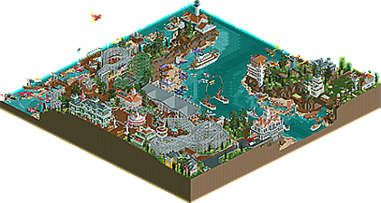
Conversely, I didn't think i'd like Day at the Races that much on first glance. It looks a little more basic than other parks we've seen so far, in terms of landscaping, ride design and theming. But it was so fun to be in! A really great park layout with a large river, pretty awesome grandstand and a cool air race going on. I kept finding little touches that really cohesively brought the theme together. I didn't love a lot of the sculptures, again they were a little basic compared to what we've seen, but appreciated how many there were. The coaster was charming without taking away from the focus of the map which was the air race, and rightly so. Overall, just a really fun park, that perhaps got a little lucky not going up against one of the other parks we've seen so far.
nice
nice
Finally adding my thoughts here as well. Comments below!
H2H9 Park Reviews
A Day at the Races
The overall coloring is so much fun. Love the pastels and boardwalk architecture all round!
Aeroplane coaster is one of my favorites of the round! It gives off strong Thunderbolt vibes too
The seemingly endless docks/boardwalks with the festoon lighting adds a ton of atmosphere
Really enjoy all the naming and variety in the planes!
The Stunt Plane acrobatics are wild and fun to watch
Racing team planes has to be the most dynamic competitor inclusion I’ve seen. Really adds to the overall theme and buzzing atmosphere!
+1 for Air Show for synchronized maneuvering and colored trails, such a clever idea
Grandstand architecture and surrounding cliff side garden areas are nicely done
The small details really sold me on this one like the Press stand
Notable are the racing pylons and pockets of grandstands, the artist and their easel next to Bisby’s Spiral Airship, and the blue cake at the private garden party/viewing area!
Notable plane details are the Icons crash, plane unboxing, and the wing walker!
+10 for Bayview and Bisby’s Spiral Airship, both executed very well
Esoterra
First off, love the huge rings of black rock and the overall landscaping!
All the waterfalls bring a great sense of tranquility
Also love the use of plain grass for walkways. Really embodies that natural feel
Sediment layering works well in certain areas, and sort of loses me in others
I appreciate the Tarot Deck organization on the Rides tab!
Having each card have a little vignette area makes the map fun to explore
Favorite attractions/areas include Hermit, Hierophant, World, The Chariot, and Hanged One
The fact that The Chariot takes you through Last Judgment and Death is a really neat touch
Really enjoy the architecture for the splash down and the Hierophant bridge!
+10 for The Stool
+1 for Pat Sajak
Vote for R2M3 – A Day at the Races
The decision was supported by the inclusion of a multitude of dynamic components that upheld and carried the respective themes. Not to take anything away from Esoterra, but A Day at the Races seemed to have that much more which ultimately brought the map to life in my eyes.
Proud of all the work and accomplishments thus far! You all are killing it.
Here's to R3!
It's nice to hear everyone's reviews. I didn't build on this park, but I was quite involved with shaping the park conceptually, and I gave a ton of feedback. It also feels like my park a bit! I think most of the criticisms are quite fair. It's not the most boundary pushing park we've seen, and maybe it's not as refined as Nippon or Acqua Alta, but we made sure to make it easily digestible, yet rich in fun and content. I don't think there's anything wrong with a most traditional RCT park. I'm really glad people recognized that and gave us their votes.
Hope to review Esoterra at some point. It's a daring park with an intriguing theme. Losing the match doesn't mean the park failed, however. There's plenty to appreciate.
Here's the graph for this match:
I was a bit sad and mildly nervous when we started losing the wide vote margin we had during the first 40 votes or so. 85% is quite different than 60%, but we'll take it all the same.
I'm still glad we can have that and that it can win. Sometimes I feel H2H is too much about innovating & doing special stuff, and too less just building nice atmospheric parks. Day at the Races was awesome.
thanks for the writeup, I love how detailed the ideas were and how much love you guys put into it. I agree, I also probably love this park more than average- maybe I'm an SQ stan. You guys are killing it from an artistic standpoint.
I hadn't noticed the organized rides list but thats a neat idea
Great write up. Esoterra captured something very artistic with its subdued symbols and storytelling. The deeper that I looked, the more I was fascinated by this approach and with the care put into the park. We haven't seen anything quite like it this H2H besides your newest park, and I am really happy to see work like this being created.
Check out my video review of the parks!
Here's a video review of both parks. Esoterra continues to grow on me-- great landscape.
https://youtu.be/kOMbFXAb86c
I Just looked at the comments section of Esoterra and I am truly sorry. Hindsight is definitely 20/20 . Even if if my opinion of the park is what it is, that doesn't justify the way I acted. Reading back on them, I didn't realize how much of an asshole I sounded like. I can probably look through a lot of the scream queens parks and say the same. So I'm sorry to the lot of the team.
the world is healing
esoterra is still one of my favorite parks in recent years. gg queens
have we decided we actually all liked esoterra now? good good