Park / Zero
-
 12-April 09
- Views 4,575
- Downloads 790
- Fans 0
- Comments 10
-

-
 80.00%(required: 65%)
 Design

chapelz 85% Evil WME 85% Fr3ak 85% RCTFAN 85% Xcoaster 85% 5dave 80% CedarPoint6 80% FullMetal 80% Magnus 80% zodiac 80% Milo 75% nin 75% geewhzz 70% posix 65% 80.00% -
 No fans of this park
-
 Full-Size Map
-
 Download Park
790
-
 Tags
Tags
![park_2401 [H2H6] R3 - Hurricanes - Avatar](https://www.nedesigns.com/uploads/parks/2401/aerialt2145.png)
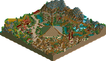

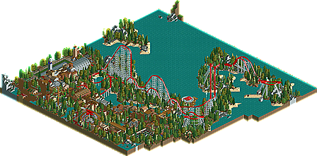
Back in February New Element hosted its annual Awards Ceremony. In it Roomie tied for a distant second place for the best comeback of 2008, overshadowed only by RRP's transition into RCT2. Granted he did start a bit late in the year, yet as the early months of 2009 draw to a close he is certainly proving that he is deserving of the gold for the best comeback. Zero marks his third design in a few short months, along with Jurrasic Park: Rampage and MultipliCity. With this design he really starts to push some boundries, taking his shoestring hacking to a whole new level. In it he unveils the first working cable lift system in RCTLL as well as a working Himalaya flat ride, with realistic starts and stops. Combine these clever hacks with a nostalgic coaster that harks back to the early days at NE and similar style theming you get Zero. Read On...
wonderfull design roomie
Congrats Roomie!
I can't look at it ingame, but the overview looks really good.
Xcoaster Offline
I really enjoyed this park and layout. The aviation theme was nice. And that was a very neat hack (and it works more than once, it just takes forever to start going again, lol).
Congrats on the design roomie, shows why you were my #1 pick.. Levis can thank me for that and hope you 2 will make an awesome h2h park together (not against us though
I thought the design was very good; Good pacing, nice air time hills and variation in direction.. The low point was the landscaping imo; Lots of jagged edges (which could be a pet peeve, but I always think they ruin your flow in terraforming), not so good bush placement and treeing.. I also thought the color scheme of the train was kinda bad.. I think the white is killing it for me.. Color scheme of the track was good though.. Gives the area some needed color..
I LOVED those flat rides though, nice functional hacking!
Looking forward to your h2h park(s),
SF
Greets CheeVa
sorry slow replying. on a boat in morocco with no internet
Thanks for the design and the comments guys
As for S or Z shaped... i guess it depends which way up you look at it
the jagged land isn't necessarily a drawback even if it isn't in vogue nowadays- this is built in a certain throwback idiom, and jagged land is a huge part of that style. The coaster is fantastic, I like the way you've balanced the demands of creating a visually interesting [i.e. not just a straight-line out & back] ride while maintaining a style that would make it very enjoyable to ride as well. I've always been a fan of keeping turns at the bottom of hills and leaving the tops for pure airtime. The supporting is lovely, and the elevator lift hack is incredible. I do have a few qualms about the surroundings, though. The buildings show a promising hint of a step away from being locked into 2x2, but the whole built-up area seemed to lack any cohesiveness. "Rising Sun Pizza Palace" and "Zero" make some sense, as does the "Battle for Midway" (awesome hack btw) but where does the red baron figure into this? Not denying the plane sculpture is fantastic, just saying- Wrong country, wrong war. Additionally, I don't think Spitfires were ever deployed in the Pacific, being RAF fighters.
as for the cohesiveness of the rides. your right i know