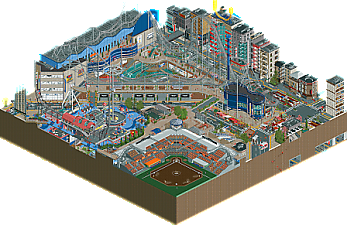
Park / Nippon Professional Baseball Championship Weekend at Tokyo Dome City
-
 11-May 21
- Views 19,445
- Downloads 862
- Fans 8
- Comments 44
-

-
 87.50%(required: 70%)
 Gold
Gold

geewhzz 100% yes Louis! 95% yes CoasterCreator9 90% yes In:Cities 90% no robbie92 90% no RWE 90% no saxman1089 90% no Cocoa 85% no Xtreme97 85% no G Force 80% no Scoop 80% no WhosLeon 80% no 87.50% 25.00% -
8 fans
 Fans of this park
-
 Full-Size Map
-
 Download Park
862
-
 Objects
522
-
 Tags
Tags


This was a really interesting matchup. It seemed so one-sided in the vote, but I don't think the gap between these parks is that huge. For me, TI's park had a lot more moments of genuine beauty and striking landscapes, while Nippon was just an incredible content machine. In the end, the sheer amount of delicious details and little vignettes to be explored in Nippon won me over. There was just so much to explore. In some places, it felt a little haphazard how much there was, but for the large part it was really engaging in a way that the best H2H parks are. TI had a lot of similarly engaging moments, but the threads holding them together felt a bit more stretched. I also struggled to shake the feeling that, in places, the intent of what I was looking at was going over my head, heh.
This match also solidified for me the plight of rockwork heavy parks. Up to this point, we had seen a handful of parks get smacked for their rockwork. First for being too rct and rough, then for being too lotr and smooth, and here was an almost hybrid style and people still didn't like it. For me, I"m less picky and I thought the look here was really striking and very impressively crafted. But, regardless, I think rockwork is the risk of the season right now.
With the midseason break I figured it might be time to make a small write up for the park. First of all since I haven't really stated that publicy, congrats to LR for the park and the win!
 The whole concept of the park is based on two frescos. One of them is the famous School of Athens by Raffael in Vatican. The other one, very much less famous is the ceiling fresko of the real biblioteca in El Escorial near Madrid. I had the pleasure to visit this library during my last stay in Spain and it completely blew my mind:
This park started as an idea that I had pre-H2H floating in my mind. Actually, it was one of my options for my finals entry in Micro Madness two years ago if hoobaroo hadn't beaten me
It is a library filled with classic books and was constructed in the Renaissance. It is a stunning place to visit and left me really permanently impressed. The ceiling painting is pretty much the same as the park concept. There are 7 different parts on the sides and each depictures an allegory of one of the seven arts (Logic even shows Zeno!). The front and back walls show each a depiction of "Theology" and "Philosophy" the two antipodes of then. With this impression I came to my team and pitched the park. Since I was the one to lead the week two and I am the captain I more or less had a free choice on what I wanted to do .. which fired back a little.
So the concept was to have a big main island with drastic rocky landscape which hosts the most prolific school of philosophers of the ancient time where they study, discuss and do research. I wanted to give every art its own little area with a clear depiction of what it is meant to represent. The whole idea of the map was that the peeps represent students, which want to go up their way on becoming a philosopher and reaching the final building, the study hall at the top. For this they have to pass an exam in each of the liberal arts, before even being able to proceed to the next one. This is represented in the pathing of the map. There is like one giant line of path from the ground plaza to the top. The several shortcuts were initially planned only to be one way, being the direction down. All the rides were set to be an elevator or other transportation ride so that peeps would ride them no matter what. Unfortunately, the peep AI did (not very suprisingly) make this plan not really work and eventually we had to build several hidden cross connections through the mountain to not cause peep jams all around. But still, in theory a peep could go from the first art, the library, all the way to the top by 'passing' through rides. Initially the coaster had the concept of being an element of distraction, which several queuelines from all kind of areas of the island and the exit at the bottom again. We kept the idea of the coaster, it represents the doubt in everything a philosopher does and finds. This is also the reason why we decided for a black color of the coaster. It is in disharmony with the rest of the map to make this moment of disruption also visually. Finding the layout was a team process par excellence. We took several days, because I really suck at making coasters. However, with the help of my team mates I think I got to a pretty good layout that flows well and has good interaction with every part of the island and therefore fulfills its idea.
The problem during the planning stage was that the Liberal arts are kind of abstract and it was hard to come up with something in the beginning. I mainly had more of a bigger picture in my mind when building/planning it and sadly couldn't really communicate of what I was thinking of so my team mates couldn't really grasp the real idea of the park at the beginning.
I started the map with some heightmap terraforming, which is my go-to point when starting a new park. I based the main island on a logarithmic spiral which I think is a nice background for a park where the most famous mathematicians were supposed to be found. In front of the main island I put a smaller one thought of being a more mundane little port village being the supply hub for the philosophers. Since the idea for that part of the map was a lot clearer, I asked Sulakke if he wanted to help me there and he agreed. I think he did a great job in doing so. The main inspiration for the village came from screenshots of Assassins Creed Odyssey, which I found super helpful myself:
From those pictures I figured that shadow cloths were an intregal part of the building style. and Fredd you were right, first we wanted to use yours but then we decided that a new proper (and more flexible one) was needed I love how Sulakke applied those to all the houses and think that he nailed the feeling of a small fishermen's village.
For the main island I didn't take many inspiration pics and just built what came to my mind. Since I didn't really have much of a plan I started at the bottom and built my way up around the spiral to the top. The only thing that was planned was to have the 7 arts divided into the Trivium and the Quadrivium. Historically this has nothing to do with the ancient study of philosophy and was just introduced in the middle ages, but who cares. The trivium are the arts Grammar (so reading), Logic and Rhetoric. These make up the basis knowledge of a philosopher before he is able to even study the other ones. Therefore, these arts make up the ground half of the island and also their rides are designed more down to earth, while the ones from the second half with the quadrivium are more conceptualized and figurative (giant instruments, tour to the celestial bodies). I wanted to give the top building some kind of grandeur as what you can see from Raffael's fresco. I decided to go for a diagonal base to have the better viewing angle on the opening where I wanted to put the fresco scene of the school. For some reason I didn't put that scene with all those peep object until the very end like 15 mins before the deadline in the time of like 5-10 mins. For a work in such a small amount of time I think I reproduced it into a recognizable state, I admit that it could be a bit busier though:
Time was an issue for this park during the whole process. For personal reasons I couldn't start really with the park like 3 weeks before the deadline. I'm a bit sad about it, cause I think the park is missing the refinement. During that time also Rob was assigned to the park to assist with some work like supports and adding details. He did a good job, also in the later stage coming up with the abacus design was a great achievement!
Coming to the criticism, I'd like to say first that I got the feeling that the park was - in parts - very much reduced only to the objects it introduced while there is a lot more beyond that. With some distance to the park myself now I can get the criticism that we overdid the rockwork in parts and how it is a bit spammy. Also the unprocessed underwater landscape was unintentional and came out like that due to some jumble on the deadline day. That's what happens in a contest.
I want to thank my team for the great support during the construction, Sulakke and Rob for being excellent building buddies and Spacek for the great addition with the unconventional CTRs which really elevate the village to another level. For me the construction was more stressful than anything else and I was happy when it was over... I'm not really the guy to lead parks Still I'm proud of the endresult, even though I would say that I can do better.. watch out other teams!
https://youtu.be/oecErFps8lA
Mostly a review of 7 Liberal Arts, review is up!
2 videos for this match!
First, a review of TI's great park!
https://youtu.be/Wed5A8BBvC8
Second, an inside look behind the building of Nippon featuring Maverix and I:
https://youtu.be/jcLQS7-WYBg