Park / La Tomatina
-
 28-April 21
- Views 16,006
- Downloads 594
- Fans 0
- Comments 58
-
 74.50%(required: 65%)
 Design

CedarPoint6 80% robbie92 80% saxman1089 80% Camcorder22 75% Cocoa 75% In:Cities 75% Scoop 75% WhosLeon 75% chorkiel 70% CoasterCreator9 70% nin 70% Xtreme97 70% 74.50% -
 Description
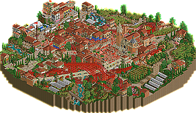
Every year, on the last Wednesday of August, thousands of people from around the world gather in the Buñol for La Tomatina - a food fight that covers the entire town and everyone in it red.
-
 No fans of this park
-
 Full-Size Map
-
 Download Park
594
-
 Objects
464
-
 Tags
Tags
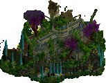
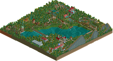
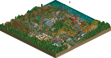
Tomatina:
Really fun idea for a park, first of all! I love how vibrant and alive the map is. First thing that sticks out is of course the all red wooden coaster. I don't think it looks pretty neccessarily, but i respect the bold choice and I think it adds a lot of character to the park. That character is definitely needed here because the architecture and setting aren't super original/fresh by themselves. The big square with the tomato fight is really great, and as mentioned a couple of times before the tomato-splattered walls are a fun touch. I think thats the strong suit of this park in general; the dedication to the theme. The tomato trucks driving on and off, the plants growing tomato's, the little carpaccio fountain, the 'washing off' ride for guests to clean up after attending the festival, all really fun details that contribute to the immersion and the enjoyment of exploring the map. I think the architecture in the center of the town could have used some more variation in color. The little street going uphill at the map edge is by far my favorite section in terms of archi, and i would've liked to see that same color variation in the rest of the architecture, as it gets a bit washed out in the town center. I tried recoloring some facades there to white and it already improved it a ton to me.
Gauntlegrim:
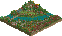
Sick opening scene. The paths leading up to the grand entrance are super cool and they made me expect a lot of the park. The whole entrance is really well made, and I really like the big plaza that overlooks the mine right after entering the park. The cutaways on the sides there are cool (big fan of the 'ski rack' used as a tool rack) but i felt like they could use a bit more life and movement. Some slides are really nice like the half pipe interacting with the terrain and the 'bowl' slide, however, I think with some of the others you could have done more to integrate them into the landscaping and theme. The best area of the park is the mine train section in my opinion, the way the coaster weaves through the rocky landscape is awesome, as is the station of it. I think the rocky landscaping works in places, but in others it left a bit to be desired imo. I am assuming that this park ran into some time issues, as the middle area and the landscaping in general feel a little unrefined. Totally understandable in a R1 park i think, but some rough edges like the standard stations showing and the lack of a final layer of detail in places did kill a bit of the immersion and atmosphere for me. Kind of a shame, because I think the concept is really nice and there are some really great moments in this park.
All in all I enjoyed Tomatina more out of the two, but not by a large margin. I think both parks are strong in their own way, and I am expecting this match to be a nail biter once again.
Another close one.
Won't have many words in me right now but before I don't comment at all:
Tomatina:
In parts brilliant and classy, especially the garden and outskirt design as some have mentioned. My fave here being the spot with the LL maze turned into an object. That looked beautiful, and like quite some aesthetic potential could not be explored due to H2H time limitation. The coaster was a lot of fun to watch. Surprised me how long it kept going. If I'm perfectly honest, I didn't really care about the tomato thing. I'm impressed by how you went for such a difficult concept to realise. Takes a certain boldness which is nice. But ultimately I think it didn't open many things for you to milk, park-popularity-wise. I struggled to read the town as it was all a bit messy, regardless of what was going on. Looked a bit rushed and underdeveloped macro-wise, and it hurt it a bit.
Gauntlegrym:
An underground dwarf mine turned waterpark for them to have fun? Pretty twisted but awesome idea. Millions of little details to find and explore here. One of those moments where I send a prayer to the pixel scaler of ORCT2. I loved how there was quite a bit of care placed onto all the landscaping, which was Kumba-esque in places, the good type. Really liked that, along with all the little paths on it. The entrance was beautiful, and a nice moment leading "up" to the park. The stalls there looked amazing. A lot of finessing achieved here just through terraforming, which is such a devoted macro skill, and which I love. You then maxed it out with a lot of hacking micro for all the rides, and meticulous details everywhere. I can't say it all came together for me, but it was still a lot of fun to look at everything.
Voted Laborers. Good luck to both teams.
Gauntlegyrm: I love the entrance, it's a fantastic way to start off looking through the park. There's some great scenes like the forge area and the crystal caves, and the park makes good use of elevation throughout. I also thought the waterfalls throughout the park were especially well done.
One thing I didn't like as much personally was the default station tiles on the slides in the middle, they seemed to clash with the surroundings to me.
La Tomatina:
I love the outer parts of the map here, the villas are beautiful and the amount of small scenes is great, everywhere I look there's something going on, and yet it isn't cluttered or crowded and and it's very easy to read.
The foodfight has a lot of cool effects and tricks to make it convincing and chaotic as it should be, and I'm a love the layout of the wooden coaster and how well in interacts in the town.
In the end I went with La Tomatina, the beautiful setting, tons of small, pleasant scenes and fantastic coaster won me over.
Finally a match I don’t have to have a heart attack about! Definitely a tough vote and I haven’t yet made a decision, there’s a lot to love in both parks and also some flaws holding them back from being exceptional.
La Tomatina:
For all the suspense of whether Liam was going to change things up this season, this felt like a pretty standard Heaven’s X part, with the obvious tomato twist. I think it is fairly successful with the tomato fight being the centerpiece but not the end all be all of the park, its still basically just a pleasant Mediterranean park. To address the elephant in the room: I did not like the bright red coaster at first, but its grown on me a lot. I suppose it would’ve felt like a missed opportunity to not have a bigass bright red coaster in a park about tomatoes. Its a great layout, might end up holding up for best wooden coasters of the year. The aqueduct scene is obviously supposed to be the primary scene of interaction and it does feel a bit forced. The double diagonals have been a bit dicey for me so far (I did like Tolsimir’s original a lot), but with this one the perspective feels a bit off, and the glitching through the track is a bit much. The second half of the layout imo is where the interaction really shines, with some much better looking half diagonal usage and the coaster racing under the bridges and over the paths. The town itself was strong. It came off a bit by the books at first, but the more I explored was very immersive and distinctly Spanish, but like real Spain and not a caricature of Spain. The outside of the worn was quite nice too, particularly the Gazpacho maze, and tomato farms. Overall, a very digestible and readable park. The “little things” were not hard to find, the composition naturally led you to what you were supposed to find.
Gauntelgrym:
There’s surely lots and lots of great moments in this park. Yet it was a challenge to really dig in, mostly due to composition issues throughout. When I look at the entrance and palace, its clear a great deal of planning went into this. That’s in stark contrast with the back half of the park. When I’m looking at it zoomed out, I’m not particularly sure what to make of it besides lots of rocks. I suppose it might be very dwarf-y to bury the coaster far out of sight, but it hides most of the big moments of the layout from both the park viewer and the guest. Which is a shame because when you dig in, there are plenty of great moments, especially a nice cave/waterfall scene which is about as buried as could be. A lot of great stuff going on with the slides as well, but its all laid out in a way thats a bit difficult to take in. I get the need to heavily use rocks to pull off the cave look, but some sort of formations, instead of rocks on rocks on rocks would’ve helped the viewer a lot. I won’t get too much more into the individual moments here I liked, as most other reviewers covered them as well as I could have, and there are many of them, but I wish they could’ve been done more justice with a bit more emphasis on planning.
Now that I’ve dug into both a bit more I think its pretty clear La Tomatina is preferable to me. Props to both teams though for getting in parks so full of content and quality in such a short period of time.
Another great match; fun to be able to relax and get into these parks a bit.
La Tomatina
Wow, what a fun theme - definitely not unexpected from this team. There's a lovely sense of atmosphere, the festival vibe is sold really well with the peeps and booths around the place. Just "fun" in general. The creative object use is really cool - I love the use of fade here; we used it as rust in Drowned and it's cool to see it now as tomato splatter. The tarps are a nice little touch too. My favorite parts are probably the farm and estate scenes on the outskirts; it's a nice break from the business of the center of the map. There's really a nice sense of life and excitement, and the coaster layout isn't too bad.
The architecture is a bit of a mixed bag; convincing and unique in many places, but very samey/filler-esque in others. The church has one really nice tower and one really mushy tower, which was odd to see. The half diagonals were a bit glitchy on my viewing, but only on one angle. The positioning of the coaster in the town was hit or miss too; very DKS in spots winding around the buildings, but also rather obscured with some forced interaction in other spots. There's a lot of red. I think there was plenty with just the tomato theme, but adding in the coaster to that was a bit much for me. I appreciate the dedication to the theme, but it just gets to be a bit too much on the eyes. The foliage was also a little haphazard in places, especially among the outskirts where it became more filler than anything else.
Really like the church, other than the dome it was a lovely feature.
I really love this scene, the bridge and little ravine with the hills and stream are great. There's some visual glitchiness among the aqueduct, but it was strangely only this angle.
Also love this little estate scene.
This whole area is pretty great. The architecture definitely isn't super varied, but the contest and the festival structures are very nice.
__________________________________________________
Gauntlegrym
You guys are making these decisions hard. The opening scene to this park is phenomenal. Both sides of the cave entrance are simply stunning and very well done. It's clear that a lot of focus and effort went into this statement piece for the park. Something subtle but very well done; how did you manage a single queue for multiple rides? Very nice. The back corner with Crystalis is also another favorite of mine; it's among the better put together areas of the park and convincingly themed. This is important; we'll get to that... The cutaway sections are nice, they break up what would otherwise be purely dirt land walls. Of course, the water features are great, and I love the little details everywhere. Waterparks can be tough to beat from my perspective.
There's some weird inconsistencies with this park. I started to notice more and more as I kept coming back to the park. There are some object placement oversights in places, and I started to get this weird feeling that parts of the park were extremely well executed and well themed while others felt like a generic waterpark with a different skin thrown onto it. There's a ton of worldbuilding, and a ton of immersion breaking features. One of the biggest things for me was the landscaping. The hybrid between normal land, krypton rocks, wall objects, and other rockwork falls apart a little bit in places; most notably around Spring Slides (and also a case of weird departure from the otherwise excellent worldbuilding). There are jagged rock features in places that are immediately juxtaposed to krypton rockwork, and it's just jarring. This is also particularly noticeable with the wall objects plopped onto bare dirt walls. I get what it's going for, but it just doesn't come out well because it's such a jarring transition. The park as a whole kind of feels a bit "undercooked".
This is amazing, one of the coolest opening experiences to a park in awhile. Very well done, very impactful.
This whole section was a little weird. It felt like a themed waterpark more than an immersive experience like a lot of the rest of the park did. Coupled with the jarring landscaping, it was definitely one of the weaker parts of the map for me.
Compared to the above screenshot, this is on another level. Great use of verticality and so much cool interaction between the rides and landscape. It still suffers a bit when it comes to the landscaping, but the structures help remedy that a little bit. (Key point here; middle left part of the screen, it's a bit of a mess of objects, walls, land).
I really can't get enough of this. The landscape feels more finished and polished (aside from some at the bottom), but the big draw here is the waterfalls and the entrance plaza. I also love the forge, it was one of the parts of this park that excelled at worldbuilding and theme - I really wish the whole park had that same feel.
_________________________________________
Like I said, this is another tough match. It took me awhile and several viewings of each park, but as I looked at each more over time, one began to emerge as a frontrunner. I'm excited to see what both teams have in store for the future.
La Tomatina,
Fun and cute little park, but it feels like a the "coaster/theme park in a European town"-thing we've come to expect from Liam's H2H theme. The even is a nice touch to make it stand out a bit more, but it didn't blow me away that much and felt like it was trying to recreate the success of DKS.
That said however, it still has some fantastic things in it. It screams fun, just like the real tomato figth, and the whole map is created to support that notion. The trucks hauling tomatoes to the scene and going back empty is such a fantastic little trick, the tomato contest, the first aid post.... All great little things that tell a story.
And then there's the coaster. While I'm still not fully convinced the red is a good look, I do applaud the decision to make it red. It's a bold choice but made this park stand out and memorable. If it was brown, this park would suffer the fate Walto predicted for it, but now we're all gonna remember it as the park with the red coaster.
Gauntlegrym.
That entrance man, so fucking gorgeous. Love all the staircases, the use of the ferris wheel object. It feels grand and majestic.
The rest of the park is very creative and cool idea, but suffering a bit in execution I'm afraid. My biggest gripe with this is the combination of LOTR/Kryptonian rocks, and the default land textures. That's a big no-no imo. Combining these, is difficult and can be hit or miss. For me, it's a miss I'm afraid. The landscape feels cold and grey, and while that's fitting for a cave, it's not nice to look at. I would've loved to see the landscape from the entrance area repeated and expanded in the water park itself.
Of course there are things I love here. The mine train coaster is ace, the water slides are well integrated and pretty nicely done, even if they're the standard ones from most water parks. The stations are well done and I love how you need to rotate the map to have seen everything. Not everything can be seen at first glance. That's a plus on La Tomatina, where from just the overview you get a good idea what you can expect.
It was a tough and close call, but my vote goes to La Tomatina.
Tomato:
- Maybe a bit safe in concept, but for round 1 and needing something quick I can excuse that.
- The execution of the tomato fight is fantastic, love the use of the faded wall, footsteps, splashes, etc.
- The village is really pleasant. The most amazing thing ever? No, but it's very enjoyable and sets the scene well.
- Love the woody layout. Unconventional but flowy and pleasant. Not sure on the colors, but I get why they were done. Just ends up looking like a lot.
- Landscaping definitely more subtle than the other park in this match, but nicely done.
- TBH I HATE the off-diagonal aqueduct. It feels forced in, and the odd angle makes it look like it rockets off the space from one angle.
- That said the use of the off-diagonal objects in other places are fantastic. I think it works better when it's used subtly and not as a main feature.
- Lots of fun little details to find and explore in this park which were great.
Gauntlet:
- The entrance is WOW. Fantastic in scale, execution and setting the stage.
- I do wish that this park would have stuck to just a water park. The coaster isn't bad, but felt forced/an afterthought, and I think the space the top spin is in could have been used better.
- I do find myself going back and forth on whether I love or hate the rockwork. The pallet does it a ton of favors, maybe it just feels inconsistent in places? Some great scenes set up for the rockwork, and maybe some places that felt too chaotic.
- Waterslides were all great, good solid clean hacks, good looking slides, and some nice pops of color.
- Concept overall is fantastic and creative.
- Overall I felt this park had more WOW moments, but wasn't quite as cohesive as tomato park.
This is really tough for me, but I'm giving my vote to La Tomatina. Just seems to resonate with me more, but both teams should be proud of these great parks!
Cereal Killers - La Tomatina
-Woodie layout is excellent. Love all the swoops and big dips. Big ouch on my eyes though. It seemed a bit out of place - it seemed like a mostly realism concept, bordering semi-realism, and then the coaster was painted bright red. Not sure if it's been mentioned yet but I think it would have benefitted to paint the coaster normal wood colors, and then paint bits of it red around the town as if it got caught in the crossfire.
-Yes the archy is repetitive, but it makes sense for a city. Still, I wish some of the roofs were different textures to break it up. I love the raised platform area by the first aid tent.
-Church/Religious building has brilliant areas and very barebones areas.
-The farms and foliage are delightful
-I was soooo caught off guard when I realized the handyman was harvesting the tomatoes, that was a great trick!
-Truck trick too? This place has it all!
-Very confused by the roto drop ride...
Manual Laborers - Gauntlegrym
-I love all the marble bits in the entire park, mainly the entrance/exit, and the one station for Coal Chute/Gold Rush
-I love the shape of the landscaping - the verticality of it all, but I can't stand the abundance of the same rock piece being put everywhere. There were also some places where the rocks didn't seem to be finished.
-Minor gripes such as some exposed stations and the ending of the slides slamming on the brakes instead of a gradual splashdown; also the Top Spin not being operational was beeg sad.
-The waterslides are otherwise dope and weave very very nicely.
-Absolutely GOREGEOUS waterfalls.
-The cutaway holes on the edges are great! I wish there were more!
-The whole Area by Iron & Rust is delightful.
-----
Both parks were solid! Glad to see more work being done, having a grand old time watching these get released. Good job to all those involved!
Another great match, it'll be a tough decision...
Attached Thumbnails
Gauntlegrym has some amazing architecture in the front that seems to be kind of forgotten on the inside of the cave. I don't mind the rocks like some others did, it's just there's a lot of rocks and it felt like there isn't a huge amount else. The architecture that is inside the cave was quite well done, like the outside, and the coaster I like a lot, but it seems like these are small fry compared to the rocks.
La Tomantina has some decent architecture all over and a cute theme. The entry feels reminiscent of World Tour contest entries with some local activity blown into a full design. Everyone's already mentioned the coaster color. The tomato fight itself is well done, I immediately knew what it was representing when I saw it. There's some nice custom objects too.
So everything I’m going to say has probably been said already, but I already typed this up, so why let good typing go to waste. First off these are two amazing parks with both a really cool and unique concept. Both teams have created something special and it’s amazing what you guys created in a short timeframe.
Cereal Killers – La Tomatina
+
Great archy in most areas
Liked the entrance and station of the coaster
El Grande Tomatina Layout
The tomato harvest
Festival details like the First Aid and toilets
The riverbed
The vast amount of red in this park is a love or hate kind of situation. But I’m a sucker for big colourful statements.
That red eye for the viewing options just screams: ‘I want to bash your skull in with a hard piece of red fruit that is often mistaken for a vegetable’. So that’s a big plus, but I won’t give you extra points for that though.
Great readme
-
Church towers don’t match the style/level of the rest of the map
Diagonal brakes don’t function
Semi-diagonal aquaducts look weird in certain angles.
Don’t understand Los Penones? Cars on water? I don’t get it. I’ve been to Spain quite some times, but never seen anything like this.
Gauntlegrym – Manual Laborers
+
The entrance area is gorgeous
Pillars using the signs as motif
Cauldrons
Use of the half ferris wheel
Blue flames
Crystals
I know many don’t like the mix of ‘fake’ and ‘real’ rockwork, and switching them in colours is seen as a sin, but I like it.
-
Diagonal brakes don’t function
Peoples falling down when leaving ‘Iron/Rust’?
Crystalis doesn’t feel fully fitting in with the rest.
After going back and forth on these parks for hours I decided to go with Tomatina.
RaunchyRussell Offline
I can't really add anything unique to the conversation here, but would like to add my thoughts in here about each park.
Tomatina:
Pros:
Charming atmosphere
Most of the architecture
Surroundings are great
Woodie layout is sweet
Ctrs and how they function was a great touch
Cons:
Coaster color is a little distracting for me
Car ride doesn't do it for me
The aquaduct is cool looking for about 2 angles
Gantlegrym
Pros:
Entrance is immaculate
Lots of content to explore
Cutaways are very nice
All of the supporting achy and columns are outstanding
Love the gold or metal foundry
Cons:
The rockwork is very rushed looking
The rockwork being a huge part of the park
Station pieces are visible on some slides while others are invisible very clean
Overall everyone did wonderful and have a lot to be proud of on these parks. In the end I went with Gauntlegrym because it was ambitious. I just feel like I have seen Tomatina before, which is not a bad thing.
Finally got time to write a review for these two.
La Tomatina:
Wow! This is such a bold statement to go with so much red, and I'm sure you've heard it before but it just doesn't do it for me. Would definitely have made the supports brown or something, plus I'm confused why it's just the one train. It would also have been cool to get those diagonal brakes working.
Also the whole thing seems to be overly red - I've looked at images of the town in question and the roofs aren't nearly as red, so I'd have tweaked that palette. Also the diagonal aqueduct feels really forced and is glitchy for me and it initially felt repetitive for me (especially given the fact that a lot of the walls are similar colours to the roofs too), so I have to admit on my first viewing I was not a fan of this park.
BUT, when looking at the park over and over... there's just a ton of detail here. From the little scenes such as the security guard with the police car, the guests jumping in the town square, the parked tractor, the medical tent area, the tomato truck, the tarpaulins used to protect some of the houses, the greenhouses used as the coaster queue, the tomato size contest... there's just a ton of fun stuff to look at here and I'm very glad I zoomed in and got past the sea of red. Also that coaster layout is pretty fire, gotta be honest. I do think it looks better with white or brown supports, but it is what it is.
Gauntlegrym
Let's start with that entrance, which is absolutely amazing! The landscaping is just *chef's kiss*, the rockwork works, and it's just well composed, as is the interior of it. The rockwork here doesn't feel as strong to me, and I really would have gone for a different flame colour throughout that doesn't match the water (maybe a purple? to keep the fantasy theme), also the steps in the middle kinda lead to nowhere?
The rest of the park is really hit and miss with the rockwork for me. I think the issue might be that too many rock types were blended in certain areas, plus I think the coloured expansion rocks usually don't work with all those columns of them.
Going for a waterpark was a bold choice, and I honestly feel you tried to cram too many slides into here. This is evident with them not really having enough time to stop properly, and most rides end very abruptly which just feels off to me. I did like the hacking done to get two or even three slides served by the same queue.
The coaster is fantastic, as is the area it travels through. But in some sections, the park just feels a bit unfinished to me? The bridge near the foundary (great ferris wheel and chain combination), for instance, feels like it was just left. I also would have preferred to see the top spin operating, but I'm not even sure myself how I'd go about hacking it so I can understand this being left. Also the halfpipe, with it's sudden turn 90 degrees to the left? Not a fan, not gonna lie.
Overall though, both parks are amazing for the little time we've had to do things, resulting in two very different parks that it's taken me over a day to decide on. I have to emphasize that, despite the "flaws" in each map I really like both of them and commend you for your work. But overall I have to give it to the Cereal Killers. Can't wait to see what y'all come up with in the next rounds!
Tomatina.
Going against the grain here but I think the bright red woodie was a master stroke. Turning the ride to brown makes the map look so much worse IMO and it loses all its impact. I love the arch way supports and the double down first drop in to the valley reminds me of Knight Valleys excellent GCI. The coasters 2nd half around the town ducking and diving among the towns buildings is lovely and easily takes the crown for best coaster so far for me.
Loved the theme overall and again going against the grain I appriciated the architectural sameness. I've always been of the opinion people on NE want every building to look different for difference sake when in real life that's often not the case and it often just leads to a mishmash of buildings that wouldn't ever be built in real life.
If I had one quibble with the architecture its that it doesn't really look like the real Buñol that much. I also wasn't really a fan of the squiffy acuaduct. It was a bold choice but not really sure it paid off.
It was also nice to see someone else take on the 4D hack trick with the tomato trucks.
Gauntlegrym
Another bold park and wow what an entrance. In fact the architecture around the park was top knotch and really suited the theme. Good to see someone go full fantasy water park too. Unfortunately it's not a theme I really connect with (my general rule is if something could have an Ork in it I probably won't like it
However like the books for LOTR and Name Of The Wind this park bucks that trend to a certain extent. There's some genius ideas in here.
It took me an age to figure out how those little mine carts were done and they look perfect. And as has been mentioned the chain was a masterstroke.
The sheer variety of slides was amazing and I loved the quarter pipe slide which provided a much needed splash of colour right near the middle of the map.
I must admit I didn't particularly like the way the slides stopped dead at the end of the ride like they hit a wall and I couldn't help think how this could have been mitigated with some hacking but due to the time constraints of this park going round 1 it's one that I can let slide (pun intended)
The mine train was lovely but felt a bit obscured at times. But a very solid layout and I love the support work over the lazy River towards the end.
The overall rock work was again bold choice and looks different to almost anything I've seen before, however it didn't quite stick the landing for me, appearing at times more like rubble than rock formations.
In conclusion I really liked both of these parks but the quirkiness and that woodie swings it to Tomatina for me.
However this was a great round and both teams should be rightly proud.
I'll post my thoughts of these parks and try to keep it short.
Tomato Town: The park is pretty and has a nice cozy feeling to it but the red everywhere is overwhelming. The woodie is probably the easiest fix of this and I think it really needed at least one brown in the scheme. The layout is fantastic though and redeems that a bit. The supporting rides are weak and honestly shouldn't have even been there. I'd have prefer more of the fun little festival things to look at because the ones you had were great. And it is for me a little uninteresting having tomato fields cover so much of the map but I understand it. One of the best things about this park is how easy it is to understand the purpose. The storytelling is amazing and you really don't need a read me to understand it. The biggest negative of the park is that aqueduct. Those half diagonal arches are not it! I like the attempt for the coaster interaction there but visually it doesn't work at all.
Waterpark: This park opens with an amazing moment, and it is definitely my favorite things between both parks. Had the rest of the park been this good it would have been a much easier choice. Inside the caves does have it's moments, but some areas are a bit messy, hard to read, unfinished, or dead movement-wise. The water slides are all cool though and I feel there is a pretty good variety to them. The mine train is good. Others say it was forced, but I think it made sense, although maybe could have used a water moment. My biggest single issue might be not understanding whether this is a fantasy park with dwarf guests or if it is a semi-real waterpark themed to a dwarf mine.
Overall this match was super tough to me. I've spent 2 days trying to decide which I like more, but I will say I don't love either. I think what it really comes down to is how the spaces were used. I felt like ManLab tried to go further with how much they could do on the map and CK played it a bit more safe.
My vote goes to Gruntlegym or however you spell it.
Hi! I watched Gauntlegrym carefully. At first I didn't feel the emotion. However after some time, "something" worked. According to Me, the creators decided to develop that work,
design, to provoke some deeper reflections. Life has shown more than once:
- where is wealth, there are also many emotions, but not only positive.
Architecture in this mine is a great splendor. Contrasts with cool climates ones of rocks and rock shelves. Big splendor objects - they are opposed to rocks, but is unable to do so,
to overcome . All attractions are well thought out. Water is life and great fun. Cool style. Everything seems to be carved with reverence, and the same - with reverence
offer slides and a roller coaster. A nice sculpture of a "strongman", and the quantity of the beautiful
waterfalls is outstanding. However, I don't know? Is this a safe place? What will it be when happen something like
another collapse? ...
Then I saw the second park "La Tomatina". From the very beginning, my impression can be describe: - it is really great feed for the viewer. Everyone loves tomatoes for their good taste
and great value. Maybe the tradition of the street battle does not appeal to me positively, but as the background for such a park is great. Everything possible has been squeezed out of the "woodden coaster" a resource of its original beauty. It's how it flies between buildings, and how it is laid out over the rest of the landscape makes it "the true star of the festival".
Diligence in creating a town, all buildings, and accuracy in making it muck in red makes me curious: What if in other countries of the world there were also such festivities. For example, kiwi fruit or peaches.
Everything harmonizes - beautiful fields, greenhouses, vegetation, small farms of growers,
and the Mediterranean climate. Accessories such as a hospital or an attraction with cars
to the topic of tomatoes - they are businesslike.
I wonder: is there nothing missing here?
For me - it is all that is needed, to make this scenario delight.
I like "La Tomatina" more than "Gauntlegrym".
Greetings to both teams and everyone.
Gauntlegrym - Holy hell that enormous stone entrance is one of the coolest things I've ever seen. It's actually a little difficult to process just how massive it is in the scale of RCT. Wonderful fantasy atmosphere stonework, and I like that there is a taste of what the area outside the "mountain" looks like. Forge's Fury's chain is such an awesome touch.
La Tomatina - I like the story excuse to get this crazy bright color scheme in here. The bits of red (and the red cannonball tomato stacks) were really nice, even though it's quite messy and chaotic. The tomato vines being semi-populated was a nice touch. The woodie is okay, but the station structure really steals the show here. It manages to be intricate and beautiful but also the most functional and believable building on the map. The half-diagonal stuff kinda breaks my brain, I'm not sure how I feel about it yet. These woodie footers are really cool! I can't believe I've never seen them before.