Park / Revolution, a Arrow Dynamic coaster
-
 21-May 21
- Views 1,877
- Downloads 340
- Fans 0
- Comments 8

-

-
 56.00%(required: 65%)
 Design Submission

geewhzz 60% In:Cities 60% inthemanual 60% Scoop 60% chorkiel 55% Cocoa 55% Jappy 55% RWE 55% saxman1089 55% Xtreme97 55% posix 50% CoasterCreator9 45% 56.00% -
 Description
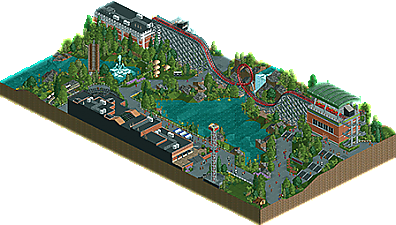
Arrow Dynamics Launched Loop Coaster, created for the DKMP mini-contest round 21.
-
 No fans of this park
-
 Download Park
340
-
 Objects
161
-
 Tags
Tags
![park_3791 [NEDC4 5/15] - Arevik](https://www.nedesigns.com/uploads/parks/3791/aerialt3450.png)


Is this a recreation?
https://en.wikipedia...olution_of_1952
You mentioned this being a Design submission on Discord; as such - the coaster is the primary focus here. An Arrow launched loop is certainly a unique choice for Design. I'm glad you went for a hacked version, otherwise I wouldn't have much to say at all. The hack is good, adds something interesting to an otherwise very simple layout. Being such a simple layout, I don't find it to be a particularly strong contender for a Design accolade. The wooden coaster track as supports/catwalks was an interesting choice, not sure it pays off.
The architecture is quite clean, but the buildings surrounding the arcade/dodgems feel rather cold and lifeless. It felt more like a strip mall than an amusement park setting. I'm also not really sure why you didn't just make the drop tower functional by moving it a few tiles. I don't think I'll ever be a particularly strong fan of the use of the steel blocks as a way to break up paths. The landscaping is a bit haphazard and feels quite random, though I do appreciate the water features. The foliage is a high point, I thought it was well put together.
Overall, I don't think the coaster type did you any favors here - it's very simplistic and frankly not very interesting when it's the main focus of the submission. However, your foliage and architecture show promise. 45%
Landscaping is very pleasant. I agree with CC9 in that the architecture felt very cold and reminiscent of a strip mall. Would've preferred the bumper cars to have their own unique building to add more to the map. If this is truly a design submission, I'd rate this a 40-45%.. not much there in terms of skill/creativity with the layout. But I do think the hack is nice, and I appreciate the odd ride type.
I was a pretty big fan of this park. I really love the macro of the area leaving so much room for rocks and foliage. On that note the foliage here was really solid, I thought the landscaping was done nicely as well. The coaster is framed really nicely also, the guests would have a great view over the water. I wish you had been a little bit more adventurous with the archy although there is some cool object use like the gravestone for example. the park seems almost a bit too clean, I kind of wish there was a little bit more going on in the path detailing department. I think a few more little stalls and such would have gone a long way. I think I should also say that the diagonal train bridge is awesome, one of my favorite scenes in here for sure. Overall this park is super cool, I really enjoyed checking it out:)
nice! not a whole lot of content, but its fine. the layout doesn't exactly inspire, but its a fine entry in the long line of this sort of NCSO realism. for what it's worth, i'd recommend turning off openGL sometimes and fixing glitching objects with the TI. I suspect there's a decent bunch of people like me who don't use it, mostly because of extremely liberal use of the invisible scenery button which brings the game to a crawl atm
This was weird to vote on. Not a lot of content at all, but most of it really well executed. The quality is definitely on a design level, but the amount of content didn't really justify the accolade in my opinion.
This was exactly my thought as well. A little more content with this kind of execution would have probably gotten my vote to 65%