Park / The Good Death
-
 25-April 21
- Views 19,855
- Downloads 600
- Fans 2
- Comments 71
-

-
 77.00%(required: 70%)
 Gold
Gold

CoasterCreator9 80% In:Cities 80% inthemanual 80% posix 80% RWE 80% WhosLeon 80% chorkiel 75% G Force 75% Jaguar 75% ][ntamin22 75% Cocoa 70% Scoop 70% 77.00% -
2 fans
 Fans of this park
-
 Full-Size Map
-
 Download Park
600
-
 Objects
336
-
 Tags
Tags
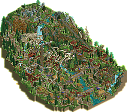
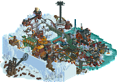
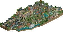
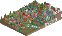
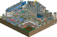
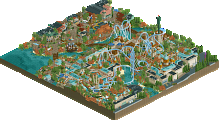
For me it came down to atmosphere. Voted The Good Death.
Both parks are brilliant for the limited time given and the technical level is amazing.
I guess a readme would have helped both parks.
This was a close call for me.
Overall I think Drowned was just a tiny bit better.
I agree with Magnus about the readme though.
What a nail biter though... great work to both teams!
Going to try and write my thoughts down. Overall two great parks, although as others have said a readme file for both would really have helpd.
Drowned:
Buildings are fantastic in both quality and variety, there's just so much to explore and it does a fantastic job with the post-apocalyptic feel. (I love how one of the cabins from the wheel is removed and repurposed elsewhere.) The fade effect the the edges was a nice touch as well. The launched suspended swinging coaster is an interesting concept with an interesting layout, and the lifeboat water coaster is really well done, another great concept.
I will say that this park was kind of overwhelming and a bit hard to read, although it got easier as I looked at the park more.
The Good Death:
I love the landscaping, terrain and overall shape of this map, and the skeleton fits well into the surroundings, and the atmosphere/feel is very well done throughout. The wooden coaster is amazing, with fantastic use of the terrain and interaction with the surroundings, and the steel coaster is great as well with some great support work. I do think the park could have used a 3rd roof type mixed in around the town, but that might just be me.
Also I usually have my sound on when reviewing, so the bumper cars music was kind of jarring as others have said.
The Good Death I felt a strong resemblance between it and H2H8's Heaven's R1 park, which was neat. I liked the grandiose landscaping, it really helped sell the mystic theme (alongside the giant skeleton of course). Good macro with some good foliage and the mystic element makes it feel like it's celebrating Legend of Zelda: Breath of the Wild.
Drowned was also interesting, a kind of England-become-Venice. Despite also being quite good, it didn't catch my attention the same way The Good Death did. There was lots of neat little details; I thought the museum swimming pool was a funny touch, but after living through one apocalypse, another just doesn't catch my interest the same way.
I voted for The Good Death, although this was a very close call. I'll say why after the results come in.
Insanely tough vote. I ended up going with Drowned. Both of these maps kind of perfectly made up for what I felt the other lacked, which made the call incredibly tough.
With Drowned, I initially felt a bit lost, as the macro composition sort of tosses me in and leaves me with no clear direction to go, or distinctions between any of the areas. Once I broke past that though, I found an abundance of high quality architecture, atmospheric details and ideas, and creative object usage. I was immersed in looking at the facades of buildings, imagining the feeling of walking roof to roof on these shoddy, rusted bridges. The different buildings were cool and the lifeboat coaster's integration with the water was sick. Details like the overgrown foliage, invasive wildlife, and purposeful textures really sold me on the feeling of this world. Again though, it's that barrier to entry getting through an unremarkable macro that makes it hard to enter, and hard to bask in holistically when once again zooming out from the details.
The Good Death is much more digestible on first glance, with the seriously cool ribcage and skeleton. The skull part I think could've been executed a bit better, as it took me a bit to piece out just exactly what it was at first. Zooming out to see the tomb-like landscape, protruding hand, and have all of it click, that was a seriously satisfying moment. The woodie is a beaut. My big issue was that, once past this, there wasn't enough to keep me there for long. The foliage and architecture are just too indistinct from each other, and outside of the coaster, there wasn't enough to keep me feeling like I needed to see more. Once I zoomed out, there wasn't much making me feel like I just needed to zoom back in.
Both have their good moments and made up for what the other lacked in such a perfect way that had me thinking on this matchup for a long time. Both had cool and relatively straightforward concepts that were executed cleanly but without any bold risks taken; neither map seemed to leave any kind of comfort zone or push any boundaries. Ultimately, the atmospheric, immersive micro and concept of Drowned was just good enough for me to weigh it over the sharp macro of Good Death. I think if Good Death's micro had been just a little more diverse and captivating, or if the areas had not been so homogenized over the whole map, it would've been enough for me to put it over its competition. Vice versa, if Drowned had just a bit more emphasis on macro, or was given something to make its universe feel more purposeful and with direction, the choice would've been easier.
As a final remark, I appreciate Logan's Run specifically for not including a readme to explain the story. I respect that call, as an entry like this is better left shown than told, and not indulging in exposition only served to immerse me more in the map itself. Shoutouts dodgems theme
This is a hard one. The Good Death is a shining example of fine RCT2. I love the ride designs and the huge skeleton that makes up the framework of the park. It's the better looking of the two parks IMO, but Drowned is just so so so creative. That little shanty village at the southeastern corner of the map is one of my favorite parts of the map for sure. That janky, cobbled together appearance is so chaotic yet just makes so much sense. I think I have to give this one to the Scream Queens.
What a way to start off H2H. Christ these parks are great.
The Good Death
Absolutely loved it. Macro focus is spot on. The missing legs aren't an issue to me. Pretty easy to infer that they're buried. Unique theme, lovely execution. Some of the landscaping looked a bit rushed at times - but thats how it goes!
Some highlights:
The water cascading through the eye is gorgeous. Love how the bone fades into the waterfall and the holes on top of the skull allow for the falls to be seen throughout. That said - the waterfall itself could have used some love. A little too blocky I think.
This whole scene is just beautiful. The hand, the freefall ride, the scaffolding, the little path under the lift. Just perfect.
Great sightline here. Excellent little entryway to the park. Diagonal coaster hill really shines.
These supports are so cool.
Couldn't ask for better coaster interaction! Great moment on the map.
Found the good boy.
Drowned
Another incredible map. I think you guys really committed to this concept and it paid off. While the overview macro isn't as strong as Good Death, I do think that you guys succeeded in getting some good composition in when it came to specific areas and buildings. Was really impressed with the theme consistency throughout. The awnings, the shipping containers, the cranes. Love it. And not to mention the individual buildings themselves are just so well thought out and designed.
Some highlights:
Crane ride is sweet! Great concept and execution.
Just such a good moment. Am always biased towards the flamingos.
The repetition with the pillars in this structure really make it work. Repeating structural forms and details can really do a lot of good. The torn up awning is so cool. Especially with the metal bars up top. The various sheet metal bridge is a fun detail as well.
This is insane. My favorite thing on the map. The detail of this church building is nasty. But the metal station structure is simply the best. I love this sort of building style. Again - repetitive forms in architecture are heavily considered and executed so well. Someone on this team must be an architect ;0
I thought this little corner with the museum pool was great. The bright orange construction fence and green trailer are my favorite details here.
What a cool moment. The busted skylight structure, the boats going into the mall, the trees in the middle. I really love how you can see the "shoppers" from the back angle.
Huge fan of these supports. Honestly this little section as a whole is just so cool. Well balanced. I like the market behind it!
All in all, this is an incredibly close match for me. Theres so much to love in both parks. My mind changed several times while viewing these parks haha. But in the end I had to go with my gut and vote A Good Death. While I lingered for a long time on Drowning, AGD just resonated with me more. I feel bad voting against such a great park - but in the end it all came down to which one felt right to me. Again, what an incredible start to the contest. Makes me nervous for future rounds!
Josh
Enjoyed both, voted for one of them. Hand vs. Awnings. Ribs vs. submerged archy. Slightly elevated perception for one vs. other.
Congrats to both squads...and seeing eventually who built (the reveal of who has always been favorite part...and the guesses)
So exciting to finally see some of what's been cooking the last few weeks! Pretty darn good stuff on both ends.
Drowned
Ok, so I'll admit I was not initially wowed by this. As the concept is clear pretty much from the second you open it, I was kind of underwhelmed that it was about a place being underwater. The idea just doesn't feel very original, and almost has an off-the-shelf feel to it. I was of course impressed by the details already on the first viewing and the rides are fun. BUT, on a second viewing, I started to appreciate it more, as I could put my initial reactions a bit to the side and focus on all the little great details everywhere. Archy in general is very pretty and impressively varied. The ferris wheel is obviously very cool and a great signature feature. And looking at it closer, it does sell the theme better than I had noticed at first. Plus, my fade wall features heavily, so an obvious winner! Haha, maybe not...
The Good Death
I think for me, this matchup might come down to this: Drowned is most likely one of the best if not the best take on "flooded city" we've seen. The Good Death is the best (and, I think, only) take on "Giant fucking skeleton of a fucking giant buried in a mysterious valley" that we've ever seen. The latter concept is clearly the more interesting. I agree on the points made about the archy being a little samey, and the style does maybe not fit the theme the best. But it has such an interesting, enigmatic atmosphere anyway. I know for sure I'd have more fun building on this park than Drowned, especially if I got to work on that skeleton. On top of that the woodie is great and beautifully integrated into the landscape and the skeletal remains. A hip bone protruding out somewhere toward the bottom of the map would have been nice, and maybe some refinement on the top waterfall which looks a tad blocky and abrupt without much water movement until the very edge, but other than that, a park of very high caliber both idea-wise and execution wise. I thought it was the clear winner at first, but seeing as I started holding Drowned in higher esteem after spending some more time with it, it's actually with a really thin margin I'm voting TGD.
Great job both teams!
Lovely first match. Both great H2H parks in the sense that they're lovely takes on what are pretty boldly not-real-themepark ideas for NE meta, concept-driven, built for meta wow moment showcases.
My vote went to Drowned with a moderate margin.
I loved the verticality and exploration of Good Death, but there was more to explore for me in Drowned. I liked the use of open space and naturalistic landscape in Good Death, but found the same more varied and exciting in Drowned. Drowned has some fantastic interplay of the old world - new world that I think was missing from Good Death. The museum pool is such rich environmental storytelling. Good Death has similar moments with the hand, the eye socket, the cathedral ruins and the cages - but Drowned is a map made for those moments and it delivers.
Moreover, the longer I spent with Good Death the more some minor annoyances ticked up - the dodgems are playing dodgem music, the buildings feel too similar, the bright green bushes started to bug me as not really fitting the rest of the foliage, the launched coaster right into the tight helix reminds me of the time I hurt my neck on Italian Job. As usual with H2H I'm sorry that parks have to be compared, since I enjoyed them both and would rate them as great viewing experiences, but se la vie.
Drowned.
good death-- lovely and so smooth. almost, maybe, too smooth- the colors are so grounded and earthy that it almost becomes a bit of a mush. regardless, there's a lot to love. the huge skeleton is a great setpiece to pull together the park theme a tiny bit, especially with the hand at the bottom of the drop. the archy and landscaping is nice, if a bit lost in a big blend. good witchy vibes, reminds me a whole lot of the work on dr dirts big civilization competition map. did you mean to have the dodgems music going? sorta kills the vibe imo
drowned-- wow, i really adore this park. its absolutely bursting with ideas and creativity and i spent so long wandering around looking at things, way longer than I usually do. the mall with the broken dome and the shopping trip was a highlight, but all of the architecture was fantastic, even without the extra layer of theme. the shipping containers, crazy nets and awnings, foliage growing out of bulidings, subway cars-- all of it is just awesome. the ship which crashed into the buildings was sweet. i wouldn't say the composition does much for me, as i couldn't even find the park entrance, but honestly in the end the details and life and fun here stole the show for me, and made this an easy decision.
both of these parks are so unexpected but really refreshing and interesting. can't wait to see more!
I echo this.
Really tough vote for me, but I ended up voting for Drowned
Good death is super atmospheric and I think it takes the edge in terms of ride design and coaster layouts, really loved the flow of the wooden coaster and its interaction with the skeleton. The little interaction between the two coasters was cool too and the elevator and ritual flats were great. The hand of the skeleton was brilliant, the rings are such an awesome touch. Apart from those highlights, I felt like I had seen most of it before, and the architecture felt a littley samey throughout. While the atmosphere was lovely, for me it wasn't as memorable as the more original and fresh aesthetic of Drowned.
The opening scene of drowned with the submerged london eye was awesome. All the emergency/impromptu houses on top of the buildings were really cool, especially around the big ben/palace. While hard to read in some places, I really loved them (especially the house utilizing a london eye car, brilliant). The coasters were cool, not completely memorable, but some nice moments like the dip into the water. I think the park would have greatly benefitted from a bit more verticality, which could have been some taller/bigger impromptu structures, or an extra one or two floors above water from the old part of london. The big ben tangled up in vines was by far my favourite moment of the map, and it left me wanting to see a bit more of that old city.
All in all, i just found myself coming back to drowned more, and I found new and exciting details every time i opened it. I really like the Good death, but Drowned happened to captivate and impress me a bit more in the end.
Good effort from both teams! Looking forward to seeing what else you all have in store
Definitely a tight match. My reviews, and some modest dialogue because maybe we don’t have enough of that.
Logan’s Run - The Good Death
First of all, that skeleton is gorgeous. This is a giant sculpture done right. That hand? Doing a good looking sculpture is one thing, making the anatomy look good is another. And then to use it in a functional way, and add a layer of good details like the rings… Masterful! The coaster here, The Moss, is also fantastic. The other coaster I didn’t care for much, it’s there. I guess that also goes for most the architecture on the map, it’s a little underwhelming and subpar. Maybe the map should’ve been less architecture and more landscaping? You clearly had no issue with the landscaping, because that too is great. Another point of criticism would be the overall concept. I feel like I’m missing something. All the stuff on the map is trying to paint a narrative I think, but I can’t figure it out. To end on some positive notes, I’ll highlight some details that I think were great: the texturing on the skull, the rings, the summoned ghost, the stained glass in the window on the hill, and the winch system for the conveyor. Lastly, also props for making a map like this - not a content overload, but a nice impression.
Would you actually say it's lacking execution? To me it seems to be by design that it's not super clear zoomed in. Like you said, the piecing out what it is and then getting a satisfying reveal is what makes this. I don't think the skull could've been done significantly better. Thought it had great, appropriate texturing.
 I’ll wrap it up with some loose thoughts. Great archy. I’m not sure why the suspended is called Deliveroo. Did you literally theme/name the main ride in a post-apocalyptic London to a food delivery service? For H2H I think this park has the perfect amount of content. Enough to allow for some exploration and gradually discovering more and more ideas, but not so much that it’s overbearing. Great park all around!
Scream Queens - Drowned
This is definitely not a cliche concept, but it’s not exactly far fetched. I think you did really well at selling this concept though, and there was a lot of originality in the execution. What I love is that took a kind of bleak looking city and made it colourful and pleasant. The melancholy that comes with a destroyed metropolis juxtaposed with a seemingly utopian post-apocalyptic society full of optimism and opportunism. Visually, the motifs of corrugated iron, tattered tarps, bright colours and lush foliage is very strong. What I like conceptually is that you changed the London setting in two ways: 1) you raised the sea level, and 2) you shifted the climate. Maybe a bit too lush, tropical is a bit excessive, but I can easily suspend my disbelief and just appreciate the climate shift itself. It’s not too obviously done, it’s mostly the flamingoes that give it away - and the flamingoes are more appropriate, being subtropical birds. A plot hole seems to be that the sea level rise appears to have been catastrophic rather than gradual. All the glass seems to be in tact. I can believe that the roofs have been repaired because that’s still in use, but below the water? And a submerged store still having stuff on the shelves and dressed up mannequins? I guess if you figured out how to sell the narrative of a gradual sea level rise, the end result would not have been as striking. A lot of words for a nitpick, let’s leave it at that.
Why though? When you watch a movie or read a book, would you want the whole context to be explained and spoonfed to you in a Star Wars-esque crawl? I think The Good Death's puzzle was incomplete, but for Drowned... It was pretty obvious what was going on and you clearly figured it out on your own too. Why the strong wish for a readme? What would it achieve?
--------------------------------
I think The Good Death has the best element in the match - the skeleton. I value strong aesthetic identities, and Drowned is the clear winner in that regard. Overall I think Drowned is the better park too, but The Good Death is also lovely. Great first match. And like I said for both parks, I appreciated the amount of content in both. It’s digestible! That’s what I wanted from this H2H.
At this point, I'm finding it difficult to leave a review without echoing what has already been said, but I'll share my thoughts anyway:
The Good Death
+ The skeleton set piece is striking yet still very well integrated into the map as a whole. It works on both macro and micro levels
+That woodie (The Moss) is the best coaster in the matchup by a healthy margin
- The architecture moves past cohesive and into repetitive.
Drowned
+ More and more details emerge the longer I explore
+ Beautiful contrasting architecture. My favorite is the building with the glass dome exploding with plant life.
- Some of the nicest details are partially or entirely obscured by density of the foliage and architecture. The way the water coaster moves through holes in the ship for example.
The creators can be proud of both parks.
Drowned: The concept is incredible, the details are amazing and the glass under the helix is killer. The details all over this map are mesmerising, and yet, these details seem to fade a little in the bigger picture.
.. The Good Death: Much more simplistic. Back to basic. I went through the map rather quickly, as opposed to my experience with Drowned. Everything works really well here, as multiple people already said, the skeleton is amazing, and I am a sucker for sculptures. The park - and coaster layouts are on point, as well as the naturalistic vibe I get when looking at the foliage and landscaping.
This is my first time voting and the feeling I got when looking at both parks: TGD really got to me in the end, so my vote would have been:
TGD-Logan's Run