Park / Crimson Mountain Park
-
 06-May 21
- Views 1,980
- Downloads 402
- Fans 1
- Comments 5
-
 66.00%(required: 65%)
 Design

geewhzz 75% In:Cities 75% Scoop 70% Xtreme97 70% chorkiel 65% Louis! 65% robbie92 65% saxman1089 65% WhosLeon 65% posix 60% RWE 60% Cocoa 55% 66.00% -
 Description
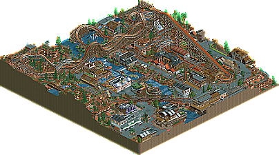
A segment of the much larger park, this section of the park is home to the new Timberbeast RMC coaster. This (pre RMC track) coaster is a fast paced thrill ride for those adventure seekers. Numerous complimentary rides provide excellent guest interaction with the coaster. Enjoy!
-
1 fan
 Fans of this park
-
 Download Park
402
-
 Objects
304
-
 Tags
Tags
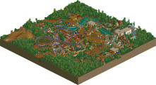
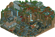
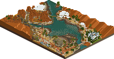
I was a really big fan of this park. First of all, the layout was really great and flowy, and was elevated by such an interesting first element. The setting of the big waterfall flowing through the middle of the park really is amazing as well. It sets the ground really wonderfully for everything else in the park. The theme seems very strong throughout, I also appreciate your fresh use of objects and your non-reliance on trackatecture. The archy was pretty strong everywhere and the supporting rides were all great.
My only real gripes were small things like atvs running peepless and the fact that the river rapids kind of just teleports back to the station underground.
In full, This 100% deserves to be a design. All I can say is I am very happy to have you on my H2H team
RaunchyRussell Offline
Lovely park you have here! I really enjoyed the layout, and was surprised on how much i liked the first drop. Very unique approach. The surrounding archy was great and loved all the points of interaction. Nice to see a throw back pre-RMC coaster track. I think this still stands up quite nicely to the new track we have now.
yooooo! This was one of my favorite entries of all time! I love the layout, the supports and the colors on the coaster. Absolutely fantastic. This archy was such an inspiration for months and months after. (you can see several of these buildings in my younger entries haha). This is also one of the best use of WW and TT objects imo.
This park is absolutely incredible! I had to keep reminding myself I was looking at NCSO. The landscaping and building shapes all work so well together, with the cataract and rapids roaring through the town. I think this is definitely one of the best uses I've ever seen of the notoriously tricky to integrate WW canyon wall pieces. The colour palette you used is also perfect; A really satisfying mix of the deeper, richer browns, red, and black, alongside the bright orange, white, and blue highlights. I can tell that you spent a long time moving elements around to ensure they fit exactly into the compact footprint of the park.
All in all, a real gem that definitely deserves more praise and attention. Kudos!
not bad. its hard not to compare it to the wealth of ncso designs/parks out there that are very similar in style and construction. its definitely good but there's just a lot of textures everywhere and I find it hard to read in places, and compositionally a bit blocky. highlight for me would be the monster trucks- love a good old school adventure ride