Park / Cocoa's DisneySea
-
 22-April 21
- Views 5,160
- Downloads 655
- Fans 7
- Comments 16
-

-
 88.75%(required: 80%)
 Spotlight

chorkiel 90% yes CoasterCreator9 90% yes Milo 90% yes posix 90% yes robbie92 90% yes RWE 90% yes Xtreme97 90% yes bigshootergill 85% yes ][ntamin22 85% yes Scoop 75% no 88.75% 90.00% -
 Description
It's not perfect, but it's finished. Thanks to my testers (Rob, Pos, & Liam), and to all those who have given me feedback over the last 4 years, especially the Strangelove discord, even when I didn't listen to you.
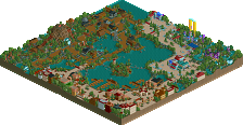
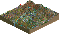
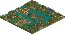
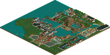
Welcome to DisneySea -- featuring Mediterranean Harbour, Pleasure Island, Mowgli's Jungle, Lost River Delta, Arabian Coast, Mysterious Island, and Mermaid Lagoon. It's enough to keep you obsessed forever...
(I recommend you water the gardens sometimes and make the rides reliable...)
Thanks for everything. I love you all. And- of course- LLLL -
7 fans
 Fans of this park
-
 Full-Size Map 1
-
 Download Park
655
-
 Tags
Tags
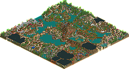
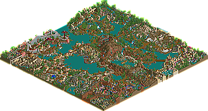
Bringing over my Discord announcement:
congratulations Cocoa! overview looks incred. I really want to get LL working to see this ingame, hopefully I can get it sorted soon.
Will leave a more elaborate comment later, but for now let's stick with a:
Damn! That's good. Congratulations and thank you.
I will also come back with a more thorough comment, but I am glad I came back to this site at the right time to be able to see this release. Cocoa, this is inspirational.
DisneySea is just such an amazing setting; always fascinating subject matter. I think you've pulled off a wonderful rendition of that majestic and mysterious atmosphere.
My favorite area is Mysterious Island, but I'm very biased toward that theme - always been a fan of the...well...mysterious air about it. Such a cool setting with all the unique architectural features hidden within the caldera, the launch facilities, and Journey itself looks like a terrifically fun ride to tie the area together. 20,000 Leagues is my favorite ride in the park; a unique yet faithful rendition of a fascinating ride in reality. Everyone should take a look at it in the roofless version; it's awesome.
Another significant highlight for me is Mermaid Lagoon; such a cool tucked away area. It has a feeling of something I'd wander into in an actual Disney park, but with that LL charm to it - super cool and very well themed.
It's almost impossible for me to find anything not to like here - the foliage, the architecture, the macro composition - as expected from you, it's all tied together so well. You've been at this level for a long time, and we're now finally seeing it in a larger scale solo. It's awesome.
Obviously, the nautical features (read: ships) are great. The diagonal galleon and the Nautilus are big highlights for me. I might have liked to see even more waterfront features, but you've struck a nice balance which is crucial.
I'm so glad to finally see this completed, and very excited to see another extremely high quality LL release. Great job man; I would expect nothing less from my former H2H8 teammate - 90%/Yes
The landscaping. The colors. The distinctly themed areas that all feel interconnected. The details in each of the areas. Absolutely spectacular. Wow.
Choo Choo, all aboard the hype paddle-steamer. Probably my most anticipated release of the past two years? Spoilers: it's good. It's flawed, but it's really, really good.
1/2 (Areas from entry, clockwise)
We open with the gorgeous entry plaza, of course. I think this is a superb neo-classical NE type of thing – easily falls in line with fatha and nate and pyro with just a hint of codex-era icing on the cake. Aside from that, no hotel, and a compact monorail and entry, sets the tone pretty well for this less sprawling version of MEDITERRANEAN HARBOR.
The opening vista of the harbor is stunning and absolutely a great interpretation of Tokyo, doesn't lose anything for the fact that it's pixelated down to LL resolution and squished into a smaller map than most people would do the tokyo disney sea monorail station on.
The martian dome and the portcullis gates on the explorer's fortress are lovely. The 'tallboat' is absolutely superb – the gun deck is brilliant - though I wish it were named or had some sort of shop/ride activity to give some additional character. I don't really understand what Soarin' is doing here; slapping the 3D dome down in the middle of the fortress feels like a missed opportunity.
The split-level color scheme works really nicely here with the rock>grey castle>tan castle>yellow stucco gradient pulling the eye nicely up to the main tower.
FLYING MACHINE is a great organic expansion of the med harbor. Clever setpiece details with the waterwheel, ghost train tunnel shaft, and just the way it's nestled mostly out of view but has it's own rich queue and ride experience - it feels appropriately disney. Family invert is a great choice as well, high throughput with the long trains and just enough thrill. GEPETTOs on the other side of the harbor .. I like as an idea, and the overall framing of being nestled into a kind of backstreet nook – aces. I think it could have used a facade or a little less clutter, sort of hard to read what's happening exactly back there. The venetian gondolas are a little sad to see stuffed down under the main path, and with no canals to glide through - but I appreciate them being included. The theater by the gondolas is fantastic, a really unique layout that is visually interesting without overcomplicating the trackitecture and still feeling functional. I wish the entertainers were named to let me know what was going on with the show here.
SORCERER'S APPRENTICE is completely great. Doing a park like this, choosing to do interiors is a big decision and one you have to commit to to make it work – for a disney park I think it's the right choice, since there's so much reliance on tracked / dark rides outside of the typical coaster-heavy NE paradigm to sell a disney concept. Sorcerer's is a lovely pairing of ride system and concept, a little reverser trick with the magic wand. Love the enchanted broomsticks and especially the planetarium gallery ending with the walkway / exit overlooking.
I really appreciate the 'standardized' boat docks and how they're integrated. Thats the kind of detail that pulls something up to disney-tier theme and park design IMO – but could be even better if they were sliiiightly more customized to their areas. Color coded walkways, barrel bouys, luggage on the dock, scrolling banners with 'welcome to' messages.
PLEASURE ISLAND is … ambitious. The PARACHUTE JUMP is jaw-droppingly good. Simple construction with just the right objects. The ironwork? Lamplight? 'beams' contouring the area are very clever and a superb trick to break up the rigid sawtooth diagonal paths. PLEASURE ISLAND SCREAMIN is a surprisingly tight layout for being a map-edge special, and the overall concept of a boardwalk park fits in pretty nicely with the overall “DisneySea Re-Imagined” approach – it's just .. aesthetically, not good. The STROMBOLI SLIDE – Screamin' queue looks like a Blitz megapark. The pink and green and the bare stalls / entry-exit tents are bold, but they just don't work in a disney setting where you can't do the nuance of imagineering's exceptional characterization. It clashes with the rest of the map style-wise, where everything is functionality-hidden and aesthetic-driven. If we're honest, the funfair-boardwalk areas are the weakest areas of IRL disney parks already; the Pinocchio connection is an interesting thought for a unique take, but it's hard to say it makes a good area squished into the corner and with a relatively minimalist approach to hacks cutting out the options of inventive new tetxures or colors to at least help deliver it aesthetically where LL can't communicate content.
I do appreciate the cablecar being added in to help alleviate this dead-end of the path layout, and that takes us to .. JUNGLE BOOK? INDIA? FRESH PAPAYA SALADLAND. Holy hell is this slick. The raised brick/sand temple ruins are perfectly evocative for LL. I love the treehouse and the little theater and how they're seamlessly integrated into the surrounding waterways and path so it feels like a continuous discovery. The hedgefence spam – I wasn't sure about it at first. It feels okay as a solution, but I think something more elegant than absolutely slathering the back of the park in the same bushes & hedgefence would been better. The little blue gated fence at the queue entry to BALOOS BIG RIVER RAPIDS is fantastic. The jungle village is a great vignette, just small enough and just enough variation to make it feel rustic and not overworked. The canoes with the ladder down to them and the way PRICKLY PEAR is embedded are delightful. Overall the waterslide logs – and hot damn that dive machine tree root – along with the minetrain leaf canopy are so smooth it barely feels like trackitecture. Top marks, and it's great to see the entertainers as disney characters here – definitely missing from the entry areas.
LAUNCH FACILITY B is great. Extremely creative and IMHO it feels like a perfectly DisneySea addition. Not a lot more to say on it other than v cool and good job nestling this little burst of extra creativity in there.
THE AMAZON. God lord almighty that biplane is soooo good. 10/10 for sure. Mysteries of the Amazon is very pretty laced through the areas and along the double-decker bridge, but it feels like a bit of a nothing ride with no dis IP associated and no visible storytelling otherwise. I also think borrowing the waterslide log from India for a few turn supports or extra thematic scenery after the big drop wouldn't have been out of place. Not that I care, because the area is clearly completely stolen by INDIANA JONES and the TEMPLE of DOOM. Ohh, this is masterpiece. The play and combination of the IRL Indy rides, the way the loop is actually the surprise finish, the lift and drop out of the temple – it's all sick. Couldn't ask for more. Perfect windup and delivery of a fantastic RCT concept that makes you want to experience that ride. This feels much more like a direct reference from Tokyo in terms of path layout, area scaling, etc – I think this works really, really well.
ARABIAN COAST has too many poplars. It's kind of weird and – as much as it might actually fit a real sun-drenched, olive tree lined landscape, it doesn't match the visual preconceptions of an Aladdin theme, disney sea's arabian setting, or offer enough visual distinction from the front of the park. Outside of that? Love this area. The path and coaster are fully intertwined in a way that feels super organic. The ship is sick. I like the vibrant bobsled canopy but I think the amount of green already in the area and the splashy magenta-blue track takes away from them. MAGIC CARPET is again a fantastic fit for the big-on-ride-experience, middling-on-thrill Disney footprint, and although it's a bit of a stretch for it to be bare coaster track so prominently out in the area I can buy it here. Great take on aquatopia with MA'AN TOPIA; all the viewing area and that station landing is excellent. I totally understand the desire to present a vibrant, earthy eco-park version of the Levant instead of a stereotype of a condescendingly camel-infested sandpit – but I wish the angle here was that the lush greenery were secreted back in the secondary path areas or in a palace garden.
MYSTERIOUS ISLAND!! Very faithful and recognizable, and easily the best LL (or probably any game) NE has seen. The ironwork supports are just next-level, super clean and just as much as needed with no more. I can definitely say I'd have tried to hack in three extra layers of nonsense here and it would have added nothing. JOURNEY and 20,000 LEAGUES are really nicely handled as well and solidify the really nice treatment so far park-wide of these dark ride interiors. I love the double-lobed pumpkin kraken, that's genius – lumpy nautilus is also fantastic IMO. This is one of the areas that sticks closest to the original TDS blueprint and that's good mostly but it does carry a few minor letdowns. As my girlfriend put it, viewing over my shoulder: “Hey, that's Disney Sea! I've been there! I've been in that souvenir shop!!” – and then neither of us could remember what it was called, so I went looking for a shop in-game and .. there isn't one. There's a sign nearby for Vulcania, but we knew that was the restaurant we ate at, and we also knew Vulcania wasn't the quick-service at water level below the gift shop. Basically – I've been to TDS, and so for me this area put a grin on my face (and my girlfriend's face) but if we didn't already have the context of what these structures are and how we felt being there and the leftover dopamine from that, I'm not sure I'd find enough in the map by itself to generate a rich mental model of the park. Nothing tells me that's a gift shop in game in Cocoa disneysea vs Tokyo disneysea; I'm not sure if it's intended to be a gift shop or a restaurant in this version. The exact same thing happened a few seconds later – I moused over the CURRY POPCORN stall and my face lit up. But if I didn't know the deal with tokyo disney popcorn, I wouldn't have gotten excited – and because I did, I immediately rushed to start looking for the other half-dozen flavors of popcorn in different booths around the map. And .. well, there's one in Paradise Island, but that's it. It's a little bittersweet to find CocoaDisneySea walking this line of fiction and nonfiction and not quite giving me enough material to work with to absolutely sink into either side. Sure does look nice though.
I was hoping things would finish on a high note with MERMAID LAGOON? ATLANTIS? They absolutely do. I held off knowing in advance what this was, so it was a big relief saving it for last and loading up the roofless version to a home run. The outside is perfect, with the martian rock and the sunken-relative-to-path attractions perfectly achieving the slightly alien feel they do in Tokyo. Just enough landscaping difference to set it apart. I really dig the junior coaster as a riff on Scuttle's. The extra loop of EXEDITION ATLANTIS around the interior area is a great surprise with the roof reveal, and I've already mentioned multiple times how the ride choices really nail the disney design ethos. As for that interior – is it a mess? Yes. But I think it juuust about comes together enough to get the idea even if you're not familiar with the Tokyo rendition. Interesting choice to restrict the jungle plants to this sub-area despite having Indian and Amazonian jungles to contend with. All of the mini-attractions here are just perfectly peachy scaled to RCT flats, and those vanilla LL elements are so much nicer here than over in pleasure island. The theater is great, easy to understand despite being really slammed into the footprint and restricted by the raised land on several angles, and THE LITTLE MERMAID ADVENTURE is easily the best dark ride of the map. The story beats are so clear – maybe it's because we've all seen a half-dozen little mermaid rides at this point, but KISSING BOAT and EVIL URSULA are all you really need to see and it clicks. Perfect use of the corner real estate.
And so, here we are, circle complete. This is a hell of a map. Huge variety of themes, all full-bore efforts with a truly commendable amount of originality. If you were to tell me someone did a classic NE semi-realism LL park with a Mediterranean village, a volcano, an arabian area, a jungle, and a meso-american pyramid – I don't think I would expect it to be this wild and unique and fresh. It's a magical one to view. I winged a bit about the slight friction between Real DisneySea and Fake Australian Videogame DisneySea above, true. I think the areas hewing closest to the Disney bone are the best, but not necessarily because the strength is in recreationsim. Those areas I have mental blanks filled in for, and there's already plenty of character in my head to supply detail where the in-game is unfortunately lacking – which is almost everywhere. I can tell I'm being helped along by nostalgia goggles when looking at cocoa disneysea and I kind of wish I didn't have to be. There's still a hundred ride slots left to use here – for god's sake, give me more popcorn stalls. Give me lame disney names for souvenir places. Even if there's no in-game detail that this particular style of LL can really offer to explain what Magellan's is, at least let slap a stall in there and name it Magellan's to let me juice up on the japan trip memories I can't recreate until they re-open international flights. I mean – this is a disney park without so much as a mouse-ear motif anywhere. No Mickey entertainer. (Worse still, no ][22 entertainer, somebody make that guy a parkmaker already) It has to deliver on the richness of disney lore almost more so because it intends to build a disney-level experience without leaning on the IPs as much.
The good news is, I do think it still feels like a disney-level experience to view. This has style, it has atmosphere, and it has the kind of 'chefs kiss' park planning and ride design qualities that transcend the visual filter you choose to build with (LL, NCSO, CSO, Table With Umbrella). The attractions make me smile and I can picture them in a disney setting. The view from the park entry across to that incredible ship and the volcano is so astonishing it would wow me even if it had no real-life precedent. The way the rides are semi-hidden, totally enveloped by their context, is spot on. The creative liberties and original expansion areas are seamless and feel like they belong – even, ironically, Paradise Island's below-par funfair. I think if I compare it to the pantheon of recent(ish) LL superparks, I won't be coming back to this for the endless clever tricks or out-of-the-box thinking, and probably not the layouts or to find microdetails buried another three hours of digging in, but I'll be coming here for the thematic integration of a total area. That's what it excels at and what I'd hope to emulate.
Wow, great work cocoa...
The nautilus sub is awesome.
This park warrants a somewhat long review. I'll just write about some things that stood out to me in particular.
The entrance area was really dense but also very legible. I also really enjoyed how nostalgic it felt in terms of architecture and colors.
Atlantis - and particularly its indoor part - also really stood out to me. Also very dense, and full of different objects but they all come together nicely to convey the theme. It was immediately clear to me what the theme was.
Another area that I particularly enjoyed was the Jungle Book area. It's pretty big for an area that only consists of one ride (and a flat). Yet I could totally imagine walking around and being flabbergasted by the plants and structures.
Some smaller things:
The start of the 20,000 leagues queue looks terrific. Same for the temple of dooms exterior - particularly the drop from the waterfall. Lastly, that boat.
I'll surely open this park from time to time and discover new things that I enjoy. Overall the atmosphere and ride design stood out to me.
Easy spotlight vote. Debating on the score.
Thanks again!
thanks everyone for the kind words and votes. LL has always been kind to me- wild west first got me a parkmaker spot, and this ended up with a spotlight. its a weird time both in my life and in the current chaos of h2h9, but getting a spotlight was a childhood dream of mine from the days when I first stumbled on this website. only took me 14 years to get my act together! definitely a strange feeling to wake up this morning and rub the sleep out of my eyes to a shiny yellow star.
big thanks to posix for all the release prep and to ][22 for the beautiful, 2002-era logo.
<3
Big congrats cocoa! Well deserved Spotlight.
Your park really brought back that nostalgic old NE Spotlight feel. Love you also did interiors as that's typically a Disney thing.
Awesome details all around the map, and it will take a time to fully absorb all of them.
Best thing about the park is the atmosphere; Of all the past Disney (LL) Spotlights yours really created this Disney atmosphere with all the little decorations and theming.
Again, thanks for this gem of a park!
Congrats Cocoa, well deserved.
I am so mad cause I had some ideas that you used in this park that i was thinking of using in my next park, good stuff!
Finally getting around to seeing this in game. Incredible work dude, really something to be proud of here. I think one thing your work always has is this sense of drama. Big cliffs, big landscaping, intense atmosphere. Even when comparing this to RCT2, the immersion is quite impressive.
It's hard to pick one area that I enjoy the most. Traversing the park, each area was unique and fully fleshed out. Starting with the entrance area, the flowy trackitecture was a great callback to old LL style. Starting with the Pleasure Island area, I see where ][ntamin22 is coming from, but I think the coaster and the parachute drop rides more than make up for it. This fair area would probably be where Disney went low budget.
Mysterious Island was easily the best adaptation of this theme we've seen in rct. I think we got a teaser of this from you with DisneyPunk, but seeing it in a DisneySea park was even better. The use of various track pieces to make rooves, overhangs, supports worked well here.
The Arabian area to me is worth mentioning as well. The boat was so cool with the little hints of color. The entire area was bright, colorful, and lively. Was a nice change of pace after looking at all the jungle vibes with the Jungle Book and Indiana Jones area.
Speaking of which, the Indy and the Temple of Doom along with the Mystery of the Amazon rides/queues were so well integrated into the landscape/theming. Top notch. "Thematic integration" is a great way of putting it, ][ntamin.. and it's rare to see it done so well in almost ever single area of this park.
If I had the chance, this would be 95 for me. Hard to top this. Maybe if I was a named entertainer I would say 95/100 :P