Park / Wanakawri
-
 22-April 21
- Views 2,564
- Downloads 473
- Fans 3
- Comments 9
-
 72.50%(required: 65%)
 Design

In:Cities 80% Jappy 80% Liampie 80% posix 75% RWE 75% Xtreme97 75% CoasterCreator9 70% G Force 70% saxman1089 70% chorkiel 65% Scoop 65% Cocoa 60% 72.50% -
 Description
A monument of a coaster awaits you…
-
3 fans
 Fans of this park
-
 Full-Size Map
-
 Download Park
473
-
 Objects
455
-
 Tags
Tags

![park_3126 [MM2014 R1] Machu Picchu - The Journey](https://www.nedesigns.com/uploads/parks/3126/aerialt2710.png)
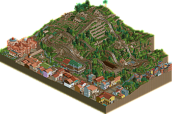
I hope people wont overlook this because of H2H. Its an awesome little design. The landscaping and detailing with the ruins is perfectly executed. I also am a huge fan of the architecture, really liking your usage of color here.
I think whats holding this back a bit is the composition of things. Would have loved to see a bit more room for stuff to breath in general and a bit more organic shaping. Buildings, paths and coaster station being one straight line at the map edge wasnt a good call i think, could have been broken up a bit and the building backs could have been handled better in my opinion.
The actual coaster of this is good. I like the uniqueness of the layout. Although i maybe would have liked some more interaction with the town, following the train around was a very fun experience.
All in all a solid design for me and a good release you can be proud of. Excited to see what you will produce in the future. There is a lot of potential and definitely a great career of RCT ahead of you.
Some of the landscaping and theming in this is almost 90% level for me. It's so tasteful and just beautiful. It strangely very much clashes with the rest of the little town you've built, as that's not quite up to par. Would be really exciting if we were to see more stuff from you. This gave me Julow vibes. Please don't be as elusive.
nice work. I like the ruins that the coaster flies over, although the layout is a bit straight and awkward-- could use a lot more flow. the town reminds me in a good way of the roman park from last h2h. could use a bit more detail and finesse but certainly does its job.
This is spectacular! The ruins are looking fantastic, but the town is really well done too. Great sense of place, I can recognize the Cuzco in this. Love the layout, love the foliage. Some flaws for me would be too much stuff underground, and the stacked favela stuff not really making much sense in this setting - would've been better without it.
Gotta say, this is incredible. Too often we see ruins as a theme. But not like this! The worldbuilding and attention to detail you have is so impressive.
wow this is really fresh! The coaster is a bit weird in that its just a series of switchbacks, but I love the setting and the atmosphere of the ruins.
Love this a lot. The town is nicely done, that church is spectacular, but the ruins and surrounding landscaping are what sells it for me. Great release that I almost overlooked.... To the others, don't make that mistake!
This was a lovely little design. The archy, landscaping, ruins, were all great imo. The only thing that held me back from going higher than 70 was the coaster layout itself. It was good, but I would've liked to see some more variation in it, and perhaps some more interaction with the town.
Oh my word, this is awesome. Great execution of such intense landscaping. I hope you're building more stuff!