Park / The Conquests of Quinlan Quinto
-
 07-April 21
-
 The Conquests of Quinlan Quinto
- Views 8,499
- Downloads 792
- Fans 8
- Comments 24
-
-
 84.00%(required: 80%)
 Spotlight

chorkiel 90% yes Camcorder22 85% yes G Force 85% yes In:Cities 85% yes inthemanual 85% yes posix 85% no RWE 85% yes saxman1089 85% yes Xtreme97 85% yes CoasterCreator9 80% yes Scoop 80% no Cocoa 75% no 84.00% 75.00% -
 Description
RCT meets RPG
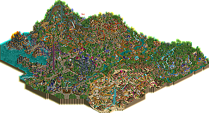
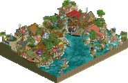
This is no theme park, this is an adventure! Follow in our hero's footsteps, Quinlan Quinto, as you explore and conquer the unknown lands that lay beyond Tuckborrow Village.
Enjoy! -
8 fans
 Fans of this park
-
 Full-Size Map
-
 Download Park
792
-
 Objects
627
-
 Tags
Tags
this reminds me of oldschool spotlights
congrats on the well deserved spotlight! Excited to spend more time looking through this park, as there's so many fun things to discover.
Great work man
Congrats on the second spotlight, BSG! Very impressive.
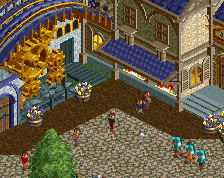
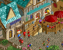
What really stood out for me personally in this park was the landscaping. It made great use of the default land blocks with 1/4 tile blocks mixed in very tastefully. The log flume in particular was lovely in the way that it interacted with the whole landscape around it. The foliage was nice throughout as well. This park of course also made excellent use of architecture. Some of the standouts for me in this department were the entrance to the park, the black castle towards the water in the gloomy area, and the station for the wooden coaster. The dragon sculpture was also pretty cool.
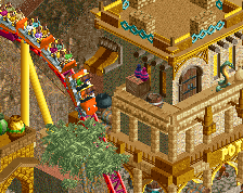
For me, the main thing that wasn't my favorite in some areas was the use of the custom-made flat rides (I prefer hacked flat rides, and I don't really like the look of the custom ones) and the pacing on a few of the coasters. For example, the inverted coaster was simply too fast through the first loop (37 mph at the top). I also think it would have been cool to do a more realistic take on the air powered coaster in the desert, maybe with one spike instead of two.
Overall this park is really great and is absolutely deserving of a spotlight! 85/yes from me
Positives:
+ Great entrance area
+ Very nice fantasy architecture throughout
+ Very good layouts
+ ...which are well integrated in the park and landscaping
+ Areas are distinct, yet still fit together
+ Liking the path-side foliage
+ Great use of color in the entire park
+ Loads of height differences
+ "Arabic" area is outstanding
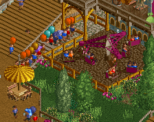
+ Loads of content and details
Negatives:
- Not the biggest fan of landscaping and wild foliage
- Some awkward park layout decisions
- Some content a bit too close to the map edge for my liking
Overall: Great park throughout. Really captures the feeling of being in a theme park. I'd have given it a 85%
Circling back on this one, as it got lost in the pre-H2H shuffle for me but definitely deserves a review. The timing on this park was definitely an odd one, being released at a time where the meta was shifting significantly between Grand Tour and H2H9. Add to that a style that feels very throwback to the semi-realism of the late 2000s-early 2010's, and you've got a park that feels incredibly unique and distinct from the trends we were seeing at the time.
I say this as a great thing, because this park felt incredibly nostalgic for me in a way that many modern approaches to rct (including my own) just don't capture. It truly felt like someone took a semi-realism park from 2009 and rebuilt it with a more modern approach to execution. The sheer volume of ideas and content baked into the park also reminded me of H2H. Like a H2H5 park expanded to a larger scale.
What I loved about this park was its atmosphere, its unique architecture, and a really powerful sense of imagination. From the gorgeous readme to the way you've thought thru every building's purpose, this park was fun to explore and I get the sense fun to make. Even having taken a few looks at it, I still feel there is a lot more I'll want to come back to later.
That may also be my primary criticism of the park, that it was at times hard to fully see and explore in a logical way. In places, the composition felt too sparse, like buildings that should be clustered were pulled apart. This kinda fits with the video game theme where individual 'areas' are often separated a bit, but I think pulling some things closer could have helped the composition. In other places, there were so many things happening so close that it became hard for the viewer to understand them. I'm not sure I'd say the park necessarily needed more space, but rather, I felt it it could have had a bit more balance in how some areas were organized. While I think this could have helped perfect the park, I wouldn't call it a major issue.
Overall, a really impressive release. Congrats on the second spotlight and wrapping up something this big, which is no small feat. Understanding this park within the context of when it was released, when you started building it, and how things have shifted in rct over the past few years, I'm excited to see where you go next. I think a style like Pirates could really suit your approach to rct. Bringing all the ideas you have to a less semi-realism and more hardcore non-realism project could be magic.