Park / The Conquests of Quinlan Quinto
-
 07-April 21
-
 The Conquests of Quinlan Quinto
- Views 7,720
- Downloads 673
- Fans 8
- Comments 24
-
-
 84.00%(required: 80%)
 Spotlight

chorkiel 90% yes Camcorder22 85% yes G Force 85% yes In:Cities 85% yes inthemanual 85% yes posix 85% no RWE 85% yes saxman1089 85% yes Xtreme97 85% yes CoasterCreator9 80% yes Scoop 80% no Cocoa 75% no 84.00% 75.00% -
 Description
RCT meets RPG
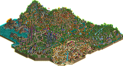
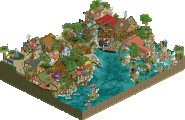
This is no theme park, this is an adventure! Follow in our hero's footsteps, Quinlan Quinto, as you explore and conquer the unknown lands that lay beyond Tuckborrow Village.
Enjoy! -
8 fans
 Fans of this park
-
 Full-Size Map
-
 Download Park
673
-
 Objects
627
-
 Tags
Tags
Only took a quick gander through it, but already there's so much to love! Some killer epic coasters, unique theming and narratives throughout. Will require a much deeper look but this is totally Spotlight quality for me.
The dive coaster and launched coasters are my favorites by far, and absolutely loved the hidden cave areas in the back! Congrats on a fantastic release, will be taking a longer exploration soon!
This is great! Saying this park has everything feels like an understatement and almost detrimental to the effort you put in over the years. Yet for now that's all I have to say for this park. An interesting (not too complicated) narrative, interesting themes, good ideas, fun details, and great rides. You have found a great balance between details and ideas, and legibility. When I was done exploring, I would just randomly zoom out and zoom in again and discover something new every time.
Thank you for the great time!
This has been my most anticipated park for a long time. Will give it a proper review this evening, but from the overview it looks like it won't disappoint.
Had a quick look just now, and this park looks like a worthy sequel to Mario Kart, Also similar in the sense that the screens you've shown have been relatively fallible, but the park in game is stunning and it becomes clear how all the parts fit together. Looking forward to doing more exploring!
This is quite great! Easily my favorite work from you. Feels like a spiritual succesor to Treasure Islands and I love it. It has much better composition and ride design. The architecture is quite nice as well. That castle is a standout. I do think that where it lacks is a bit of unfinishedness. There are many cliffsides that look a bit too bare and really take your attention away from what is actually supposed to be the center of attention. I also don't like all of the custom flat rides. Those rigg ( think that's right) flats have never looked good to me. This might also be taboo but I got rid of the air powered coaster and the smaller of the two drop towers and doing so made both areas instantly better. The colors of the wooden coaster would have looked much better with a combination of browns. I really loved the invert and mine train. OOOOhhhh and Damn that shoestring for the dive coaster is BRILLIANT!!! Easily a top contender for idea of the year for me. All in all this is a great release, but doesn't quite garner that spotlight status for me because of the aforementioned issues. 80% from me good sir.
From the start, I love the water feature just inside the entrance. A fresh take and much more suited to the theme than a more standard fountain. It would look very striking from the peep perspective - a common feature with many of the set pieces.
Another thing I enjoyed as I looked around was the use of multiple flying rides. Skyward Riggers is a unique transport ride. In general, the floating rides are a nice way to add another layer of interest to any area, and they're particularly well suited to the fantasy theme.
There are a couple things I thought could be improved. First, the park layout has many dead ends. This is easy to forgive in a fantasy setting. The second thing is the ocean fog. I love the concept, but without an alpha channel in the games graphics it just doesn't read very well.
The rides are very well integrated into their surroundings. The ride that stands out the most to me is Drake's Descent due to the finale. Nice work from Louis there.
Such a fun park to explore and just has a ton to see. The fantasy theme is so cohesive, and the Guidebook adds another level to the worldbuilding.. Very easy to imagine myself visiting this place. This is the type of park I aspire to build some day.
@Scoop: Glad you enjoyed some things in the park, you're a hard guy to please. It's definitely a fine line when it comes to having more extreme landscapes throughout a park, to either leave some cliff faces more bare or detail them too much where it looks excessive. It was a calculated decision to leave some of them bare like that as I have a tendency to hyper-detail, perhaps I still need to keep working on finding the right balance. Btw, I'm sure I could have cast your vote for you
@astroturd: Appreciate your feedback. I had lots of fun coming up with the flying rides. Unfortunately dragonflies were the closest thing to dragons, but they work I guess. As for the concern about dead ends, there's actually only one, in the bay that leads to the Skyward Riggers station, so the only thing there is a transport ride. All the other seeming dead ends you're thinking about all actually make a full loop to another pathway in the park. Glad you liked the guidebook, it was the cherry on top before I released it!
Well, I love it. Your build style is (and has been for a long time) exactly the way I wish I could build, and everything this park offered was like looking at fully-realised, well executed, beautiful depictions of thoughts I've had.
Area by area:
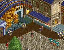
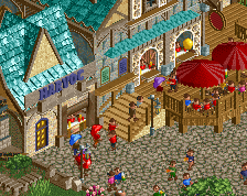
Tuckborrow Village: I remember being instantly captivated by the screenshot you showed of the entrance, with the elaborately detailed fantasy style buildings, and I was pleased to see this carried through this area and indeed the entire park, both in quantity and quality. The purple, brown and black combo worked well for providing colour while maintaining a down-to-earth feel. Lovely plazas and details dotted throughout. Ghasper's Gauntlet was an inventive reinvention of the golf ride too.
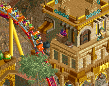
Forbidden Desert: Perhaps my least favourite area in the park, but I think this was due to the desert theme feeling a little out of place compared to all the rest. Nonetheless, it was still very well done. The Phantom Sheik palace was sufficiently gaudy and glitzy, and I loved the way the queue trailed along the balconies. The whole area around Zabusiris looked great too, with its complex of structures forming the queue and shops and general theming. Again, good colour combinations in this area, helping certain details stand out amidst the sandy terrain.
Eternal Valley: I enjoyed the way you presented a mining theme without going down the typical mining route, and I really got the impression that these were fantasy elements being dug up. Rockfire Mines had a lovely bit of near-synchronisation with the parallel hills, and the accompanying rides as scenery certainly helped sell the scene. The rest of the area was sufficiently bustling, yet all the bridges over the river were pleasant ways to provide a contrasting openness to prevent anything getting too claustrophobic. (Furthermore, I think the rivers and waterfalls throughout the entire park were very well done, and I appreciated the way, for the most part, they made some sense in terms of flow and direction.)
Ordiric's Outpost: I thought this was a really tranquil corner of the park, exactly as stated in the Guidebook (which in itself is a very high-quality bit of work, but I'll mention more later). I liked the way the log flume had height and meandering sections, whilst still staying tight and logical with the landscape. Again, nice path-river interaction, and the cavern was a neat addition too.
Niraric Ridge: Incredible interaction between the Explorer coaster and everything else, even if I did lose it once or twice. Agreeing with Liam about the parallel tracks, I was pleasantly surprised to see it charge up the steep hill, especially so far into the course, so nice job on keeping the pacing high. I perhaps didn't feel the ethereal vibe as much as I think you were going for, but the bits that certainly did pull it off for me were around the shrine and Jacaranda Dust - the snow and the floating purple shapes really worked here.
Blackbone Bay: Like the desert, I felt this area was a little straying from the other themes, but it was still nicely done and a great way to include a larger body of water (even if none of the rivers flowed into it!) Some great piratesque theming, especially the boat which functioned as the main walkway too. A lovely moment occurred as I watched a handyman sweep the floor there, looking just like swabbing the decks. I liked the way Skyward Riggers carried guests from the dead-end peninsular, really giving its station location a reason for being there. The castle was an interesting addition, but my favourite part of it was the way Torture Wheel spanned over open floor, straddling the platforms either side.
Drayke's Lair: Excellent coaster, especially the ride back into the station. I appreciated the change of architecture here, which felt a lot more archaic, whilst still retaining the fantasy element - very suitable for dragons. The tail spikes were a clever bit of moving scenery, and the Drayke sculpture looked cool too. I also liked the way the Apallon dragonflies flew in and out of the cliffside caves.
Overall, a very fun, engaging and beautiful park, with plenty to explore. The combination of landscaping, foliage, water features, structures and pathways was blended well to create many interesting themes, scenes and little moments. My main criticism would be in regards to the foliage though, in that sometimes I felt that it obscured some of the more intricate details. This was naturally due to it being presented in an overgrown, wild nature, but I think that on occasions a little less would've been more, and it would've been nice to see the architecture and sculptures behind, as well as allowing areas to breath, just a smidgen more. A minor quibble though, and one that did not distract or detract from the park as a whole.
The Guidebook was very well crafted and a lovely addition to the park, which helped explain the story and the themes, and even served as a bit of a scavenger hunt as I sought out all the shops and rides mentioned. A wonderful way to say thanks to the contributors as well.
This park is certainly one of my new favourites, and I'm sorry/not sorry that I will be stealing many of your ideas and methods in a current project which shares a similar theme as, as I said, I have strived to build like you do for some time. Well done on completing this, to such a beautiful high standard, and I look forward to whatever you produce in the future.
dang, this park wasn't on my radar as much as it should have been. really excellent work and jam-packed with fun details- furnaces and cogs and obstacle courses and ships and piers and all the fun fantasy stuff you could ask for. I especially loved the way the invert had its corkscrews mid-way through up on the hill- that would be so fun irl. the backward twist on the diver would be sweet too. the arabian area was probably my favorite, and it stood out the most stylistically. great atmosphere. I also loved the castle island, the intamin launcher station, and the entrance area specifically.
I still... just can't quite get on board with the way you use color though. there are probably rooves of every single color in the palette in this park, often in the same areas or even buildings. I just can't put it into my brain what that is 'supposed' to be, other than like fake plastic bad theme park fantasy buildings. I feel like i could spend maybe 24 hours just recoloring the park, not changing any objects, and I would love it ten times more. Its filled with amazing landscaping and detailing and rides but it all ends up feeling overwhelming and muddy and plastic and the atmospheres all bleed into one another. i get the impression you're very set in your style and your ways so all the power to you to build exactly however you want. but just know I'll be slightly in pain every time haha. you can still be extremely whimsical and fun and fantastic while acknowledging that roof tiles are made of real clay/shingle/wood/etc in the fantasy world.
anyway, congrats on the release. looks like everyone loves it!
What a fantastic park
Really a pretty fantastic piece of work, you've definitely worked a lot on you micro and I think this definitely has the best archy you've ever done. Probably still think Mario Kart is a bit better overall just due to the creativity that went into that, but this is also super strong. I might prefer a bit more open space and macro in the planning and composition but thats just my preference. The density was kind of hit and miss overall for me. As a result I probably liked the area with the flume and the river in the back the most, felt like all the great details and ideas could really breath and be enjoyed here without there being too much overload.
Anyways, borderline spotlight yes vote for me, I think this deserves it on the quality and creativity of the work.
@choco: loved that you loved the park. I tend to bounce back to my old parks from time to time to read over everyone's comments, so yours will be read many times. I personally really appreciate the thorough breakdown of each section of my park. Good luck on your future projects and hit me up if you ever want feedback as you build.
@G Force: thanks for feedback. I was kind of expecting this park might not appeal to those that lean more towards full-blown realism, so it was definitely an encouraging surprise to get the nod of approval from you, means a lot bro.
I really enjoyed this one. I'm sure I didn't catch everything on my first viewing and will return to look for more little things. There were some dated elements, both good and bad. The old school flat rides were fun to see again, in a time where the community has moved on to fully functional custom flats. It was a lot of fun exploring and I think there was a good balance of density with some areas that had more breathing room. The shape of the map was probably a necessity to get a project of this scale finished but it was a shame to have some of the landscaping or outskirts of certain sections cut off so abruptly. Great job and I'm happy there is someone breathing some life into this style.
Definitely the right call on going all-in on the spooky harbor idea, definitely a lot more atmospheric than the last version I tested.
You already know I love the ideas and the old adventure-RPG nostalgia that comes with exploring this park. You also already know that I find the foliage a bit messy throughout.
Some highlights:
* The gaudiness of the Shiek station
* The potion shops, especially the one in the back right corner
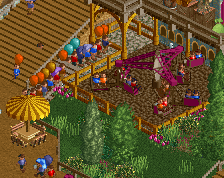
* The obstacle course
* the entrance
* the station you blatantly stole from that screen I shared with you
Congrats on the great release, and hopefully the score is something you'll be happy with.
I was hoping to not be the last vote on this, as I've been flopping back and forth since the initial release on this one. Overall, the quality and creativity nudged me to a "yes" vote.
The individual structures and themes are all fantastic; my favorites are the harbor and the mountain with the dive machine. I think I'm in the same boat as cocoa when it comes to things I didn't like; in a lot of places it sort of felt like a mashup of a ton of things that didn't come together super well, and there was a lot of stuff that was just crammed in along the map border without much room.
Overall, I think this is a lovely park and certainly one to be proud of.
Congrats on the spotlight! I was hoping this was going to win, its deserving