Park / The Warhol Express
-
 07-April 21
- Views 2,385
- Downloads 472
- Fans 2
- Comments 10
-

-
 54.50%(required: 65%)
 Design Submission

In:Cities 65% bigshootergill 60% Scoop 60% chorkiel 55% CoasterCreator9 55% inthemanual 55% Jappy 55% Xtreme97 55% Cocoa 50% Liampie 50% posix 50% RWE 50% 54.50% -
 Description
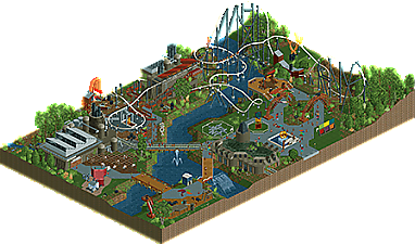
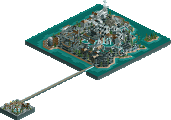
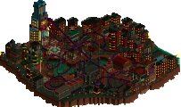
The Warhol Memorial Sculpture Park in Pittsburgh, Pennsylvania, is a summer-only venue to showcase some of the country's finest sculptors' work.
Guests can observe the wonderful sculptures, explore the semi-abandoned train station on site, and grab a bite to eat at the Monesson Brewery right next door. The park even features a top-spin style flat ride right on the riverfront. Kids will enjoy the small playground that the park has to offer.
New for 2021:
The Warhol Express: an RMC Raptor single rail coaster that races through the abandoned industrial complex of the area.
Thanks to Scoop for making the logo! -
2 fans
 Fans of this park
-
 Download Park
472
-
 Objects
265
-
 Tags
Tags
![park_6136 [NEDC6] Gaudi Gardens](https://www.nedesigns.com/uploads/parks/6136/aerialt6370.png)
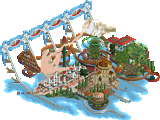
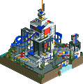
Congrats on this release Dedede! There are tons of really good details and ideas in here. All of the art pieces are done quite well, I really enjoy the old corkscrews, the train and the bits of color in the path. I think it works well with the old factory vibe- like some kinda industrial chic art exhibition. I also think this really fits the aesthetic you build, and are quite good at too, the infrastructural style meeting the abstract/ artsy stuff.
Your coaster looks pretty good too. The train doesn't fit on the transfer track! I don't think you always need to build one but since you added one it might as well look functional! The supports are done well. Maybe the mini suspended track could be incorporated into it a bit better? The ride interacts with itself, the architecture and the art nicely.
Again, congrats on the release! Can't wait to see what you do in h2h!
not bad. i like the vibe in general. I think your scale is a bit small so all the buildings came out a bit squat- the factory in particular would be great with some more height. the coaster is not bad but a bit short perhaps
The coaster is a bit short but considering it's a Raptor I think that's perfectly fine. Love the overbank specifically, think it actually works here! A nice bit of colors that are subtle and not bold, very good for the Pittsburgh look. Overall, this is very pleasant!
Congrats again on your release dude!
This little design is really enjoyable. To me perhaps what I like about it most is that it screams so much potential in your future. You've just been posting for about a year, you've got a lot of strong skills (as I'm seeing in our H2H team too). You have a creative gene in you, and sticking to your theme throughout this design is excellent, with the little splashes of art and sculptures all over the map.
Here's a couple ideas to step up your game a couple notches:
- You've got about 5 different path types on such a small map (which includes the bridges), probably better to cut that down to just a couple
- Spend a bit more time adding details to your work. For example the buildings have unique structures, adding more trims and finishing touches would be great. And along the water there's no foliage, rockwork etc to blend the water with the land.
I think you'll be building so much better as H2H progresses, learning from the experience of others. What you'll see is that higher quality releases will take more of your time. Looking forward to what you come up with in the future. Your current creativity with more attention to detail and finesse is an exciting thought.
AJ - True about the transfer track. Thank you for the feedback/compliments!
Cocoa - Thank you for the feedback on the scale. I'll take that into account next time.
Hex - Thanks so much!
BSG - Thank you very much for the extensive review. Good points about the path types and detail work. I think one area I can improve on for sure is foliage and landscaping. Excited to work with you during H2H! Go Tile Inspectors!
Fun little design with a creative idea behind it. I like the art exhibiton thing you're going for and enjoyed the sculptures. It def is an idea worth exploring more.
I did find it to be a tad simple in some areas. Like Cocoa said, some of the archy came off as rather squat and blocky. Also BSG brings up some good tips.
Overall cute little park that shows potential, and I think H2H will help you bring that out.
This shows a lot of potential, that's for sure. I think the ideas behind this are huge, and the execution could use a bit of improvement, which comes with time.
The layout itself is nice, solid and enjoyable. Support work might be a little bit muddled in places, and the transfer track is completely nonsensical - but in general it's very solid.
I like the concept of it being a sculpture park. It feels a bit like the exhibits themselves are sort of just placed where they fit and not as the core of the park. Also, big tip - try to avoid using too many different fence types! There's definitely diagonal options for most anything out there, and it helps keep the overall look a bit more composed.
The supporting features like the top spin and the playground are a little bit plain compared to other parts of the park. I think you have a good sense of ride design, but your execution on the actual details of the rides could use some work. Others have mentioned this, and they're all right that participating in H2H is a huge learning experience.
Overall, it's nice work and I can see that you're taking different things you're learning into account. This doesn't quite meet the bar for Design for me, but I can see you hitting that mark in the near future at this rate.
Jappy - Thank you for the comment. I can see how it's a bit plain and simple in some areas. I'm very excited for H2H.
CC9 - Thank you for your comprehensive review. I agree with everything you said. I'm trying to slowly build on my RCT skills bit by bit, all while having fun. I think the biggest thing I need to work on is refinement. I find that my work can often come out unpolished. Hopefully I can work on this during the course of H2H. Again, thanks for the review!
I like how idea-driven this map was, and based around a smooth, good looking coaster, although a bit short. I think the execution was a bit lacking and aesthetic cohesion was missing. Some examples of poor execution would be the top spin sitting on top of a brown cross, the train station that lacks shape, underwater footers, and the oversized portable toilet. The good thing here is that it's recognizable as a portable toilet, and that the idea fits. That's 2/3 steps! I really liked the coaster's station. The diagonally striped canvas is a bit mindfucky, but that may not be a bad thing on a map with this theme. Some other highlights for me are the playground, the painting/billboard, the geometric shapes on the path, and like I said the coaster layout.
No design win yet, but still a promising submission. Looking forward to seeing your work in H2H, and I think H2H is also a great opportunity for you to bring your work to the next level!
Liam - Thank you for your review I agree this is not a design win yet, and there are some things that I need to work on, mainly architecture and overall cohesiveness/refinement. I'm glad that most people including yourself think there are some nice things on the map. Baby steps! I am very excited to be a part of H2H to improve my skills. Go Tile Inspectors!