- Views 4,690
- Downloads 521
- Fans 8
- Comments 14
-

-
 84.50%(required: 65%)
 Design

In:Cities 90% Scoop 90% SSSammy 90% bigshootergill 85% CoasterCreator9 85% G Force 85% inthemanual 85% WhosLeon 85% chorkiel 80% Cocoa 80% posix 80% RWE 80% 84.50% -
 Description
The Black Belt of Roller Coasters
-
8 fans
 Fans of this park
-
 Full-Size Map
-
 Download Park
521
-
 Objects
198
-
 Tags
Tags


That rapids is hawt
This is the best screamin swing I've ever seen. Fantastic park all around.
I'm a big fan of this park. The temples are very nice, the coaster + supports is amazing. Great job guys
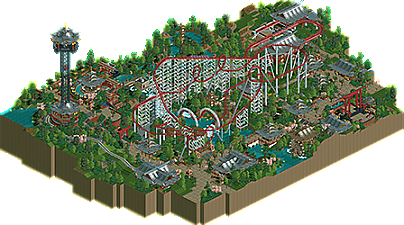
daang where did this even come from? very stunning work- clean and interesting and novel ncso. the layout is something we've seen a lot but is particularly well executed and involved in the environment- those corkscrews are a thing of beauty. the highlight though is definitely the infrastructure where you climb the hill to the rapids entrance and lookout tower. stunning work, and so much clear design skill oozing from it. it's actually absurd how talented NE people are these days at design and composition. we would wipe the floor with the NE of the past...
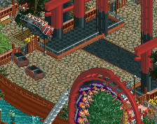
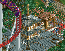
The combination of use of colours, architecture, ride design and landscaping really tie together to form a master piece, amazingly done. Whilst I love the architecture it does suffer a bit from japanese roof syndrome, as that's most of what I can see of each building, but what I can see of it is great. There's a lot of neat tricks there like with the use of the space station in roofs. The colours were great, I adore the use of the different shades of red in this park. Your sparing use of it in important areas makes it really focus attention towards the focal point of your design. Though maybe it was a bit weird to see so much of it used around the rapids station given its sparing but wise use elsewhere. Landscaping was great, loved the use of mowed grass and the height differences throughout. Ride was great too, I really enjoyed how imposing it is on the landscape. Great job guys!
Congrats on the release, I really enjoyed this from top to bottom. A lot of great macro and stylistic choices that made this feel dynamic and interesting but also immediately familiar. I also love the sort of Six Flags Magic Mountain remix vibes, combining some of the Asian inspiration from Ninja with the Viper layout. Like I said on discord, that first inversion is incredible and such a signature moment. The use of open space and freshly cut grass is also very effective, people should take note (including me, my foliage is always so fucking dense). I did feel like the coaster comes into the midcourse pretty fast, a more gradual brake run would have been nice. Personally, I felt like some of the rooves could have used a bit more color, but I do like the stylistic choice as a design to keep the color focus on the rides.
Overall, a great design and likely another all-time highest scoring in a year where we've already seen some killer designs. Congrats!
StunNINg wowie. GEEz! Arrow loopers are my favorite in the game, absolutely love the supports and that wild loop.
A+
What a great design, amazing to flush out such an incredible park with 99% ncso, this whole movement recently is mindblowing. The coaster is excellent, both the layout and all the supports. That corner with the elevator and rapids is so atmospheric and well put together, in fact clearly a lot of effort to nail the macro in this park. Zoomed in or out everything just fits. Archy is on edge of being too much, but considering it's a design I don't really have any qualms. I mean the buildings themselves are fantastic. And the palette adds the extra shot to drive home the theme, something the original rct palette couldn't help accomplish. Nice to see a Nin & Gee combo release too!
Wow pretty good. Maybe a bit too much grey in the archy, but I get it. Using the Jr coaster track for cross bracing in the supports was brilliant.
Likely design of the year for sure.
So good. I love the way you transitioned into that first loop.
I feel like that support style on corkscrews is the most overdone thing on NE since it would never actually exist on a mega looper but as a design choice it does look nice so I get why you did it.
In the end though I'm just nitpicking because I'm super jelly at how good you guys are at the game. Stop that shit.
PS: Rapids station is sick. Observation tower is also quite sick.
Thanks for the comments everyone, this was definitely a fun design to do. What started as a "4 hour design" speed-build evolved into a longer project bookending Storybrook Glen. I definitely agree that it can be a bit repetitive in places, but I'm also glad to see some of the color choices and decision-making are evident as well as I had hoped!
RaunchyRussell Fan Offline
Love this design. The first loop is so sick and I love how it swoops you down towards the water. Beautiful setting and supports are lovely here as well.
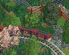
Nice coaster and foliage. Couldn't really get used to the roofs, but very good nonetheless.
Thank you to all for the comments. This was a blast to work on.