Park / Behemoth
-
 30-March 21
- Views 4,021
- Downloads 565
- Fans 1
- Comments 13
-

-
 72.00%(required: 65%)
 Design

RWE 80% Camcorder22 75% G Force 75% In:Cities 75% Xtreme97 75% bigshootergill 70% chorkiel 70% CoasterCreator9 70% Cocoa 70% geewhzz 70% Scoop 70% nin 65% 72.00% -
 Description
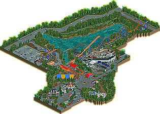
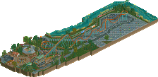
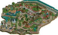
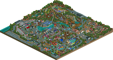
My take on Behemoth from Canada's Wonderland
-
1 fan
 Fans of this park
-
 Full-Size Map
-
 Download Park
565
-
 Objects
379
-
 Tags
Tags
hey this is great. seems like you wanted to practice diagonals? lol
I really like the behemoth raised lettering and italian job, and in general its some pretty good realism. good to see you stepping away from your past blocky forms and creamy colors and into some tighter construction!
Didn't think I'd enjoy this as much as I did. There's so many fun things to see here that really make me a fan. There's a lot of great touches here and the hacked flatrides were good. I really liked the parking lot coaster. Other than that it was (understandably) a lot of concrete and a lot of buildings with steel roofs, but you did a great job with what's there.
Although Behemoth is advertised as the main focus, it is the surrounding features that elevate this design. To me, the flat rides are particularly nice. I’m usually not a fan of the static structure on a moving ride, but sledgehammer translates surprisingly well to RCT. Back Lot Stunt Coaster is nicely detailed. I really like the sign for Orbiter.
There are couple spots where I think a desire to strictly match reality hurts the look of the park. First and foremost, the massive canopies over the Behemoth queue stand out at all zoom levels. The uniform texture just doesn’t blend at all. Also, Sledgehammer and Cyclone both being on the diagonal comes across as a bit forced.
I’m sure it was fun paying homage to one of your favorite rides. I hope to get to experience the real thing someday soon.
Congrats on the release! There is a lot to love in this design, two coasters and tons of flats, a lot of fun activity and juicy details. It was really fun to explore, and like I said elsewhere, I honestly think the stunt coaster was the show stealer here.
Overall, I think the design shows a ton of great parkmaking skills and improvement from previous projects, but it felt like you are just on the cusp of putting those skills together (and I think H2H will give you the experience to push you over the edge). For example, the design for Behemoth had some awkward moments, a lot of the roadwork was pretty glitchy, the macro felt really spread out, there was some missing polish like default supports showing. Don't get me wrong, none of these are enough to take away from the quality of the design, but I think as you get more experience you'll smooth out these kinds of details. That is all to say, I'm really excited to see what you do in H2H and what you do next.
This is amazing and makes me miss Canada's Wonderland so much.
-Cocoa: thanks for the comment, diagonals were definitely something I wanted to practice with this haha
-Lotte: thank you! I appreciate it:)
-Astroturd: Thanks for the comment, I see what your saying with the queue line, It probably would have been better with a better texture for the queue line. To some extend I also agree with you on the diagonal rides, and I did debate make psyclone straight. I ended up deciding that maintaining the IRL park layout was more important in the situation though.
-FK: Thank you, I always appreciate your feedback. I understand what your saying with the refinement, I did kind of rush this thing out because I wanted to get it out before the draft haha.
-SavvyAdam: thank you! I appreciate it:)
Overall a bit rough around the edges, but has some really good bones and shows tons of promise. Probably would focus on your object selection a bit and clean that up, the foliage seemed a little sloppy in places too. I sort of wish you made the layout a bit bigger too, seemed the coaster scaled a bit odd in some places, but I totally get what you we're going for and overall did a pretty good job with it.
Definitely want to note that your usage of space and scaling of things in the horizontal dimension is really good here. None of the craped stuff we see today, and you leave space for all the little backstage details and things we miss from a guest perspective in real parks.
Just keep building an getting more familiar with objects and building and whatnot. This honestly reminds me a ton of my Magnum recreation, except quite a good bit better haha. Keep it up and you'll be building spotlights in no time!
-G-force: Thank you for the feedback, lots of helpful stuff in there!
I like this a lot.
Great technical skills, I like the Stunt Coaster and flat rides a lot and the bold use of color works well in the Behemoth area. Sure, those are the actual colors but I feel like a lot of people would shy away from those fire-engine red colors everywhere and uses a darker shade. The bright colors add a lot of life.
My only real complaint is that Behemoth doesn't look all that "behemoth". I know NE loves to make every coaster tiny but I feel like this one is squished a little too much. It could benefit a lot from some more height. I also don't get the sit-down trains and I didn't know Canada had flamingos. lol
Overall great work though.
-Coasterbill: Thanks for the comment:) In hindsight, taller might have been the better move. The bird are supposed to be geese haha, it would be nice to have a few more bird objects to work with.
RaunchyRussell Offline
This slaps dude. I love how real the park feels in this. The Flats are super good, but that claw ride takes the cake. So sick looking. Behemoth is great, but Back Lot coaster is so cool how its tucked underneath. Super believable.
Everything else: Really nice. There’s not much to add to all the comments above mine, they laid it out really well. The setting is great, if a little spread out.
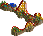
The track work: I hate to sound negative here, but I am not a fan of how many of the hills are shaped, sorry dude. If it were fantasy that would be one thing, but since it’s realism, and a borderline recreation, the fact the track work is so out of whack just knocks this release down quite a few pegs for me. I’ll try to explain my reasoning here, as it boils down to one thing: radii.
On real rides, the radius of a curve (either vertical or horizontal) depends on the speed at which the train will travel through said curve. Basically, higher speed is larger radius, lower speed is smaller radius. I’d say this is more strictly followed on vertical curves. Horizontal curves can be banked and thus allow for a more forceful and thrilling design, whereas the bottom of a large drop will usually need a larger vertical curve radius as to not snap people’s necks due to the high speed the train is traveling at.
My main problem with this release is the use of small vertical radii at the bottom of hills and then large radii at the top of hills. I’m sorry, but that’s bad design and certainly not how any manufacturer has ever built a roller coaster (except for maybe in China, they build some sketchy-ass shit lol). I’ll agree that B&M uses pretty gentle curves on the top of their airtime hills, but the bottom curve is still a larger radius than the top. So when I saw to many tiny, spine-breaking small radius curves that you placed at the bottom of hills, I disagree with it. Then when I see the large radius at the top of the same hill, it really misses the bar of quality IMO of what a recreation should be. Here’s the best example:
^this just screams amateur track work to me, and to be honest I’m just not a fan of the way a lot of the hills are shaped.
Sorry this comes off as harsh, I just wanted to explain some details that I think are critical to quality realism and recreation building. Like I said, the surroundings are really nice. Just the actual roller coaster that could use more work.
Probably a 50-55% from me since the environment is so nice.
I can’t wait to see what’s next from you!!
-Sephiroth: Thanks for the lengthy feedback, helpful stuff for the future