Park / Orchid
-
 30-March 21
- Views 1,899
- Downloads 418
- Fans 2
- Comments 5
-
2 fans
 Fans of this park
-
 Download Park
418
-
 Objects
382
-
 Tags
Tags

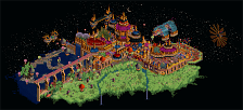
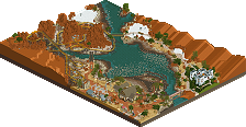
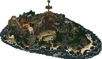
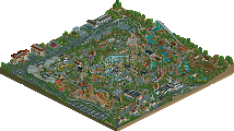
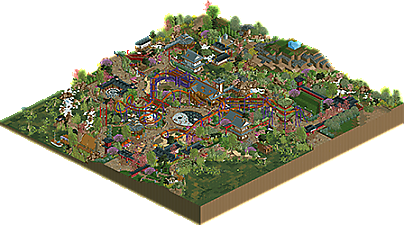
damn this thing is wicked. there's so much good design here, its absurd, and almost a bit confusing. Maybe my favorite piece of architecture was the old-style thatch roof house- thats a piece of japan you don't see often. the station building and nearby white castley building was great too. The rapids is probably the highlight though- its an absurdly beautiful journey through stunning gardens and rockwork. its actually so overwhelming that it almost feels not japenese again.
the only thing that confuses me is that weird blocky patch of landscaping off to the side... is that left like that on purpose?? i just don't get it!
I'm a big fan of this. The colours and the water just work so well here, you did a really nice job coming up with your palette and getting the absolute most out of it. The architecture was stellar as well. One thing I disliked was the mountain, it would've looked a lot better if you rounded off some of the edges there or added some quartertile landblocks as well. It looks almost unfinished.
I really enjoyed the foliage. Very colorful without becoming busy. The large pond near the entrance was my favorite. The mountain is a bit of a miss in my opinion. It needs to be larger to be a striking feature, and the blue ice would look much better as white.
I am torn on the color of the water. On one hand it makes the ponds look very nice and natural. On the other hand, the contrast with the land and foliage colors is lost. Zoomed out, much of the macro shaping is lost.
The coaster colors stand out very nicely. It is a nice layout with well framed elements and great interaction. The pacing is rather fast in the mid section through the zero-g and loop.
I really love the river rapids. It is intertwined everywhere and I can imaging getting a tour of the park’s bridges and gardens that way would be very fun. Again the color of the water prevents it from standing out as much as it could.
Wow, all the gardens and foliage looks spectacular!
Really enjoyed this design a lot. Here's my video review. Nice work!
https://youtu.be/rlpoEUH7kac