Park / Kidderbrook Amusement Park
-
 27-April 09
- Views 31,103
- Downloads 870
- Fans 2
- Comments 122
-
 64.00%(required: 60%)
 Silver

Cocoa 70% posix 70% Xtreme97 70% CoasterCreator9 65% Liampie 65% saxman1089 65% Scoop 65% Camcorder22 60% geewhzz 60% In:Cities 60% robbie92 60% nin 55% 64.00% -
2 fans
 Fans of this park
-
 Full-Size Map
-
 Download Park
870
-
 Objects
322
-
 Tags
Tags
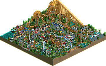
The architecture in this park is fugly at best.
It clearly was not finished and not in a good way either. I mean, not finished in like a "oh shit the deadline is coming. maybe if i build some shit and put some trees here no one will notice." way. The best evidence of this is the splash ride in the corner.
Looking at the overviews zoomed out I thought this would be close but now I am wondering what people are seeing when they look at Eftelrama. I am sorry maybe I am being to blunt and harsh but I am no means a strong or even middle of the road supporter of realism but in my opinion there is no question for me. The log flume station alone would have sealed the deal for me.
Edit: Sorry, I forgot to mention Alpha Legends, yours looks like a great park, haven't opened it yet but I will say more when I do, and I'm looking forward to see how this plays out in the coming days.
Edited by Comet, 27 April 2009 - 09:35 PM.
I didn't penalize the park just for that. The lack of movement just destroyed the atmosphere, which could have been there. It's unused potential!
Am I not allowed to give criticism anymore? I admit that maybe I'm a bit too harsh, but you act like a child now.
The park is not bad, there are just few good things. Most of it was mediocre. Maybe I should have put it in another way, sorry if I offended anyone.
it's interesting how this poll turns out to go into alpha legends' favour. i totally didn't see that coming. maybe it's all the elementalists guys voting AGAINST the realistic park now because they're still bitter from their match1
i can understand where this complaint about "deadness" comes from, and i must say it would have been smart to open all rides and fill the park with peeps. i can also understand why minutemen themselves would say "how does that penalise the park?". it does because people would have to do it themselves. they want to get and consume what's offered. not put effort into it themselves. while i agree it's not exactly objective, it's just human nature.
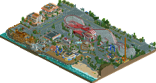
Kidderbrook Amusement Park:
Very nice realistic amusement park. I loved all the details that were used, like the arcade games, the ramps for handicapped people and all the little shop details. The coasters were also nice. Especially that Schwarzkopf. The archy was generic somehow, but there were also some highlights such as the log flume station. What I didn't like was the non-peepfriendlyness and the somwhat confusing layout. If this park would be real, I'd definately get lost in the path layout. There were too much dead ends and bottlenecks.
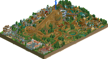
Eftelrama:
I really liked that one. It looked a bit over-the top at the beginning, but looking closer it was really nice. I really liked the architecture in the whole park. That's one of the themes I'll always love. Two corners of the park nearly looked the same, but every other corner had distinct styles. This park offered also many details, while keeping the overview and it was more clean than Kidderbrook. Details like the ball-throwing game or the pony thingy were just awesome. The coaster on the mountain was definately the best of the park. It was really fast in most places, but I really liked the whole atmosphere and how it's going in and out the mountain. The B&M didn't do much to me, it looked kinda forced. The splash ride and the ghost train were also very nice.
Great work and great matchup again!
Oh and just judging by the comments in this topic I can cleary say now who did both parks
"MFG"
RRP I don't see how the woodie is too high, you are high; probably. too high off the ground? well, maybe
I need to get rid of my 1129 post count (efff past anniversaries, AMIRITE), so I'll just say that yeah I shouldn't have posted that without reasons as to why I think that, and why I put my vote towards Kidderbrook over the other park so I shall do that in a bit. I really wish RCT2 had window mode...
Yes, so am I
edit; Whoops, misread your post, as it seems like you did notice them..
chapelz - whatever dude..
SF
EDIT:
Oh, i found them, who made em?
Edited by Goliath123, 28 April 2009 - 03:27 AM.
Btw, How did you (posix/geewhzz) get all of the unused objects and rides out? Nice job with that!
SF
haha,if only. What i mean is it just looks to high, in comparison to everything else.While realistically it is as high as of intamin woodies it just looks huge.Maybe thats due to placement or something?Id have prefered it half as high
It looks really impressive from the overview. Great idea, and the music really helped get that atmosphere across. I liked the queues, although they were all the same. Rides wise, the centre piece was fantastic. Great fun coaster, although i'd question people saying it's realistic. Kept pace all the way through, well done. Pity about the unfinished buildings though, roof pieces just missing is a bit sloppy. And the castle had no texture! I hate large buildings with no texture, just moulds into one big blob for me. Too many roof colours too. I preferred the delapidated tower to the actual one.
I didn't like the B&M, felt like it was just pushed into an area that it didn't fit into. The colours were pretty dull, and the station was pretty boring. Again, parts of it just looked sloppy to be honest. The splash boats in the corner were a nice idea, I liked the way they looked with crossover drops. Nice. The underground coaster was a bit pointless to be honest, almost done solely for the pleasure of having a cave. Which didn't add anything, there was nothing really in it.
The coin operated horse is a great idea, I haven't seen that before. They're the kind of ideas that really sway parks for me and stick in my mind. The entrance area has beautiful architecture, mainly due to the texture that's there! More buildings like that please. The corners are also pretty nice, although I feel that I can tell who built where, the level of quality is different. The architecture jumps from serious to cartoony, and I felt that didn't help. I didn't much like the windmills, they're not a "little detail" (ride6
Minutemen - The park is dead. This pains me, it's not that hard to open it up and make sure the rides are working and whatnot before the deadline. Would have really helped the park. That said, it looks really nice. The entrance building I don't really like, I just think the texture is off a bit. Once you get past that though, that little area with Cascade's station is fantastic. Love the sign, great idea, and i'd love to enter the queue underneath the trains... the queue itself is pretty boring though. The ride is good I thought, good changes in pace and height, and it sits in its place really well. Like it's meant to be there.
As I go round the park from a peep's point of view, I can really imagine being there, seeing the second lift of the steel coaster looming over you as you enter the main bit of the park, that would be cool. You're never more than a little distance away from a ride of some sort, I think that shows admirable planning, to be honest, contrary to what people have put before.
The little area with the log flume is nice.. The flume itself doesn't do that much for me, the layout seems a bit meandering, but at least you could watch the steel coaster flying around you. And that station, that is one of the best bits of architecture i've seen so far. Bloody beautiful. Moving round, the toilets are another example of the little touches that are everywhere in this park. Great idea. The steel coaster I think is lovely. Good interaction with landscape and other rides, as well as itself, and I think if it didn't have that second lift it would have been too short. However I would have liked it to have done something more after that second lift.
The little pier could have been developed into more of an area I thought, kiddie coaster didn't really do much but was nice I suppose. Good array of rides over that side of the park, and some really nice details like the basketball game, pavillion, more toilets (love those) and water pipes for the fountain.
I thought both parks were rushed, although Eftelrama was more obvious. I really liked Eftelrama's theme, moreso than the generic theme of Kidderbrook. I thought the quality level was higher in Kidderbrook, though, and it was more consistent. Rides wise they were pretty evenly matched. But Kidderbrook held my attention longer, and made me go "oh that's very clever" more.
No spaceman on a shop, though. Still reeling from that, well done Kumba.
Eftelrama: the name is a bit strange to me. I know its from Efteling, but it sound somehow weird to me (maybe it's just me). whatever. the archy was overall ok, but not a fan of the roof texture -it's odd, i know... but there wasn't a real variation in the archy imo.
I didn't like the rides that much. The coaster were painful fast in my eyes and the super splash was blocking somehow. a no-go for me... the flatrides were good placed though -great to see a not so often used one (the circus).
the custom music made so much with the atmosphere as the peepablility. the hacking did a lot here.
However there is something missing imo... can't tell what though.
KAP: Very pleasing, realistic park. I liked the coaster layouts. also all thoses little charming details made it. but it was a bit chaotic as dave mentioned already. however i think this ark deserves my vote.
it was an obvious match up for me. but it doesnt like it is for the community... waiting for the results
Same here, except for the review part.
Minutemen:
+ layouts
+ foliage
+ supports
+ invisible entrance hacks + "new entrances" for these rides
- architecture wasn't that great
- atmosphere
Alpha Legends:
+ coaster in the center
+ invisible shops & all these invisible entrances
+ entrance area
+ background areas
- landscaping
- roof textures
- less details on some buildings
- theming seems to easy
- supports
- colours looks very strange sometimes
- foliage
So I decided me for the Minutemen. I've to say, that it was really hard, but I found more weak points on Eftelrama.
Hope you understand my opinion.
Yannik
Didn't like anything in the Eftelrama park, Theming was crude and I haven't felt any atmosphere, because nothing seemed lovely done here.