Park / V1's Fort Fun Abenteuerland
-
 21-March 21
- Views 2,939
- Downloads 475
- Fans 4
- Comments 11
-
-
 57.50%(required: 50%)
 Bronze

nin 65% RWE 65% CoasterCreator9 60% Jappy 60% saxman1089 60% WhosLeon 60% Xtreme97 60% chorkiel 55% G Force 55% Jaguar 50% Scoop 50% inthemanual 45% 57.50% -
 Description
New Element any% CSO Speedrun
-
4 fans
 Fans of this park
-
 Full-Size Map
-
 Download Park
475
-
 Objects
403
-
 Tags
Tags
![park_4118 [H2H8 R4] Mount Haystack Ski Resort](https://www.nedesigns.com/uploads/parks/4118/aerialt3883.png)
a good 65% for me, cozy, basic but a tad coaster heavy for the style of park this aimed to be, i'd assume budget wise a park like this would never have the funds for all these coasters and would try to have more space filled with flats and so on, playgrounds and such
I was so surprised to find this in the submission queue, I love old school surprises like this. Park has some weaker areas, and some of the most mature parkmaking you've done in other areas. Review will follow, but for now: great job.
Is this a replica of the orginal park than it is cute. I see you use my cso Logflume and the big dipper cars, hope you like it. It is a very clean and cool Park and very fast build with good details. I like it
Ps: is the big dipper Coaster located in Plohn?
Definitely. It's mostly due to me not really building coasters for Heckengäupark, so I wanted to include some more to get into building layouts myself.
texas?
Cool surprise to see this park come out. Highlights for me are probably the alpine coaster and the park entrance gate. The plaza containing the Wilde Mine ride and Devil's Mine was pretty neat. Having both rides be half dark rides is interesting, but I do enjoy the creativity. I think that entire western area had a lot of great individual parts with the various game stalls, shops, restaurants, and indoor attractions, but could've been squished together to be a tad denser. The footprint of that area of the park is probably twice as big as it needs to be imo.
Of course not as surprised about this as other people. Its definitely a nice little release showcasing your productivity. I think you also achieved your goal to practise coaster design with this quite well, the mack one definitely my favorite, nice area, probably better than Heckengäu. I also really enjoy the entrance.
Some other parts were of course a bit rushed and not up to the Heckengäu quality, but i guess thats fine, cause its not what you wanted with this. All in all good job and looking forward to see your stuff in H2H, would give this a silver.
Nice to see a release from you.
Pros
- The Entrance is very simple but effective. It shows good composition and is overall just a cute, warm area.
- Custom flats
- Alpine coaster is awesome. Easily the best part of the park.
- Campsite
- Some of the architecture is well made. Specifically the station of the woodie and the adjacent station with the silos.
- Devil's Mine and Speed Snake
Cons
- The big dipper just doesn't appeal to me at all. They are definitely hard to pull off in RCT and I don't think you hit the mark. Rest of the layouts are pretty good though!
- Foliage is very repetitive which is understandable considering the time spent on this park.
- Most of the architecture is subpar, it lacks excitement. Very samey.
- A little to sparse for me as a whole.
Overall, not a bad park, especially considering how quick you built this. Definitely worth an accolade. 50% for me. Excited for what you'll produce in H2H.
I was working on a review of this, but I lost it when my computer crashed.
This is an interesting park because there are a few sections of Gold quality intermixed with Silver and then some pockets of Bronze work.
My favorite parts were the area around the alpine coaster (including this Disk-O) and Devil's Mine. Those seemed to have the most time and care put into them. The custom flats and El Toro all have good ride design. Noble effort with the big dipper, but it's a little rough around the edges.
I found a few areas to be a little lacking in life. Most notably, the area around the chair swing feels quite dead in comparison to some of the other locations in the park. Lots of open path with few features to add to break it up a little bit. This comes up in a few other places, but I think it's only so noticeable because of the really stellar places in the park like near Devil's Mine and the entrance.
In general, this feels a bit like a European G Force park, definitely not a bad thing at all. In some places it definitely feels like this was a speed build, others it really doesn't. The variety makes it a little difficult for me to score, but I think I have a good idea of where it lands for me.
Nice to see a new park from you, V1!
Starting at the entrance area, i love the 'local park' vibes you have going on here, and the yellow entrance is a beautiful color pop. Its composed nicely and has a really nice atmosphere. But then, right after the entrance it switches to tarmac path, what a shame! Really wish you kept that same path type to make it more cozy also after the entrance. Devils mine is great and i like the obvious 'plastic theme park rocks' facade it has, feels very appropriate for a park in this type of setting. The area around the swinger feels kind of dead and lacking that cozy atmosphere the entrance hinted at, but its also not bad, the buildings are all solid, i just wish they were packed a bit closer together maybe. The western main street is nice, and probably my favourite architecture in the whole park. I liked the subtle spanish/mexican theme for the rapids, giving it just enough identity to be considered themed, with the little village street facades. I think those were really tastefully done. The rapid track itself felt a bit blocky and unrefined, especially compared to some of the rapids we see made today, but thats okay. My favourite area of the park is probably the alpine coaster, had a fun time following the cars going down the mountain and i felt like it gave the park a unique character. El toro had a really nice setting zooming along the bungalow park, and the little pond the first drop wraps around is cool! The back section of the park does kind of bring back that cozy feel of the entrance area, which i like a lot and would have liked to see more of, but the architecture here feels quite redundant compared to the stuff near the swinger and the western street for example.
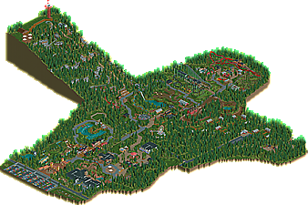
Overall a nice park, some areas stronger than others. I think it could have benefitted from being a bit more tightly packed, in the sense that theres a lot of very wide paths and long stretches of path. This is not neccessarily a bad thing ofcourse, but in this case i felt like it made portions of the park feel quite dead.
good stuff. I think the scale does wonders for the park, giving it this natural and grander vibe. I especially like the huge mountain slide. i'm not sure layouts were exactly the strong suit of this park, but the vekoma mine ride was great IMO. well done and very charming