Park / Washuzan Park Rainbow Summit
-
 10-March 21
- Views 10,458
- Downloads 1,079
- Fans 23
- Comments 28
-

-
 92.50%(required: 80%)
 Spotlight

CoasterCreator9 100% yes In:Cities 100% yes robbie92 100% yes bigshootergill 95% yes geewhzz 95% yes Jappy 95% yes WhosLeon 95% yes inthemanual 90% yes nin 85% no posix 85% yes RWE 85% yes Scoop 80% yes 92.50% 91.67% -
 Description
Nestled in the hills above the small town of Shimotsui, Washuzan Park Rainbow Summit has seen better days. The park-- and the area as a whole-- has seen its fair share of change over the years. Through ups and downs, the park has continued to offer guests thrilling rides and the best views around (even if a number of the rides are no longer in service). Come along and explore Shimotsui's Rainbow Summit!
-
23 fans
 Fans of this park
-
 Full-Size Map
-
 Download Park
1,079
-
 Objects
568
-
 Tags
Tags
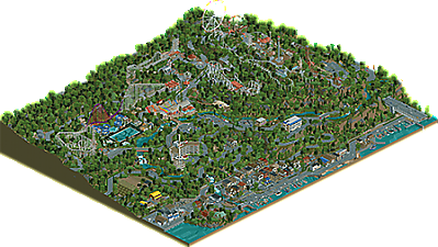
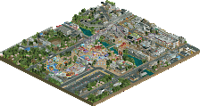
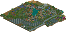
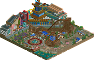
Alright. To start, I still like this park, A lot. I still gave it an 80% Yes, which is still spotlight. The ride design, as per usual, is ace, and I also really like how detail oriented the park is when it pertains to the story. It seems like each individual element on the map has it's own purpose. The small town is very well crafted and is probably my favorite section of the map. I know that it may not be realistic, but I wish there was a bit more life in the town. If you were trying to achieve a sense of melancholy then you nailed. This goes for the map as a whole as well. One of my biggest gripes was the foliage. It just didn't feel dense enough, and felt really repetitive. Maybe if another two trees were added to the palette then it would've been better. There is just a grandness and missing when looking at the landscape of this park, that I feel would've propelled it the extra mile. Now back to stuff I liked. The sound design was really cool. Especially with the water effects and the sped up trolley noise for the high speed train line. My favorite ride is probably Ultra Twister. Easily the best iteration of that that we've seen. Before finishing, I do have one question. Was parking actually this sparse in Japan when you went?
Congratulations on the well deserved spotlight, and I hope that you can eventually figure out how to finish your Sea World Park eventually.
Congratulations on finishing this brilliant park and on getting Spotlight. This park is an incredible statement in realistic RCT parkmaking. I´ve spend a long time going through all the little details and there is probably still a lot I haven´t seen yet. It has this brilliant ´80´s park that fell into decay and is now slowly being patched up´-vibe all over the place. If there was any constructive feedback I could give you, I would, but there simply isn't anything I can find.
damn, this is amazing. it takes me right back to every weird as fuck japanese park and I love it, especially because you were so helpful when i was trying to figure out things IRL like how the fuck do you get to himeji central park (and why would you, anyway)
the village may be my favorite part. its so authentic and so impressive- the 7/11 maybe the highlight, and maybe my irl japan highlight too. I love the sbno hotel near the park and the general air of "are these rides actually open? when was the last time they operated? what is going on here? am I supposed to be walking here?" that all these parks exude. from strange off-white-rust color schemes and rides in obscure and hard to reach places. my favorite dumb detail is that little figure-eight kiddy ride right near the entrance, awkwardly obstructing a big chunk of the rainbow path. so accurate. the ony detail I wish you'd included was an awkward and terribly-used sliding station in the togo standup so that it could be both a standing and sitting coaster at the same time. everyone's favorite gimmick...
maybe the stand-out detail for me is the sbno custom observation tower at the hotel. that is a beautiful piece of rct engineering and I love how much I hate it.
congrats on another spot! well earned.
i'm now realizing that i actually spent like 3 or 4 nights super close to the real washuzan highland when i was going to naoshima/teshima/etc. I should have made the journey!
Thanks everyone for such a nice reception of the park. It was certainly a 2 year labor of love and I feel I was more engaged in this park narrative than any of my others. I'd like to do more like this in the future. I really appreciate everyone who took the time to leave a comment, especially some of these huge ones, which are a pleasure to read!
@FK:
What a fantastic review. Thank you so much for the very kind words. Totally agree with your note about the foliage (as will be a running theme here). I would've loved to have it about 1.5x thicker, but the object limit precluded that. If there was one 'good enough' decision on this map, that was it. But thanks for seeing the creativity in realism of this nature. I think the nature of recreating actual places and things can comes across as less so, but I think there's a creativity in understanding and taking the nature of a real place and translating it into a readable experience within the game.
@Jappy:
I'm glad you caught the water sounds. I used to do this in old parks (there's rapids rides in Mountaineer), but I got away from it. So many people (me included) play without sound, so I was unsure if it'd get noticed, but I think it adds some nice subtlety to the soundscape.
@Maverix:
Brick-san will always and forever remain the model employee. I'm glad to have had you to bounce screens off of from a realism standpoint since you also had the chance to visit the park. Helped ensure I wasn't going too crazy over any particular thing.
@V1:
Surprised to hear silver level! But to each their own for sure. Parts of the map are supposed to feel quiet, which can be interpreted as dead. That's part of the point of the park. Same regarding content across a map of this size. It's intentionally sparse.
@alex:
Thanks so much. I don't see myself as great with color selection that often, but I wanted to really focus on that this time around since it was one of the main pieces of the aesthetic I was trying to achieve. I've always found Japan to have such an interesting washed out appearance in real life. White, grays, blacks, and browns dominate, nestled inside green foliage. There's a surprising lack of color when you look at the overall picture. That was the goal to capture here, and I think it turned out like I had hoped.
@Leon:
I appreciate the review! The decision to not go for rocks, or 1k ruins, or any of that other stuff took a little while and I was unsure in the end. But I figured cleaner is better here since I didn't really want the focus to be there. The landscape serves as a background to display the narrative upon, so simple it is!
@FredD:
You've gotta get to Japan and do some Togos. I promise they're a lot of fun! Thanks very much for the review and for noting some of the little details buried in there. Glad you liked it!
@Rob:
This means a lot coming from you! Thank you for the feedback you gave through the process. It really made a difference.
@RaunchyRussel:
Thank you! I fully realize a lot of people aren't going to read the narrative, but I appreciate you doing so. I think it does offer some additional insight to the park as far as context goes. And it's just fun, I think!
@CC9:
I was fairly confident you'd enjoy the park with having visited Japan, so I'm happy to see it resonated with you. There's such a distinct atmosphere and setup to a lot of areas and I wanted to ensure I captured that. Happy to see it seems to have translated well. Thank you!
@KaiBueno:
Really appreciate this review. It means a lot from people who have seen-- or in your case lived-- in the area and can feel the details work appropriately for the area. For what it's worth, I'm also not a fan of the purple and red on the coaster, but I didn't have the ones I actually wanted on the palette so I decided to go bright and garish. Since that's what the real park did! Thanks always for the support and the great conversation.
@Zara:
I knew you'd go for the hacks-- and thank you again for offering to solve the Ultra Twister when I was having trouble with that. Great to have someone to bounce ideas off of. Really happy to hear you enjoyed the narrative in the readme. I like to write just in general so I wanted to give it more feeling than paragraph upon paragraph of "and then they did this." The goal is really to invoke a particular vibe, so I'm happy that's come through.
@RWE:
I would have also liked to expand the town also. You'll notice how much space was blacktiled on the opposite side and also how tight the boats are to the map edge. It all comes down to placing things in the wrong spot to begin with. Granted I didn't know quite how it'd expand at the time, but it didn't quite work out. Of course, I'd have hit the object limit regardless, but more town would have been cool to add. I actually had a number of ideas for buildings and architecture which didn't make the cut due to space. Maybe next park!
@Josh:
Thanks very much! This is one of the first parks I've built that I can say I really achieved what I set out to do in a way I'm satisfied with.
@BSG:
I'm glad you called out the traffic in particular, because I wanted to try something a little different with it, just in how little traffic there was. The town is meant to be sleepy and quiet, so it made sense to move them slowly and pretty spread out. Half of the vehicle tracks are narrative based too-- like the delivery drive which does stop briefly at the gas station and the other places on his delivery route. I think it worked really well as a way to add some additional interest to what's otherwise just traffic. There's still a lot that can be done with traffic in this game, I think, so I'm always looking forward to seeing how others handle it.
@ITM:
I hear you on the foliage. There's a part of me that wishes I fully ripped it out and redid it towards the end, but I was happy enough with it that I left it be. Steve did a recolor suggestion for me also, but in the end I stuck with the original. Definitely something to look into for future projects as I place to clean up.
@Scoop:
Thanks! No need to be defensive on your score-- you do you! I was going for a sense of melancholy within the town-- that was sort of the primary goal of it- so I'm glad it hit even if it wasn't quite your thing. I figured there'd be a tradeoff for some with going down the quieter route, but that's ok! Parking was indeed pretty sparse in Japan, though maybe not this much. It was a bit of a scale tradeoff from an RCT standpoint. I probably would've settled at maybe 2-3x of this, but the big sections of foliage between it in the village here more important. I really wanted that giant homogenous forest-- if you look on Google Earth of this space, it's definitely very same-y, which I'm tried to recreate, perhaps to a detriment.
@Jene:
Thanks very much! I've actually thought about releasing a 2021 or 2022 version of the park based on after a number of the investments were completed and the park looks a little more whole again. Could be an interesting comparison to this map.
@cocoa:
Thanks so much-- great to hear it from someone who visited Japan. Happy to hear you call out that kiddie ride. It always struck me as a very Japanese thing to have these big plazas with kind of ugly painted concrete patterns on the ground but then plopped a bunch of these sort of stupid little kids rides over it all. Kind of wish I'd added another 1 or 2 more, but I was out of space! I did think about the sliding station too, though this park just went with the single-- in real life they switch out during the day. The standup runs 1:00-3:30 and it's backwards sitdown the rest of the day. Kind of odd.
Thank you all once again for the comments! Here's a parting screenshot-- of what the wild mouse looked like before I closed it and turned it into a walking platform:
First of all, congratulations on another Spotlight! While I'm the sole 'no' vote in this case, it's still a great achievement and impressive nonetheless. The execution of rides, cityscape and infrastructure was all top notch and something we've come to expect from you, but here it has a level of believability and storytelling far higher than even your own work or those with similar intents. Cityscape parks are never one to vibe with me, but I can certainly appreciate the effort it takes to make one convincing and you absolutely hit a new high in its execution. The same can be said with the rides and coasters throughout the park, and here you've continued to show your absolute mastery of all things both technical and operational.
That said, while the landscaping and setting is impressive, the foliage suffers a bit and becomes rather repetitive, especially given that the darker trees are so evenly spaced throughout the map. It gives a sense of procedularism rather than artistic intent. This could be a product of the object limit taking precedent, but worth exploring foliage in future endeavors as more than filler, but rather a more neutral palette supporting the park. I often see many taking care when the foliage "matters" in park spaces, but go into autopilot with the surroundings. Again, just something to explore moving forward.
As a whole, I think the park got a very deserving score. While I gave it an 85, the 92 is a great average of those who contributed their votes. I voted a no because I felt the park didn't push the Spotlight bounds in the sense that others push the medium, though in retrospect I could see the argument being made that the storytelling of this park is certainly a step forward. To me however it was a case of SFWoD Syndrome, where it was executed on such a highly technical level, but was simply similar to parks and work we've seen a few times before (in this case, a hyper-realistic amusement par/cityscape combo). Admittedly that may have some bias as those parks speak less to me as a builder, but perhaps that's why the panel aims to be as diverse as it is.
Again though, congratulations on the Spotlight and apologies for the delayed response! A bit saddened by the fact that you won't be in H2H, but hopefully that means more focus on the next big CP6 solo.
washuzan park rainbow summit - 90% yes
i stared at this hours
details, they are plentiful
dead park, full of life
A masterclass in blending realism with creative liberty and immersive atmosphere. Your adoration for both Japan and its theme parks shine in this release like no other I have ever seen. There's just so much authenticity and knowledge and soul and love and genuine interest and passion in this park. It's a story, it's a memoir, it's a love letter, and it's one hell of a spotlight. One of the best releases NE has seen by far.
I was taking a look through Watkins Woods recently and reading through the comments on it when when a realization struck me. The main (valid) criticisms of WW are 1.) little verticality or terrain interaction, and 2.) a lack of atmosphere or interest for the viewer. Here in Washuzan, these have been universally cited as the strong points by reviewers. What a perfect example of how to assess feedback and use it to improve while maintaining your own style. Even when you're already building spotlight parks.
I look forward to the masterclass in foliage that is surely in the works.
This instantly reminds me of a trip to Japan in the past. It seems that you were closely observed the landscape outside the city.
So eerie, but beautiful...