Park / Washuzan Park Rainbow Summit
-
 10-March 21
- Views 9,343
- Downloads 922
- Fans 23
- Comments 28
-

-
 92.50%(required: 80%)
 Spotlight

CoasterCreator9 100% yes In:Cities 100% yes robbie92 100% yes bigshootergill 95% yes geewhzz 95% yes Jappy 95% yes WhosLeon 95% yes inthemanual 90% yes nin 85% no posix 85% yes RWE 85% yes Scoop 80% yes 92.50% 91.67% -
 Description
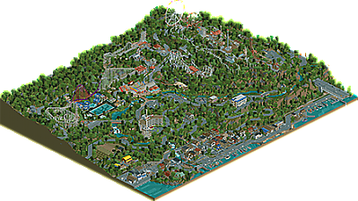
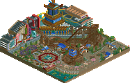
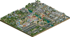
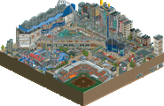
Nestled in the hills above the small town of Shimotsui, Washuzan Park Rainbow Summit has seen better days. The park-- and the area as a whole-- has seen its fair share of change over the years. Through ups and downs, the park has continued to offer guests thrilling rides and the best views around (even if a number of the rides are no longer in service). Come along and explore Shimotsui's Rainbow Summit!
-
23 fans
 Fans of this park
-
 Full-Size Map
-
 Download Park
922
-
 Objects
568
-
 Tags
Tags


frirst
2rd
I have to admit, I knew this park was coming and I knew it'd be good and I'm still shook. I feel confident in saying this is a masterpiece.
First and foremost, before even talking about the park, the back story. As someone who has often built in more fantastical styles, narrative has always spoken to me. I've found that narrative has frequently been the foundation of my work; once I have a story to tell I can begin forming that into a park. Narrative will often inform the very style and substance of the project itself. I feel like that has always been more inherent to the way non-realistic parks come together while, and I'm generalizing a bit here, narrative hasn't played as huge a role in realism projects. That is all to say, the storyline and sense of narrative you've wrapped into this project is for me what sets it apart. Here, we aren't getting a brand or a style, we're getting a nugget of history. It is essentially a historical non-fiction park, and that is a true achievement. Reading the story, looking at the park, I get a feel of a real, living place and all the details and moments that have gone into creating this place in time. Knowing the care you put into that, all I can say is bravo.
Now, turning to the actual rct save file itself. The lasting impression as I explore is that this project really and truly feels like your passion for unusual rides and coasters and theme park history melded into a real, tangible thing (well, that is, a computer/data thing). You've taken a collection of rides often seen as supporting or non-functioning set dressing or just unusual and made them the stars. There is no flashy RMC or wingrider or even B&M, but I don't think those are missing. In truth, they just have no place here. Instead, you've crafted these richly detailed and largely functioning depictions of the rides that are correct for this setting, things that feel more appropriate for a smaller regional Japanese park. For me, that is a true treat, the feeling that we as viewers not only get to enjoy these rides, but more that we can feel your passion manifested.
I know I'm gushing a bit, but for me, as someone who has come to see rct and the work we do as an incredibly niche art form, this is a marvelous piece of art. I think in the past my tendency to build non-realistic parks has led to the assumption I don't like realism, but really I just love all rct. And here is a park that manages to be incredibly artistic but also incredibly realistic in one. I'm really in awe.
Some things I particularly enjoyed:
-Pipeline coasters, layout-wise, are typically nothing special. But seeing Ultra Twister operating as it should, detailed as it should be, it is a true star of the park for me.
-The rainbow motif is great, but moreover, how you've implemented it gives this very Japanese almost 80s throwback feel that is just perfect.
-The Village is a great example of how careful composition and clean construction can create great architecture. Here I think you've struct a great balance between detailing where needed but also simplicity. In particular, I love the Yamakazi Mart, the Knitting Cafe, and the Corner Shop.
-Overall, there is a sense of polish to this that makes it so impressive. From all the named buildings and ride details to the staff. I usually obsess about this in creating a complete 'package' so I really appreciate the effort you've put into that, even down to researching names common to different time periods of Japan.
-The Hotel La Rainbow is such a great statement piece.
-The custom rides are impeccable throughout, as we'd all expect from you. On top of that, the aging on the rides with different color choices was amazing and really essential to crafting the park's unique atmosphere.
-I love all the details like Titan MAX getting painted or the leaking pool and how they tie back to the story.
-The water sounds along the coast line is an amazing detail. It reminded me to view this for a bit with sound on, and the fact that you've even thought about that is next level.
If I had one, solitary criticism for the park, it might be that in some places the foliage and landscaping felt a little sparse. But, I know you were facing object limit issues and I'm obviously prone to a pretty heavy hand with foliage. Sure, there might be some things I'd do different stylistically, but nothing that strikes me as incorrect for what your vision was for this project
I have to say, you've said to me in the past that you don't have enough creativity to do something fantasy. I call bullshit. This park has creativity in spades. Sure, you've channeled that into something highly referential and structured around real-life places, but the creativity and dedication and care that goes into creating something this artistic is truly awe inspiring. A huge congrats on the release, on what should certainly be a spotlight, and what I think deserves a place among the best rct creations of all time. And thank you for sharing all that with us.
FK has already summed it up better than I could, but the lengthy backstory that this park has really helps to add context and understand what you’ve built here. Also like FK said (I feel like I’m gonna say that a lot here ), your fascination and love for this real place shines through. It’s a love letter to the real deal and it really feels like you captured not only a real place, but a moment in time and a piece of your memory in RCT form.
When opening the save, I decided not to look at the park first, and view it as if visiting the real place. So I started out at the town itself. Now, I’m far from an expert concerning Japan, but the images you added, plus the limited knowledge I have via TV and other media, you captured the damn place bang on. Not only did you do a great job recreating it, you successfully added ‘the breath of life’. Anyone can build a house. Make a box, and add a roof to it, but it somehow feels...dead. But then you break a window, you add some dirt to the walls, perhaps some washing on a clothing line...and it suddenly feels as if peeps live there. And you very much convinced me peeps live in this! Also, water sounds using dinghy slides?! You’re insane.
The park itself is the highlight of course and you captured that gorgeously tacky run-down 1980s feel perfectly. The selection of rides here fit without a fault and the SBNO rides are all adding to the story. I don’t have that much to say here, it just all works. Fantastically.
My only remark would be the same as FK’s, namely that the foliage leaves a bit to desired in places. You can see you were nearing the object limit, especially on the cliffs near the highway.
I find this to be more than Spotlight worthy. You went above and beyond creating a real piece of theme park history, drenched with your own passion and memories with a nearly faultless presentation. Look at the staff names, the stall names.... The little extra details sprinkled on top (Brick-san for best idea?). Even a soundscape with the water. You can be proud of this.
As someone who has been fortunate enough to visit the park that inspired this brilliant piece of RCT-art, I'm thankful you pointed me to visit this place in the first place! Brick-san alone is worth the visit. As you said in the read-me, Brick-san is best employee.
More than that, having been to the real place, viewing this park is all the more special. Everything here looks like a photo or a memory to me (except for Titan MAX, RIP Space World). I feel like I've actually walked through the streets leading up to the park, climbed that obnoxiously large staircase to the top, and I've seen the frankly insane view from the cycle ride.
I could gush like this for a long time, but to go through some specifics:
- Brick-san, Obviously
- The backwards train on the Togo, such a small thing, but true to life
- The mad mouse observation deck
- Ultra Twister, easily the best rendition of this ride type we've seen in the game.
- The grillmaster at the front pavilions
- To be honest, all the SBNO rides. The aging on these is done so well to how long the ride is to have been shut.
- Hotel La Rainbow, brilliant shape, cleanly done curves, and so full of details.
- Nakamura-san heading to work (Orange Car for those who haven't found him)
- The Lawson's and 7-11, both so spot on
- The shrines
- All the boats in the fishing port.
- Slow lift hill speeds
- The little ride on vehicles in the entrance plaza
- The detailing in the bottom of the pool
- Honestly every building in the village
I think I'll stop here before I list everything in the park. This is truly a masterpiece, and something to be proud of. It's another huge milestone for the game, something you seem to be good a turning out. No doubt to me this is a Spotlight, and one of the best pieces of RCT that's ever been made.
Congrats Brian, can't wait to see what's next!
Positives:
+ A ton of details
+ Grittyness
+ Good ride design
+ Town is cool
+ Feels very real
Negatives:
- Some parts of the map feel dead
- Foliage and landscaping on a silver level
- It feels like there isn't a lot of content for the size of the map
Overall: Very strong park but with real weaknesses. Probably a bit too detail heavy for my taste. 85%
Congratulations on this release Brian!
Obviously there is incredibly rich storytelling throughout this park, and most of it is wonderfully subtle and atmospheric, but what I was particularly blown away by is the unique aesthetic you’ve created. The amount of cohesion in architectural style and colouring is something quite rare in “realism” projects, and it really shines here. I love all the different types of canopy structures and how all the whites, pastels and dull tones give the park a very distinct character which captures somewhere I've never visited in real life but now feel like I have.
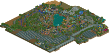
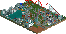
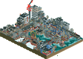
The sense of scale and depth you’ve created with the elevation changes is breathtaking too. From each of the 4 angles you get a totally unique vista. And it would be easy to lose the sense of depth in all the overgrowth, but the way you’ve used things like retaining walls, coaster supports or chairlift towers to give definition to the vertical space is wonderful.
going to keep this as a short comment for now - there’s still lots I need to dive in and explore more, but I can already tell this is going to be a landmark park which will be hugely influential on how people build RCT going forward. Amazing work!
Congrats on this release, CP6. I just spent about two hours looking through the park and I totally lost track of time while exploring it. FK explained it better than I ever could, but i'll try anyway. This is probably the most immersive map I've ever opened in RCT. The grittyness of everything makes it feel so 'lived in' and realistic.
The little town is one of my favourite parts of the map. I remember hearing sentiments about it being too empty or dead when you posted a screen, but I think you have the perfect amount of life going on there to make it believable. I don't have to see busy roads and thousands of peeps and an overly filled airspace every time somebody makes a town or city in RCT. Keeping it quiant payed off big time here. I also love all the little imperfections and quirks of the buildings in the town. These are details that you obviously spent a lot of time on and making it all feel so natural must have been a result of spending a lot of time with reference pictures.
The abandoned hotel was beautiful overlooking the town, and I think you added just the right amount of rundown-ness to it. Looking at this part of the map makes me think about all the urban exploring video's ive binged on youtube over the years, and you couldn't have captured the vibe of that better. (also appreciate the urban explorers you added in it) Makes me feel like you knew exactly what you were going for.
The park itself is also fantastic, i loved the pastel colors throughout and as FK said, your love for theme parks just oozes everywhere you look. The unorthodox rides and coasters where a nice breath of fresh air and were presented in such a way where you can appreciate their tackiness and uglyness, which i always have a soft spot for. Also a big fan of the abandoned rides, and the slight differences in color you used throughout to make the structures and rides seem aged. (I tried to re-open the Jungle Safari ride and it crashed, oops )
)
While the park is awesome, the outskirts might have to be my favourite part of the map. I already discussed the town, but the highway with the train going next to it, and especially that little trench the train goes into under the highway exit, just feels so believable, to a point where i forgot i was looking at an RCT park.
In terms of the landscaping troughout the park, it didn't feel like silver quality to me at all. I actually really appreciate that you kept it rather simple, as the end result is super clean and readable despite of the big changes in elevation. I think if you used rock objects for it, it wouldn't have been as clean, and the elevation wouldn't have the impact it has now.
Overall, just outstanding work. What really impressed me is how realistic everything feels, without it being over detailed. We're definitely in a phase in RCT right now where a lot of realism parks are trying to be as detailed as possible, adding crunch and texture and whatnot on every single tile, but I think this park proves that you don't need that. If you only add detail where it matters, the result will be so much cleaner and readable.
Congrats again, I wont vote just yet as I want to look at it again before doing so. I might not be in time, but im sure this park will get a deserving score regardless.
It was a great start of my day to see this released. The strongest point of this park, and why I like it so much, it's the recognazibility. You put a lot of effort in your readme and so, it was nice to see reference material.
I've never been to Japan, or even just Asia. But it all feels so realistic, exactly how I imagine such a park would look like. It feels so real. Creating such ugliness and make it look good, is an art. Hats off to you. The SBNO rides, the not-maintained and overgrowing paths,... all those little details make this whole park feel so real.
Same thing with the coasters, they were all pretty fun and aesthetically pleasing to look at. But still you made them feel look like crap too, as the real Togo's and that kind of coasters look like in real life
Another point about this park that I love: the landscaping and view lines! Everything is placed to perfection! The park is located in such a way there is such an amazing view from the park to the village and vice versa. Not only from the POV for me as a viewer, but also for the rct peeps. And also in the park, I think I could take so many good looking photos as a visitor from like every spot.
I also want to say I dig the foliage. It's quite something else than we're used to but I think it works great. I'm a sucker for dense, heavy forests in rct. It really adds to the wilderness vibe.
The stations of the rides and the entrance of the park were also a big highlight for me. And of course the outskirts are amazing too. The amount of detail and effort you've put in it is stunning. It adds a lot so that effort was worth it!
Stuff I like:
- the harbor with the custom boats and the whole atmosphere there
- The hotel Rainbow SNBO tower
- the colored curved path at the park entrance
- the scrap yard near Titan MAX
- the 'abandoned' wild water ride at the water park (also yet again, the curves in the big pool are a fantastic touch)
- All the station buildings were quite amazing but the dizzy cups ride roof takes the cake!
- the weird path and the fact how hidden the entrance of it is from Star Jet
- The lonely Roll-o-plane
- Cavern Quest
- I also liked the highway with train tracks cut-outs a lot
Stuff I didn't like so much: I'll let you know if I find something.
Obvious spotlight to me, and I agree with the statements that this can be seen as one of the best rct creations. In history. Congrats Brian, a work to be proud of!
I feel like I'll definitely need to come back with a more detailed review when I can give myself the time to write one, but this is a perfect park, a love letter to coaster enthusiasm, to travel, and to the depth and intricacies of real life. It's not the most traditionally beautiful, but the level of detail that you rendered everything at speaks to a real devotion to capturing the essence of the source material, both from a physical standpoint and an emotional standpoint from your visits and the history behind it.
Utterly perfect, 100%, a new apex of realism in my opinion. I really hope this can usher in an era of highly-researched passion projects.
RaunchyRussell Fan Offline
Once I have time to give a detailed review I will do so, because this deserves it. I advise people that skip over park readme's to not miss this one. The context this provides takes this from a high gold, to spotlight, no question. This park oozes atmosphere, passion, and skill. Like FK said, it is a nugget of history.
This is the most realistically Japanese park I think we've seen, without a doubt. There's so much to love about this, and I feel some nostalgia from my visit when I look through the village.
My focus is going to be a bit on the feel of everything drawing from personal experience; you've already gotten a ton of feedback on the general atmosphere and all the little details - all of which is deserved. I really want to focus on what I found amazing about this.
I'm gonna start with the Gion Shrine. While I was in Japan, my host family took me to a small rural shrine not unlike the one you've made. The sense of community there was unlike anything I've really felt before, and it was an amazing place. That being said, you did a phenomenal job at capturing it. From the stone torii to the sculpted features, the placement on a little hill with those stairs leading up to it, to the dirt/gravel pathways - you captured that atmosphere so incredibly well it's hard to believe.
The way the main roads wind around the farmland and along the hills is exactly as I remember it, and the village itself is fantastic. Each residence is full of character, and it really feels like you pulled this right out of the countryside of Japan.
The traditional graveyard and the convenience stores are major highlights for me here. The harbor is a lovely little scene and I really love the ocean ambiance effect you pulled off. The use of different textures in land and pavement both really help sell the atmosphere to me. I could go on and on about all the lovely little details, but the atmosphere as a whole really made me fall in love with this.
The park itself leaves nothing to be desired; I love all the quirky theming bits, the realistic but comically slow lift hills, and of course the fantastic ride design. The Jet Coaster is my favorite, not only because I'm fascinated by the type of coaster, but also because it's so well done. Comparing some stuff on RCDB, it was really amazing to see the similarities in the views you get when looking at this in RCT versus reality.
I love both this and Fujin for different reasons; Fujin is a lovely but almost idealized version of Tokyo; Washuzan feels so very real. Both are amazing settings, and I'm really excited to see more representation of this unique setting in RCT. You've really done an amazing job at capturing a real place, and giving it some RCT personality.
Game over or be inspired. You choose.
I'm going to jump on board and say and honestly say that on top of an excellent take at realism, perhaps the best I've seen in my 2 yrs back, what separates this is the full package.
Posix, FK and Maverix nailed it, in that CP6 has given no room for error on what this map is supposed to be. The park itself is stellar. I'm not keen with the paint color (new) on TM, but blame Mgmt. They actually started that while he'd already started the map and he adjusted. The purple is awkward currently but it's an attempt at giving the old place some love, so there are worse things to worry about that Mgmt could do. I love the SBNO free fall, having ridden those, and the rusty look here is just one example of the level of detail. Rainbow signs, awnings. Check. Huge ferris? Mate. Huge fan of the walk to and then on the viewing platform, as well as the sky cycles. I'd researched those over the last 2 years, and can respect that down hill view this implies, having lived in Japan as well. Park looks worn, as it is, as it should be.
As for the town, it likely surpasses the park, especially when considering the tunnels into the mountain side (love those), the shore, the train, or just all of the different building styles. If you aren't convinced, the doc proves it with all of those pictures of buildings. Man, it's like a view into my very old, faded memories. Older than CP6 himself, nevermind anyone else.
From my view, having lived in Japan when I was 3-6 yo on Okinawa, this brings back memories going back almost 40 yrs ago, to this very time frame (early 80s heyday). While I did visit Tokyo Disneyland when it was 2 weeks old, I don't think I ever went to this park... but I did go visit some towns, like Kadena on Okinawa. The detail for the buildings, the road gutters, the little alleys, I lived this...whether it be the off base house on the hill I had, or the markets we visited in Okinawa or on the bigger (main) islands.
So...absolutely amazing. I know (like FK) that I tend to favor fantasy over hyper realism, but if we're going to go into realistic mode, this is what appeals to me.
For others, if you want to go to the level of pondering if NE Admins should create another pm color/level, pick your topic, support your topic, and tell a tale. We'll never get to live it the way your have while you research, build and create, but feel free to support it like this here, FKs Nepal, etc. For me, it makes it a complete package and I love it.
Great job...can't wait to see where you go next CP6.
Admins - 100% and new parkmaker status/color needed.
Had a long look last night. Read the readme today and looked again. I have to say the readme was a genuinely good piece of literature, and stands on its own quite well without the park. I was nearly in tears at the various tragedies. RCT never felt so heartfelt for me.
That feeling carries over into the park. When I think of "atmosphere" in RCT, this is everything I desire. It still feels very much like RCT while avoiding all pitfalls and tropes. The use of color is something I can't stop thinking about. The balance of all the major rides being white contrasting with the rainbow clad plaza- and the dark green of the trees repeated throughout and the water park floor.
The coasters all feel so special and unique. The hyper, even more than the others, captures this uncanny space, equally awkward and elegant. Star Jet's high pre-drop (or whatever term you prefer) curving over the path, and its towering airtime hill falls more firmly in the elegant category, and is probably my favorite in the park (even if you didn't make it go backwards). JCST feels maybe the most unique for RCT and I love how it dives and floats low to the ground, weaving through pathways and everything else. Maybe the ultra twister is actually my favorite- I've always found them so charming and it's nice to finally see one done realistically. I'm glad SpaceK got the hack figured out for you- I'm not sure it would have worked so well if I'd done it (especially back when you asked me last year).
I love all the hacked flats of course, but equally mesmerizing are the SBNO rides that really give the park that feeling of history, and being lived in. It is partly my own disposition, but there is absolutely something a bit more inviting to me in a park that is a bit run down like this compared to the many shining six flagses, cedar fairs, etc. The readme really took it to another level, and the two complement each other so well. the wild mouse observation platform especially is a fun one. the ferris wheel looks insanely good for its size, and it seems to me that you are a master of making gigantic things look good in RCT- a scale that most builders simply cannot execute a good looking ride.
Zooming out I am struck by the pleasantness of the foliage. To call it silver quality feels obviously wrong to me. It in itself is not "spotlight" either (by which I mean it wouldn't help bring a park to that level), but I think it serves a great purpose. To me it feels very much like a backdrop, which is welcome in a map which is otherwise so overflowing with content. (I likewise appreciate that you kept your road crunch to mild levels rather than extreme.) And here we see the unerring power of nature which draws in all man leaves dormant. In this way I find the park, not only romantic, but Romantic (and specifically gothic) in its portrayal of nature and decay.
I have less to say about the village as so much has already been said. I'll just say that its great and I love that that building has an English palette blue roof in real life as well. I really love the boats as well- you really did the most with the least tiles in the harbor area. Overall you managed the game limits quite well in this park. Of course all the narrative details are wonderful as well- the shrines and graveyards, and Tanaka deliveries. (Is "waiting for Akari" the "waiting for Godot" of RCT.)
To conclude, yes I liked this park. I have no considerable criticisms honestly, and I think that's fine. What makes the map so successful across the board is its total commitment to your concept (and of course your laser-precise execution of that concept). To me this stands as a new high water mark of RCT realism- and instantly my favorite realist park (100%)
This definitely was a great release. Im really glad to finally see this finished. It definitely shows a lot of dedication and effort. The amount of realism is above almost anything else we've seen over here. Im also glad that you kept a lot of fun little details in this and not let the realism thrive you away from that.
Having been myself to Japan a year ago this park really connects to me too. Although i not have been to the real park or the area its located in, i can definitely imagine myself being there with this release, especially looking at the outskirts and the city. The architectural style over here is simple, but effective. Would have maybe loved a bit more life in there, but i guess that also might be a bit nitpicky.
Bold move with the foliage and landscaping on this. I can definitely see you tried to create something unique in that aspect. Im digging it in terms of the landscaping, feels refreshing compared to the hyperdetailed quarter tile landscaping were used to these days. The foliage is probably the only thing about this park i dont really like. I would not agree its silver quality, but you set the bar so high in terms of realism with the park and surroundings that the foliage felt a little bit underwhelming to me compared to that. So much rough edges that made viewing it a bit hard for me.
All in all a solid spotlight park for me, especially looking at the passion you seemed to have put into this. 85% / yes.
100 / yes for me.
This park achieves exactly what it meant to achieve. Storytelling is king in my book, and that aspect is executed flawlessly. I don't think there is anything I would change on this park. While I know the foliage could have been finessed a little bit, I understand that the object limit was an issue. Not every single tile has to be hyper detailed, and thats perfectly okay. I thought this achieved just the right amount of grit and polish. Everything is believable and nothing misses the mark in my opinion.
Does this park achieve the goal you set for it when starting building? Absolutely. Is it executed at a very high level? Absolutely.
If this isn't top-tier worldbuilding and parkmaking, then please someone show me what is.
Excellent work Brian, it was a privilege to have played even a small role in helping you with this process.
Now this is the type of park, I download it and place it directly into my spotlight folder in my parks files. It's a no-doubter!
This is realism maxed out with the pedal to the floor. As a prime example, I think someone recently posted on discord that they've never really seen realistic traffic, despite the many excellent attempts to nail it. While I don't know if I agree with that viewpoint, but I would say there is nothing more legit than what you have in this park, from the slow pace of the neighborhood streets, to the hustle and bustle of the highway, the switchbacks heading towards the park, even pulling into the gas station to fill up. Anyway, that's just one example of the dozens of intricate details you put into surrounding neighborhoods, oyster and fishing boats in the marina, even just the right amount of peeps walking around compared to the actual park. That highway is so damn cool, funny how something like that can be so captivating and impressive. Every time I open the park I have to go take another look.
On to the park... well before I get there. I had the privilege of being on the same H2H team with Brian last season. Seeing first hand his approach to realism, and his vast knowledge of theme parks was intimidating, but your humble approach to the game and helping your fellow players is at an all-star level of excellence. You make the game better for everyone.
So, with that being said, your ability to hack and recreate what we see in real life from this ancient video game is next level. We're used to seeing recreations of typical theme parks, but you've taken a somewhat unconventional setting (at least by NE standards) and perfected it. The coasters, flat rides, stations, the legit gritty feel of the park is all stunningly captured in this work of art!
As for the foliage debate, I feel it achieves it's purpose and looks great doing it. Sure if you had another 10,000 map elements you could have used then maybe add a few more bushes everywhere to blend it a bit, but it's by no means a negative on the park. You balanced your use of objects perfectly. If you wanted to perfect the foliage then other parts of the park would have suffered. You absolutely made the right call there.
95%/Yes
Legen.... (wait for it)... dary!
Sex
Great storytelling to the point that you don't need to read the readme to understand the thought, age, and development that went into the worldbuilding in this. Little details and things that most of us wouldn't consciously notice, but get subtly picked up and shape our perception of an area or ride's history. This thought and effort and patience and detail is what sealed the spotlight "yes" from me.
On the other hand, I wasn't a fan of the foliage. The noisiness of the foliage was too much for it to blend in as a background element, but it didn't draw enough interest as a feature to justify the noise.
Congrats on the well deserved spotlight, the reinforcement of your Legendary Parkmaker status, and on finishing this passionate piece of parkmaking.