Park / Bumbly Beach - Pier of Fun
-
 06-March 21
- Views 2,710
- Downloads 554
- Fans 1
- Comments 9
-
 55.50%(required: 50%)
 Bronze

Jappy 65% saxman1089 65% Scoop 60% Xtreme97 60% bigshootergill 55% CoasterCreator9 55% Cocoa 55% In:Cities 55% posix 55% RWE 50% chorkiel 45% Liampie 40% 55.50% -
 Description
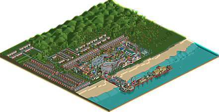
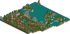
This park was part of a DKMP contest where the objective was to redesign an original scenario. This meant building within the original given land, but including construction rights. I chose my all time favourite, Bumbly Beach, and added something that I always felt missing... A pier. The Bumbly Beach scenario probably has the most underrated construction rights of all. So much potential.
For this entry I decided to pay tribute to my favourite RCT-builders, who helped me rediscovering the game and improving my building skills. Therefore some buildings and rides are 'citated' directly from their parks, albeit with variations. They are included as an entertainer or guard somewhere in the park, mostly near their inspired object/building/ride. Special thanks to Jappy for giving me the inspiration for this build with his CSO remake. The general layout of the coaster and the park, including ride interaction and parkmap are mostly resembled from his park. An overview can be found in the ReadMe.
To those who are about to build, I salute you. Thank you for your inspiration and motivation. -
1 fan
 Fans of this park
-
 Full-Size Map
-
 Download Park
554
-
 Objects
365
-
 Tags
Tags

It seems as if the author wanted this "reconstruction" not to lack any of the objects that should be placed in it. And even good if it was a little more than you had to expect. Of course, I mean carefully constructed shop structures,
stands and others where everything that could possibly resemble the given elements in reality was used. This is what the NCSO is all about. This way of making parks is a high crossbar. Unfortunately, with this set of individual parts of the scenery, it is difficult to get the "eye catching" effect. That style is "catching attention" .
Make absolutely sure to pay attention to the pier. Great idea. The new attractions in the "Pier" section will not let anyone pass by the old park indifferently. I especially like the lotteries and the cable car (the balustrade is also worth mentioning). A great reamake, a lot of work and passion put a smile on everyone face.
a nice little park. I'm not sure exactly what to make of the 'cited' buildings and rides. I guess there's no problem with it but it does sort of make it a bit more difficult for me to figure out how I should rate things. I suppose life isn't about ratings though and we should just enjoy things. and this is a perfectly nice bit of ncso. Always enjoy a good scenario revamp!
Sad this doesnt get more attention. Its definitely a nice little park, im liking a lot of the architecture. Interesting approach to not change the outside of the park from the original park, resulted in some big of a contrast between your stuff and the original scenario stuff quality-wise.
The release definitely screams a lot of fun to me. Probably worth a bronze for me.
bumbly beach - 60%
i loved this - so good
coaster roofs blended better
real seaside park vibes
Clear skill in this little park, clever use of trackitecture in the buildings, and you packed a lot of rides in a little space, which I guess is the vibe you were going for. Love some of the little things, like the buoys off the pier, the red string lights, using the scrolling signs to make moving lights etc. It really is packed with fun! Good work!
Next step for your parks is to present a more finished product, not a big fan of massive empty spaces like this around the park. Maybe employing some more foliage/landscaping and/or simply just taking time to trim the park with some sort of NCSO black tile methods.
This can use a little bump...
I like this park, it has quite a few good ideas, a nice planning and some well executed ideas. It is obvious you used my park as inspiration for it, but tried to do something different with it. I like the addition of the pier for example.
My main problem is that in some areas it's pretty texture heavy. It's not yet too much, but be careful you leave some breathing space in your future parks.
This sums up my thoughts quite well. Where's Risiko in this? I guess you're the one who skillfully made a collage of bits and pieces from other parks. Is the lighthouse entrance yours? That's a good idea. The architecture I found a bit weak, in general, lots of nonsenical layer cake design and wall spam - sometimes elevated by an idea that may or may not have been taken from someone else. The flash bulb on the photography stand for example.
The flash bulb photography stand was first designed by Wacked i believe. In fact, most of the buildings in that street are either taken from or inspired heavily by Wacked's work. The lighthouse was from a park I made back in november 2019, but i must say it looks nice when used as an entrance like this.
I suppose im in agreement with the sentiment other people share here. I find it very hard to put a rating on this considering much of the work is not originally done or designed by you, and i was a bit confused at the time when you submitted it as a contest entry.
like Cocoa said, not everything is about contests and ratings and i do enjoy the park overall, and i appreciate the fact that you were able to take inspiration and motivation to play the game from many different builders.
First, congrats on the bronze. I will say though that I hope your next park/submission is original work. While being able to piece together ideas is nice and requires solid planning, I think Liampie is right in asking, what here is Risiko?
Otherwise, I think the pier was a bit disconnected.. the L shape was a bit odd to me and seems really far away from the rest of the park with the big empty beach separating the park and the pier.