Park / Six Flags Challenge Woods
-
 06-March 21
- Views 3,633
- Downloads 701
- Fans 2
- Comments 16
-

-
 49.50%(required: 50%)
 Spotlight Submission

posix 60% bigshootergill 55% Cocoa 55% In:Cities 55% WhosLeon 55% CedarPoint6 50% Xtreme97 50% CoasterCreator9 45% Jappy 45% Scoop 45% chorkiel 40% nin 35% 49.50% -
 Description
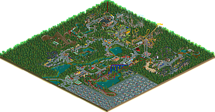
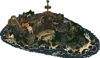
This park was started with the intention of pushing the scenery manager and some other new OpenRCT trickery to the limit - by attempting to build a park in a day. An idea born and started on the spot with no planning whatsoever. I didn't finish in one day and over the next two days I was mostly busy with work - but the park got there in 2,5 days regardless, all thanks to the scenery manager, some much appreciated contributions, and lowered standards. The point was not to make the best park ever, and I'm not sure it will even qualify for an accolade, although I'd like to see this grab a bronze - time will tell. The point was also not to make a mockery of Six Flags parks in general, I'd like to build a six flags park in the future and the type of park lends itself well for an experiment like this, so that was an obvious choice for me. This is not satire, it's a challenge, hence the boring name.
I hope you will enjoy the park, and I hope you will go experience the power of the scenery manager yourself. I'll be sure to share some findings on the forum son. -
2 fans
 Fans of this park
-
 Download Park
701
-
 Objects
338
-
 Tags
Tags

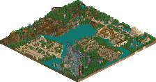

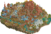
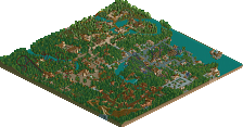
This park was basically the park I expected to be (nice macro- meager details), but I ended up enjoying more than I thought I would. Really reminds me of some of the full scale parks we see from new cso players on the site- a little rough, but still very fun. And there are lots of little moments fo beauty around it. The little lake with the teacups and swinger by it for instance. (although I wish you'd used the ncso flat rides- the cso ones always look kind of ugly to me.) My first thought on opening this park was "hmm does scenery manager not handle path objects?"- would have been worth it to spam some around in 30 minutes. Honestly, my favorite thing on the map is battle boy's schwarzkopf- really fun layout. Wish there'd been a bit more of that sort of thing on the map. Yes I know I said it was fun earlier, but it's also very sterile in a lot of spots- which is the danger with speedbuilt minimalism, I suppose. Arrow looper was also a nice layout. Anyway, I had a look at this over breakfast and it was by no means a bad breakfast. 55
Integrity of paths for visitors with built attractions ... I think, it could
be a criticism argument. Although it seems that this style of layout is even typical of the "Six Flags" parks.
Of course should pay attention to the sidewalks for those waiting in line. Many of them allows to "feel" the atmosphere of the ride.
Thanks to the characteristic and well-chosen vegetation, you can feel great in Bugs rabbit zone.
One could speak for a long time about vegetation. It is important what the park creator imagines location. Although the flowers look nice, the park designer was not in my head arranging any garden (...). Maybe it's because of the cost?
Wild west scenery elements look good. They absorb the attention of visitors.
The roller coaster of my project got a nice painting and a name - I like it.
Batman's car is truly a world championship.
I myself was thinking of some "Six Flags" park design based on game elements but I decided that it was not the time for my reform.
My rating is 75.
It's really crazy if you see what you did in such short notice with the scenery manager. Imagine doing all of this in vanilla rct... not so good old times. Experiment succeeded I think!
When it comes to park quality... it's not your best work obviously. Some good stuff in there though, I did like the western village. Lay-outs were a bit poor sadly.
I expect a close bronze.
I rather like the giga coaster and arrow (or vekoma?) layouts. The latter especially has a nice shape, sequence of elements, and feels like a convincing alternative to the typical double loop, double cork combos.
what's the scenery manager? is it like save track design with scenery without the track?
Oddly satisfying park to look at, but I think the repetition of certain elements like coaster and ride stations made the novelty wear off pretty quick. I think crowd sourcing more archy in 24 hours could've yielded better results, but this was a good study in scenery manager usage. I agree with others that the arrows was a nice layout. One thing that might've helped the park was using a different path.. the grey tarmac was just so sterile.
RaunchyRussell Offline
This is a cool experiment you did, and I honestly feel like this is a solid park all in all. It does check all of the boxes of a semi-successful park in my opinion. I really like superman and the arrow layout. I liked the bug's bunny area as well. Fun thing to be a part of.
I love it, especially the toilets.
man I liked this way more than I thought I would haha. if only the original RCT games came with the default six flags scenarios built to this level.
If I didn't know this was built in such a short amount of time, I'd probably be coming into it with a bit harsher of a mindset.
I think this is a fantastic experiment in what the scenery manager is capable of. There are a few places this really shines; notably the regions of dense foliage and the parking lot. Of course; it's excellent for any repeated motif in a park, and I think that's great.
Obviously this has some major flaws; largely due to the time constraints. It's lacking a lot of the typical life-bringing path objects and little features to break up the seas of pavement. I think you also fell into the "islands of park" trap that you advocate against. The architecture is a mixed bag; wild west isn't too bad, all the stations and generic buildings are extremely plain and suffer from an identity crisis.
Hey, the layouts aren't bad - you clearly outsourced them.
All things considered (and jokes about layouts aside), this is a nice experiment - and worthy of praise considering how fast you built this. As far as an accolade decision goes, I don't really think that has a *ton* of merit, but I do appreciate the effort and the demonstration of what this tool really provides us.
hey this is pretty not-bad for what it is. layouts were decent for the most part and it feels relatively cohesive. I think its just slightly noticeable that theres a bit of building copying trickery going on, but if you lowered the amount just a tad and didn't tell us, I reckon it would slip right under my radar. fun experiment and I need to figure these tools out for myself...
edit: you got nin'ed...
Ha, missed by 0.50%! A bronze would've been neat, but no hard feelings. I think I proved my point with this, and part of me is glad it didn't win, potentially discrediting other bronze parks that took more than three days to build.
I'm happy with the reception (thank you!) and I had fun making it. And who knows this park will someday get the SFH/Storybrook Glen treatment.
challenge woods - 45%
good experiment
the park layout is great
the content is not
You don't mean that about my toilets do you lew ;_;
This turnout looks a bit like a punishment voting, and I'm not sure I like that. It's not an amazing park, but easily should have won Bronze in my opinion.