Park / Storybrook Glen
-
 28-February 21
- Views 11,466
- Downloads 881
- Fans 26
- Comments 30
-

-
 89.50%(required: 80%)
 Spotlight

Camcorder22 95% yes inthemanual 95% yes robbie92 95% yes CedarPoint6 90% yes CoasterCreator9 90% yes In:Cities 90% yes Scoop 90% yes ][ntamin22 90% yes bigshootergill 85% yes chorkiel 85% yes posix 85% yes RWE 75% no 89.50% 91.67% -
 Description
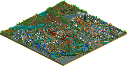
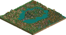
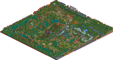
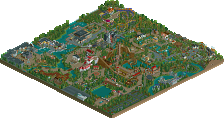
A Replacements Park
-
26 fans
 Fans of this park
-
 Full-Size Map
-
 Download Park
881
-
 Objects
412
-
 Tags
Tags
I love everything.
Airtime Offline
This is such an incredible park. To think how quickly it was built is incredible. Watching the build has been an emotional roller coaster. Destroying something that was good to turn it into something great takes serious commitment and determination to achieve greatness. That’s a huge reason why this park seems almost perfect to me. Lucky you guys didn’t burn out doing this process but I guess the team spirit kept you going... please finish SFMM tho. I’ll even accept Engima’s SFMM alternative haha.
My favourite area has to be the Western area. The steel lasso coaster is so unique and the architecture and atmosphere is ridiculous. The singer is mind blowing. How has nobody done something like this before? It looks more accurate than CSO versions!
The Mexican architecture is just as good. The textures and stuff you’ve all used throughout the park is mind blowing. There’s objects that we wouldn’t normally build with looking amazing out there, wtf.
The Mexican water ride is so atmospheric and has loads of great details like the support work, catwalk etc. Particularly love the lift/stairwell details.
I have a problem with the sky swat as I don’t really think the support work looks like the real thing but that’s a personal preference, there’s nothing necessarily wrong with it.
The flying circus is incredible. I have such a soft spot for this ride type.
I think generally the custom flats are everything in this park.
The dark ride details are next level. Really glad you have a mix of dark rides and none of them are similar.
The little backstage details and especially the farming vehicles really add.
I think the selection of rides and themes really work well together as a park. The composition is prefect and the general atmosphere is great. Love the pops of colour everywhere and how vibrant berthing is.
All of the coasters have such strong layouts, I think the woody probably has the best followed the wing coaster. The positioning and choice of rides is great.
The name of the park seems a little uninspired compared to the actually thing but again personal choice I guess.
It’s a definite spotlight, 90-95/yes everyday. Anything below 80 is an insult, even anything below 85 is silly but everyone has an opinion and that’s absolutely fine.
I don’t understand the comparisons other people have made here at all. This is a new generation of NCSO spotlight and I’m really happy to see that.
Bit of a ramble but you get it. It’s good.
Can you timeline this park now please... you do like nuking stuff after all.
pog
This is one of the most impressive things i've ever seen in RCT. Took me quite a while to work out it was NCSO, and there were so many moments where I flat out couldn't work out how things were made. Also, to get this many different builders to look like one person made this whole park is amazing.
Wonderful, seamless building all around, coupled with great innovation, ride design, and atmosphere. The ONLY blemish keeping me from voting 100% on this was the muddled and cramped transitions between areas. Well done to everyone involved, and I hope that some of the NCSO-driven ideas started here can carry over into other work as well, raising the bar all around.
I think this is going to be one of my favourite parks of all time. Amazing atmosphere and a huge, but balanced, amount of things going on. This feels like a complete mastery of the NCSO realism genre. If better NCSO than this is possible I'd be very keen on seeing it. There's few if any negatives on this for me, although I agree with inthemanual that the area transitions could be better. In some instances it literally happens building to building, which I suppose is the one thing I could name. The fact I have to get into something so nitpicky to even suggest an improvement says heaps about this park. Excellent work everybody
95%
First of all congrats on this huge collaboration. It's pretty insane that this started as a 15 min park and grew out to one of the best NCSO parks ever. Another piece of NCSO renaissance. There is so much detail in here that you would never see it's NCSO until you take a deep look. Amazing.
Composition of this park is spot on and I have to say it's fun to see the resemblance to Walibi World. The same entrance with the same structure: having to walk through a building before actually getting into the park. The woodie and hyper on the same place as Untamed and Goliath... There's even a suspended coaster in Mexican theme and it's also a clone haha
The coasters were A-game. My favorite by far is Robin Hood, because look at that first drop! I really get a Ghostrider vibe from it and I loved that coaster. Anubis was also pretty fun, we don't see coasters like this enough in this kinda form. Overall the coaster selection was a great mix between kid-family and thrill. Not a big fan of the El Loco though, think that one is a bit too wide.
Outside of the El Loco, there isn't anything not to like. Stuff I really liked:
- sombrero pumpkin
- Roman horse carriage ride
- flying island
- Globe theatre
- the wave swinger is just out of this world
- the logs on the conveyor belt
- the Roman splash boats
I said on Discord that I like Ancient Worlds more, but the more I'm viewing through this park the more I start to get my doubts about that. I don't like hypes but the hype for this park is just... well deserved... When it comes to technical execution in NCSO, this is the best. I don't see any discussion possible about that. I still think the immersive atmosphere with more open space from AW got my preference, but yeah... It's stupid to keep comparing, we are so lucky to get so good parks in short period of time.
Congrats to all builders, well deserved spotlight and a NE highlight.
RaunchyRussell Fan Offline
The park entrance is a thing of beauty. Love the use of brick here. That seems like such an underutilized texture in the game, and it looks great. Surrounding buildings are strong, but that curved entrance pavilion is stunning. The sign on the columns is a clever detail trick.
Off to the roman area. Overall theming is great here. Love the chariot ride, shit is cute. The S&S swing is super clever here. Really stands up to CSO ones forsure. Pegasus is uber hot. Layout is beautiful, supports are great, the overall setting and interaction this thing has with the area is so good. Great visibility for the guests. The Voyage water ride here is also a show stopper. Lovely building and I love the viking ship in the cutaway scene on this one.
Diving into Egyptopia, again theming is spot on here. Anubis's station is so sick. This ride also has some pretty great moments of interaction here, which is a huge plus. The space shot ride is beautiful and how Anubis frames it. The dark ride really sets a lovely backdrop to the whole area, really adds to the atmosphere here. NCSO cut away scenes are fantastic here. The El Loco is sweet, Love the flume and that final drop into the ruins. The flume's simple station looks so cool to me.
Coming out of that area I see a flying circus cleverly put together using some shoe stringing. Absolutely love how that ride came out, and I would love to try to tackle it using custom scenery.
Moving towards the medieval area, Robin Hood is the first coaster I see. The layout is hot. Love the diagonal airtime hills and turnaround here. The sign for the coaster is so effing cool. The village is just perfectly detailed here, Fireball ride looks good here with the wooden station structure. Moving along the waterfront, the sky swat catches my attention. Looks fantastic here. Excalibur is fantastic. The station is grand, the plaza with the cool little sword/ swinging ship detail is so cool. Layout is what I would expect, it’s great, colors forsure pop out. The ride demands attention.
Transitioning into the Mexico section, Journey to El Dorado is Gorgeous. Everything about this ride is phenomenal. The theming here is really top notch, along with great object use. Moving towards the mexico inspired plaza there is some really pleasant archy. Loving the hanging flags that converge on the tree in the middle. Great stuff. El Condor is a cool looking batman clone with some nice support work and an attractive color scheme. Love how saturated red looks in this game. I like the sombrero ride a lot as well. Overall, I love this little area you have going here.
Moving on over to the rapids ride. Wow. Very clean work and clever theming on this one. This is the best NSCO rapids I have ever seen. The conveyor belt logging mill is cool and the way it carries the log flume car is so neat. Great guest interaction points as well with the water jet sections. Very cool to see.
Final section is the western town. Great theming, I really feel like the objects provided in the base game really sets you up to do some solid western style buildings. I really like how the Spanish area shares that giant building clump with the western area. The theming switch has got to be surreal if this were a real park. At first, I see a nice stadium with good supporting archy. Moving along from that I see the best swinger in NCSO ever done. Very simple, yet effective here. Steel Lasso is great. The supports are a thing of beauty and I love that final swoop over the water. Lovely job.
Things I missed:
Backstage details: Super well thought out, effective and probably more detailed than they need to be. That is a good thing though, I really appreciate those kinds of details. The farm is also a cute little touch here.
Sorry for the novel/ essay, but I feel like this park deserves all the attention. 100% from me. Killer job everyone involved.
Wooow
this is a stunning piece of parkmaking. I've been watching it from the shadows of the last year, but purposefully keeping a bit of distance because I'm lazy and because I wanted to be surprised when I finally opened it. and i'm not disappointing!
I'm so sick of most ncso work this day being the same rehashed themes and techniques, smeared with palettes into a samey mushy mess. this one is nothing like that at all- its fresh and absolutely brimming with new ideas, from tiny details like the detailing of the top columns of greek buildings to huge things like the amazing flying theatre (never seen that before...)
all the layouts are perfect and wonderful for their environment, and flow so well. archy is brilliant throughout- so detailed and atmosphere and unique that I forget I'm in ncso sometimes. I usually try and narrow in on some favorite bits but I can barely choose here. the tudor frame buildings? the colorful spanish street? the glass building in the entrance? the queue structure for the greek splash boats?
overall- one of the pinnacle ncso releases and one that deserves to be studied and replicated until it's absolutely done to death and we all hate the style again. looking forward to the next stuff from the replacements discord!
Here is my belated video review:
https://youtu.be/dy6c0GOvYPA
Such an incredible park. Congrats to all involved!