Park / Storybrook Glen
-
 28-February 21
- Views 12,849
- Downloads 1,053
- Fans 26
- Comments 30
-

-
 89.50%(required: 80%)
 Spotlight

Camcorder22 95% yes inthemanual 95% yes robbie92 95% yes CedarPoint6 90% yes CoasterCreator9 90% yes In:Cities 90% yes Scoop 90% yes ][ntamin22 90% yes bigshootergill 85% yes chorkiel 85% yes posix 85% yes RWE 75% no 89.50% 91.67% -
 Description
A Replacements Park
-
26 fans
 Fans of this park
-
 Full-Size Map
-
 Download Park
1,053
-
 Objects
412
-
 Tags
Tags
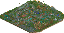
![park_4119 [H2H8 R4] Incident at Billy Wonka's](https://www.nedesigns.com/uploads/parks/4119/aerialt3859.png)
I made a little video showcasing the park. Enjoy! https://youtu.be/qgX_G_zPC7k
This is so good! The dark ride cutaways are the best I've seen with NCSO, and there are so many creative concepts like the horse and chariot carousel. I'm gonna have to revisit this one a bunch to really soak it in.
RaunchyRussell Fan Offline
When I have time I'll make a full review, but first look at this is absolutely beautiful. I am pretty blown away from my first look. Looks like we have some spotlight material here.
Awesome to see another solid NCSO release after Faastopia. I'm sorry but i can't resist myself to compare the two parks with each other, although this one features a rather different site of the NCSO genre.
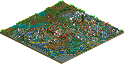
First of all i appreciate a lot how cohesive this feels although so many people worked on it. But i'm also glad to see the personal notes of certain builders in here. The entrance area for example definitely screams Steve for me. I'm also glad to see some changes here compared to the screen we saw some time ago. Feels much cleaner now. Going right from the entrance i see a solid coaster with nice theming. Overall this park showed some very good ride design. The thing i'm not keen on over here are the trackitecture roofs, i think they are kind of ruining the antique atmosphere here. On the other side custom rides here are a big plus.
The egyptian area was well done too in terms of ride design. It really helps to elevate the otherwise pretty boring architecture in that area. Ironically i personally spend more time looking at the awesome backstage stuff in that part of the park than at the actual park. Lovely fields and probably my favorite area of the park haha.
The middle area of the park is probably the part of the park where you can see the most that a lot of people worked on this together. Over here i can be on one square and im in a medival village, in little mexico and at a mine at the same time. Also there is a flying circus when i turn around? Don't get me wrong, all these themes are executed well and they individually definitely shine a lot here, but i probably would have appreciated more space for all the individual themes to develop. On the other hand we see some interesting stuff over here that definitely catched my eye: Mexico flags, conveyor belt and the invert supports are definitely something to check out here. Looking at small things im also a huge fan of the Robin Hood entrance with the bow and arrow.
Next i went looking on the western area. Not sure if the rapids is supposed to be part of it. Steel Lasso is a great coaster, well executed. Otherwise well done architecture and a good flat ride to see here. Then i realized that the area with the water coaster also belongs to Mexico. Interesting. Definitely a cool ride with some good theming. Same goes for the castle area, also the architecture was a bit messy for me partly. The giant trebuchet ride definitely was a great look tho.
All in all i think this is a very good release. Definitely deserving a gold accolade for me, i think im rating this at 75%-80% since looking at all the up and downs i probably see it in the same category as Faas' park and although it definitely had some parts that were impressive it didnt have as much wow factor as i would expect for a parkmaker quality park probably. Good job!
I just went over the park in detail. It is incredible. I love the wing coaster and wooden coaster. The dark ride sections add so much depth to the park, so when you look at a large building you know that it is being utilized. The shoestrung rides all over the the park are top notch and make this park extremely unique and high quality.
Your architecture choices all across the park will be utilized as inspiration for many parks to come. This is top tier NCSO and will be in my save files forever. Maybe next time, I shouldn't tell you I'm too busy. lol.
how DARE you compare MY BOYfriends to f a a s
god I hate that this park is so good because it really is so good. nice work you douchebags
where the heck is my 1%
Best park I've seen in two years.
Phenomenal execution and so much fun to look at. You guys absolutely knocked this one out of the park.
congratulations on pulling together to get this done! just taking my first glance at the finished park and its really an amazing achievement to have a group speedbuild(kinda) project built to this standard. I’ve got lots of feedback but I’m inclined to wait till after the panel voting (which I'm thankfully not part of). nice job all!
This is an amazing park. Huge props to making something so cohesive and fun with so many people involved.
I related this on Discord, but I see this as an "Ancient Worlds if Ancient Worlds was Universal or Busch Gardens style" - which is intended to be the highest of compliments. It has the same sense of feeling very "RCT-like" in style but with an entirely different atmosphere.
Beginning with the entrance; I appreciate that it's classy and modern, and sticks to a cohesive style unique compared to the rest of the park. I love the little seating areas and restaurants overlooking the park. I'm glad you kept Tour des Jardins from the original, and I think the Virginia reel track is actually really effectively used here. I think my one gripe about this area which can apply to more of the park is that the shops and restaurants are a little lacking in identity; maybe other than the tables and the occasional Texas Giant sign, it's a little hard to tell what might be a shop and what might just be theming - this is a very minor thing, but something I noticed. I also think it's super cool to have included the flying theater as the main visual set piece for the main street - both unique and impressive.
Greece might be my favorite here - I really love the use of columns and signs to provide details. Essedarii Spin is particularly well done; the framing with the trees and the curved structure is very effective. The way Pegasus looms over the whole area is great. Aether's associated structures are really subtle but super well designed. I adore the use of landscaping and varying heights of buildings for Odyssey, and the fountain out front is so well done for the limited object selection. I can't really get enough of this area.
Just going to throw this in before I repeat myself 500 times; the ride design across the park is phenomenal.
Off to Egypt; Anubis is awesome. Reminds me so much of Jaguar! from Knott's, and the way it winds around the other rides is lovely. I think the density in the area as you get back toward the dark ride is actually really cool. It seems like something an actual park would do if they were short on space but wanted that immersive theme. Throughout the park, I appreciated the dark rides and the tasteful use of cutaway techniques to show them off.
Sherwood Forest has some fabulous moments; most notable being the Globe Theater - fantastic architecture and extremely recognizable to me. I liked all the waterfront features, but I was maybe missing something for the guests to do there. It's got great sightlines on Robin Hood, but that's about it. It's a shame they're planning on RMCing such a great wooden coaster layout. The Excalibur castle might be the best NCSO castle I've ever seen, and the sword in the stone trick is lovely. Excalibur is one of the great moments of ride design while also showing that you can have a ride set in one theme without limiting the position it holds in the park; I think it's amazing to have an imposing ride framing half the park. Something in particular that I noticed which might be an underrated moment in this park; the Legend of King Arthur castle is a masterful use of forced perspective in this park. The landscaping and structures being positioned the way they are makes it look a lot bigger and taller than it actually is - super cool. The use of badminton rackets around there as bollards is wild.
Those Journey to El Dorado temples are crazy. Great use of color and a very nice combination of track and objects to create really recognizable forms. Love what you did with Hat Dance, I think that came out great after the initial iterations. I'm glad you decided to keep the rapids, as it has great interactions with El Condor. I do like how the western and Mexico areas flow together in a way; the themes are typically similar geographically, and I like that they both integrate with each other a little bit. The flags in the Mexico area are another great micro detail that really contribute to the overall feel of the area.
I felt the western area might have been the weakest except for two major things; Steel Lasso and High Plains Drifter. I don't think we've ever seen such a fantastic chairswing done fully NCSO like this. It honestly competes with some of the CSO versions and might be a candidate for Best Idea 2021. Steel Lasso is a great riff on the traditional mine train (I'm so glad you changed the supports over the water, though). I really liked your take on mine theming for this ride; felt really unique like the theming in the rest of the park. The rest of this area was a bit of a sea of western style buildings that I felt could have maybe used some individual personality, as I had mentioned before. Regardless, the use of foliage and the irregularity of the architecture definitely kept me interested.
I guess I should mention the stuff surrounding the park a little; I really like the farm scene, and the single rail track was a pretty effective trick.
All in all; really impressive work. For how many cooks were in the kitchen, this is really cohesive and well made. Most of all, it's fun - fun to see so many people come together and make something great, and fun to see people coming up with new techniques. Great work, guys.
90%, Yes
This is really something special.
As someone who's never been overly interested in NCSO, I can safely say this is my favorite NCSO project to date. And I think this will and should go down as one of the most successful group parks in NE history. I don't think there has ever been a spotlight where no one had a majority share. In fact, I would guess we've never had a spotlight that didn't have one person building at least 50%+ of the park. That is all to say, I'm pretty shook, rightfully so, by how incredible this park is. While there are a few individuals with a heavier hand, a huge congrats to everyone involved in creating an exceptional park.
Overall, I think this park does a great job of capturing the macro-focus that defines a lot of what NCSO at its best can be, but that is balanced against a wild streak of smart details and ideas that really make it something else. I'd go further to say, a lot of the innovation in this is universal beyond just NCSO. That to me is a sign of a true landmark park, one that doesn't just succeed at a specific style, but that presents ideas that can be built upon and taken into other styles.
Some of my favorite things:
-The ride design throughout is impeccable; my favorite were Essedaril Spin, High Plains Drifter, Hat Dance, and the Flying Circus
-The cutaways of dark rides are a great detail that really elevates. In particular, the boat mast made of looping coaster for Voyage of the Odyssey is excellent.
-Suspended monorail curbs were a really effective detail
-The architecture around El Candor is some of my favorite, very smartly constructed to feel appropriately detailed without actually having that many details
-The castle and interior are amazing, adore the chandelier
-The interaction of all the rides in Egypt, from the flume to the coasters, is incredible. Particularly love the smoothness of the coaster around the drop towers, something about coaster circling above a flat ride is always gorgeous.
-The farm details outside the park are a lovely touch
-The logs detail on the rapids is easily one of the coolest ideas I've seen in awhile
I don't really have much criticism for this park, partially because NCSO has never been my wheelhouse, but also because it has been so well crafted. I'll leave the needless nitpicking to others, but a huge congrats to everyone involved! If 2020 was a landmark year for rct, this feels like a huge step toward 2021 outshining it.
I have yet to dive deeply into this park but I can already say I'm happy this park won spotlight, and interestingly enough it also makes me feel more confident about some of last year's near-misses. We needed another spotlight to get the gold-spotlight barrier in focus again.
The meta meta.
The quality of both ideas and execution with this parks is one of the highest ever. Countless moments of awe as you look through. Especially the ride design.
Thank you guys.
Thanks everyone who's viewed and commented thus far. All of us were pretty ecstatic to see this released and received as well as it has been. The park was a great social experiment utilizing our build style in a grander way, and in the coming days I plan to write up a larger post-mortem detailing some of the process.
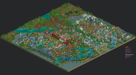
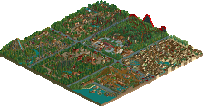
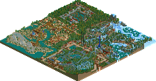
For now, here's a dot map showing who built what, more or less. So much of it was built by numerous people that an accurate map would probably be impossible, but this gives a general idea of who did what.
I have loved watching the little details come to life in Discord over the last month. This park is aces. Sad to see it didn't hit the 90% mark, but very glad it got Spotty.
Speaking of spots, I love the dot map that shows what portions every contributor did.
I don't have much else to say about the park itself cause I've just vocally commented on it so much in various voice chats.
Great work, everyone!
big