Park / Old Hickory
-
 28-February 21
- Views 2,676
- Downloads 464
- Fans 2
- Comments 16
-
 69.00%(required: 65%)
 Design

CedarPoint6 75% robbie92 75% bigshootergill 70% chorkiel 70% CoasterCreator9 70% In:Cities 70% WhosLeon 70% Xtreme97 70% inthemanual 65% RWE 65% Scoop 65% nin 60% 69.00% -
 Description
Small wooden coaster layout nestled in a sleepy river valley. Built this quickly over roughly two weeks while I was at home with covid. Hope you guys and gals enjoy!
-
2 fans
 Fans of this park
-
 Full-Size Map
-
 Download Park
464
-
 Objects
183
-
 Tags
Tags
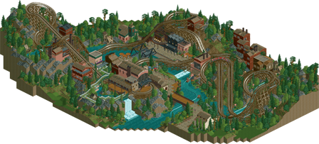
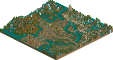

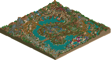
I've only looked at this briefly yet because I had to make the aerial, but I could tell it looks much better than it looked on the screens. Really looking forward to exploring this later today!
I really enjoyed this. The use of terrain and the valley in the center really accentuate a lot of the features. I appreciate how the theming is nestled into the terrain without feeling forced or awkward. Architecture feels fresh without a lot of overdetailing or the need for heavy layering. Coaster layout is very nice also, though I would have maybe left out the helix in the tunnel since it's getting a little long there.
Really nice work overall. Great piece of NCSO.
Really nice piece. I really enjoyed the coaster and the architecture. Overall not much content to see, but what i can see here is pretty cool. I especially enjoyed the view of the coaster lift hill with the waterfall in behind. Good job!
This is a great terrain wooden coaster. I love the industrial feel that the architecture has, and after looking at the layout probably a dozen times now, I can safely say that it is excellent. The way it flows through the subtly beautiful landscape is really nice.
Great work as always!
Lemme tell you a little bit about 'Old Hickory.'
Noooo, I ain't talking about no barbeque... This here 'Old Hickory' is a wooden beast that prowls around the old riverbend; bobbin' and weavin' around the surrounding Sylvania and brush.
I cannot tell you how many times I've tried to swipe those lights with my fingertips during her ascension. However, I can tell you that her first drop never ceases to take my breath away. She teases you a bit with a descending turn by the old waterwheel, and then plunges to the bottom of the crick like there's no tomorrow. After that, you're constantly thrown around left and right, up and down, and every other which way.
Visitng on a hot summer's day? 'Shoot The Falls' is a nice way to cool off in the blazin' sun, and also offers some gorgeous views of 'Old Hickory," as well as the surrounding areas.
If your belly can't handle some of that adrenaline, there's plenty of spots to enjoy the beauty 'round here. I've stood on the old burnt, iron bridge many-a-time just soaking in the the vicinity, watching 'Old Hickory' as she flies on by. All, of course, while eating some hot and fresh fries from one of the few eateries here. Them places don't really have any memorable names, but who needs names when you can throw some fried taters down your gullet?
Need something to do where there ain't much else to do? Bring your kin here.
Overall, I thought this was really well composed and showed a great approach to terrain and balancing a coaster with architecture and landscape. The coaster layout was great, though a few of the transitions felt a little awkward due to how you banked/unbanked them, but that's more a personal preference.
You had some great little details like the crane, the food carts, or the half showing Medusa sign. I think you did a great job with the architecture in capturing different shapes and styles that show variety without being too unrelated, though I think you may have just a few too many textures (the roman wall building and the dark brown under the coaster come to mind). Overall, I thoroughly enjoyed the release and think it is clearly design worth. Congrats on the release!
I think my favorite part of this is the station and the architecture surrounding the lift hill. The vertical elements combined with the terrain with the coaster sweeping through it is really nice. It all gives this really nice atmospheric vibe. The water works building and the structures on the hill behind the coaster are also really nicely done. Coherent and well built without too much textural noise.
I'll echo CP6 on the coaster layout; it's very nice but maybe has one helix too many. I do love how it frames the drop of the splash boats, but it might be a bit slow through that element at the top. It's a pretty minor complaint, the layout is very nice. I'm glad you didn't go overboard with custom supports; I think that would have detracted a bit from the overall look.
The landscaping is top notch, love the wooded sections with the valley between - almost reminds me of the river valleys back home in MN.
Aside from what I've already mentioned, some of the other buildings were a little hit or miss for me. Individually, they're all okay and avoid too much layering or overdetailing, but some of them (this is especially apparent below the diagonal rise after the coaster first crosses the river) feel a bit incongruent when placed immediately next to each other. I think I personally would have liked to see more of the style of building like the water works or the stuff on the hilltop across the rest of the area.
All in all, nice work. Looking forward to what you've got in the works!
70%
I thought this was a great design, it has a somewhat old school atmosphere and style but blended with modern building techniques and I think it works pretty successfully. The layout has wonderful interaction with the landscape, could be a little smoother in spots but there are some great elements such as the turnaround above the water ride and that first drop next to the waterfall.
The architecture is pretty nice, great colour scheme and the dark green and reds are used effectively - the work on the station and next to the lift hill stands out to me. I also like that you used the brick and rusted roof combo throughout but it doesn't feel overdone. Could have maybe used one extra supporting ride to balance out the buildings but I think the rest is pretty solid. Great foliage and landscaping, and everything feels tightly composed.
love it. mature style. beautiful interactions. nice colors. good landscaping. big boy
Congrats on the design! Deserved win!
Thanks for the comments everyone. This park sprung out of a building that got nuked in Storybrook Glen, and I wanted to expand upon that idea. I agree that a little more life or another supporting ride would've tied it all together more. Looking back, the area where the splash boat station is across the black bridge needed a re-do.
Honestly I wanted to complete a project during my 10 day isolation period, and this is what I came up with. Glad some people enjoyed the atmosphere.
this is a lovely quaint park. I think the layout maybe needed a touch more careful working into the landscape and archy because it comes off a bit awkward in places, but it doesn't bring it down too much. I love the vibe and the rustic colors. the bridges and the boat ride station are the highlights for me
A nice little release otter, probably some of your best work as your really upended the critique I've had of you with regards to your pathing and layouts of your builds. Felt like a really inspired and immersive little area that would be a great sight to see irl. Overall the layout was pretty solid although I wasn't a huge fan of the turnaround, seemed to kill the pacing a bit. Overall, injecting a bit more life in this would have helped it possibly break that 70% barrier.