Park / Vampyre

Which park is better?

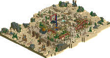
  1. Land of Wonders - Whzz Kids 29 votes [72.50%]
    Percentage of vote: 72.50%
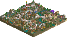
  2. Vampyre - Flying Germans 11 votes [27.50%]
    Percentage of vote: 27.50%

147 Comments

This park shares comments with 1 other park(View Park)
  • wheres_walto%s's Photo
    Posted Image
  • Xeccah%s's Photo

    had to vote for Flying Germans if I were to vote.


    Posted Image

  • wheres_walto%s's Photo
    Posted Image

    What the fuck you care, new fish? Doesn't matter what his fuckin' vote was. H2H5 is dead.
  • Wanted%s's Photo
    SHAWSHANKKKK
  • ][ntamin22%s's Photo

    this is getting a bit out of hand.

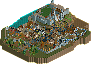
    vampyre's invert is a great layout, it falls just short of stellar. The curves in the first half certainly work very well, but i would have preferred to see another inversion to maintain the element-to-element flow. the buildings are solid -they remind me of beauty and the Beast - and there's a fantastic use of detail throughout: the ruined walls and wall gates use those tiny building 16th/tile blocks to great effect, and they aren't needlessly scattered about the rest of the park- its all very tasteful. As far as I'm concerned it is a decent start to a park that could be fantastic when finished. On the downsides, it was obviously unfinished. i watched the coaster go a few times and then scanned the rest of the park- I really liked some of the houses, but the similarity between them all left me feeling like I had seen them all after just one. I would have liked to see the foliage demonstrated near the entrance spread over the whole area.


    A few (well okay, more than a few) years on, I'd happily revise my description of this layout to be a 5-star smash hit.  It just looks outstanding and is perfectly "packaged" despite some real unconventional choices - no loop to be found and a very turn-heavy front half.  

    That aside, the landscaping effort is still praiseworthy as well.  
    Attached File  diorama.JPG (160.69KB)
    downloads: 32

    The land-blocks here and the tiny flower objects give it a real diorama feeling and it's very smart about applying detail only where it really matters and leaving open space elsewhere.

  • Liampie%s's Photo

    Unfinishedness and suboptimal tree colours aside, tht screen is perfect to me. The flower colours are good evidence of the thought and care RCTFAN put into this. RCTFAN was far ahead of his time.

  • SSSammy%s's Photo


     RCTFAN was far ahead of his time.


    I was just about to say this

  • Cocoa%s's Photo
    Does the y make it extra edgey or something