Park / World Showcase
-
 17-April 09
- Views 47,134
- Downloads 1,541
- Fans 2
- Comments 182
-
 67.00%(required: 60%)
 Silver

CoasterCreator9 70% Cocoa 70% geewhzz 70% Jappy 70% saxman1089 70% Scoop 70% Xtreme97 70% Camcorder22 65% Liampie 65% posix 65% In:Cities 55% nin 55% 67.00% -
2 fans
 Fans of this park
-
 Full-Size Map
-
 Download Park
1,541
-
 Objects
483
-
 Tags
Tags
![park_3338 [H2H7 R2] World's Fair](https://www.nedesigns.com/uploads/parks/3338/aerialt3037.png)
I've no problem with this fact
Although that makes no sense at all...?
"MFG"
If you have already voted in the matchup you won't receive a new code because why would you need one?
You must be logged in when you download the park so we can verify your codes against your member id. The codes which are used are always those of your most recent download. So if you download both parks, then re-download park A, the most current code must be used for park A.
I just don't understand how you did that. lol
"MFG"
I must say though I'm really impressed how far you guys have gone to make this the most fair competition created lol. Congrats guys you've worked hard!
Elementalists:
I thought that the concept was very interesting and the hacks were very well done. I thought that the archy was pretty good too. Though the one thing that I really didn't like about the park was that it didn't seem to hold my attention for very long.
Hurricanes:
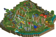
The concept of the park wasn't new but the execution was very good in my eyes. I was very surprised how many areas they fit i there. Also most of the areas had something that I thought was interesting. I thought that the invert was very good as well. Some of the archy wasn't the greatest but for the most part I thought it was pretty good.
Edited by RCFanB&M, 19 April 2009 - 01:19 PM.
tbh I have a good idea who made WSC and I know they can do a whole lot better than what they did here. It's not bad but to me it could be so much more. That's mostly due to round 1 stuff though, as the same could be said for ours.
And I don't think I've said this yet but please no more "lake-in-the-middle" parks, everything is smashed up on the map edge. One of the major problems of WSC imo.
We now have a very post-modern rct community. lol.
Shit.
May I get your permission to do a pretty big "lake-in-the-middle" park with enough space to the map edge?
Art of War:
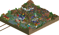
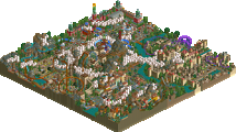
Lovin' the D-Day section! Very explosive from a screenshot perspective. And nice hacking with the planes! Now with that aside, I noticed all the hacks. In my opinion, there's too many hacks for a computer like mwa. Probably would make it crash (again
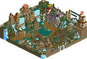
World Showcase:
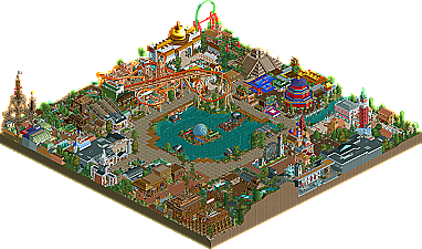
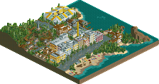
1st round rush, I'd say. The Morocco section is my favorite, of course. The coaster really reminds me of King of Morocco on RCTAvenged. But the rest of the park... nice buildings, but cluttered and squished together. Anyone can clearly tell the styles clash. And the park layout was vanilla (as in, unoriginal). And, UUGGHH!!! I really dislike that Eiffel Tower. Too blocky. But the theme was straightforward and simple to grasp. Next time, though, keep it more original.
That said, I would say this was a stalemate. But if I were forced to vote, I'd say... World Showcase. I think the reason why this park is winning is because of the keyword "park". I like to imagine myself in the park and what would be happening. Art of War was more of a demonstration of hacking than an actual park. World Showcase was a full park, relatively small, but still a park. And it caught my eye first because of all the random items surrounding a small lake and...
Dear God, I'd vote for Iguana-Man.
I've checked both parks out, and will write a review about it later...
Surprised at the score though, that it's that far away from each other.. Thought it was a close match-up..
SF
At the end of the day, it literally does come down to what people LIKE more. You can go on about innovation, execution, aesthetics or whatever, but the park that gets the vote is the one that people like more. I can APPRECIATE features in both parks, but seeing a hack and thinking 'wow, that's unique' isn't going to sway the vote majorly for me. It might help a bit - originality is good - but it doesn't make the park.
It all comes down to personal preference. For me, RCT is about building cool roller coasters in cool theme parks. I like to imagine that park in reality, and imagine myself going to that park for a day out. That's how I build my parks - that's why I play RCT - I almost use it as a design tool. You could argue that I'm not 'playing' the game. That might be true, but that's fine. There's no right or wrong way to 'play' RCT. The park which gets the most votes is the park that will please the most people. End of.
I voted for the Hurricanes' park. I look for good rides, well intergrated into good theme parks. For me, neither park really satisfied my thirst for 'good rides' - there were no major stand-outs for me. But Hurricanes got my vote on the basis that there's was a well-constructed theme park. Maybe this boils back down to realism vs fantasy - I'm going to vote for a theme park. Art of War is not a theme park in my eyes - I can appreciate its qualities for sure, but it didn't feel like a proper, feasible theme park to me - instead more a themed canvas, on which a whole load of ideas had been tried out on. Sure, that deserves credit, but it doesn't deserve my vote, as it doesn't satisfy my RCT preferences.
World Showcase was less original, but was well executed regardless. Ride-wise, nothing really stood out - the Eiffel Tower drop was well-themed I guess, I liked the log flume, I liked the layout of the invert, although its pacing was far too slow. The opening fireworks show was wicked. I do think you tried to cram too much onto a small map - this did result in some rides being poorer than they should have been. An example is the 'pointless' LIM coaster. If you had crammed less lands in, and had given more space to a select few, you could have allowed rides such as the LIM coaster to have more space too, and thus expand the layouts into a more noteworthy rides.
Ok, that's my two cents, over and out.
I voted art of war, I just thought it was cool..