Park / Kechibi
-
 28-February 21
- Views 1,991
- Downloads 388
- Fans 0
- Comments 7
-
 64.00%(required: 65%)
 Design Submission

CedarPoint6 70% Scoop 70% bigshootergill 65% In:Cities 65% Jappy 65% nin 65% WhosLeon 65% Xtreme97 65% CoasterCreator9 60% inthemanual 60% RWE 60% Liampie 55% 64.00% -
 Description
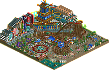
Kechibi is an NCSO (with like 2 or 3 expansion objects) RMC built before the custom hybrid track was added to the game. I think this is one of my best layouts I've come up with, and I hope y'all enjoy!
-
 No fans of this park
-
 Download Park
388
-
 Objects
214
-
 Tags
Tags
![park_4091 [H2H8 R2] Tubiao Action Park](https://www.nedesigns.com/uploads/parks/4091/aerialt3830.png)
![park_4114 [H2H8 R3] Forum Caeleste](https://www.nedesigns.com/uploads/parks/4114/aerialt3853.png)
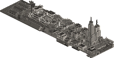
Happy to see this released here. Really cool interaction first off with the turnaround across the street. Quickly want to highlight the area outside the park.. the facade on the left has some great details like the glass window stairwell. Overall some creative shapes and architecture.
The coaster itself hauls ass! It's a tad fast, but fun as hell. Other than the loop over the street, the helix and interaction with the blue pagoda near the station was done very well.
Lastly, love the colors and how how you built off of the vanilla game Soybean Milk stall. So cool.
Solid release. Looking at the activity weve seen from you lately on discord, i was wondering if we would see a release from you soon, and im glad to see were having one now.
I think the RMC is well done. There is one angle from which it looks amazing and three angles from those it looks not so good, but thats not something that was bothering me that much when viewing it. The architecture had strong moments and a lot of good ideas and technical execution. The overall composition might have been a little bit weak tho. I dont want to hate on square maps for small NCSO designs for the 100th time, but the square map is definitely not helping this one either, also looking how the map was cut off at the back of these buildings that definitely looked much better from the front.
Nevertheless a nice little release and something that makes me wondering what we will see from you in the future. Looking forward to it!
Overall, I thought this park had some great striking visuals and ideas. The pagoda's, both the casino and around the coaster, were great and, as mentioned, the use of those food stalls paid off here. I liked the RMC (for a pre-custom track version), though I would have chose a car with corkscrew animations. I think that's be worth it to avoid the old school corkscrew glitch.The architecture on the non-RMC side of the street felt a bit hit-miss to me. In some places thinks come together visually (like the pagoda), but others they seem a bit disjointed and don't read well for me.
I think my biggest drawback for this is the macro. With the buildings on one side and the diagonal nature of the RMC, it really only has one decent view where you can follow everything. Also, with the yellow coaster above the casino and the mini, it just felt a little scattered across the map. You definitely showed some great skills here, so if you can bring those together in a more cohesive way that'll be a huge improvement to the overall feel of a project.
I'm gonna be agreeing a lot with FK here, I think.
I believe that the best architecture here is the stuff in the actual park portion. It's not trying to do anything too out of the box, but it works *really* well, in my opinion. Across the street, it's a little hard to tell what I'm looking at in some places. The buildings with the glass enclosed escalators are very well done and do feel very Japanese, but there are some things that I really wasn't a fan of. The station for Tokyo Express feels incredibly basic compared to everything else, and I'm a little inclined to believe you'd have been a bit better off without the coaster and going for a bit of a smaller scale to the cityscape. The Karaokee noodles building feels like the right balance in height here.
The coaster layout is nice, feels very RMC-esque. I really do wish I could make out more of it from all angles. Diagonals are tough, and it looks quite good from one angle and a little harder to appreciate as well from others, as those above me have said.
The fallen cherry blossoms and those trees in general are really great, love that a lot. The half sunken tall trees are a pretty good effect too, didn't actually notice it the first couple of times, but I'm impressed you pulled it off without much clipping - really good idea.
While I think there are a few big hits and a few big misses, this definitely shows a lot of great potential. 60%
Found this pretty enjoyable, a few odd choices here and there but the overall product is still great and feels quite unique. The layout is definitely RMC, super fast through some of those elements. Great profile with the drop set against the background of the diagonal street buildings, and I like the triple-up dive loop over the road. I also really liked the style of the station, bright blue roofs are in style it seems But for real great work on the theming, love the use of the shop roofs too. Normally one might be inclined to use all of them at once but having just the blue variety is great for the cohesion.
The architecture across the street is nice in places but also a bit on the massive side. Took a minute to realise what the ice cream cone was, and I'll echo that the brick station on the roof was uncharacteristically basic compared to the rest. Also agree with CC9 that the custom trees and fallen flowers were done pretty well.
I really like the RMC, and the archy and scenery here. I don't know what those big buildings were doing in the background - those buildings look like typical ncso spam to me. Hedges against the walls, ugly trackitecture... It's not for me. But again, the park section is very nice.
i like the idea of a tokyo version of new york, new york in Las vegas but I agree with liam that it doesn't work well here- it feels like two nice bits smashed together and I'm left a bit confused (as well as the usual ncso complaints that liam said). the layout is good though and I like the big blue-roofed buildings it interacts with