Park / Sozin's Temple
-
 21-February 21
- Views 2,408
- Downloads 532
- Fans 0
- Comments 13
-
 71.00%(required: 65%)
 Design

In:Cities 80% robbie92 80% bigshootergill 75% Xtreme97 75% CedarPoint6 70% CoasterCreator9 70% inthemanual 70% Scoop 70% WhosLeon 70% chorkiel 65% RWE 65% nin 60% 71.00% -
 No fans of this park
-
 Full-Size Map
-
 Download Park
532
-
 Objects
324
-
 Tags
Tags
![park_6118 [NEDC6] Valley of Huanglong](https://www.nedesigns.com/uploads/parks/6118/aerialt6364.png)
![park_2432 [H2H6] R5 - Reservoir Dogs - Galaxy Geeland](https://www.nedesigns.com/uploads/parks/2432/aerialt2182.png)
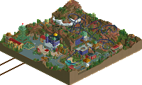
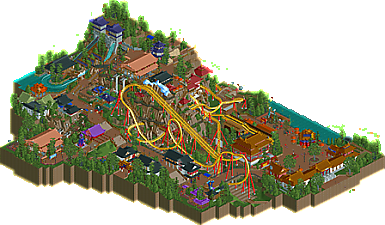
Glad to finally see this finished! Really enjoyed how the coaster interacted with the terrain. Darting around and thru the cliffs, it was hard to follow the train at times, but that I think would make for an exhilarating experience. It seems rider pov was important to you when making this.
Other areas show a lot of creativity and solid architecture. Was a fan of the tiny burger stall, love stuff like that. The chairlift ride, albeit short, I think highlights the elevation changes in the park quite well.
Only drawback for me is how this would fit in a larger park.. there are 5 different ways into the area. I'm curious how that would work in a full sized park.. would this ride be the centerpiece in a hub and spoke layout? Regardless, I wouldn't rate this differently, just something I noticed.
I enjoy this little park a lot(te)! I think the layout flows well but isn't entirely realistic, for example i think i would run 8 cars instead of 6 and the large diagonal floater hill under the lift is a touch uncharacteristic for realism sake. However! I think it looks absolutely stunning. The bold yellow really pops in the mostly brown and landscape and buildings. Likewise, the interaction with itself, the path and the buildings is so fun! I like the station building, queue and transfer track too.
For the park, one tiny tiny detail is you have some brick paths oriented the wrong way? (There's an object that has the bricks the way you need on the corner) oh well lol. I think this rock work is leaps and bounds ahead of doing a ton of little 1k ruins, huge fan of this! The architecture is pretty solid and cohesive. There is one blue circular or octagonal tower up top that is killer- I wish that was taller and placed on the top of the cliff overlooking the whole park!! There's also a tiny blue building in a pond near the Ai Lahmao that is so cute!
Congrats on this park Lotte! Mega cool stuff
This is a nice little design. The layout is a mix between daemon and Hellraiser and I think it works quite well. I like that there are multiple points of interest in the map for not just the coaster, but the supporting rides as well. The architecture does feel very similar to what we've seen before in an Asian inspired park, but if it ain't broke don't fix it I suppose. The cliff sides are really cool with the way you've build those. I do wish that there were peeps or something on the catwalks of the cliffside just to give them a bit more context. There are a few spots where I think you could've made one more polish pass, There are also some areas that feel like they need more foliage as well such as next to the top station of the chairlifts, but overall it's solid. 70-75% for me. Not sure which I'll choose.
Quite like this design. I'm glad you stuck with it from years ago, even if it does mean it has the "older" architecture meta from when you started it. I like the take on a more abstract B&M sitdown. Agree with AJ about the 8 car thing, but that's a small gripe, just a visual thing for me. It's cool how it sweeps in and out of the mountain. I really appreciate the elevation and like the different method of using the steep rooves as terrain. The scaling of the entire mountain seems to fit quite well. The supporting cast of rides does its job as well. Overall, nothing crazy, but also a very solid release and well deserving of design. 65-70% for me, likely the latter. Looking forward to stuff from you in the future.
I liked the idea. The mountain as a centrepiece worked very well and really masks the elevation changes going on within the map. I like how the buildings felt integrated into the cliff edge and you had a purpose for it, with the coaster interacting with the structure. I agree with others the rockwork is very good, and this is an easy design. Cool stuff!
Kudos for finishing this, despite having a big break in between. It's great to finally see this done. I must say I really like the originality of the coaster. It has a quite unique lay-out for a floorless B&M and I like to see something different on that part. Not such a fan of the part after the zero-g-roll, I think that could be done a bit smoother and maybe with an extra helix or so. Otherwise: great coaster.
I also don't care at all about the 6 or 8 car thing. I see no reason why B&M would perse stick with 8 cars and wouldn't change that if the situation is there for it. I also want to clearly point out that in real life, there are floorless B&M's with 7 cars and even 6 cars. So I can't follow that 'complaint' at all here.
The coaster is pretty well integrated with its surroundings. Heavy landscaping around which is a nice backdrop for it. I'm not sure if I like the quarter block useage for the landscaping, not the right texture for it really imo but you got some nice shapes with it. I'd also go for more dirt landtextures around the mountain instead of the grass. Looks a bit too clean.
Archy is pretty good, you were always good with archy and this proves that again. Overall a very enjoyable design. I'd be doubting between 70 and 75 too.
Xi'an Falls might be my favorite supporting ride of 2021 so far; to me, it's got some of the best architecture on the map, I just wish it was a little less off to one side. Love the supporting features in general, and the layout is quite nice with some good interaction. Highlights for me include the chairlift and the black/white buildings. That being said, a few of the structures felt like filler more than anything and were a bit less strong examples of architecture. The building next to the spiral slide, across from the top spin, and along the water stand out a bit as not being quite as strong as the rest. I appreciate the height variations and landscaping; I read it as semi-artificial landscaping which is kind of a cool aesthetic to think about. At the same time, I'm a little torn about it where it begins to merge into more typical, natural landscaping. I also found the foliage a bit single note - a sea of the same green with some dark purple flowers and oddly colored tree trunks. The little zen garden was really well done, I just wish the foliage felt more natural and less like filler.
In general, solid Design material. The landscaping and overall architectural quality is great; though the cliffside makes for only a few angles of solid viewing for the centerpiece ride. I'm glad you were able to finish this, and I look forward to you applying what you've learned and developed here to future work. 70%
Great design.
Gripes: Double chairlift seems unusual. Wish there was more openness in front of the loop. Some of the architecture felt haphazardly placed - I'd have liked a little bit more attention to the composition and spacing of areas.
Greats: The loop and drop dangling off the side of the artificial mountain is such a cool feature. Great planning around the station/queue/plaza. Excellent supporting ride. Nice details/ideas with the zen garden under the ride, and some of the other ways you filled space.
Good job on finishing this, Lotte. I think it turned out really good. The layout is really strong and I dig all the viewpoints you've implemented on the map, so many good views on the coaster, makes it really easy to imagine being there. The landscaping with the steep roofs was really nice and really gave a good impression of a 'fake' theme park mountain. It is a daring choice but i think it payed off in the end and looks great. in terms of architecture i felt like it was a bit underwhelming in the sense that the buildings are all a bit similar without real 'standout' buildings that keep you engaged a bit more. Dont get me wrong, the architecture is quite good overall, but i was missing just a little bit of 'oomph' in it.
Overall, an obvious design win and i hope a good step towards even work from you in the future.
Glad that you've come back and finished this off. It's definitely a nice design but does show its age in some respects. The first thing I'm struck by is the colour scheme, which I'm surprised I've not seen more often (unless I have and am just forgetting) and the overall shape of the coaster. Great placement against the cliff side and the layout is pretty sweet. My only complaint would be how short the trains are for a layout of this size - if it was a smaller floorless on the scale of Deamonen it would make sense but I'd rather see a full 8 car train for this.
Architecturally a lot of this feels a bit like a pastiche of BGA and the 2015/16-era realism but I think there's still plenty of your own fingerprint in here to matter. The main entrance building and the temple set in the cliff side are definitely the stronger moments for me.
Aside from this the rest was generally very strong to me. The landscape is a bit strange in places with the mixture of the blocky pieces and the standard full tile landscaping, but it's very cleanly done which I appreciate. The foliage could also stand to be a tad more exciting but the monotony of the green weirdly works for me, and frames everything nicely.
Really enjoyed this overall.
Congrats on the release! Overall I think this was a clear design win with a lot of great moments. As many have noted, the central mountain and how it interacts with the coaster are really the star of the design. This almost felt like a case study in how impactful dynamic and interesting landscaping can be for not just a coaster but the surroundings. I did feel like the coaster's pacing was a bit fast, but the impact of it racing through the landscape and buildings was incredible. It almost had a floorless meets diver feel to it.
Also, all the pathways along the mountain are awesome. It has an almost Tom Sawyer's Island feel to it, like peeps could explore and go up and down the mountain. I almost wish you would have pushed that idea more and added like some high adventure type elements or something. That feature overall is just so great.
I have to agree that the chairlift feels like an odd choice, maybe just because of the angle it approaches the mountain. Like, it makes sense to have an 'alternative' way up the mountain, but where it's positioned felt a little unnecessary for the amount of steps up and down to it.
Overall I think the architecture is really good, particularly around the station and the black roofed buildings by the dive loop. There were a few color choices that felt odd, like the red and pink building by the slide. I wonder if having a more unified palette of colors for the buildings might have created more cohesion.
I know this was a long term project, and I do think there are a few areas where that shows, but in general I think you did a great job of keeping it fresh. Congrats again!
Not a bad design. I thought the coaster was pretty solid and the jagged rockwork was cool, but much of the surrounding archy and landscaping felt uninspired. Many of the buildings and details felt very "generic Asian" and lacked identity, and overall didn't give the design a strong cohesive look other than matching construction technique. As mentioned, the landscape feature housing the coaster was really nice and made it feels rather imposing, but it wasn't followed through the rest of the design and replaced with flat, repeated rock-textured fences and brick walls which was a bit disharmonious and felt like you just wanted to finish the thing.
As a whole though, not a bad piece of work. Again, the coaster was nice and I too liked the water ride and its housing. It just needed some nuance to really sell itself.
sozin's temple - 70%
on the whole - good, but
you can tell what's old and new
parts shine, others not