Park / Jurassic World: Raptor Strike
-
 15-February 21
- Views 3,076
- Downloads 543
- Fans 2
- Comments 12
-
 77.50%(required: 65%)
 Design

RWE 85% bigshootergill 80% CedarPoint6 80% In:Cities 80% Liampie 80% robbie92 80% Xtreme97 80% chorkiel 75% CoasterCreator9 75% inthemanual 75% Scoop 70% WhosLeon 70% 77.50% -
 Description
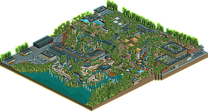
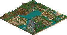
Are you ready for the hunt? Board an all new high-tech vehicle and race side-by-side with the most fearsome predator in history: The Velociraptor.
-
2 fans
 Fans of this park
-
 Full-Size Map
-
 Download Park
543
-
 Objects
365
-
 Tags
Tags

![park_3371 [H2H7 R5] Universal Studios](https://www.nedesigns.com/uploads/parks/3371/aerialt3057.png)
I'm so HYPED for the coaster this is based on. It's a pretty nice layout, but the only thing I would change is what is supposed to be the stall. I would just keep that as a barrel roll even if you are sacrificing accuracy. The building structure was really cool and probably my favorite thing on the map. The jeep ride is a really cool secondary ride choice. I'm surprised that none of the parks have really implemented that kind of idea (not including skull island. I think this is a step up from your previous park, but I would also still put this in the same boat as your previous Jurassic Park design. 70% from me. We'll see when it comes to voting.
I'm definitely not surprised to see this from you, at this point.
I get the feeling this has been in the works for quite awhile. Very convincing architectural choices, and the ride design itself is pretty top notch.
One thing for me is that there's so much dense tropical foliage that it's a little hard to view the rides. While I think it's excellent atmospherically, it does make the viewing experience a little more challenging.
I really love the supporting Jeep adventure ride; that reverse section is surprisingly effective and I'm glad you went with the open rooves to make it more visible without relying on cutaway view. While nice, that can be a bit of a chore at times to deal with.
All in all, great stuff. If the discussions on Discord are any indication, I don't think this is the last Jurassic World coaster we'll see in this style!
As with BG, you build so fast it doesn't seem fair. Having seen this come together, I feel like there is a real maturity to your work as of late in capturing stuff from the real world and translating that into rct. The result is really stellar, richly detailed and filled with great content. Things that stand out to me are the coaster, the foliage and landscaping, and the architecture particularly the main building for the coaster. Not that your past architecture was bad by any means, but your efforts to capture real life buildings from the park I think really resulted in some stellar structures. There are some minor execution blips that I see, but those are more personal gripes. I do with the raptor encounter was a bit more immersive, particularly with peeps being sparse in that area with the final save, it feels like a ton of wall and could have benefited from some stuff to better emphasize what was happening there.
Overall, a really high quality and mature design that feels very carefully and deliberately crafted. I would easily rate it above 80%, I don't see how this is anything less than parkmaker quality. Congrats on the release!
Good job, this is definitely a great release and a huge step up for you. The main coaster was enjoyable and well done. One of my favorite bits was the station, that dinosaur mural above the entrance is amazing. The adventure ride was mindblowing, this is probably going to be some serious contender for best non-coaster ride 2021. Everything feels so realistic, yet also warm and inviting due to the good detailing job from you!
I think my main negative critique point on this is probably foliage and landscaping. I would have really loved to see some stuff more clearly with the foliage being less dense. Compared to the rest of the park the coaster pit in the middle felt also a little bit underdeveloped and to be honest the LOTR rocks over here are awful in my opinion.
All in all this is doing a lot of things right though and i think this is a design that deserves you a parkmaker title. Crazy how many good designs we've seen here lately...
First of all I think it was a really great idea for you and BG to release simultaneously, it makes both parks feel connected in that sense and gives them both an opportunity to shine. It definitely shows a good deal of knowledge and appreciation for the real life counterpart that shines through and your style is elevated here.
I've been waiting for someone to properly attempt a version of Velocicoaster so of course I really dug the coaster. The layout is super strong and the bowl element doesn't feel overly drawn out which I think would be tempting given its scale in real life. I also enjoy the colour scheme quite a bit; wasn't initially big on the shiny metallic blue but it grew on me as I watched for longer and the beige supports look great.
The dino mural at the entrance of the coaster is one of my favourite details here too, feels like you got the silhouette just right without it getting overcomplicated. The building isn't quite as interesting as the rest on the map but it does break up the foliage pretty nicely. The Jeep Adventure makes for a really solid supporting ride, love how you can follow it through the journey and the underground/backstage details are a nice touch.
I think the rest of the park stacks up well too, the pops of blue from the grill and elsewhere are a lovely accent and in general it's a nice evolution for your work.
Another great release from you. First thing I noticed is that the archy in this is a lot better than your previous Jurassic Park design. Felt a lot more immersive I think. The lush foliage and jungle vibes helped as well.
The coaster layout was great.. really no complaints here and definitely flowed quite well. I liked the stall element, it's about as close as you can get to being realistic. Doing a normal barrel roll would've been goofy imo. The launch tunnel under the station structure was cool as well.. only thing that was quirky to me was the extra long break run. Part of me thinks that part of the ride would have video screens with Chris Pratt talking to riders lol
Lastly, the accompanying Jeep ride was great as well. A bit cramped, but the ride was immersive and had some great moments with the dino attack. Great stuff sir
So glad to see this done and released! You've build some good stuff in the past but for me this is cleary your masterpiece (so far ). Def the best work you've ever done.
The coaster is so good, not only does it looks aesthetically really beautiful for us rct-viewers but it also looks like a really awesome ride to ride. I'd pay a good amount of money to ride that. There is also a good amount of interaction with path and that viewing point on the non-inverting zero-g-roll is amazing.
I also love the dense coaster part with the rockwork and dense foliage, combined with that out and back part, this coaster has it all. Might be one of my fav rct coasters if you take the total package around it into account.
The monorail station is a pretty bold move imo but it works really well. It brings in some nice curves and you detailed it just enough to make it interesting enough. The entrance sign is also pretty cool.
The car ride was fun to look at and also an extra ride this zone needed. The curved station here is also an awesome feature! Overall color choices in here are awesome, the blue roofs work and I also love the bright colored bushes
Really loved this one. 90% work for me.
Really enjoyed this.
The coaster is awesome, definitely one of my favourite layouts recently. Big fan of the little bits of interaction on the 2nd half of the layout, but I wish that we saw more in the 1st half, feels a little too cut off but I guess I can understand the idea that it's meant to be contained until it breaks free via the 2nd launch.
The Jeep Adventure ride is also pretty good, the station is really well done. I would like to have seen a bit more detail in the actual ride area, where as at the moment it's 80% just landscaping, foliage and dinosaur objects. Would be great to ride in real life, but for rct viewing it doesn't hold my interest as long.
I think the foliage and landscaping here is very pretty. While the foliage does feel very busy, it feels less thick and dense around the rides and paths, so it sits as a nice backdrop. Not a fan of the coloured bushes, but that's just personal preference.
One thing I'm not so keen on is the use of monorail track everywhere. I can understand it being used for fences and things like that, but I think using it for the coaster station building is a bit too much, especially considering it's coloured the same way as the fence-monorail. Would love to have seen this building with more texture, either as the vertical wood or the horizontal metal, I think it would have given it more life and allowed for more detailing.
Overall, still a very enjoyable release, and definitely my favourite design from you. Coaster was fantastic, theming is good overall, with a clean atmosphere, but I would have liked to see some more 'little things' added around.
80% from me.
Solid design. Really cool interpretation of the upcoming coaster, and an enjoyable map to explore.
I think I'd have cut the Jeeps back a bit, so they wouldn't be sitting before the station for so long, and I also thought the foliage was a bit thick and disruptive in places, particularly where it blocked the view of the launch from the path.
I LOVED the way it hovers above the lake and dances around the path in that area, and the ride sign was a great touch.
RaunchyRussell Offline
LOVEEE a good intamin launch coaster and this is no exception. It really dominates the map along with is station being a pretty large focal point of the ride. The raptor mural you did on the diagonal station entrance was fantastic.
The surrounding rides where also wonderful as well, the jeep ride is definitely a cool idea here. I agree with ITM here on a few points made on the amount of jeeps and the foliage sometimes blocking the view on a few things.It's not our fault we can't explore it at peep level though.
Overall this is a 80% design for me.
i love getting to see this and BG's take back-to-back. Yours is clearly of a new era of jurassic park rides, and I can imagine you in particular have spent a lot of time dreaming up things you would do... I especially love the safari jeep ride and it's impressive climax. the coaster is neat and I also appreciate the cooler blues and purples of this park. The station building itself is very impressive in that its a giant grey blob that doesn't feel overwhelming or out of place. love it.
Once again nice work Mav, another fantastic coaster concept that really feels like a new thing here. I echo most of the criticism on the station, its certainly epic but texture wise and visually it just doesn't work for me. Definitely bold going for monorail walls but I think in a situation like this it's just a bit overwhelming.
As a whole, some readability issues and consistency issues sort of held this back. I liked the flyer you did a bit better than this, that just felt a bit more focused, while this feels more like a themed land of a large park that you sorta pushed into a design release.
Regardless, pretty great, and hope to see more work of this quality from you going forward!