Park / The Flying Dinosaur
-
 15-February 21
- Views 3,141
- Downloads 603
- Fans 2
- Comments 12
-
 83.50%(required: 65%)
 Design

robbie92 90% bigshootergill 85% CedarPoint6 85% chorkiel 85% In:Cities 85% RWE 85% Scoop 85% Xtreme97 85% CoasterCreator9 80% inthemanual 80% Liampie 80% WhosLeon 80% 83.50% -
 Description
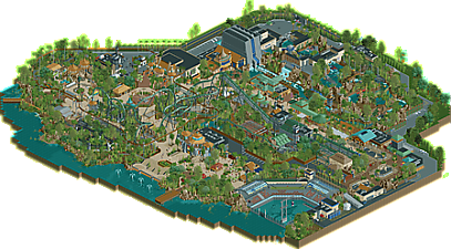
With it’s massive leathery wings it ruled the Mesozoic skies, now it’s using them to inspire terror in the hearts of it’s riders. Meet the Flying Dinosaur.
-
2 fans
 Fans of this park
-
 Full-Size Map
-
 Download Park
603
-
 Objects
527
-
 Tags
Tags

![park_3371 [H2H7 R5] Universal Studios](https://www.nedesigns.com/uploads/parks/3371/aerialt3057.png)
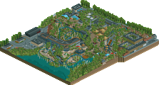


Amazing release. Im glad to see that you seem to have dealt with some flaws your style always seem to have: I think the qualirty of individual details is way better than in timber valley, I mean, just look at that dinosaur statues. You also showed off some good improvement on landscaping and foliage with this. Composition is not perfect, but definitely quite solid.
The actual main coaster of this, although the layout was solid, almost felt a bit underwhelming to me. Its probably the thing i looked the least at on this map, although it also had some nice interaction moments.
All in all good job and i think this definitely is a great design. Migh even be enough to deserve you a red name!
WOW What a huge step up from your previous park. There is so much atmosphere here. Every building feels perfect as far as the Jurassic park area aesthetics. The layout is perhaps a bit long, but still has some great interaction and elements. The topple tower is pretty neat as well. I think you would have been better off making the rapids ride a pure splash boats ride instead. The drop just doesn't feel right at that length or steepness.
Oh my I forgot to mention the dinos!!! Such good work on those sculptures. I haven't been too impressed by a lot of work lately but this is going into my book of top releases in the past couple of years. 85%
I had a feeling you two were up to something when I saw these at the same time.
Naturally, a few comparisons are going to come up between this and Mav's own version of Flying Dinosaur. The layouts are both quite unique compared to each other, and I like them both a lot. You've managed to capture a lot of the elements of the real thing and present them in a unique context, so that's pretty fun. Really solid work with the path interactions and the setting; it all comes together in a nice and well presented area.
I think where this shines a lot is the supporting features; all the dinosaur skeletons and sculptures associated with the rapids are really fantastic. The theming is recognizable, and you've done an excellent job at building an atmosphere I can see myself in.
The couple of buildings along the rapids are a little more plain and less interesting than the rest, but all the architecture in the park conveys that Jurassic World theme to me, so nice job there.
I do wish that this was a full on park. I know Liam convinced you this is destined for Design, and I do agree that it straddles the line between small park and Design, but I also don't think it is as strong a park as it is a Design submission. Maybe you can do a Universal park justice in the future!
Another day, another rapidly completed BG creaation. The depth of details and immersive elements here is incredible, if a bit overwhelming in places. Generally, the execution and macro elements of how you've organized everything is stellar, and all the stalls and shops and add-ons are amazing as well. The sculptures in particular I love. The coaster is excellent, though I agree that compared to the bright blue of Mav's, the green doesn't have the same pop against the background that might have helped given the sheer amount of other green stuff going on throughout. Overall, your dedication to realism and translating real-life theme parks and rides into rct is incredible. I do wish at times you would allow a little more flexibility in how you translate things into the game, which I think has yielded some awkward bits in this, but it's hard to argue with the general quality. I definitely see this scoring above 80% for me. Congrats on the release!
Easy design accolade. Whole thing was great fun to explore. As mentioned above I loved your dino-statues it was very easy to work out what was what. Enjoyed the main coaster although I think I preferred the rapids just because you really managed to emulate the look of the real life version. Thought the architecture was really great and easy to read, reminded me sometimes of an improved Terra Fantasia. Also liked your attempt at the t-rex cage. Plenty of small things I'd need to go back to investigate further but this is a great attempt at taking something from real life, improving upon it and implementing it in game.
Fantastic work, BG. Probably one of the most ambitious designs I've seen in terms of scale and there's really loads to explore here that it could almost be a park on its own. The fact that you've pumped this out alongside two full scale parks in the span of about a year is amazing too.
The layout is very nice, I liked how you did the pretzel with the twisting steep drop, though it feels like it could have been integrated with the path and theming elements a tad better near the middle. I also would have liked to see the industrial style of the station expanded a bit more into the queue and ride entrance, since I think you nailed the style.
The other content on the map really is the highlight of this, and I think outshines the coaster in some ways. The dinosaur skeleton fossils were a fantastic idea and looked perfect with the way they were outlined by the path. The stadium was also superb also, the access road over the path is integrated pretty well into the structure but also distracts somewhat from the pathwork.
I think despite there being quite a range of architectural styles it still feels coherent. The one piece that sticks out poorly to me here is the restaurant to the left of the rapids - there's too many roof and wall texture in use here and it could have done with another take to refine it.
Besides this I think the rest was excellent - a very strongly realised design that sits among your best.
Thought this was a big step up from you!
Starting off with the layout, I think it's overall very good, especially the first half. I'm not a massive fan of the figure 8 kinda bit in the middle, but I think that's more the limitations of rct than the layout. I liked the pretzel a lot, it was framed really well around it and was very obviously the main focal point of the ride.
The architecture throughout was great too. It all felt like it had a purpose, and that you went into each building knowing what the purpose was before building it, making it feel more cohesive as a whole than some of your other releases. The coaster station is really good, and I love the suspended monorail station.
Speaking of suspended monorails, the supporting rides throughout are good too - they look like they have just as much thought, if not more, put into them as the coaster. The rapids ride is a unique twist on the usual Jurassic Park water ride, but I think you pulled it off well. They do seem to glitch out a bit, like I'm following a train of like 8 boats moving at 50mph through the layout, but taking that out of the equation, I think the theming is good, and the finale building one of the best attempts at this we've seen so far.
There are a couple of things that I think hold this back from being as good as it could be though. First of all, I'm not a huge fan of the foliage. I can see you're going for the jungle look, but for me it's just too dense and looks almost random with the tree types used. Secondly, the whole park is a bit too dense as well. There's so much content and not enough room for it to breathe. I feel like I'm missing details on my screen purely because there's 4 other details next to it that caught my eye first.
That does bring me nicely to the final point, and in my opinion strongest aspect of the park. The little details throughout this are fantastic and really do add a lot of life to the park. The dinosaur statues, the backstage detailing, even the gates throughout the park are awesome. As mentioned before, I would love to have seen this a little more spread out, or maybe if this was in a full scale park, I'd hope for some less dense areas just to contrast and give a bit more breathing space to everything. For example, I literally didn't notice the pterodon until my 3rd or 4th time opening this because there's so much else going on around it.
Overall, I'd give this an 85%. Very solid work, easily my favourite release from you.
Another great piece of rct coming our way, we are so getting spoiled these days. Once again you are proving you are great with flying coasters. Nothing to remark on the coaster, lay-out is topnotch and plenty of interaction. The whole helixy part has path under it, that for sure would be so great to walk under it. A bit of a shame of those safety nets though, I know why they are there but seeing how Phantasialand handled it you could easily get away of not doing those nets imo. Alton Towers Air also doesn't have nets.
Archy is really good, you kinda lost on opportunity of doing a mural on the dropbuilding of the rapids. Rapids are also pretty cool, overall the dense foliage is on top and lightens up the whole area. Same with the rockwork, good combo of LOTR, krypto and regular landblocks.
Some cool shit to find here:
- the dino skeletons
- the sea stadium with the big fish dino in the water with the shark used as bait
- working topple tower
- the bones near the kiddie coaster station
- and probably even more i'm forgetting
Overall a really cool design. Still one minor complaint: I'd have made the bridge that goes into the kiddy area a bit wider and also made it peepeable. I enjoyed this park a lot. You were clearly very dedicated to it, the fact that you did detailed interiors is somewhat crazy. The amount of detail on backstage stuff is also crazy high. But in the end, it's the atmosphere, the cool coaster lay-out and great theming & details inside the park that does it for me here
Great integration of the ride into the surroundings. Despite having seen several JP/Dinosaur themes before, this still felt very fresh and unique.
The topple tower was fun, if a little unclean.
Sculptures showed some serious skill as well.
RaunchyRussell Fan Offline
Wow. So much content to explore here. I really love Flying dino, the name is underwhelming, but who cares if it looks like it does. The layout is great, loved the pretzel loop especially. There is so much interaction with the landscape and pathwork along the ride. Clean archy here as well. All buildings really have a clear purpose here and aren't just there for filler.
That stadium is killer. Love how you put the Mosasaurus under water, waiting to strike "Bruce". "Great" use of that train type there.
The Jurassic River Adventure Rapids where also pretty stand out here too. Great theming the sculptures this park features are bonkers. Amazing skeletons you have here. This whole design really shows off a lot of skill. 90% from me.
wow, this seems like a good place to start my vague backlog of reviews. this is massive and incredibly impressive. it really exudes the tropical atmosphere of the real lands at universal studios, while also building and expanding on the infrastructure in interesting and meaningful ways. Interestingly, the layout may actually have been my least favorite part- its just a bit clunky from a lot of angles and slows down a bit too much. but other than that, it exudes charm and takes me right back to the real lands, but with a bit of extra magic. I think the rapids is especially immersive and so detailed. excellent release.
Definitely a pretty outstanding release and probably your best work yet. Really reminded me of Stoksy's Extinction design from years ago. Overall I felt like the layout was probably the weakest part of this (I liked Maverix's version better from a while back) but it did still lend itself to some great scenes and interaction. The theming here was really top notch, however I couldn't help but feel a bit claustrophobic with the whole thing. Open space isn't necessarily a bad thing!