Park / GRAVE OF ARROWS
-
 08-February 21
- Views 1,936
- Downloads 391
- Fans 2
- Comments 14
-
 61.00%(required: 60%)
 Silver

Jappy 75% CoasterCreator9 65% In:Cities 65% inthemanual 65% Jaguar 65% Xtreme97 65% posix 60% WhosLeon 60% bigshootergill 55% RWE 55% Scoop 55% Liampie 40% 61.00% -
 Description
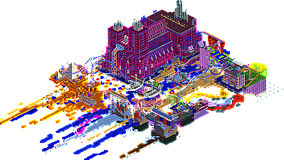
Quick, stream-of-consciousness build, freely associating various RCT aesthetics. Features three different Arrow coasters: 4D, launched loop, and their prototype virginia reel which was never built. It also includes a log flume which flows upwards.
-
2 fans
 Fans of this park
-
 Full-Size Map
-
 Download Park
391
-
 Objects
216
-
 Tags
Tags


I know this is gonna be a hard pill for a lot of people to swallow, but I love this free spirited styled of rct. It has this kind of experimental art feel to it, as much about challenging rct norms as exploring what can be done with rct as purely an art engine instead of a world building platform. Obviously, I've played with that myself so very excited to see others do it. There are a TON of ideas in here for it's size, and I don't think they are all necessarily winning. But, as a way to explore different methods of expression in the game, I'm in love. I'm also excited to see where this leads you next. I know that doing Swoon definitely influenced how I created more realistic and grounded work after that. Some ideas I'm particularly impressed with: The flowy jellyfish, the buildings with black-tile backs, the reversed log flume, the color smear on the near side, and the bonkers class cathedral. Congrats on this release, excited to see more build in this style and perhaps contribute more myself here pretty soon...
Airtime Offline
Look forward to opening this.
I loved this park, very cool! What place did you get in the contest?
I love this spirit. So much daring use of color here, large glass expanses, and how the train goes under the building is quite fun. Some areas are rougher than others, but the jellies are sweet.
This is very bizarre, I know it's supposed to have a digital or vaporwave theme, but imo it's reminiscent of psychedelic art, this wouldn't be out of place on a trippy album cover or a dr. seuss book. The scenery itself was very nice, and my favorite spot would probably be the pyramids area with the blue cacti, it just looks so cool. I agree with airtime in that it's like an FK release, kinda like Swoon or Colorflood. The viking boats and more modern ship were also cool.
As for the rides themselves, the 4D coaster's layout is questionable, but enjoyable. I liked the Virginia reel, especially with its 'luketh spiral' and how it's perched on a city block floating in the void. Overall, this is a very unique and fun release and something we don't see a ton of; technicolor strangeness that works very well.
14th out of 25
This is a nice submission, glad to see some fantasy. It was quite difficult to vote on though, i think this has some nice ideas and it showed a lot of creativity. But then it also features stuff i couldnt really read or understand and some edges felt unrefined. All in all especially the color choices are working well aesthetically here tho. Good job.
I agree that the artistic approach is very refreshing and I'm glad there's someone at the site now who does it. Frankly though I don't think this is quite successful yet. I thought this was interesting to see, but fell more into the weird than the beautiful category for me. Highlights for me as those long dotted lines towards the entrance, and the tentacle aliens, next to some aesthetic highlights popping up here and there.
Really enjoyed the style and boldness of this, looks like a very stream of thought kind of building and throwing everything out there and I love a lot of it. Elements like the jellyfish things were very successful, great curvature. Also really loved the ships, very skilfully designed. The absinthe express was another delight. As much as I loved the weirder elements, I think some of the object choices and palette uses were too distracting elsewhere. Great stuff though, very refreshing.
Weird and insane but with thought and not too overbearing. I loved the ideas and concepts behind the elements and the fact you can make up your own ideas of what's going on here.
grave of arrows 60%
holy shit my eyes
love this, but reasons unclear
rainbow bridge, so gay
Thank you everyone for the comments, and the silver! I really thought this was a bronze.
strongly agree with this quote. this was a very fast and unrefined build. and I was definitely trying to be weird for weirdness sake as a parting middle finger to dkmp and their checklist style of building, Still it is very encouraging that this scored so well. This was definitely practice for making another more polished park, and it's nice to see that people on NE are excited about this style.
if you think the bridge is gay look at the staff names.
Multi-dimensional
there's been a lot of vaporwave in the last few years (too much?) and most of it doesn't work as well as it wants to. I'm not sure this entirely convinces me that the design philosophy of it isn't just a hack to sort of generate composition quickly and without too much planning. still, there's some great stuff here. I think the crystal church is phenomenal in particular