Park / Destiny of Kalfou
-
 08-February 21
- Views 3,025
- Downloads 502
- Fans 1
- Comments 12
-
 74.50%(required: 65%)
 Design

In:Cities 85% robbie92 85% chorkiel 80% bigshootergill 75% inthemanual 75% Jappy 75% Xtreme97 75% CoasterCreator9 70% Liampie 70% posix 70% RWE 70% Scoop 70% 74.50% -
 Description
"Explore at y’alls own risk, but they’ll be no turnin back if Kalfou gets his way."
-
1 fan
 Fans of this park
-
 Full-Size Map
-
 Download Park
502
-
 Objects
279
-
 Tags
Tags
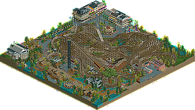
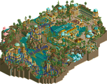
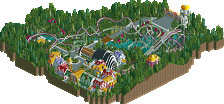
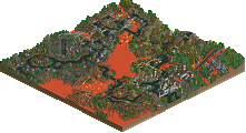
Can't view in full right now cause I'm missing the WW/TT objects, but what I can see is pretty stellar. As I've noted elsewhere, I think this does a better job of actually accomplishing the 'dueler' objective, but I know what wasn't maybe the actual intent even from the organizer.
Regardless, I think you've done a stellar job of balancing the content heavy focus of DKMP with the need for some landscaping and open space that allows the viewer to put everything in context. A lot of really great CSO details like the Mardi Gra streamers made of mini suspended coasters. I did find the coaster's center to feel a little coaster-chaotic, but the size of the map is pretty limiting to that. The NOLA vibes overall are really well incorporated, that and the dueling elements are the main thing that pushes this a little bit over Inwood Springs. Congrats on the release, especially fun to see DKMP and NE players working together and learning from each other.
Airtime Offline
So much to be amazed at in this.
The layout is top notch as expected.
The Star Flyer is awesome but wow the Top Spin. I love the fact it actually moves. The realistic touches for both are great.
Love the little square with the surrounding buildings near the Top Spin as well.
Would love to see this dream team again. Whatever you both touch is gold (or spotlight if it was big enough).
Well, thats a combo i havent expected. And what a great release! I think i would have loved some more breathing room for the wooden coaster, since its filling like 75% of the map, and i don't understand some of the color choices, but its amazing work nevertheless, especially looking from a technical viewpoint. My favorite thing about this is that you guys managed to create interesting and innovative NCSO structures by still keeping your object usage minimalistic. Keep it up!
Thanks guys!
This was challenging to build. It's definitely out of my comfort zone but Swag was great in helping make that move and pick up the slack where I fell off.
Some of the DKMP specific rules definitely held things back a little bit in regards to map size, breathing room, etc, but I'm happy with how things came out despite the limitations. Swag carried almost all of the architecture except the mansion, and I did ride design.
The top spin was something I had been playing with for a little while and am going to be doing a hacking tutorial video for really soon. I wanted to step of the idea of the standard ride, so this was fun to build.
All told, I'm happy with how it turned out, but that's it for my NCSO career I think haha.
Another really great piece of NCSO, we are really getting spoiled on that part. These days NCSO became so good it's hard to distinguish from CSO, just so much details with clever ideas and tricks I'd never could think off.
But the highlight of this is the ride design. The duelling woodies have great lay-outs and they duel so well! A lot of interactions with eachother and the timing is spot on, which is incredibly hard to achieve. Really awesome job on that! I love the turn around after the station with the big tree in the middle and the airtime hill right behind/over it.
The Gris Gris mill and the carroussel were also neat rides. Overall it has pretty good atmosphere. The queue entrance in the shape of a boat was so nice. Overall a really nice entry and glad to see some new CP6 work too!
Carry over from the screenshot comment:
Some of the small easter eggs like the old PTC trains were nice. Seems like something you really enjoy adding to your parks CP6. Everything from backstage to the New Orleans architecture was really well done. The coasters were incredible to watch and were timed well. This was a combo I never saw coming.. but it's pretty cool to see a layout/design expert matchup with a NCSO builder. Love seeing so much realism NCSO lately.
This might be the best NCSO I've ever seen. Realism and charm woven together beautifully and taken to its maximum. Finding out you made a diagonal railing by having two fences pointing up and down and obscured by trackitecture had me slack-jawed for at least ten seconds.
Such a lovely blend of a wooden dueling pair and modern detailed NCSO. I love how well the rides paces and duels, and yet all of the theming seems to be balanced about it, nestling in a ride or building in logical places. Some of the better usages of trackitecture and I love the buildings, especially the upper floors for the Bourbon Street like area, and also the White with the columns. Great job you two!
Great combo of two great players. I loved the story and how the entire area helps in bringing it to life. The duellers are fantastic and the archy matches that quality.
This was a really impressive design and from an unexpected duo. I really dig the New Orleans vibes I got from this, it was immediately recognisable and you've done a wonderful job of giving the map some variety in terms of the architecture and general style to keep things interesting. The layouts were really impressive, I don't often enjoy big Gwazi-style duellers too much but these were a treat to watch, and the double crossover in front of the station is a standout moment.
 )
)
The ride design elsewhere was excellent as well - the top spin especially is very well designed and cleanly done. The Square archi might be some of the best urban ncso I've seen, and has really gorgeous details like the mardi-gras deco and the dark road lines. I also really liked the manor house up on the hill with the interaction of the river cruise beneath it (though I would have love to see this extended beyond the map, seems a bit too squeezed in at the edge there).
I wasn't huge on the swampy area. There was some excellent foliage work but the architecture feels a bit standard - not bad necessarily but it's a bit out of sync with some of the other work here. There were still a lot of great pieces here, such as the steamboat and the custom Banyan tree with the hanging single-rail track (the expansion tree still sucks though sorry
All in all a very successful collab, cool to see CP6 tackle ncso. Hope to see more from both of you of course!
6TittiesPointCedarSwag
destiny of kalfou - 70%
layout from the gods
steamboat so good, flat rides - wow
atmosphere oozing