Park / Inwood Springs
-
 08-February 21
- Views 2,504
- Downloads 456
- Fans 1
- Comments 8
-
 71.50%(required: 65%)
 Design

robbie92 80% CedarPoint6 75% In:Cities 75% inthemanual 75% Jappy 75% Scoop 75% chorkiel 70% posix 70% Xtreme97 70% bigshootergill 65% CoasterCreator9 65% RWE 65% 71.50% -
 Description
I teamed up with Jens J. for the duelling wooden coaster contest on DKMP. It's mostly NCSO, but uses a custom palette, both RMC tracks X7 made and some of the OpenRCT-Official roofs. The duelling coaster we made is a GCI-based möbius with one station.
-
1 fan
 Fans of this park
-
 Full-Size Map
-
 Download Park
456
-
 Objects
261
-
 Tags
Tags
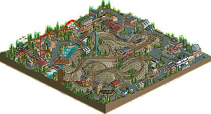
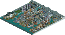
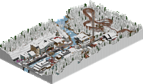
Congrats on the win and the release. As I've said on discord in relation to the contest, this clearly feels more like a racer than a dueler to me. Putting that aside and looking at this as it's own individual piece of work, I think it's a great slice of parkmaking filled with a lot of clever NCSO tricks. I think having some more breathing room on the map, even just centering the woodie and giving a bit of landscaping as an open space buffer would be great, but I know DKMP pushes for content heavy maps. I would really love to see this level of work on a bigger scale and with a bit more room to breath and develop different themed areas and styles.
I pretty much agree with everything FK said. Great piece of NCSO, and I like how many neat tricks you have in here to make it shine (the suspended monorail fountain, supports, canopy and transfer tracks). Loved the coaster, it manages to have a great layout whilst also being a good racer. I'm not as enthusiastic about the intamin launched. Its not bad, but its place on the map and resulting footprint does make it feel a bit forced. Granted, I think you did well given the map restriction you had to deal with. Would so, so, so much love to see this applied in something on a larger scale or perhaps a small map where you have more liberty to decide its shape.
Airtime Offline
Whilst I love DKMP, I find it hard to read because I don’t understand the filing system of releases.
I liked the support coaster but I feel it’s unnecessary compared to the main coaster, this seems to be a common theme on DKMP as well. Not a bad thing just personal preference.
The coaster is great, especially love the first drop. There’s so many great details in here.
The RMC supports are interesting. They are technically good and aesthetically pleasing but I can’t get over the fact the RMC track is steel so feels odd it’s acting like a wood support?
The creativeness of some of the NCSO never fails to amaze me.
Always looking forward to more!
I liked the layout, although it wasn't a dueling coaster. The surroundings seemed a bit disjointed and random though. Just a loose collection of buildings with an unclear theme and purpose.
Coasters look good though! I would have loved the drop to have more breathing space, and to see how peeps would be given the room to watch the drops from a bit further away.
Although the amount of trackitecture doesnt really fit my taste, this was a quite solid release. I really enjoyed the coaster layout, although nothing has any space to breath.
The architecture overall is well executed on a technically level, it had definitely some ups and downs for me in terms of sometimes NCSO ideas being very creative and innovative and sometimes they felt unnecessary and over the top.
All in all as said a solid submission tho and i think this is worth a design.
Great job with this, strong piece of work. The main woodie coaster is clearly the star, great layouts and nice colour scheme too. The support work was really sweet, not just the hybrid track but the way you supported the lift too. The station has some pretty interesting detail as well, and I liked the entrance sign.
I think the other parts were executed fairly well here but felt disjointed. There were some lovely tricks and object usage, I liked the supports for the launched coaster quite a lot and loved the diagonal bridge also. I'm less enthusiastic about the tracked roofs however, which felt a little overdone. I think in some places it works really well but used this much cheapens it a bit.
Thanks for the votes and the comments everyone!
inwood springs - 65%
coaster impressive
red one unneeded - subtracts
surroundings not bad