Park / Expo
-
 29-January 21
- Views 2,100
- Downloads 422
- Fans 0
- Comments 6
-
-
 51.50%(required: 50%)
 Bronze

Jaguar 60% bigshootergill 55% In:Cities 55% Jappy 55% RWE 55% CoasterCreator9 50% inthemanual 50% posix 50% Scoop 50% Xtreme97 50% chorkiel 45% nin 40% 51.50% -
 No fans of this park
-
 Full-Size Map
-
 Download Park
422
-
 Objects
427
-
 Tags
Tags
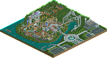
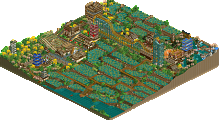
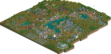
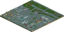
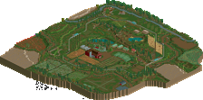
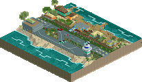
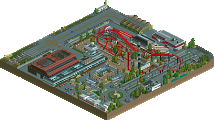
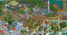
Another brilliant park by a newer player. It could use some refinement here and there and I feel like some of the coaster layouts could be improved upon. But the whole composition of the map is wonderful. I really enjoyed viewing this. Some of my favorite ideas included the way you did the outskirts, with the yachts, the small airport, and the pavilions in the parking areas. I also enjoyed the Woodie, the Go Karts, the rapids, and all of the custom rides a lot! Great work man.
I hope this doesnt get overlooked, because there are sparks of amazing things in here, although the style feels very old school, but sadly more in an outdated way to me. I really enjoyed the main street area, screams fun and reminds me of the days where i was playing this game a bit less competitive. This is the style you should develop more. With a bit more direction and composition i think, you could pump out an amazing park. Don't get me wrong, this was already quite solid, but there is of course room for development. Good job tho!
Solid little park; the ultratwister is well made! Kind of gives me some southeast Asian park vibes with the unique ride design and bright themed architecture. The buildings around the twister and the rapids are really neat. Overall, shows a lot of great ideas, if just a little unrefined in execution. Hope to see more from you.
Quite unique looking, and an interesting dedication to diagonals. I'm impressed by your attention to architectural features, given that I assume you're a new player. Although part of the nature of this park was to look "made", I would focus on more organic looking design choices in the future. I felt foliage and landscaping could be less of a filler and play a stronger role.
A bit outdated and old school in terms of object choice here, but it's clear you know how to construct buildings and plan a park. I suggest for your next project to be more consistent with your colour choices, they're a bit all over the place now with for example two colours of roofs for one building.
I never properly looked at this before until today. Very nice work, deserved Bronze win! The wooden coaster is great, as is the Togo pipeline coaster. I also love how the rapids river frames the immelmann. Foliage wasn't great and in general the park had some colour issues, but the architecture was very solid throughout. Love how you integrated a ferris wheel in a main street building.
Hope there'll be more parks from you!