Park / Mustang Island Amusements
-
 28-January 21
- Views 1,959
- Downloads 540
- Fans 0
- Comments 6

-

-
 Description
(BETA VERSION) 99%
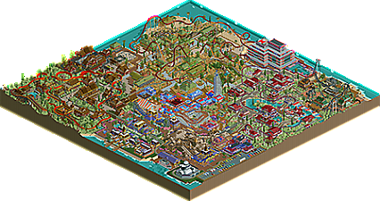
Welcome to the Grand Opening of Mustang Island Amusements! Located in beautiful Corpus Christi, Texas!
Enjoy your stay y'all! -
 No fans of this park
-
 Download Park
540
-
 Objects
556
-
 Tags
Tags

Great job, vibrant and fun map. Shame that the King of the Hill coaster valleyed. I think you will want to look at refining things here and there, as well as thinking more about the general composition/macro for your next project. There are a lot of nice details. Just feels a bit tough to follow sometimes.
Good job, and interested to see your next project.
I still like how expressive your aesthetic is. Will be interesting to see where you take it.
A great mixture between vibrant and bright colors and interesting unique theming. This park felt like a spiritual journey to me. There is definitely room of improvement, especially in the aspects Fisch pointed out, but what i see here is already very enjoyable and makes me interested for more.
This reminds me a LOT of older releases; colors tying areas together, generally vibrant, unique ride designs, and of course the object selection. The foliage is not good, but I don't fault you for experimenting with it. The sheer amount of grass objects and the like is a bit much when coupled with the bright architecture and rides. The wacky ride design isn't really for me, and the pacing on a lot of the coasters isn't so good, but I will never tell someone to not go for out of the box things unless they're specifically trying to build something on the more realistic side of things. I think it'll be interesting to see where you go with a style like this.
I actually thought this was a really nice and vibrant park. I like the atmosphere you have going on in your park, though I would suggest you give your areas a bit more room to breathe. Right now everything is very tightly packed which can make looking at your park a bit difficult and makes it easy to miss the finer details. Your rides were a bit all over the place, literally. Try to go for a more defined layout like you see in real life rather than having your coaster spread throughout the entire area, it'll make them a lot more aesthetically pleasing. The architecture was quite nice, I like what you've done with it. But, I don't think the colours you used mix very well at all, with the exception of the german area.
Overall, nice park and looking forward to seeing more from you 55%
55%
texas