Park / Five Minutes to Twelve
-
 17-January 21
- Views 19,828
- Downloads 545
- Fans 2
- Comments 34
-
 81.00%(required: 70%)
 Gold
Gold

RWE 90% no CoasterCreator9 85% no In:Cities 85% no Jappy 85% no Xtreme97 85% no chorkiel 80% no Cocoa 80% no Liampie 80% no Scoop 80% no Camcorder22 75% no inthemanual 75% no posix 70% no 81.00% 0.00% -
 Description
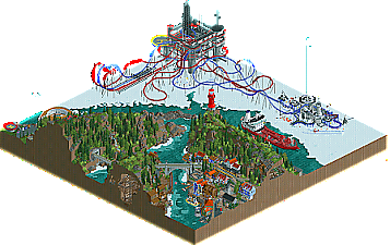
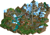
The Arctic sea ice decline has occurred in recent decades by sea ice in the Arctic Ocean melting faster than it refreezes in the winter. The ongoing exploitation of the earth's fossil resources is the fire that heats it up. With that comes the unawareness of the environment of companies and people. Research shows if we don't stop now, the arctic as we know it now will cease to exist. It's five minutes to twelve.
-
2 fans
 Fans of this park
-
 Full-Size Map
-
 Download Park
545
-
 Objects
672
-
 Tags
Tags
First I want to say congrats to everyone who participated in the finals.. amazing work this season.. quite wild how much RCT has been elevated in the past year.
Five Minutes to Twelve
Really enjoyed this. The cliffside village was amazing. As Cocoa pointed out, the architecture was quite stunning, especially with the hotel. This park I'd say would win some H2H matchups.. just oozes with atmosphere that was just really pleasing. The dueling coasters on the ice was a bit risky I guess since it seems so bare, but the big reveal made it all make sense. So creative.. damn. The adventure ride was also a bit risky in that using too much cutaway can get annoying, and I assume some don't even bother to use it, but I really enjoyed watching the coaster travel through the caves. Great work guys.
Kugluktuk
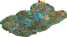
Good god the amount of texturing and detail is intense! Overall it was okay, but I like the woods/outskirts were a bit too much. I enjoy the Kryptonian rocks in moderation, but it's weird to see so much in a snowy environment. I think I might have enjoyed this entry a bit more if it was less busy. Otherwise, the architecture here is top notch. The bottom area of the ski lift in particular was stunning. The brown cabin/house at the bottom of the slopes was so damn cute. The lodge was very well done too.. the half exposed ice rink was a great idea. Overall, you guys were amazing this Grand Tour. Really stepped up to the plate and have become important members of the community and look forward to what's next from you guys.
Remote Russian Archipelagos
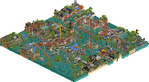
I think the coaster here was really well done. Would be terrifying to ride with how rickety and homemade it felt, but would be fun to weave around that sort of landscape. Also, glad to see another quality cruise ship! Not surprised you'd be such a good rct boat maker given your penchant for track sculptures. This entry was quite colorful and fun, and I enjoyed it quite a bit. Maybe not the same amount of detail as some other entries, but I think the composition and theming here made it on par with other entries.
Longyearbyen
Wow Geoff, you've really elevated your game this contest! Really impressed again by this entry. The seaside houses, while all uniform, were very good. The other half of the village with the bright red and tan rooves was a bit less pleasing. I think because most of the structures lacked height, it ended up being a sea of roof pieces. I think the palette was a bit wonky too.. would've rather seen the Haystack palette perhaps. But holy shit you made up for those criticisms with the northern lights.. my god that was genius. Really nailed the adventure ride criteria. I have to apologize as well, I made a mistake in voting and forgot to vote for your entry for the first part of the voting.
Tromso
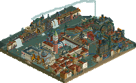
Quite impressive architecture in this entry. The bridge was quite large, but it really stood out in a good way. When I saw Zara was on this park I knew there would be some super technical and wacky hacks.. and I was still amazed at what you guys came up with. The drop track made me do a double take... wow. The kissing track was such a crazy moment as well. The detailed and realistic city architecture made for such a believable environment.
He who travels has stories to tell!
Due to the discoveries described HERE, the Grand Tour final results were overturned on March 4th 2021. The original winner announcement can be found within the spoiler brackets at the end of the post.
After the voting inconsistencies from the initial poll have been corrected, we can now announce that the winner of this first edition of the Grand Tour is FK+Coastermind and Zarathustra, whose Tromsø's Nordlysfestivalen was chosen as the greatest park on this final stop. After making an impressive showing in Round 3 and a group role in Round 2, FK came out swinging in Round 5 to earn his spot in the finals. As a solo qualifier, he invited Zarathustra, who made an impressive attempt with Geoff - one of our wildcard recipients - in Round 6. Together, it's clear that their collective talent was a very powerful force as they come out on top! Our congratulations to the new Grand Tour Champions!
Grand Tour '20 Champions
FK+Coastermind & Zarathustra
Tromsø's Nordlysfestivalen
It must be noted that Hydroportal and 6crazy6king6's (Round 1 winner) Kugluktuk Lodge and Resort made an impressive showing in the second poll question. Tromsø's Nordlysfestivalen edged out a win with a balance between the theme and overall quality - don't underestimate those themes! Congratulations are also in order for WhosLeon and Tolsimir (Round 4 winners) - their creative entry Five Minutes to Twelve made excellent use of inventive objects and came second in the first poll question.
The other contestants, our grateful wildcard recipients mamarillas and Coaster-GEOFF were trailing further behind, but both put on a great show as well. All in all, it has been a spectacular final, and a grand conclusion to this new contest format which may already be an NE classic. As our circumnavigation of the Earth concludes here, we'd like to take a moment to thank all who participated, voted in the polls, or helped out with the contest behind the scenes. We hope you enjoyed the journey as much as we did, and we wish you will accompany us on future travels as well.
Find a table with all entries and their respective ranking and scores below. The total score has been calculated using the following formula:
Total score = objectives score + quality score
Original announcement:
Congratulations!
To all the finalists; thank you for making this contest exciting to the very end, and I can't state enough what an amazing final round this has been. Incredible level of quality and execution displayed here; makes me excited for what might come next.
Big congrats to hydrohenk!!!
Hydro and Henk consistently impressed this contest, and they 100% deserve the dub. Amazing contest!
Congrats Hydrohenkert, you two had a great GT and this is a fitting crown to that. The quality of this finals was insane, you are all winners here!
RaunchyRussell Offline
Well deserved! Everyone killed it in this round though.
Here's my video review of the Grand Final. Incredible stuff by everyone!
https://www.twitch.tv/videos/885000900
I loved all the entries, this was a great contest to watch, congrats and thanks to all who participated!
Bit late to this but congrats Hydrohenk, yours looks like the deserving winner. Well done on winning both the first and last round.
Congrats Hydro and Henk.
Some random ramblings from my side on each of the parks:
Five minutes to Twelve:
Upon first opening this park I was a little underwhelmed. However, as I started to look around more and more I started to appreciate it more and liked it a lot more. My favourite thing on the map is the artic research station which doubles as the station for Sabotage Action. The Modern architecture building next to the helipad is also cool. The little village with the mine ride is very picturesque with my favourite parts being the fishing trawler and the diagonal bridge + train station which is both used for the mine tour and the regular train. I think the fact that both rides share the same bridge and station is a neat detail. The landscaping was cool but a bit of a mixed bag for me, some parts looked really amazing to me while other parts left me feeling a bit mehh. The cliff sides were overall well done but I felt like at some points they were a bit to underdetailed/bare which made them look blocky. The worst part being under the lighthouse. I know people are probably gonna disagree with me on that but idc. Other than that everything was well executed and overall this was a very high quality park.
KugLutuk Lodge:
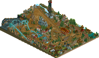
This was my favourite park out the bunch by a large margin. I don't think it is technically that much better than the other parks, but the vibe this park gives up is just so good. It really has this cozy christmassy vibe surrounding it and I really like that. This is also one of the few parks where I feel like the palette actually really contributes to the vibe the park is trying to give off, I feel like in other parks the custom palette is usually used more as a gimmick. The architecture was great. My favourite buildings are probably the round grey building and the other grey building next to it but the other buildings were also great. The lodge perhaps at some scale issues with it being too large and way out of proportion compared to other buildings, but somehow it still just looks great so it still works. Other have also said this already but the density of this park is great and this is a good contender for best crunch of the year. Lastly, I loved the train station that you guys added, it somehow fits so well into the landscape and the tunnel looks cool. I felt like the adventure ride was kind of lacking in this park, but I still voted for this as the higherst overall quality as it was my favourite entry.
Longyearbyen:
I really like the concept of this entry. It is such a unique and cool idea and executed well. The readme telling people to follow the car ride was a cool presentation and it works well. I felt like the archy was a bit simplistic in this entry so that is something which you could improve on for next times, although overall it was still not bad. The chairlift station was probably my favourite building on the map. Something which I thought was neat was the bridge of lodges over the water and the road which then goes onto this garage/indoor section under the brown building looks cool. The dirt roads were well done in general. Overall this was a solid entry.
Remote Russian Archipelego:
This park was pretty cool. The main highlight for me in this park is clearly the coaster. It is a very cool and unique layout and I like the support structure. I did think it was kind of weird that you specified that it was a Zierer coaster and that you specified a built year, as the coaster doesn't actually look terribly realistic to me, atleast the setting does not. But for a fantasy coaster it looks very cool to me. In this entry I also felt like the architecture could be somewhat better. I am aware that buildings here are often simplistic but overall I felt like many buildings were a bit blocky and underdetailled, the worst offender being the blue building with the orange roof next to the trainyards. The trainyards itself were well done btw with the trains looking pretty cool. The idea of splitting the park in two with a little glimpse of inland Russia (atleast this is how I interpret it) is also pretty cool. For the inland Russian part the main highlights for me are the custom bus and the little food stall next to the cathedral, these are some neat little details.
Tromsø's Nordlysfestivalen
This was my second favourite entry of the bunch. The main highlight is obviously the coaster. It is a bit gimmicky but I like a good gimmick and I also appreciate the effort put in. Overall the layout was pretty cool in itself and the whole thing just looks spectacular. I also appreciate the originality of ideas that are put in the ride like the near miss element on the first drop. The architecture in the town was great overall although I did thinks there were some scale issues here and there with buildings looking to tall/large although this was probably a compromise in order to get certain details in. My favourite building is the Scandic Hotel building, which is just insane although the waterfront and the buildings next to it also look great. Overall this entry was also great and a well deserved second place imo.
Been meaning to type up some final thoughts now that the contest is over. First and foremost, a huge congrats to Hydro and Henkert on the win. It was a really impressive contest for you both, and bookending GT with wins in the first and final rounds is pretty fitting, even if I tried my hardest to ruin that, heh.
Some quick reviews for the parks:
Longyearbyen: Everyone's saying it, but it bears repeating: It has been a joy to see you progress across the contest. This park was a great way to finish, something artistic, conceptual, and really captivating. Besides the fact your aurora took some of the thunder out of ours, I'm kinda in love. It has such an incredible expressionistic look that is so gorgeous. I agree that the macro was a bit rough with the two-sided nature of the park, but I'm willing to ignore that given your dedication to an artistic idea. Your execution also suffered if only in comparison to the other parks, but with a few more projects (and maybe a H2H) under your belt, I think you could easily be a big hitter around here soon.
Remote Russian Archipelego: I think you deserve recognition for the best dedication to the 'travel' theme. Between the readme's and the way you set up the park, you clearly made that front and center and it really shows. I do think the macro is a bit awkward in places, and reorganizing to get a smoother transition between areas would have been nice, but I don't see that as a huge issue and the travel theme made it clear to me what was going on. Overall, your execution was great and clearly captured the concepts you wanted to present. I particularly loved the railyard, the supports on the coaster, and the custom rides, you have a real eye for metalwork and infrastructure. There were a few spots that felt rougher or just rushed, like some of the ice edges or some of the coaster station. That being said, just like Geoff, I think you are on the doorstep of parkmaker quality.
Five Minutes To Twelve: Personally, this was the conceptual winner of the round. The innovative tricks were incredible, but for me the climate change theme and the red/blue color scheme were the real win. It honestly felt like a really mature entry that found a way to speak to the theme and focus of the round but do so in a new and engaging way. A few parts did feel a bit rushed to me, particularly parts of the landscape, which was a shame because the macro put a lot of weight on the landscape to hold the different ideas and pieces of the park together. I'm torn on the mine train, it looked great and ties into the theme, but it also feels like an easy go-to for adventure ride that we've seen before. Honestly, I'd just as soon call the coasters the adventure ride. I did think the coasters against the plain ice background was a bit jarring composition wise, but not much you can do about that and it was definitely worth it for the incredible ice trick. So excited to see how that gets built upon and applied elsewhere. Congrats on the release, I think this park will be a huge inspiration for the community moving forward (particularly into a potential H2H).
Kugluktuk Lodge: Holy crunch ya'll packed a ton into this. As someone who often lives (and dies) by the more is more mantra for crunch, this was a treat. The excessive details, the architecture was impeccable and in places atmosphere supreme, and you found so many opportunities to break the grid in really pleasing and interesting ways. As a product of a very modern style of rct, I think this is excellent. My only potential criticism for the execution is that I think a different palette would have helped with the snow blending. As it is, you have the ice-blue of the snow ground texture against the white of 1k nets and path textures, and it doesn't always feel like a clean blend. Using a palette to get those colors closer might have smoothed those edges and created some more neutral space. Looking beyond the incredible quality of the execution and content, my only gripe with this park would be the objectives. It doesn't feel distinctly 'arctic' to me, and kinda feels like it could be in Colorado or Utah or even the Canadian rockies more than Kugluktuk, which is primarily flat and barren. The safari ride seems pretty minimal as an adventure ride, though there is plenty of other rides on the map to make up for that. It honestly felt a bit like you had an idea and backed it into the objectives a bit. That being said, there is no doubt the quality and execution of the entry is worthy of the win. Congrats again for taking home the title, really excited to see what ya'll do next (together and separately).
Tromsø
A big thanks to everyone for the feedback and comments on Tromsø, It was a stressful joy to bring together and I'm exceedingly proud of the result. I want to be sure I loudly shout how great it was working with Zarathustra throughout this round. Beyond how impressive his hacking skills were, he was a great sounding board and helped to boost (and curve) my enthusiasm during the build. I had no idea what to expect when he asked if I was looking for a partner, but I think it turned out great. Probably my only regret is we didn't have much time to learn from each other as the park came together in such a mad dash. Hopefully we'll get the chance again in the future!
gee! good work, I fell in love with the bridge and the bus