Park / Brandberg Mountain Express
-
 28-January 21
- Views 1,994
- Downloads 472
- Fans 0
- Comments 12
-
 58.13%(required: 65%)
 Design Submission

bigshootergill 70% Jappy 65% Xtreme97 65% Milo 60% posix 60% Scoop 60% chorkiel 55% CoasterCreator9 55% nin 45% ][ntamin22 45% 58.13% -
 Description
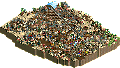
I thought Grand Tour slowly coming to an end would be a great moment to release this. This was supposed to be my submission for the Namibia round, just a quick design, nothing big. I just wanted to make LL represented in the contest. Sadly i wasnt able to finish in deadline. I hope you can nevertheless enjoy this a bit now!
Like Toreador i built this without any hacks or cheats, just pure LL.
The Brandberg (Damara: Dâures; Otjiherero: Omukuruvaro) is Namibia's highest mountain. Brandberg Mountain is located in former Damaraland, now Erongo, in the northwestern Namib Desert, near the coast, and covers an area of approximately 650 km2. With its highest point, the Königstein (German for 'King's Stone'), standing at 2,573 m (8,442 ft) above sea level and located on the flat Namib gravel plains, on a clear day 'The Brandberg' can be seen from a great distance. There are various routes to the summit, the easiest (also steepest) being up the Ga'aseb river valley, but other routes include the Hungurob and Tsisab river valleys. The nearest settlement is Uis, roughly 30 km from the mountain. The core area of 450 square kilometres (170 sq mi) was declared a National Monument in 1951. -
 No fans of this park
-
 Full-Size Map
-
 Download Park
472
-
 Tags
Tags


Excited to check this out soon.
I always love the moment when new LL gets released on the site. It is even pure LL, that is even better. Pretty good woodie, I really like the grey touch. The station is maybe a little bit too simple, but it works. The ice mountain is a nice touch in the yellow/brown landscape. The archy in the park is simple but good. Sadly that it is not peepable, but i can understand that.
All by all, solid LL-design. 70%
Loved this, felt very creative and fresh. It was charming, you have LL talent, would love to see it executed in a park.
Opened this over the weekend but didn't comment yet because I don't really know what to say for this. Wasn't necessarily let down by this but also not impressed. The architecture was not really interesting by itself and it feels like you tried to work that away by putitng small details everywhere. That made the map look a bit messy overall. The woody station may be the prime example of this. The structure didn't stand out to show it was the station, and the thing that took my attention was the in-game station and huts. The details around it did not make it a cohesive station, but rather make it look like a dump.
There were plenty of things that I did like about this. The layout looks nice, and it has some good intereaction with the railway. While the details harmed the map, its alyout and landscaping do have a nice and clear layout.
I thought this was a step down from Toreador, which was much cleaner. On the other hand this had more creativity than Toreador which you should embrace. Perhaps a bigger map would have helped as well.
Always fun to see people trying out more in LL. I do agree with chorkiel that this is a bit of a step down aesthetically and compositionally from Toreador. The layout is pretty good, but I think your use of landscaping and architecture hid it away a little bit more than necessary. As a whole, there's kind of just a lot of "stuff" everywhere that adds some visual noise without really contributing to the look of the park. Key to that is the ruin/bush spam. It's sort of just all over the place without much rhyme or reason - I would have liked to see more desert-like patches of greenery rather than them being scattered.
I can understand the challenges of building without hacks, but I do think this could have benefitted from a bit more identity. Hope you keep giving LL a shot, would be great to see some new releases in the format.
This was fun. I really liked the layout and how it was incorporated into the landscape and surrounding theming. Overall the messiness didn't bother me but it did put a cap on how much I like the map as a whole. The landscaping was great but I think the foliage felt a bit too much like an afterthought, better clumping would have helped. The majority of the texture and object choices worked for me. Some buildings like the station didn't come together as a cohesive whole which hurts it a bit imo. Between Toreador and this the hackless approach seems to yield good results for you so keep going and I applaud the different styles you are taking on.
This was decent. I enjoyed seeing you play with aesthetics, as you should in LL, and the outcome has certain merit and originality. The layout was fine. Content wise a bit small and feeling undercooked. A playful little side project for you.
Neat experimental map, not bad! I got sort of hung up on a few things feeling like they weren't fully realized and couldn't give it an accolade-tier score, but I did enjoy the fresh approach and the fun ways LL changes and pulls out different styles from mainly-2 parkmakers.
Layout - liked the concept, well-integrated with the landscaping. It felt a little short length-wise for it's height and I do wish it played juuust a bit more with height differences instead of always returning to the same height base at the bottom of drops.
I don't feel like the railroad interaction added a lot. It made the coaster area messier and felt a little forced. The little nested turns of coaster and train over by the swamp/wetland area was cool though. I didn't really dig the path solution for the "wildlife" and felt like the non-village structures by the coaster lift were confusing; I wasn't sure if the path there was supposed to read as path or just dirt that needed to serve the purpose of keeping entertainers on track.
Architecturally this didn't do much for me. The one notable little highlight for me was the asian-themed house object on the roof of the building central to the coaster plaza, that was a neat little piece of detailing to break up the 2x2ish format that I appreciated. I get the no-hacks take and appreciate keeping things light and interesting that way, but I don't think it did any favors to the foliage here. Nothing reads well as a backdrop or "wall of green" - and fair enough, it's a desert - but the choppy mix of land tile and disparate small objects is a bit too much without some framing spaces of less intense visual interest.
Actually, overall - this could easily have been a more pleasing viewing experience if there were more space between things. A simple 4-5 open-desert tile gap between the village and the start of the coaster/ mountain landscaping would have not only been cleaner and put more focus on IMO the most successful and effortless part of the map - the landscaping - it would have been better for the storytelling of the coaster bridging the village and mountain. Likewise, another 3-4 tiles of landscape context at the "map edge" of the village would have really established some visual breathing room to let the village's clutter not become overwhelming.
I hope the criticism here isn't overly harsh, because like I said; it's always a really neat experience to see someone newer to LL pick it up and run with it, and obviously no-hacks and contest restrictions were at work.
Thank you all for the comments so far, i think this has been some nice feedback. I agree that this is a bit underdeveloped and it could have been better with a lot more room for stuff to breath and themes to play.
I think i should tackle a LL park as a nice side project next and maybe read myself into all this hacking stuff you guys are doing.
I enjoyed this quite a bit. Great layout, tight but not uninteresting and keeps its pace well. Has some lovely use of diagonals and plays with the valleys of the landscape quite nicely too. The landscape in general is really quite well done imo, good use of textures (such as the brick).
The main town/park area is a mixed bag for me. Love the entryway with the big rusted wall, wish you had used that texture a bit more in the rest of the park as it worked well for the vibe you were going for I think. Some of the other architecture was decent and conveyed the ideas you were trying to bring, but there could have been more effort put into some areas such as the coaster station.
Also not sure on the sporadic use of ruins and other things throughout. I think something like plain desert at the edges, similar to Great Mesa from NEFC could have really benefited to highlight the coaster and town. Still, I'm very glad that you've finished this and there's at least one LL release this year!
a lovely little design, and always great to see a bit of LL here and there. I really liked the little buildings and the cluttered active streets, framed nicely by the coaster. interestingly- I thought the park improved drastically once I deleted the train ride. it was just a bit clunky and weird for me and the composition didn't need it
I think most of what's on my mind has been said - the good and the bad. My main positives are the layout (as usual, from you) and the general arid look. Main criticism is that I think this would've worked better on a much larger map, if not a low density full scale map, to allow for more exploration and for more space to actually make this feel like a remote desert area, and not a slummy city outskirt. I think the score is very fair. Succesful experiment?